Purchase Order Dashboards, KPIs, and Analytics
Purchase order (PO) dashboards have become a core part of modern procurement and finance operations. Instead of digging through spreadsheets, emails, and ERP screens, teams can see the entire purchase lifecycle at a glance: what has been requested, approved, ordered, received, and invoiced. When combined with well-defined key performance indicators (KPIs) and analytics, a purchase order dashboard turns raw transaction data into insight that can improve cost control, supplier performance, and operational efficiency.
At their best, PO dashboards are not just “pretty charts.” They are decision-support tools that help buyers, managers, and executives understand where money is going, how quickly orders move, and where risks or bottlenecks are forming. To get there, it is important to understand which KPIs matter, what they mean, and how to influence them through process changes and better collaboration.


What is a purchase order dashboard?
A purchase order dashboard is a visual interface that consolidates data from purchasing systems—such as ERP, procurement platforms, or accounting software—into a single, interactive view. It typically shows metrics and charts related to:
- PO volume: Number of purchase orders created over time, by department, category, or supplier.
- Spend: Total value of POs, often broken down by cost center, commodity, or project.
- Status tracking: Open, approved, sent, partially received, fully received, and closed POs.
- Cycle times: How long it takes to move from requisition to PO, and from PO to receipt.
- Supplier performance: On-time delivery, completeness of orders, and responsiveness.
These dashboards can be operational—used daily by buyers and AP staff—or strategic, used by leadership to monitor trends and identify opportunities for savings or process improvement. The same underlying data can support both, as long as the KPIs are clearly defined and consistently calculated.
Key purchase order KPIs and what they mean
KPIs are the backbone of any purchase order dashboard. They translate activity into measurable outcomes. Below are some of the most common and useful PO-related KPIs, along with what they reveal about the health of the purchasing process.
1. Total spend and spend by category
Total PO spend shows how much the organization is committing to suppliers over a given period. When broken down by category (for example, IT, facilities, marketing, raw materials), it reveals where money is concentrated. This helps:
- Identify savings opportunities: High-spend categories may benefit from strategic sourcing or volume discounts.
- Support budgeting: Comparing actual PO spend to budgeted amounts highlights over- or under-spend.
- Improve forecasting: Historical trends can inform future purchasing plans.
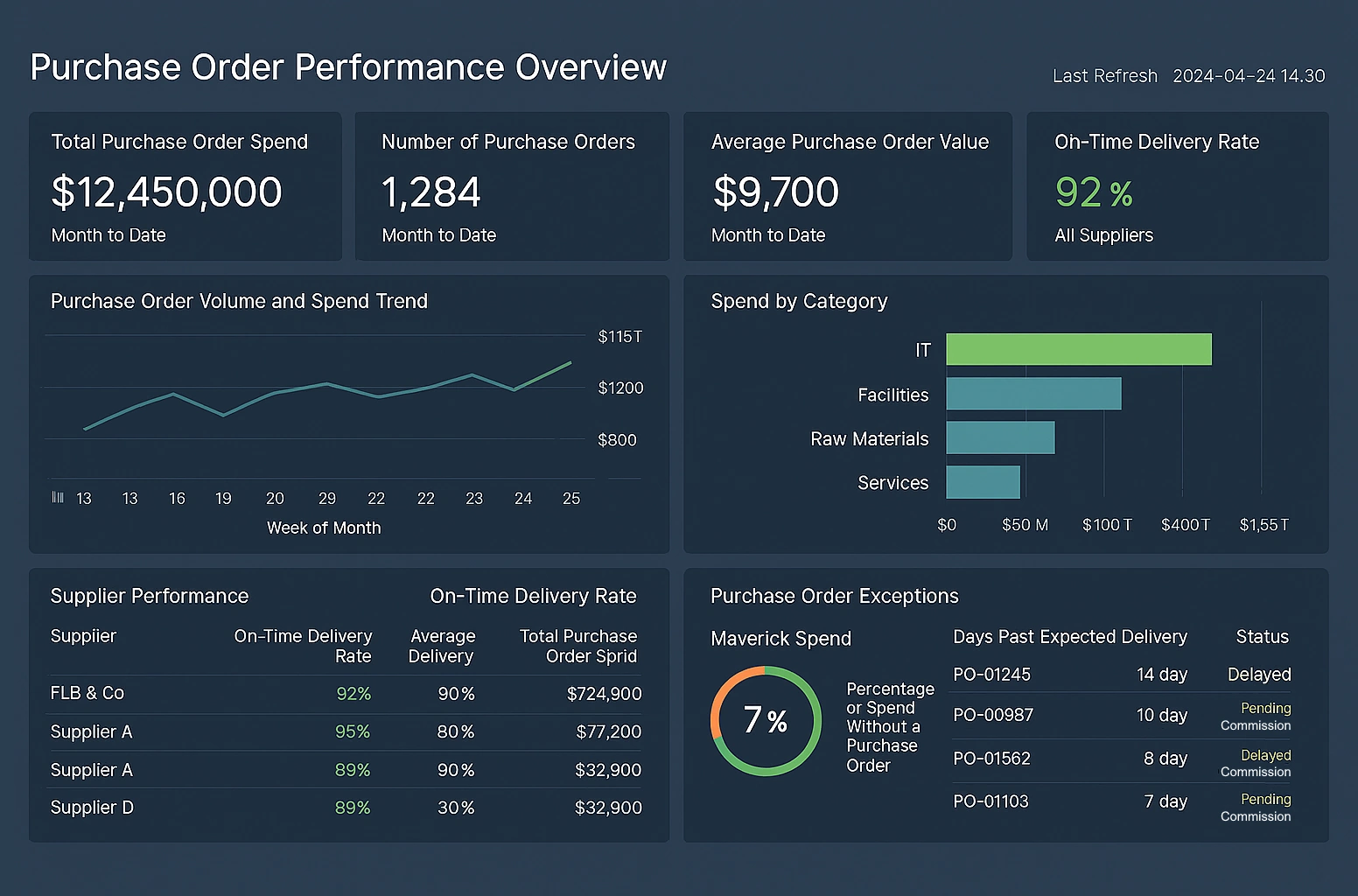
2. Number of POs and average PO value
The count of POs and the average value per PO together indicate how fragmented or consolidated purchasing is. A high number of low-value POs may suggest:
- Process inefficiency: Too many small orders create administrative overhead.
- Missed leverage: Combining orders could improve pricing and reduce shipping costs.
Conversely, very large POs may require tighter controls and approvals. Monitoring this KPI helps balance efficiency with risk management.
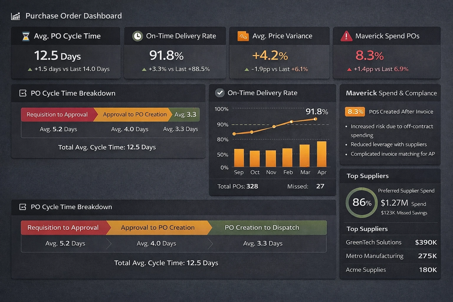
3. PO cycle time
PO cycle time measures how long it takes to move from requisition or request to an approved and issued purchase order. Long cycle times can delay projects, frustrate internal stakeholders, and weaken relationships with suppliers. This KPI is often broken into stages:
- Requisition to approval: Time spent in manager or budget owner review.
- Approval to PO creation: Time spent in procurement processing and data entry.
- PO creation to dispatch: Time until the supplier actually receives the order.
Shorter, more predictable cycle times indicate a mature, well-structured purchasing process.
4. On-time delivery rate
On-time delivery rate tracks the percentage of POs where goods or services are received by the promised date. It is a key indicator of supplier reliability and supply chain stability. Poor on-time performance can lead to:
- Production delays: Missing materials can halt manufacturing or project work.
- Expediting costs: Rush shipments and last-minute alternatives increase spend.
- Customer impact: Late deliveries can cascade into missed customer commitments.

5. Price variance and contract compliance
Price variance compares the PO price to a reference price, such as a contract rate, catalog price, or historical average. Large or frequent variances may indicate:
- Weak contract adherence: Buyers or suppliers not following agreed pricing.
- Market volatility: Rapid changes in commodity or service pricing.
- Data quality issues: Incorrect items or units on POs.
Contract compliance KPIs measure how much spend flows through preferred suppliers and negotiated agreements. Higher compliance usually means better pricing, fewer disputes, and more predictable performance.
6. Percentage of POs created after invoice (maverick spend)
Some dashboards track how many POs are created after an invoice arrives, or how much spend occurs without a PO at all. This “maverick” or off-contract spend bypasses normal controls and can:
- Increase risk: Purchases may not be properly approved or budgeted.
- Reduce leverage: Fragmented buying weakens negotiating power.
- Complicate AP: Matching invoices to POs becomes harder, slowing payment.
Reducing this KPI is a common goal of procurement transformation initiatives.
How analytics deepen insight beyond basic KPIs
KPIs provide snapshots, but analytics reveal patterns, root causes, and opportunities. A purchase order dashboard with strong analytics capabilities can answer questions such as:
- Which suppliers consistently deliver late, and for which items or locations?
- Are certain departments generating more maverick spend than others?
- How do PO cycle times vary by approver, category, or order value?
- What is the relationship between order consolidation and shipping or handling costs?
By slicing and filtering data, users can move from “what happened” to “why it happened.” For example, if on-time delivery is low for a particular supplier, analytics might show that delays are concentrated in a specific warehouse or region, pointing to a logistics issue rather than a supplier-wide problem.
Trend analysis is also powerful. Tracking KPIs over months or quarters shows whether process changes are working. If a new approval workflow is introduced, the dashboard can reveal whether PO cycle times actually decreased, stayed flat, or even got worse. This feedback loop is essential for continuous improvement.
How to positively influence purchase order KPIs
Dashboards and analytics are only valuable if they lead to better decisions and actions. Each KPI can be influenced by specific levers in process, policy, and technology. Below are some practical ways to affect the metrics described above.
Improving cycle time
To reduce PO cycle time:
- Simplify approval workflows: Limit the number of approvers and use clear thresholds based on value or risk.
- Automate routine steps: Use templates, catalogs, and pre-approved items to speed up PO creation.
- Set expectations: Define service-level targets for approvers and monitor them on the dashboard.
Over time, these changes should show up as shorter and more consistent cycle times in the dashboard.
Enhancing on-time delivery
To improve on-time delivery rates:
- Share performance data with suppliers: Use the dashboard to show them their on-time metrics and trends.
- Clarify lead times: Ensure POs reflect realistic delivery dates based on historical performance.
- Segment suppliers: Identify strategic suppliers for closer collaboration and contingency planning.
When suppliers see that performance is being measured and discussed, reliability often improves.
Reducing maverick spend
To lower the percentage of POs created after invoices or outside normal channels:
- Make the standard process easier: If the official purchasing route is simple and fast, users are less likely to bypass it.
- Educate stakeholders: Explain why POs matter for budget control, compliance, and supplier management.
- Highlight exceptions: Use the dashboard to show which departments or categories have the most off-PO spend.
Over time, this can shift behavior and bring more spend under control.

Optimizing spend and PO volume
To manage total spend and the number of POs:
- Consolidate orders: Encourage periodic ordering cycles instead of ad hoc, one-off purchases.
- Use preferred suppliers: Channel spend to vendors with negotiated pricing and favorable terms.
- Monitor small POs: Identify patterns where many low-value POs could be combined or replaced with blanket orders.
These actions can reduce administrative workload and improve pricing, which should be visible in both spend and PO count trends.
Design considerations for effective PO dashboards
Beyond the metrics themselves, the design of the dashboard affects how well people understand and act on the data. Effective purchase order dashboards typically:
- Highlight the most important KPIs: Place core metrics like total spend, cycle time, and on-time delivery prominently at the top.
- Use intuitive visuals: Line charts for trends, bar charts for comparisons, and gauges or cards for single-value KPIs.
- Support drill-down: Allow users to click into departments, suppliers, or categories to investigate anomalies.
- Provide context: Include targets, thresholds, or prior-period comparisons so numbers are not viewed in isolation.
A well-designed dashboard reduces cognitive load. Users should be able to answer basic questions—“Are we on track?” “Where are the problems?”—within seconds, and then explore details as needed.