Tracking Dashboard Examples
Are you using tracking dashboards in your business? If not, then presenting business data to your employees and upper management staff is taking valuable time away from other areas of your business that desperate need of attention.
Tracking dashboards allow for a one-click representation of how your business is functioning at a particular point in time, without having to know how all the parts work together. This style of tracking dashboards allow for management to easily communicate between departments about how to shift focus to problem areas. Tracking dashboards can be used in a variety of ways depending on the company's needs.
Using these dashboards can give your company a strategic edge when it comes to its Business Intelligence solutions. By converting your companies specific metrics and key performance indicators into a graphical representation, it allows for streamlined understanding of how the business is running, from the top down.
Tracking dashboards give the user the freedom to manipulate data in a variety of different ways to achieve appeal to numerous groups of people. From upper management, to the everyday employee, tracking dashboards use metrics and key performance indicators to pin-point exactly where your company is flourishing and where it needs some improvement. It will aid managers in their responsibilities to spot upward and downward trends as well as their ability to report new trends.
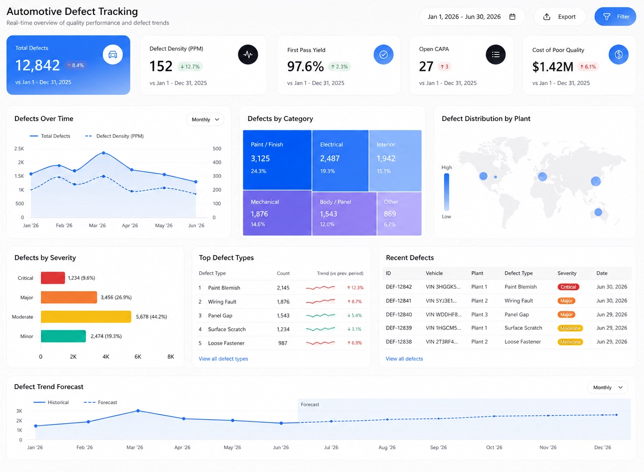
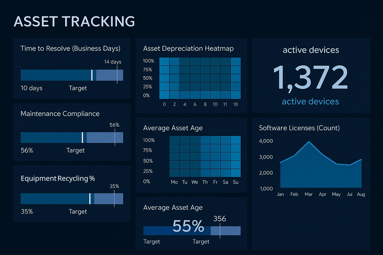
Consider InetSoft's Dashboard Software
Are you looking for software tools to build performance dashboards? InetSoft offers free and commercial Web-based dashboard software that includes a drag and drop designer for creating impactful, interactive dashboards for enterprises and ISV's:
- For a free, no software to download option, try Visualize Free.
- For our full-featured commercial application which includes advanced data mashup and security options, evaluate StyleBI.
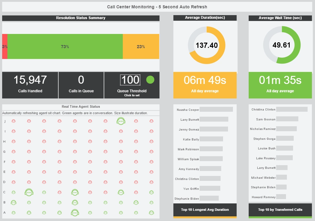
This live call tracking dashboard helps call center managers supervise their customer service reps. An agent status chart shows, in real time, who is on the phone and for how long.
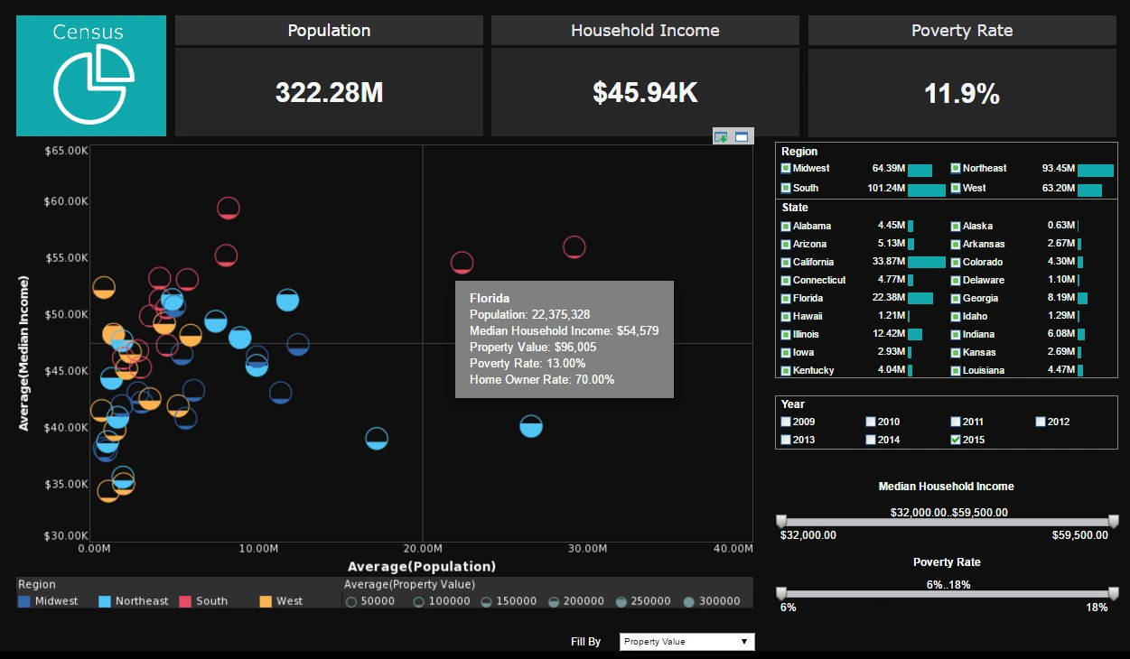
This dashboard tracks US demographics using fill and color to add two extra dimensions to it's main chart. A drop down list with 5 different measures to plot by fill adds another level of interactivity.
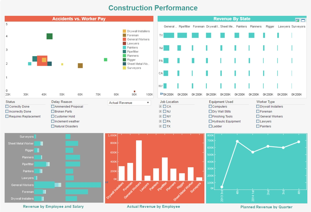
This dashboard helps property developers track construction accidents, in the hope of improving worker safety. Drilldown buttons on the Revenue by Quarter chart enables the user to pinpoint periods of high and low activity.
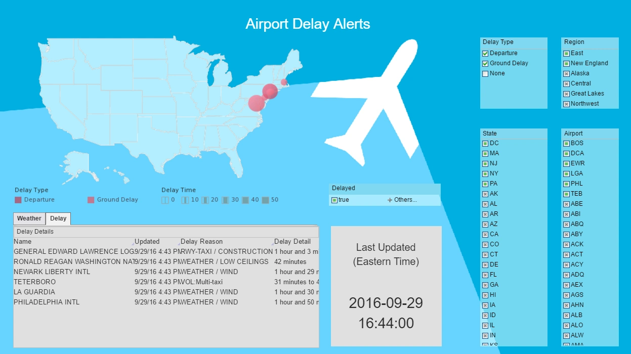
This flight tracking dashboard pulls in live flight and weather data in real-time. Interactive selection lists range all the way from general region to specific airport, allowing the user to view the data as granularity as they would like.
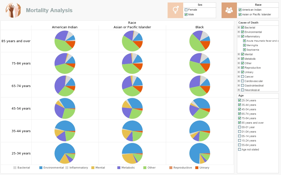
This dashboard tracks fatalities by the most common mortality causes, and breaks them down by various demographics, including race, age, and sex. Interactive filters for all of these attributes allow providers to zero in on the top risk factors for their particular patients.
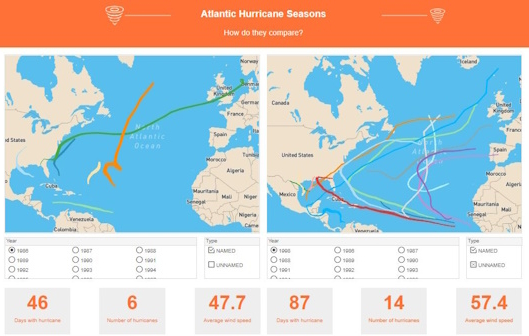
This dashboard tracks the paths of tropical storms over 25 years. Having two identical map charts side by side, with independent interactivity, makes it easy to compare one year to another.
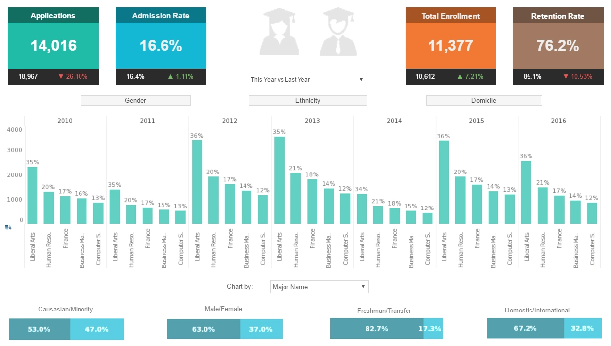
This educational demographics dashboard tracks the success of diversity, equity, and inclusion initiatives by breaking down academic admissions by various demographic and psychographic factors, such as race, gender, major type, transfers, and year.
Large, easy to read text KPIs display the dashboard's most important aggregates, with percent change from previous period displayed underneath them.
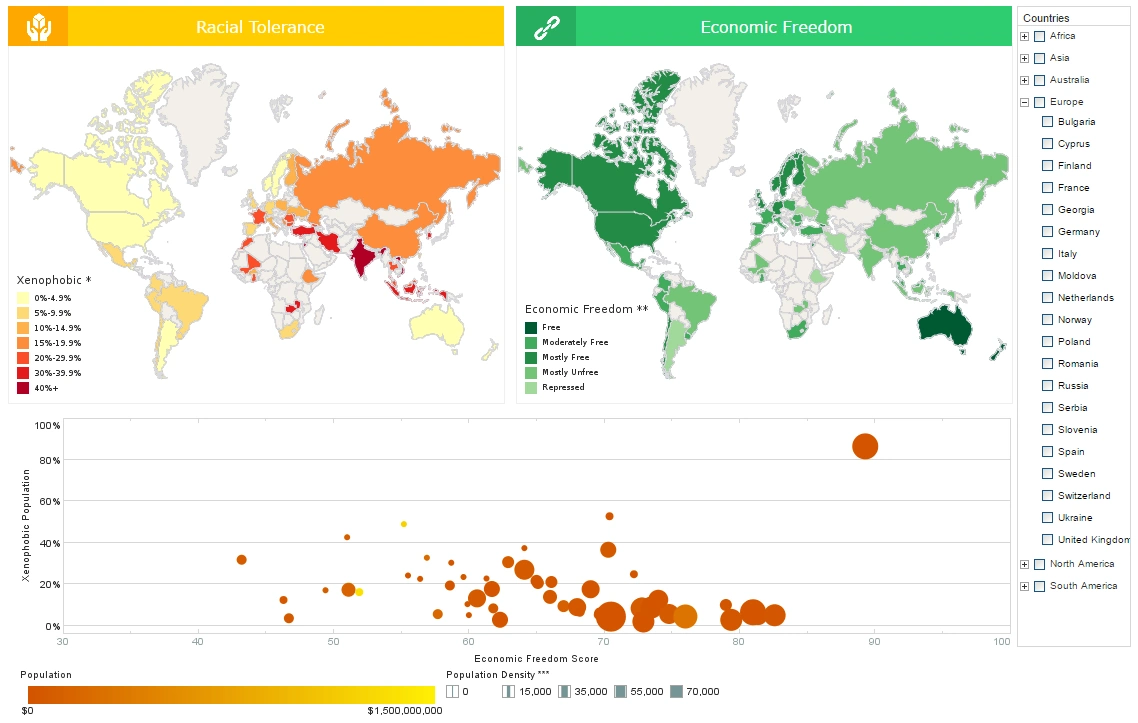
This dashboard tracks global attitudes towards racial outsiders in comparison with economic freedom, combining the best of both world by using both map charts and a multidimensional bubble chart. The addition of color and sizing on the bubble charts results in a total of four measures displayed in a single chart, allowing complex sociological patterns to be explored.
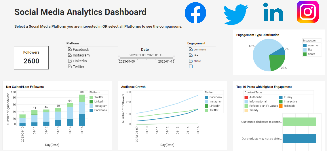
This engagement tracking dashboard can free business users from juggling multiple social media channels across various platforms, and allow them to monitor accounts and track engagement metrics all in one place. The dashboard consists of a combination of easy-to-understand charts such as summary charts, line charts, bar charts, and pie charts to present engagement information across multiple platforms, and uses interactive filters to simplify the process of making analysis and comparisons.
Dashboard Tracker Tools: A Practical Companion to Tracking Dashboards
A dashboard tracker is a focused monitoring component designed to track individual metrics or statuses in real time. While a full tracking dashboard provides multi‑dimensional visibility across KPIs, a dashboard tracker zeroes in on the most critical data points that require immediate attention. Organizations often use both together—tracking dashboards for analysis and dashboard trackers for rapid operational awareness.
What Is a Dashboard Tracker?
A dashboard tracker is a lightweight, real‑time display that highlights a single metric or a narrow set of indicators. It’s ideal for:
- Monitoring live operational statuses
- Tracking counts, totals, or progress toward a goal
- Displaying alerts or threshold‑based warnings
- Embedding inside applications or larger dashboards
Because dashboard trackers are simple and fast, they excel in environments where users need instant clarity without navigating deeper analytics.
How Dashboard Trackers Complement Tracking Dashboards
Tracking dashboards deliver broad visibility—multiple KPIs, drill‑downs, filters, and historical trends. Dashboard trackers complement this by offering:
- Immediate signal detection for anomalies or changes
- Quick‑glance visibility for frontline teams
- Embeddable components inside portals, apps, or operational screens
- Reduced cognitive load when only one metric matters
Together, they create a balanced monitoring ecosystem: deep insight when needed, rapid awareness when required.
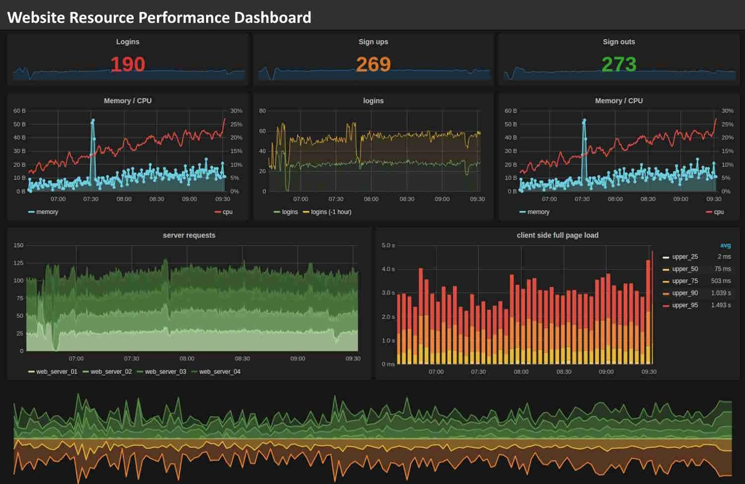
Dashboard Tracker vs. Tracking Dashboard
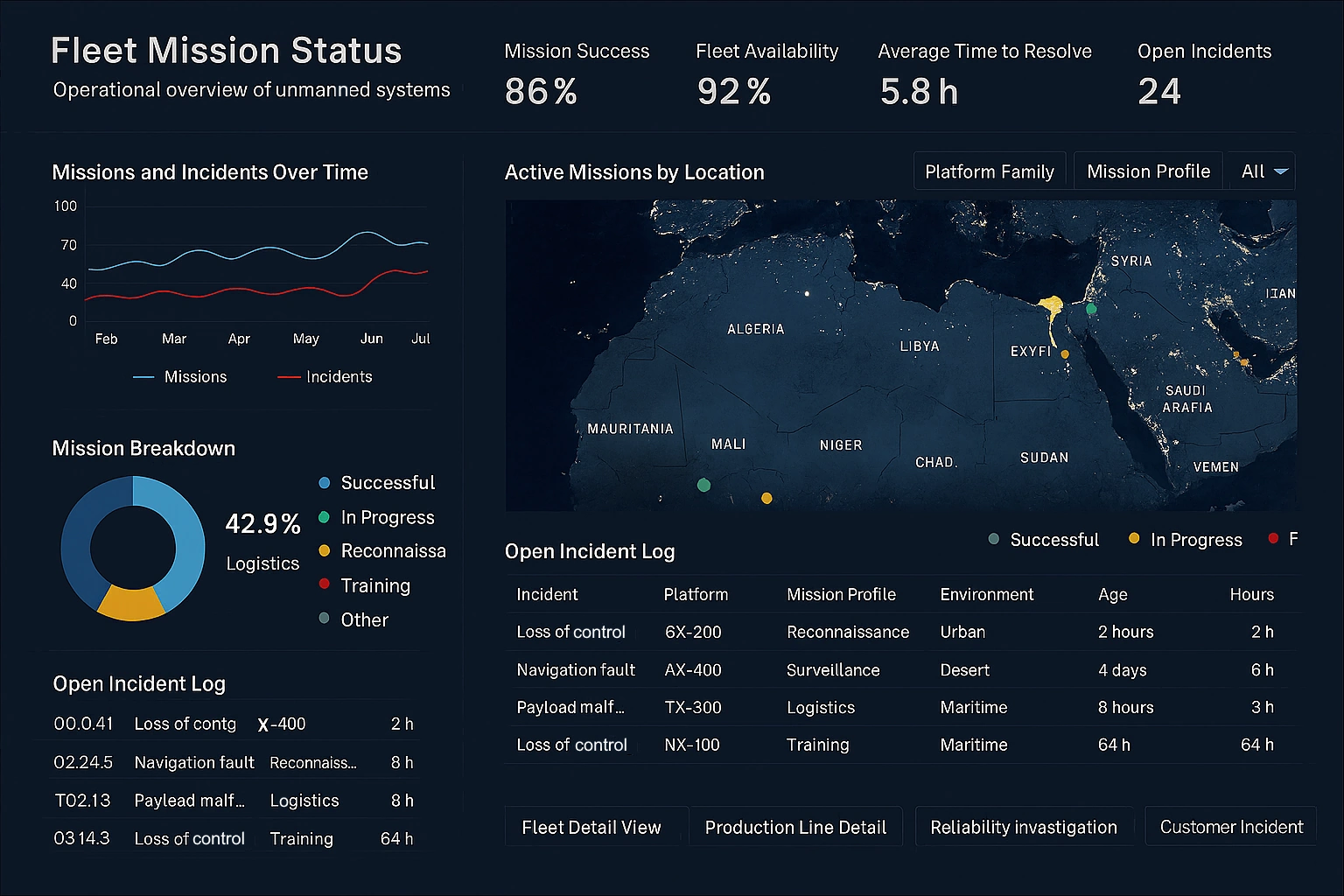
Examples of Dashboard Tracker Use Cases
- Production line counters tracking units completed
- Customer support queues showing open tickets
- Sales trackers monitoring daily or hourly totals
- System uptime monitors with alert thresholds
- Project progress trackers showing percent completion
Each of these can be embedded inside a larger tracking dashboard or displayed independently for quick operational visibility.
FAQ: Dashboard Tracker Basics
What is a dashboard tracker?
A dashboard tracker is a compact, real‑time monitoring tool that focuses on a single metric or status.
How does a dashboard tracker differ from a tracking dashboard?
A tracking dashboard provides broad analytical visibility, while a dashboard tracker offers rapid, narrow monitoring.
Can dashboard trackers be embedded inside tracking dashboards?
Yes—many organizations embed trackers inside larger dashboards to highlight critical metrics.
What metrics are best suited for dashboard trackers?
Any metric requiring immediate awareness: counts, statuses, alerts, thresholds, or progress indicators.
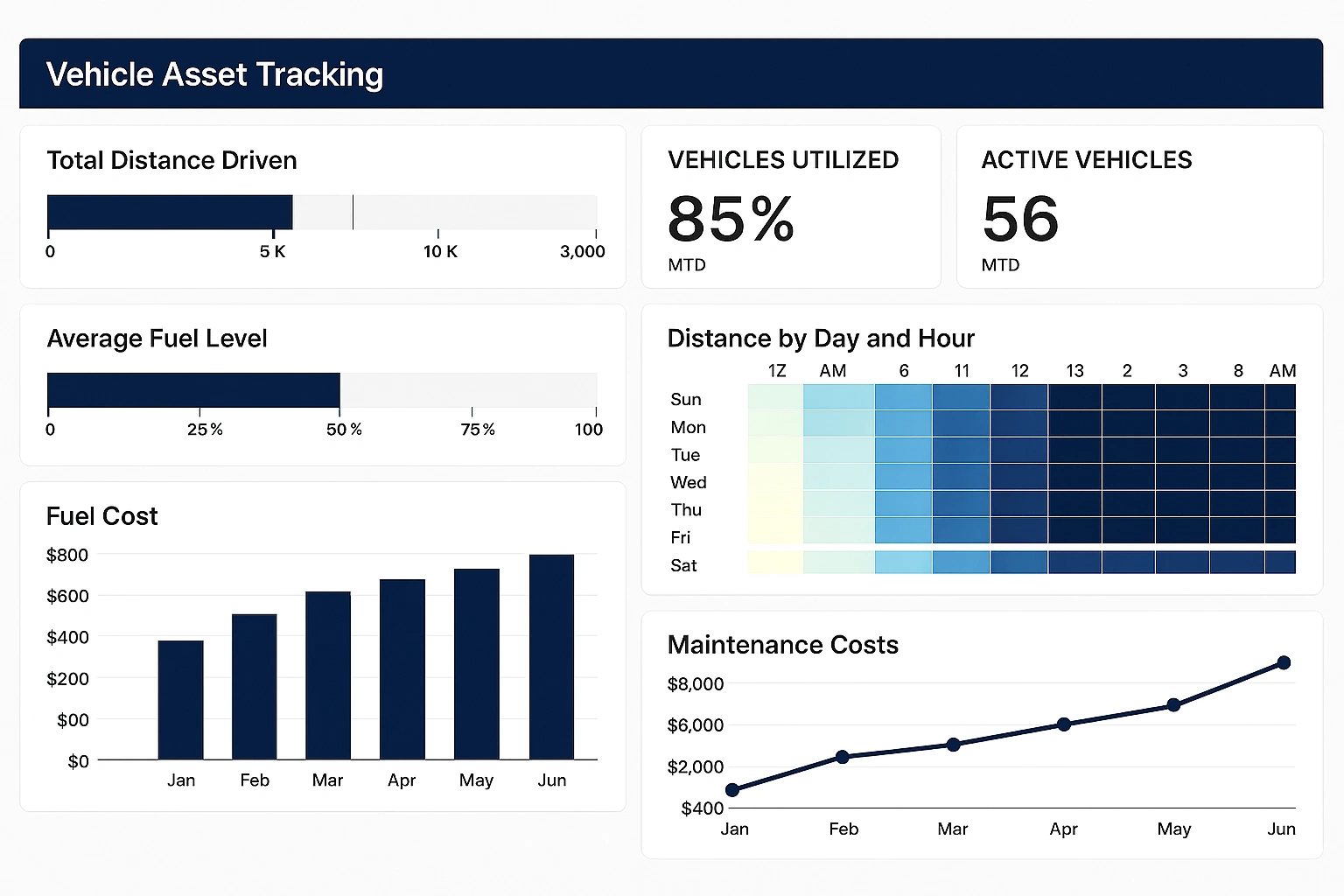
More Articles About Tracking Dashboards
Here are some articles that provide more information about tracking dashboards and their applications:
-
dashboard application for
tracking performance measures
The piece presents InetSoft’s tool for tracking and improving performance metrics using dashboard reporting. It emphasizes benefits like centralized visualization and minimal IT involvement. Users can monitor KPIs in real time and improve strategy execution.
-
performance tracking dashboard chart features
This article describes chart types and tools for performance dashboard tracking and KPI management. It explains how users can deploy intuitive, interactive charts that executives can read at a glance. The software supports self-service analytics and rapid dashboard creation.
-
easy‑to‑deploy performance tracking dashboard
application
This article explains InetSoft’s fast‑deployment dashboard application focused on tracking business performance. It emphasizes drag‑and-drop design, minimal training, and scalable analytics. Organizations can launch tracking dashboards in weeks rather than months.
-
solution for tracking key performance measures
InetSoft offers a tracking application tailored to monitoring KPM metrics via dashboards. It walks through how organizations can visualize soft and hard measures daily or quarterly. Analytical dashboards support goal alignment and operational monitoring.
-
balanced‑scorecard KPI tracking dashboards
This product page introduces a web-based solution for KPI tracking within a balanced scorecard framework. It highlights how metrics can be mapped to strategic objectives and tracked visually. Users benefit from real‑time feedback and alignment across goals.
-
tracking business intelligence metrics via dashboards
The page covers how InetSoft’s dashboards can track BI-specific metrics in real time. It distinguishes between soft and hard BI measures and how to visualize them effectively. The dashboard simplifies monitoring of business intelligence initiatives and performance.
-
sales lead tracking dashboard example
This article showcases a Sales Lead Tracking Dashboard used to track outreach frequency and contact events. It allows teams to monitor calls, emails, and lead conversions interactively. Created by marketing staff with no technical coding knowledge.
-
guidance for tracking KPI dashboards in digital
projects
The article explains how to build effective digital dashboards for tracking KPIs leveraging StyleBI. It describes integration with IoT and quality systems for real-time defect and compliance tracking. Illustrated with manufacturing use cases showing visual monitoring and alerts.
-
dashboard monitoring software for metric tracking
This article outlines InetSoft’s monitoring software used to track performance metrics via dashboards and visual analytics. It emphasizes rapid deployment, self-service, and interactive drill‑downs. The approach helps teams track operational KPIs without dedicated BI support.