University and Higher Education Dashboard Examples
Universities and higher education institutions are typically thought of as places where information and data disseminate from. However, from a business intelligence perspective, there is also a large influx of data at these types of institutions. For example, universities collect and store datasets regarding student demographics, academic performance, housing status, meal plans, academic departments, class enrollment levels, and other important information.
To help manage all these variables, and make the best use of available resources, many universities deploy business intelligence tools. By leveraging business intelligence tools, university staff and administrators can convert all their raw data into visually intuitive dashboards.
Universities can compare and monitor student performance and gauge the effectiveness of the educational process. The right business intelligence solution should be flexible enough to be used in an educational setting and robust enough to provide powerful data mashup and drill down capabilities. Alongside these tools, many students turn to the best dissertation writing service to support their academic success. Data mashup enables users to compare disparate data sources and drill down capabilities allow users to pinpoint problem areas.
Examples of KPIs in Universities and Colleges
- Percentage of freshman students who return the following year
- Percentage of graduating students relative to the total number of students
- Total operating expenditures per full-time student
- Total number of enrolled students and the number of hours enrolled per concentration
- Level of student participation in intramural athletics and sports clubs
InetSoft users in higher education include: Carnegie Mellon University, Florida International University, Gallaudet University, Northwest Nazarene University, Seton Hall University, and Rutgers University.
KPIs can be compared side-by-side in a dashboard, or they can also be aggregated and grouped together to provide deeper insight into issues like student and staff satisfaction levels.
InetSoft's Rapid Development, Self-Service Enabled Solution
InetSoft's data intelligence web application combines data mashup with visualization dashboards and reporting. The unique data mashup capabilities enable unified views of all organizational data. Visual dashboards and reports can be quickly developed and deployed iteratively along with data manipulation refinement.
The rapid development process not only produced pre-designed dashboards & reports. This process also produce a foundation for self-service by business users. InetSoft's small-footprint, web application provides a streamlined, intuitive interface for all users, teachers, and administrators alike.
More Higher Education Dashboard Examples
Below are some education dashboard examples to give you a look at some of the advanced displays that can be created using Style Intelligence. Style Intelligence can be used to build visualizations for any type of department or industry. These visualizations can be built by nontechnical users with a basic Excel level understanding of data.
University Student Retention Dashboard

This university student retention dashboard breaks down dropouts and graduations by major while also displaying reasons for dropouts. Dashboards like this can help schools direct faculty to improve student retention. An enrollment type by year breakdown helps administrators know where to direct funds and also helps identify particular academic programs with student retention problems.
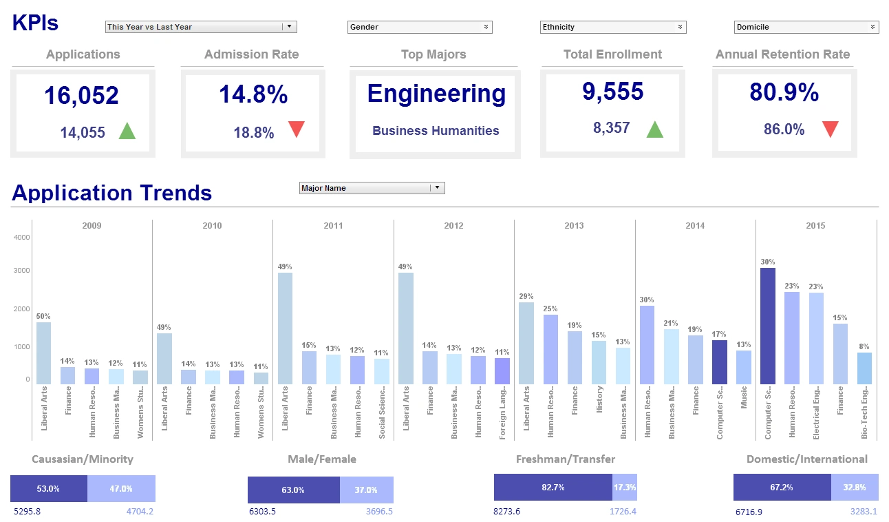
Higher Education KPI Dashboard

This higher education KPI dashboard shows a school administrator what the progression of major choices has been over the past several years, and breaks down the student population into various demographics, including race, gender, and other categories. The option to break down demographic data by class and major makes it easier for schools to implement and track the progress of diversity initiatives. Large, easy to read text KPIs display the dashboard's most important aggregates, with percent change from previous period displayed underneath them, giving college presidents an at a glance view of educational and social progress.
Academic Performance Report

This academic performance report, built by InetSoft partner Assembly, helps teachers and school administrators track overall student performance. Charts display both student performance ratings and also student performance relative to the rest of their classes. A chart breaking down performance by ethnicity helps teachers and administrators ensure that no one is being marginalized or left behind. A table of individual student data, combined with a plethora of filters, helps the user drill down into identifying particular students who need extra attention.
Student Behavior Report

This student behavior report, built by InetSoft partner Assembly, aids in discipline and behavior correction by tracking incidents of both good and bad behavior by student. Different types of behavior are represented by different colors, with good behavior indicated by "calmer" colors such as blue and green, and negative incidents indicated by "hotter" colors such as orange or yellow.
More Articles About Higher Education Dashboards
-
Unified Admissions Analytics
for Universities
This case study from Indiana University describes how a university admissions office integrated multiple data streams—Common App, test scores, financial aid—into a single dashboard. The dashboard improved forecasting accuracy, automated manual workflows, and increased enrollment yield. Staff gained real-time visibility into applicant engagement and operational efficiency. -
Campus Call Center Performance Insights
Midwest State University deployed a university‑wide support dashboard to monitor call volumes, response patterns, and service trends across multiple campuses. University staff learned to recognize anomalies in support metrics, enabling proactive resource allocation. The tool improved operational oversight and student satisfaction response. -
Browser‑Based Academic Analytics Platform
This article showcases a zero‑client, browser-deployed dashboard system used at universities like Carnegie Mellon, Rutgers, and Florida International. The solution supports self-service visualization without requiring installations or heavy IT support. It enables rapid deployment, intuitive use, and scalable performance across higher education institutions. -
Interactive University KPI Dashboard
Examples
This page presents sample dashboards used by higher education institutions to track metrics such as retention rates, graduation demographics, housing usage, and faculty ratios. The visuals help administrators compare academic performance and resource utilization across departments. Dashboards are shown as tools for operational insight, benchmarking, and strategic planning. -
Executive Dashboards at
Sullivan University
Sullivan University selected InetSoft Style Scope to deliver tablet-accessible dashboards to executive leadership, replacing ad-hoc report requests. The executive dashboards offered real-time institutional insight without reliance on IT staff for report generation. Leadership gained clarity on financials, enrollment, and strategic metrics. -
Campus Reporting
Platform at Simpson University
Simpson University adopted Style Intelligence to consolidate cloud and on‑premise data systems into a centralized dashboard infrastructure. Power users gained self-service access to institutional metrics and analytics, dramatically reducing IT backlog. The project delivered operational efficiencies and lowered total cost of ownership. -
Institution‑Wide
Analytics for Christian University
In the same story, Simpson University used self-service dashboards to empower non-technical staff across departments to build and share reports. The initiative enabled real-time visibility into enrollment, finance, and academic performance data. Staff cited improved data access and reduced turnaround time on reporting inquiries. -
University Data Mashup Strategy
The article emphasizes how higher education institutions leverage data mashup capabilities to blend enrollment, demographic, academic, and financial data. Administrators can drill down into student profiles, retention risks, and budget allocations via flexible dashboards. This approach supports benchmarking across peer institutions and departments. -
Higher Ed Strategic Decision
Support System
At Indiana University, dashboards transitioned from reactive reports to predictive operational tools by integrating analytics into admissions and student services. Real-time dashboards empowered staff to act on trends in retention, system usage, and support requests. The transformation improved data-driven decision-making across the university. -
Student Retention And Diversity Metric
Dashboards
Example dashboards track student retention by major, demographics, and reasons for attrition to help guide interventions. Diversity metrics and program participation trends are visualized alongside academic performance. These dashboards help institutions identify underperforming programs or student cohorts and target resources more efficiently.