Visualizing Data on Google Map Charts
This page explains how you can use Google Maps in an InetSoft dashboard.
Contents

What Is a Google Map Chart?
A Google Map Chart is a Map Chart that uses a Google Map as the map background. The Google Map can be panned and zoomed in much the same way as you pan and zoom any Google Map in a browser. By using a Google Map in your chart, you can lend a degree of realism to your geographical data, and provide important geographical context such as mountains, rivers, highways, and landmarks.
Prerequisites for Using Google Maps
In order to incorporate a Google Map in a dashboard, you must have an appropriate Google Maps Platform account. Obtain the API key from your Google Maps Platform account, and enter it in the InetSoft Enterprise Manager on the Web Map tab.
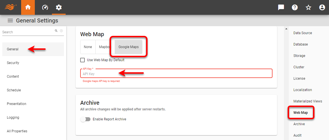
Enable Use Web Map By Default to automatically use Google Maps when creating any Map Chart. Press Apply to save the settings.
How to Create a Google Map Chart using Geographical Regions
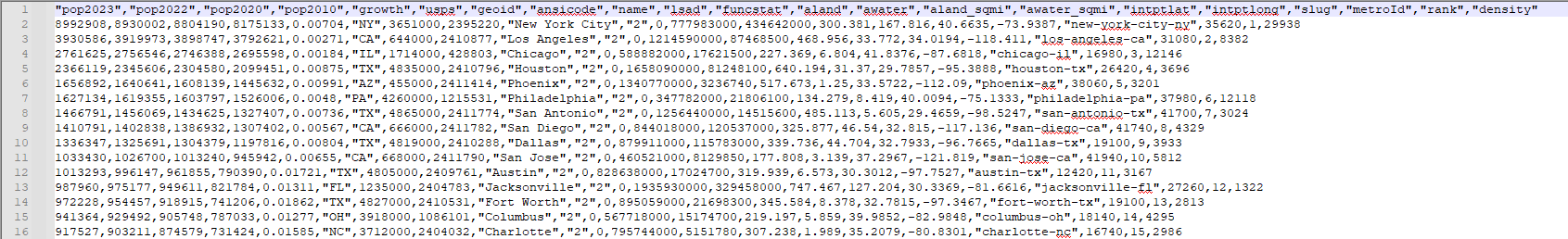
If you do not already have a data source with geographical data configured, begin by importing a data set into a Data Worksheet. The sample data we use here is from World Population Review which contains the top 200 US cities by population and has the structure shown below. The data set contains a lot of information about the different cities, but for this example we will just use the "pop2023" field as the measure.
Create a new Dashboard based on the Data Worksheet (or other data source) you have created. To create a Google Map Chart using geographical regions such as states or cities or zip codes, add a new Chart to the Dashboard. Do not make the Chart size too large, because Google Maps have a 640px size limit imposed by Google. If the Chart component is too large, you will see a warning when you try to plot data on the map, and you will need to resize it.
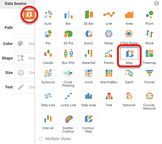
Press the Edit button to open the Chart Editor, press the Select Chart Style button, and choose the Map chart type. Press the Apply button (or double-click the 'Map' icon).
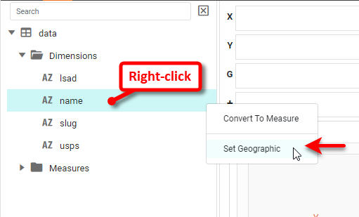
The Chart Editor now provides a 'Geographic' field. Mark the dimensions you want to use on the map as geographical fields. To do this, right-click the field and select Set Geographic from the context menu.
This places a "geo" icon next to the field name and opens the 'Edit Geographic' dialog box. The geo icon with an 'x' indicates that some cities have not been recognized.
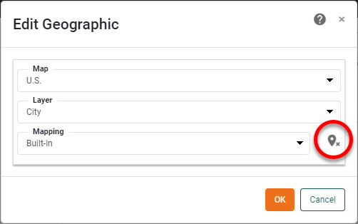
Press the 'x' icon to open the Geographic Mapping dialog box. Here you can manually map any cities that were not automatically recognized.
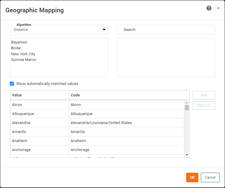
If you do not see a match for a city, try changing the Algorithm to search in different ways. (In this example, we will simply ignore values for which no match exists.)
If you did not set Use Web Map By Default in Enterprise Manager earlier, right-click the Chart and select Properties. This opens the 'Chart Properties' dialog box. Under the Advanced tab, enable Use Web Map as Background and press OK.
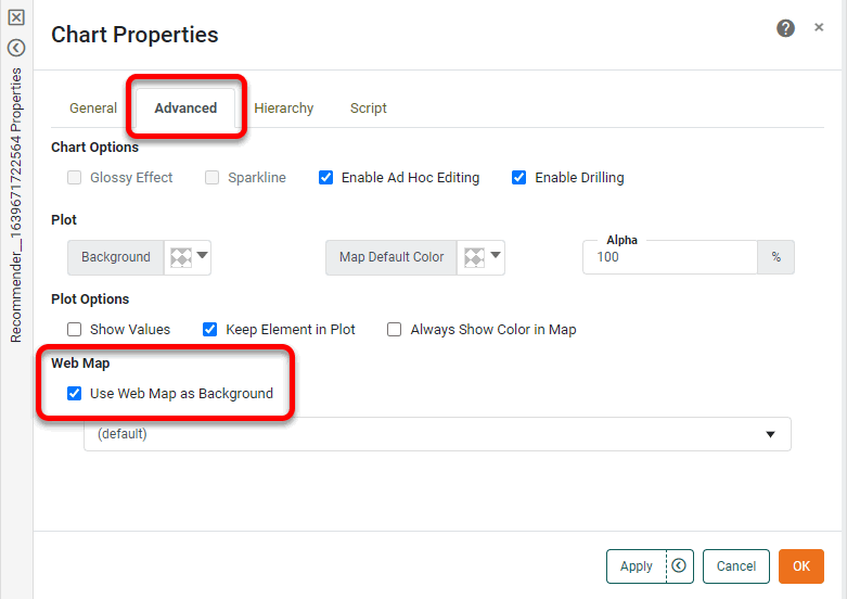
OPTIONAL: If your geographical field represents areas on the Chart (e.g., states) rather than points (e.g., cities), adjust the Alpha setting to less than 100% so that the filled regions do not obscure the underlying map background. Press OK to exit the 'Chart Properties' dialog box.
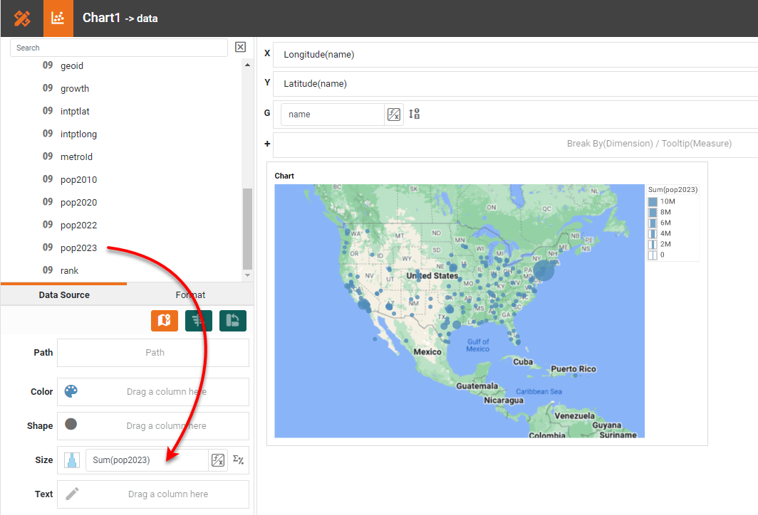
From the Data Source panel in the Chart Editor, drag the geographic dimension onto the Geographic field in the Chart Editor.
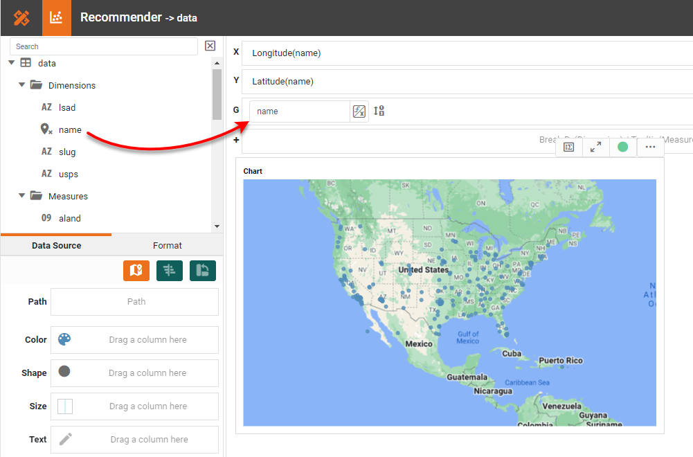
The chart updates to display the locations contained in the geographic field. Repeat the previous step to bind additional 'Geographic' levels. For example, you can bind 'City' and 'State' fields. From the Data Source panel, drag a measure (e.g., 'pop2023') onto one of the Color, Shape, Size, or Text regions.
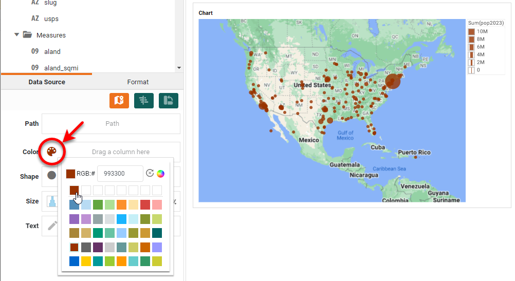
This displays the measure on the chart using the visual coding you selected (color, shape, or size), and automatically creates a corresponding legend. To change the point color, press the Edit Color button next to the Color binding.
Press the Edit Measure button, and select the desired Aggregate method for the measure. Optional: For any geographical fields that you specified, press the Edit Dimension button, and select the desired Ranking for the geographical data. For example, you can display just the top three states according to the measure.
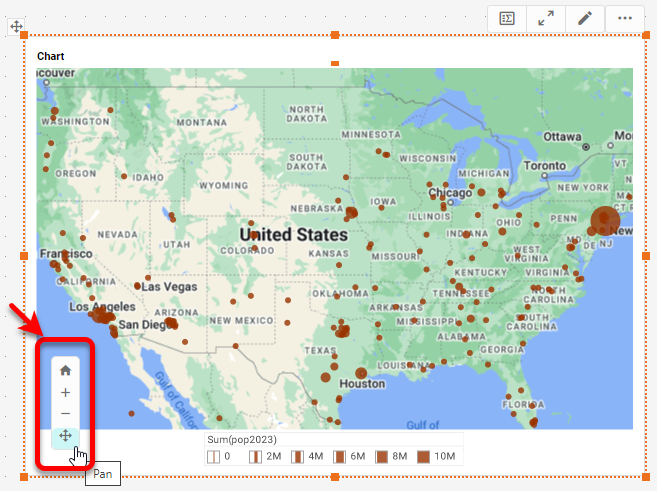
Press the Finish button to close the Editor. Move the legend if desired, and set the initial map view by pressing the Pan button and dragging on the map to reposition, and/or by pressing the Zoom In button or Zoom Out button to magnify. Press the Clear button to reset the view.
The Google Map Chart is now complete.
How to Create a Google Map Chart using Latitude and Longitude
If you do not already have a data source with geographical data configured, begin by importing a data set into a Data Worksheet. The sample data we use here is from the built-in 'Map Points' Data Worksheet. The data set contains sites along historical Route 66.
Create a new Dashboard based on the Data Worksheet. To create a Google Map Chart using latitude and longitude, add a new Chart to the Dashboard. Do not make the Chart size too large, because Google Maps have a 640px size limit imposed by Google. If the Chart component is too large, you will see a warning when you try to plot data on the map, and you will need to resize it.
Press the Edit button to open the Chart Editor, press the Select Chart Style button, and choose the Map chart type. Press the Apply button (or double-click the 'Map' icon).
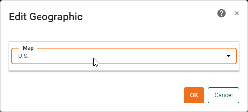
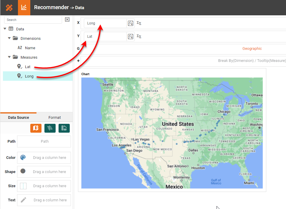
The Chart Editor now provides a 'Geographic' field. Mark the latitude and longitude fields you want to use on the map as geographical fields. To do this, right-click the field and select Set Geographic from the context menu.

When prompted, select the desired map:
If you did not set Use Web Map By Default in Enterprise Manager earlier, right-click the Chart and select Properties. This opens the 'Chart Properties' dialog box. Under the Advanced tab, enable Use Web Map as Background and press OK.
Drag the longitude field to the 'X' region, and drag the latitude field to the 'Y' region.
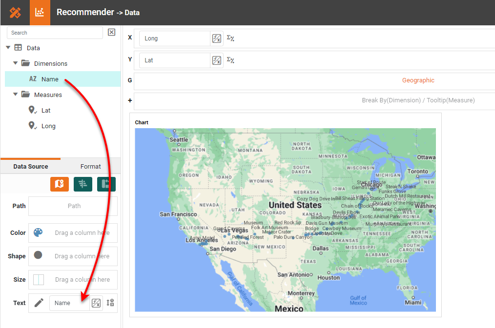
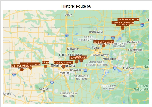
Data points now appear on the map to mark the locations specified by the latitude and longitude data, outlining Historic Route 66. To add the landmark labels to the points on the map, drag the 'Name' field from the Data Source panel to the Text field.
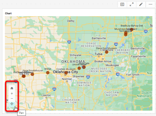
Note: The labels appear fairly crowded because of the long landmark names. You can zoom the chart to see the labels more clearly, as shown below. To change the point color, press the Edit Color button next to the Color binding.

Use the Edit Size button to make the points larger, if desired. If you have a measure (such as "population" or "budget") you can display this as shown earlier for the population map, by using the Color, Size, and Shape binding areas.
Press the Finish button to close the Editor. Set the initial map view by pressing the Pan button and dragging on the map to reposition, and/or by pressing the Zoom In button or Zoom Out button to magnify. Press the Clear button to reset the view.
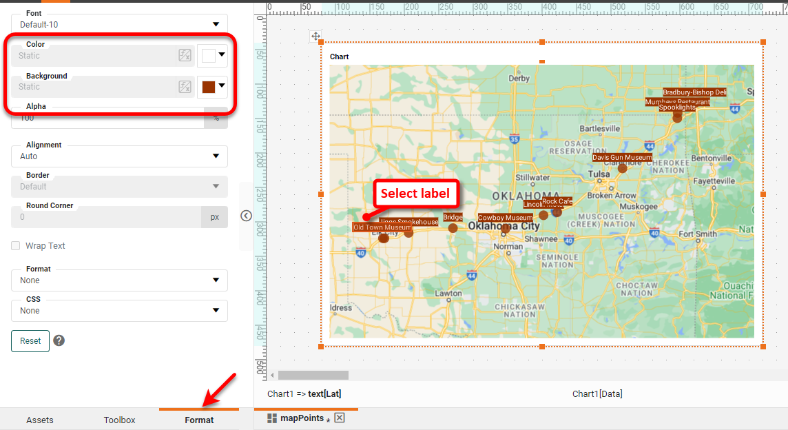
To make the labels more visible, select any label, and use the Format panel on the left to set a desired font color and background.
If desired, add and format a title for the Chart:
The Google Map Chart is now complete.