Win-Loss Sparkline Charts - Example and How to Create
This page explains how you can create a win-loss sparkline in InetSoft. This page also provides access to a free online tool for creating charts and complete functioning business intelligence dashboards.
Contents
Definition of a Win-Loss Sparkline Chart
How to Make a Win-Loss Sparkline Chart
How to Create a Win-Loss Sparkline Chart in Google
Tool to Make Win-Loss Sparkline Charts Online for
Free

Definition of a Win-Loss Sparkline Chart
A win-loss chart is a visual representation of the results of a series of events, typically in sports or competitive games. The chart lists the outcomes of each game or match in a column, with wins marked by a "+" sign and losses marked by a "-" sign, or with wins and losses distinguished by different colors.
Win-loss charts are often used by coaches, players, and fans to track a team's progress over a season, as well as to identify patterns and areas for improvement. They can also be used to compare the performance of different teams or players over time. Win-loss charts can be simple or complex, depending on the level of detail desired. Some charts may include additional information such as the date of each game, the opponent, or the score.
A win-loss chart like the one above (especially if filtered to show just a single team) is sometimes also called a win-loss sparkline because of the compact horizontal form. Win-loss sparklines can be used to quickly and easily communicate the performance of a team or player without the need for a more detailed chart or table. They are often used in sports analytics and business reporting to provide a quick overview of key metrics.
How to Make a Win-Loss Sparkline Chart in InetSoft
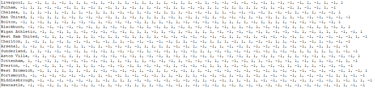
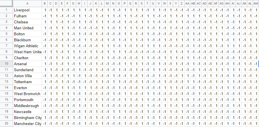
You can create a win-loss chart in InetSoft as a bar chart and then add the numerical win/loss and percent summaries by making it a hybrid table-chart. The sample data used here is from the Any Chart CDN, and has the following form, with football "wins" represented by "1" and "losses" represented by "-1".
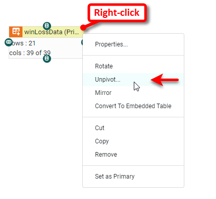
The arrangement of the wins and losses in rows is inconvenient for making a stacked chart, so we will need to "unpivot" this data.
Import the data into a Data Worksheet, and then right-click the resulting data block and select Unpivot.
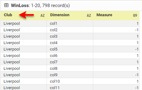
When prompted for Levels of Row Headers, enter "1". Name the data block "WinLoss" and make it the Primary data block. Change the name of the "col0" header to "Club". This data block now has a 'Club' field with the football team names, a Dimension column containing the game number (e.g., "col1", "col2", etc.) and a Measure column containing the win or loss indication.
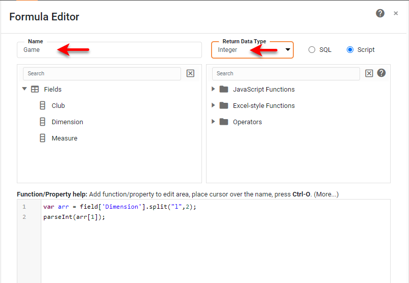
It may be helpful to have the game number as an integer value, so press the Create Expression button and add the following formula named Game that returns an Integer. The formula simply retrieves the numerical part of the "col1", "col2", etc., strings and converts it to an integer.
var arr = field['Dimension'].split("l",2);
parseInt(arr[1]);
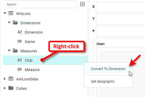
Save the Data Worksheet. Create a new Dashboard based on this Data Worksheet and add a Chart. In the Chart Editor, switch to Full Editor and set the Chart Style to Bar with Stack option enabled. Right-click on the 'Club' field and select Convert to Dimension.
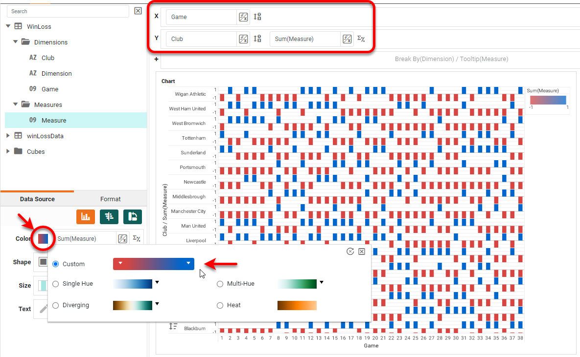
Place 'Game' on the X axis, and 'Club' and 'Measure' on the Y axis. Place 'Measure' in the Color region as well, and press the Edit Color button to choose a color spectrum that distinguishes the two values well (-1 and +1).
This is essentially the chart we want, but we would like to add some additional summary data (total wins and losses for each club) and adjust some formatting to produce a cleaner display. First let's add the additional summary data. To help us with this, let's create two more Calculated Fields; a 'Loss' field will have a "1" for any lost game and a zero otherwise, while a 'Win' field will have a "1" for any won game, and a zero otherwise. This will allow us to easily count up wins and losses for each team using a simple 'Sum' operation.
As you did earlier, create a Calculated Field and name it "Loss" with Integer return type, as show below. The formula should be (field['Measure']-1)/-2, which simply replaces the "1" values in the 'Measure' field with 0's.
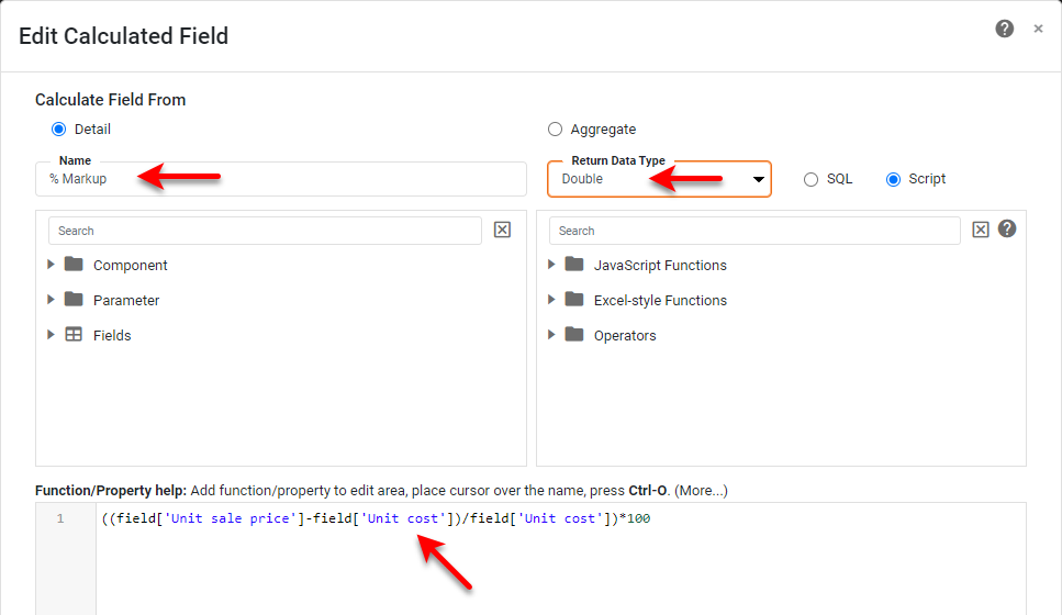
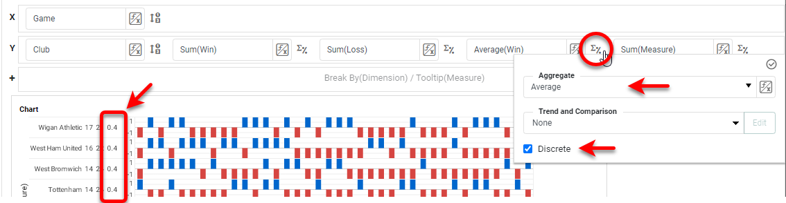
Create another Calculated Field called 'Win" with the formula (field['Measure']+1)/2, which simply replaces the "-1" values in the 'Measure' field with 0's. Add these fields into the Y region in the Editor, press the Edit Measure button, and enable the Discrete option for each field. This places the summarized field next to the left axis of the chart, creating a so-called Table-Chart Hybrid.
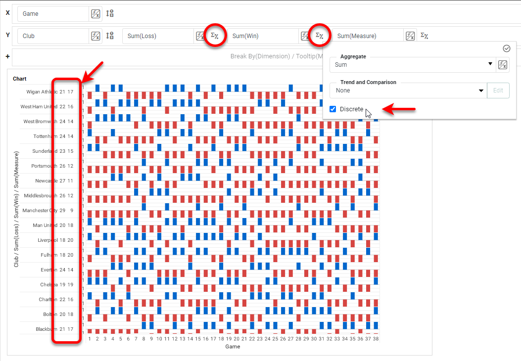
To display the percentage of wins, drag the 'Win' field again to the Y region, press the Edit Measure button, and set the Aggregate to Average. Use the Discrete option here as well. This will yield the fraction of wins to the left of the axis.
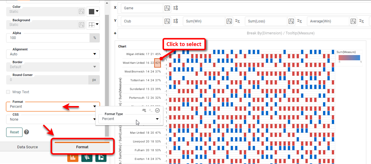
Select any value in this column and select the left Format tab. Set a Percent format as shown below, and apply a bold font:
The chart is essentially complete except for some formatting and aesthetic enhancement.
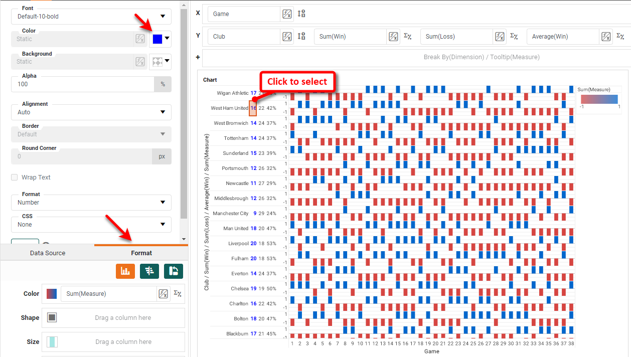
First color the summary "win" and "loss" values to make it clear which is which. Click on any of the "win" numbers, select the Format tab, and assign a blue color. Make the number bold as well. Do the same for the "loss" numbers, assigning a red color.
To put the club names in alphabetical order, press the Edit Dimension button next to the 'Club' field, and set the Sort property to Descending.
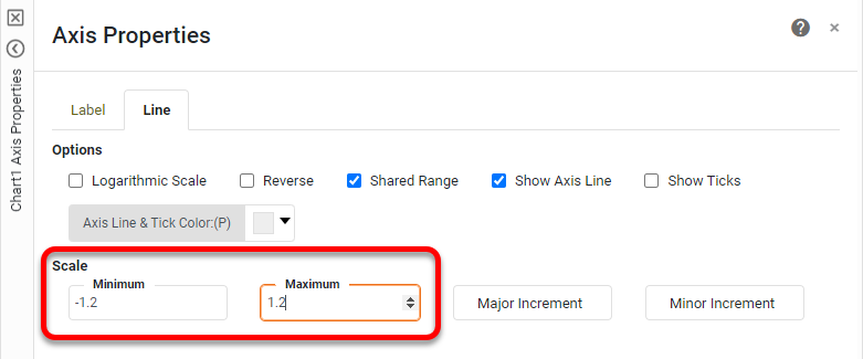
Use the Format panel to center-align the club names as well. Right-click the legend and select Hide Legend. Now create a little space between the different clubs by increasing the axis limits: Right-click on the Measure axis, and select Axis Properties.
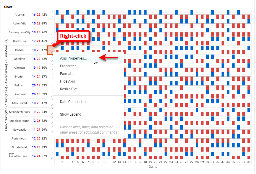
Set the Minimum and Maximum to -1.2 and +1.2 respectively, and press OK.
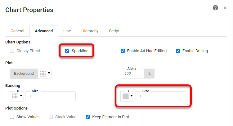
Now there are a few final things to make the chart look less cluttered. Right-click the chart, and select Properties. Enable the Sparkline option, and set a gray band color for the Y axis.
Add a Chart title if desired, and format it using the Format tab. Press OK and then press Finish to exit the Chart Editor. The Chart is now complete.
How to Create a Win-Loss Sparkline Chart in Google
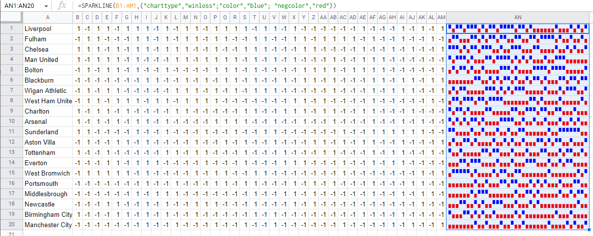
In Google Sheets, you can create a win-loss chart by using the SPARKLINE script function within a cell. Consider the Google Spreadsheet below.
To create a sparkline for 'Liverpool', create the following formula in a cell:
SPARKLINE(B1:AM1,{"charttype","winloss";"color","blue"; "negcolor","red"})
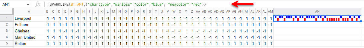
This creates the desired Sparkline in the cell. Add any desired labeling, and repeat (or simply copy down the formula) to add any additional Sparklines to other cells.
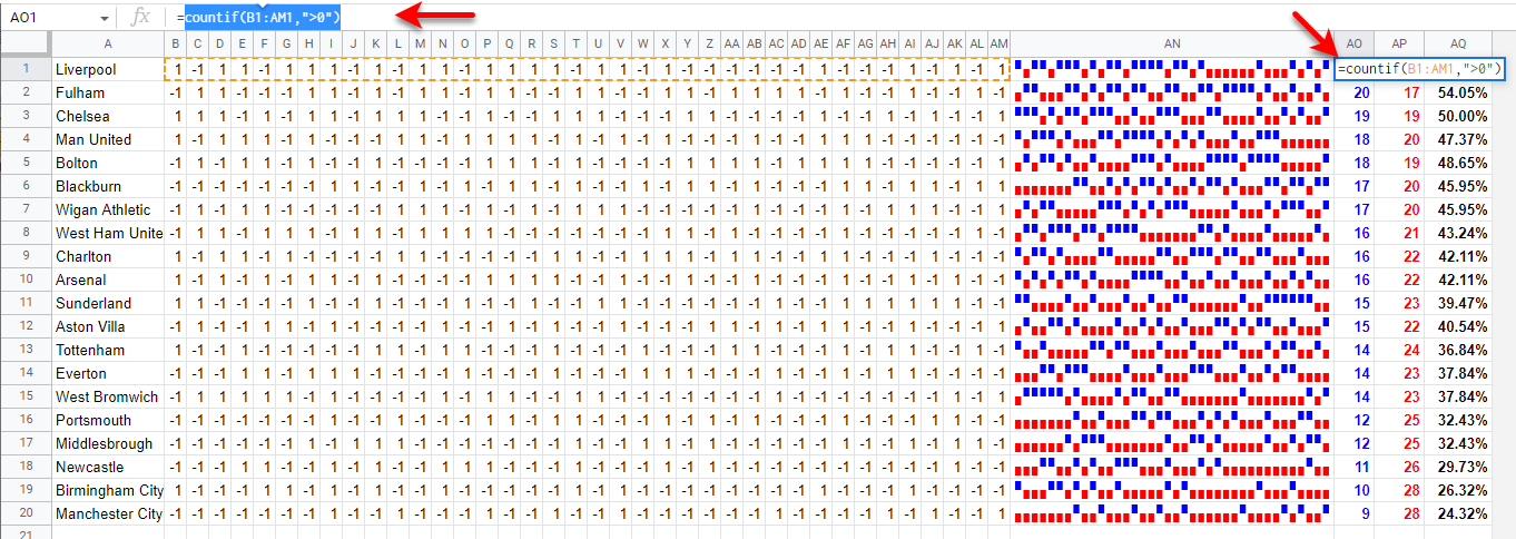
You can add the same summary values ("wins", "losses", "% wins") that we did earlier by using other spreadsheet functions. For example, use the following formula to count the number of wins in the range:
countif(B1:AM1,">0")
The losses can be counted similarly with criteria "<0", and the percent of wins is then simply wins/(wins+losses), formatted as a percent.
Tool to Make Win-Loss Sparkline Charts Online for Free
To easily and quickly create Win-Loss Sparkline Charts online for free, create a Free Individual Account on the InetSoft website. You will then be able to upload a text data set, as shown below:

Once you have done that, you will be able to proceed to the Visualization Recommender, which will get you started creating a dashboard. To start with a win-loss chart, though, you can skip the Recommender by pressing the Finish button at the top bar of the Recommender. Then press Continue to go to Visual Composer. Proceed to add a Chart component using Visual Composer, and follow the steps shown earlier to create the desired win-loss chart.