Wind Rose Charts - Definition, Example, and How to Make for Free
This page explains how you can create a Wind Rose chart in InetSoft. This page also provides access to a free online tool for creating charts and complete functioning business intelligence dashboards.
Contents
Definition of a Wind Rose Chart
How to Make a Wind Rose Chart
Tool to Make Wind Rose Charts Online for Free

Definition of a Wind Rose Chart
A wind rose is a graphical tool used to represent the distribution of wind direction and speed at a particular location over a period of time. It typically consists of a circle divided into sections, each representing the frequency of wind blowing from a particular direction. The length of the segments or petals in each section indicates the frequency or duration of the wind blowing from that direction.
Wind roses are commonly used in meteorology, navigation, and environmental studies to analyze and visualize wind patterns and variability. They are also used in the design of buildings, structures, and landscapes to assess the impact of wind on their performance and comfort.
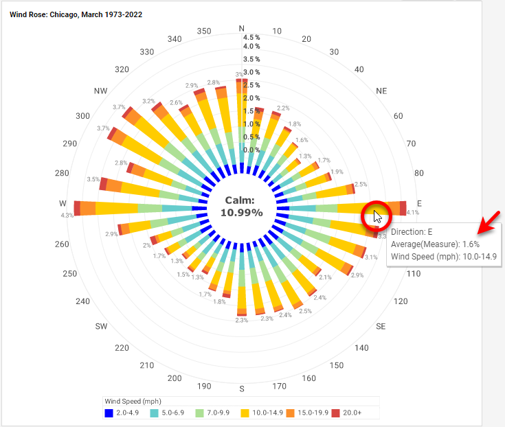
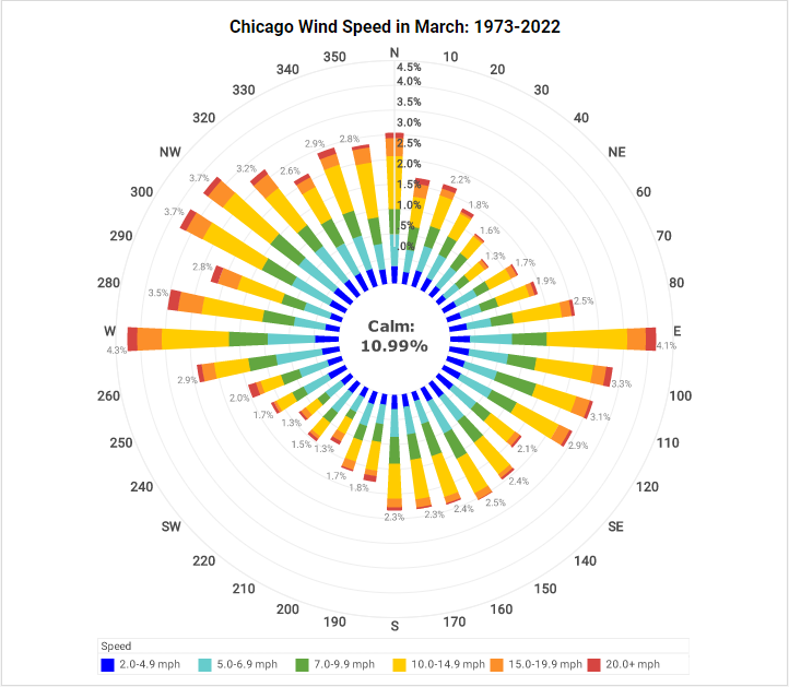
The percent values (concentric circles) indicate the percent of time that the wind blows from the specified direction; for example, for the wind rose below (Chicago, month of March), the wind blew directly from the East 4.1% of the time. For each direction, the magnitude of the colored wedge indicates the percent of occasions that wind from that direction was in the given speed range. So for the direct Easterly wind, the majority of the time (1.6%) the wind speed was in the range of 10-14.9 mph.
How to Make a Wind Rose Chart in InetSoft
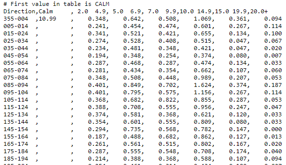
There is no built-in chart type for a wind rose; however, since a wind rose is essentially a stacked bar chart bent into a circle, it is possible to obtain this display by applying a small script to an existing stacked bar chart. Begin by importing the data set into a Data Worksheet. The sample data we use here is from Iowa Environmental Mesonet and has this form:
The arrangement of the wind speed ranges as separate columns is inconvenient for making a stacked chart, so in the Import dialog box, enable the Unpivot Data option. This creates a Dimension column containing the speed ranges and a Measure column containing the percentages.
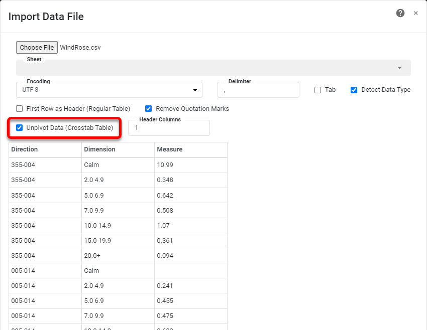
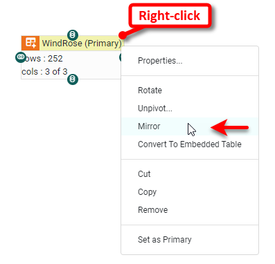
Note that this will introduce an artifact where the term "Calm" appears repeatedly without any accompanying measure. These rows can easily be filtered out. To do this, create a mirror of the imported data block, as shown below.
Then press the Define Condition button and apply a filter to remove the rows with the "Calm" values.

Give the mirrored data block a name such as "Wind Rose Data" and mark it as the Primary data block. Rename the "Dimension" column as "Speed", and rename the "Measure" column as "Percent".
Create a new Dashboard based on this Data Worksheet and add a Chart. In the Chart Editor, add a new Chart and set the Chart Style to Bar with Stack option enabled. Place 'Direction' on the X axis, 'Percent' on the Y axis, and 'Speed' in the Color region. Press the Edit Dimension button, and set the Sort to 'Descending' for 'Direction'. Press the Edit Measure button for 'Percent', and set the Aggregate to 'Average'.

Press the Edit button in the Color region, and choose the following color sequence:
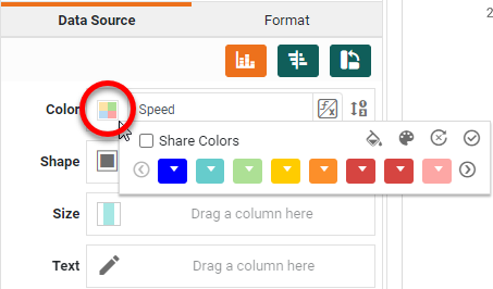
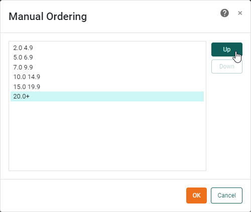
Press Edit Dimension in the Color region, and choose 'Manual' for the Sort option. Use the 'Up' and 'Down' buttons to put the speed ranges into the correct order:
Press Finish to close the Chart Editor. Right-click the Chart and select Properties. In the 'Properties' dialog box, select the Script tab and enter the following script:
// Convert to Polar Coordinates
var coord = graph.getCoordinate();
var polar = new PolarCoord(coord);
polar.setType(PolarCoord.PLUS);
polar.rotate(90);
polar.setHoleRatio(.25);
graph.setCoordinate(polar);
// Place "Calm" percentage in center
var form = new LabelForm();
form.setLabel("Calm: \n" + WindRose['Measure'][0] + "%");
form.setTuple([-1,0]);
var spec = new TextSpec();
spec.setFont(java.awt.Font('Verdana',java.awt.Font.BOLD, 14));
form.setTextSpec(spec);
form.setAlignmentX(Chart.CENTER_ALIGNMENT);
graph.addForm(form);
The first part of the script converts the default rectangular coordinates into polar coordinates with a hole in the middle (the "PolarCoord.PLUS" type). The second part of the script accesses the "Calm" percent value from the 'WindRose' data block and prints it in the middle of the Chart. For more information on any of the functions used in the script, see the Chart Script Reference.
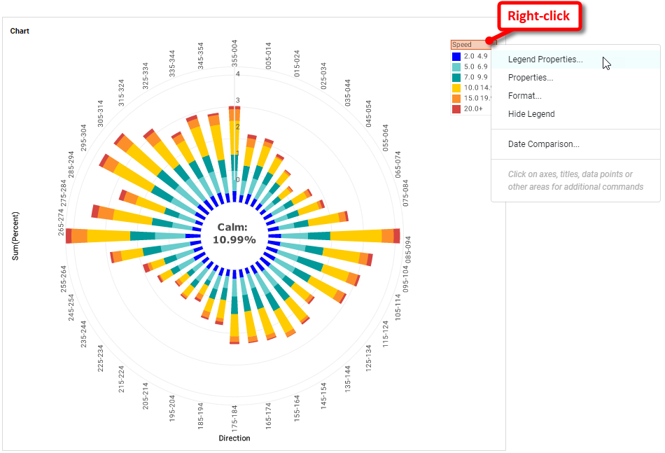
You can now adjust the appearance of the chart for improved clarity. Right-click the legend and select Legend Properties.
Adapt the legend title and labels as desired. For example, place a hyphen and "mph" to make the entries easier to read, e.g., "2.0-4.9mph". Drag the legend to the bottom of the Chart.
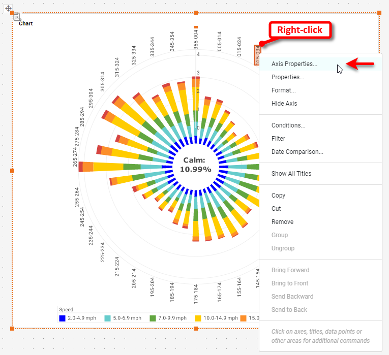
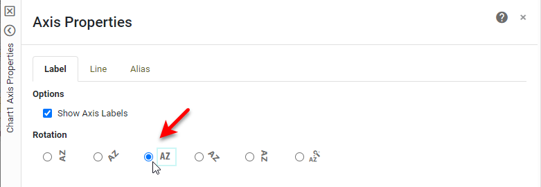
Now, right-click each axis title and select Hide Title. Right-click any of the circular axis values and choose Axis Properties.
Under the Label tab of the 'Axis Properties' dialog box, select a horizontal orientation for the labels.
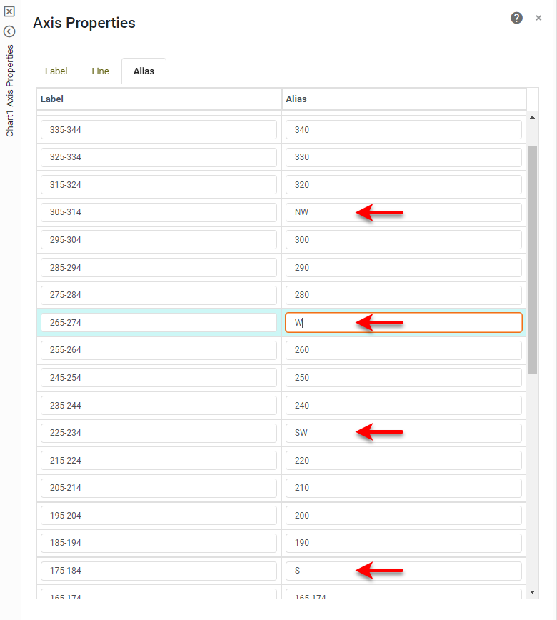
From the Line tab, simplify the label display by using an alias that gives the average wind direction, for example; for the wind direction "345-354" use alias "350". For the labels that are closest to the cardinal and intercardinal directions (North, NorthEast, East, etc.) use the alias to replace the number with the appropriate name. Then press OK.
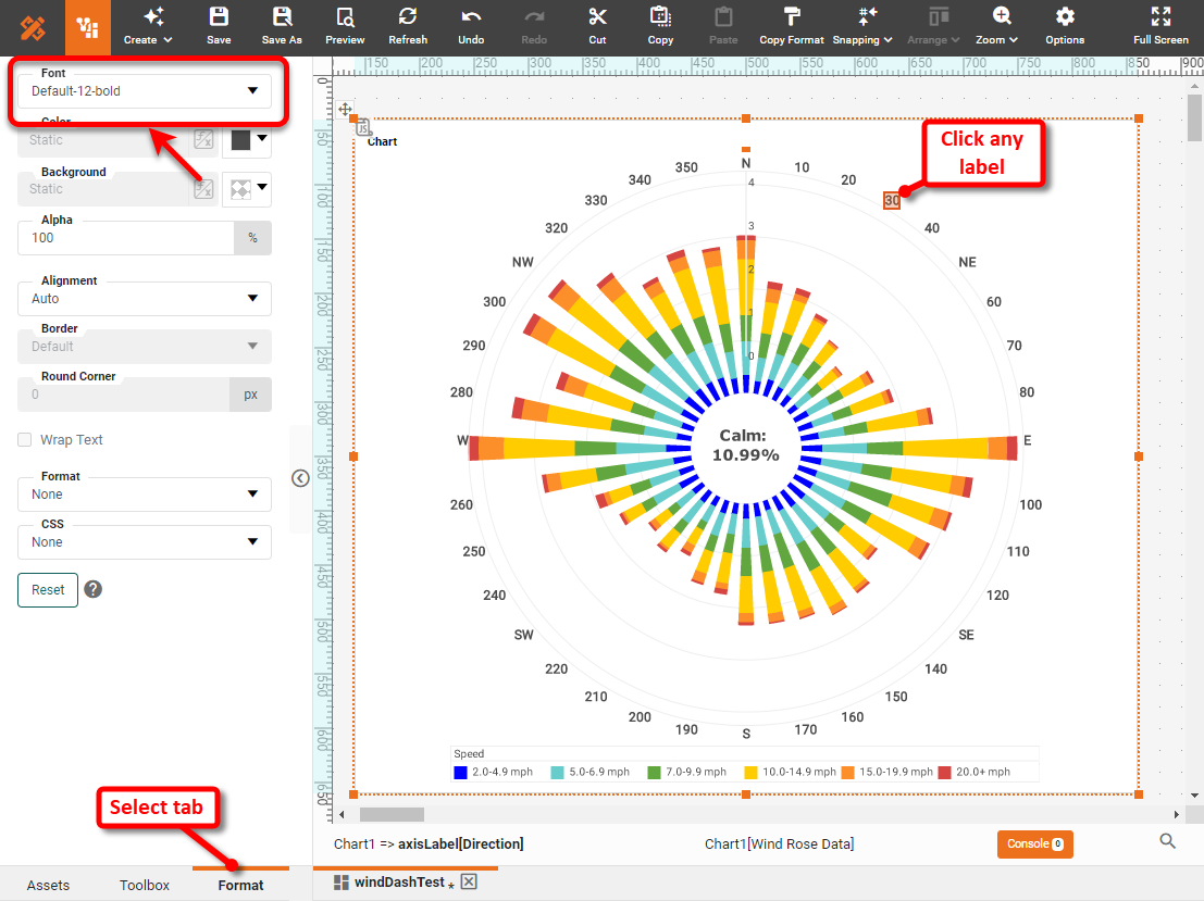
To format the axis values, select any value and open the Format tab. For the circular axis, simply make the values larger and bold.
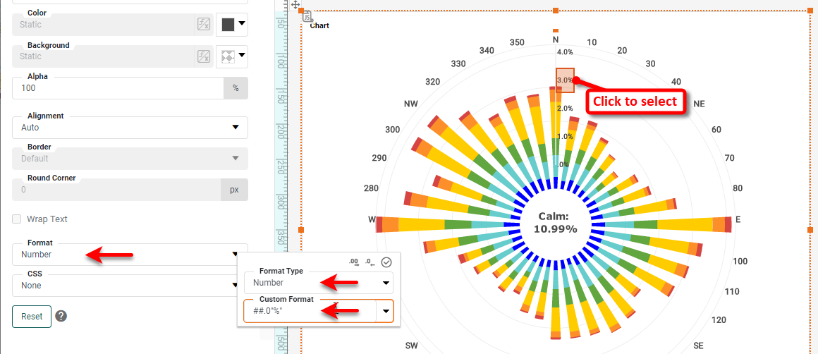
For the linear axis ("Percent"), apply a Number format that displays one decimal place and a percent sign. You can make these labels bold as well.
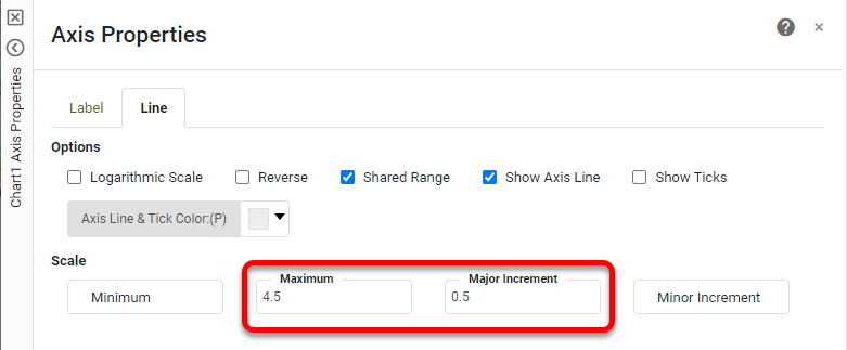
To add additional labels on this axis, right-click the axis and select Axis Properties. From the Line tab, set the Maximum to 4.5 and the Major Increment to 0.5.
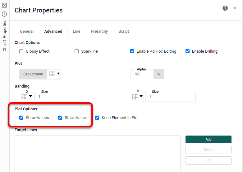
To make the percentages represented by each bar clearer, you can place labels on each bar. To do this, right-click the Chart and select Properties. Select Show Values and Stack Values.
You can format the labels to be less intrusive (for example, small and gray color) in the same way that you formatted all the other labels. Add a title to the Chart and format as desired. This completes the wind rose.
Tool to Make Wind Rose Charts Online for Free
To easily and quickly create Wind Rose Charts online for free, create a Free Individual Account on the InetSoft website. You will then be able to upload a text data set, as shown below:

Once you have done that, you will be able to proceed to the Visualization Recommender, which will get you started creating a dashboard. To start with a wind rose plot, though, you can skip the Recommender by pressing the Finish button at the top bar of the Recommender. Then press Continue to go to Visual Composer. Proceed to add a Chart component using Visual Composer, and follow the steps shown earlier to create the desired wind rose.
Can You Make a Wind Rose Chart Using Google Apps?
No, you cannot use any of Google's applications to make a wind rose chart. Advanced interactive data visualizations require a professional analytics solution.