Dashboard Display Software Examples
Looking for dashboard display software examples? Here are some inspirational, good-looking ways to display information for managers and executives. Test drive InetSoft online for free.
App Performance
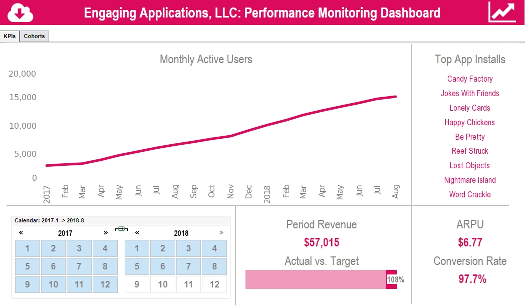
This app performance dashboard display uses a cohort analysis to compare the performance of different apps. A cohort analysis uses historical data to compare and examine user behavior by grouping users into cohorts based on behavioral similarities. This type of analysis gives insights into customer needs and improves market segmentation targeting. This cohort churn dashboard displays what percentage of users spent a certain number of hours on a particular application.
Officer Summary
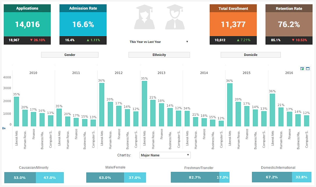
This officer summary analysis breaks down admissions by various demographic and psychographic factors, such as race, gender, major type, transfers, and year. Large, easy to read text KPIs display the dashboard's most important aggregates, with percent change from previous period displayed underneath them.
Information Display
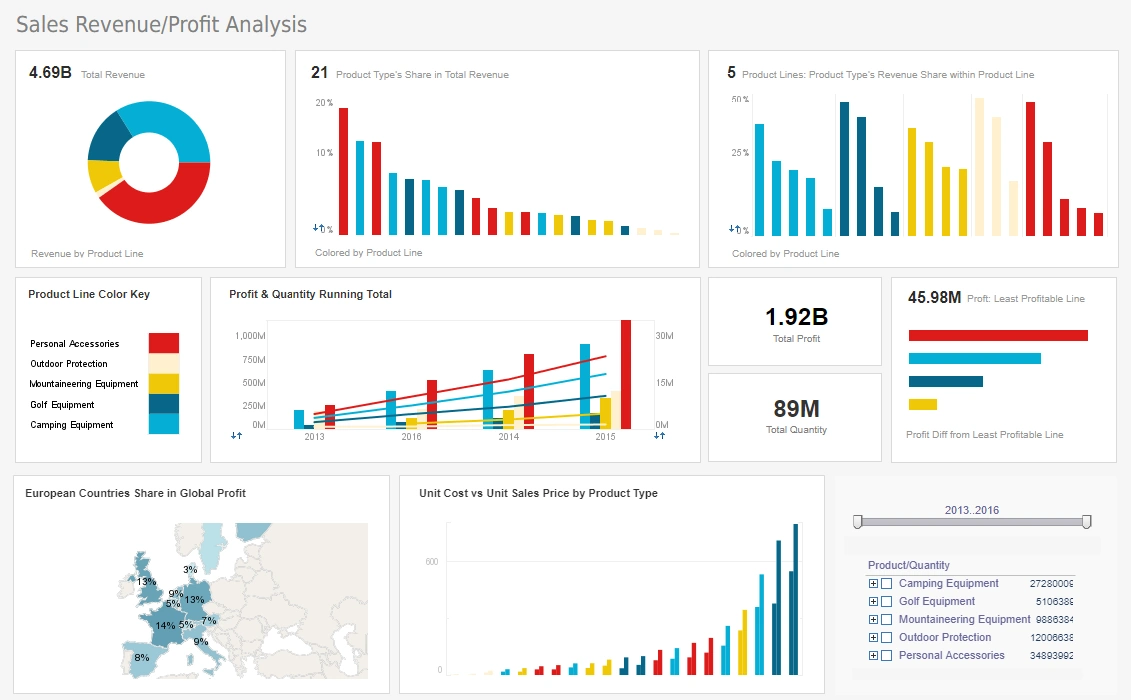
This CEO information display gives managers a complete overview of business activities. Various charts display revenue and profit, with the growth of various product lines displayed on an annual basis. This dashboard display can help a board of directors see what product lines have the greatest sales and profits. A map chart displays each country's share of global profits.
Scenario Display
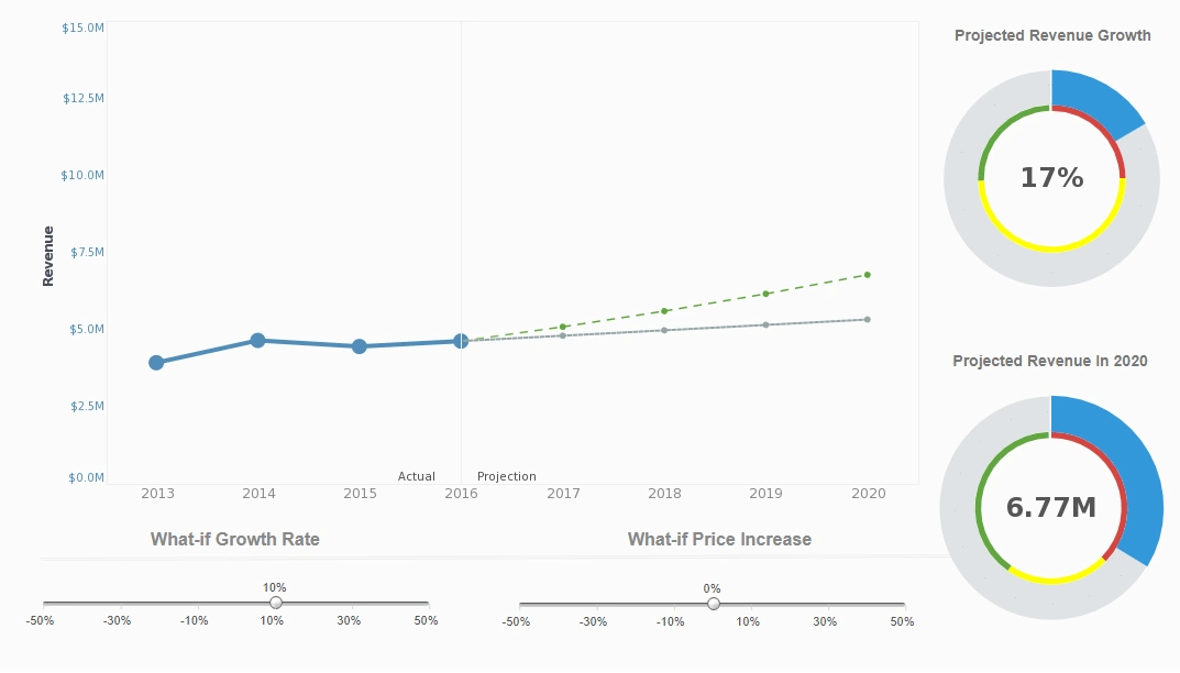
This what-if analysis predicts how revenue would be affected by changes in growth and prices. What-if analysis is the process of mathematically predicting how an organization will be affected given a predefined situation. This is typically done in spreadsheet programs, by modifying certain values in a dataset to see how those changes will influence outcome of the formulas in place. InetSoft's what-if analysis feature assists analysts in quantifying uncertainty in causal relationships and optimizing resource allocation while guiding decisions. InetSoft's Style Intelligence is a comprehensive, real-time, analytical reporting and dashboard software solution used at thousands of enterprises worldwide.
Business Executive
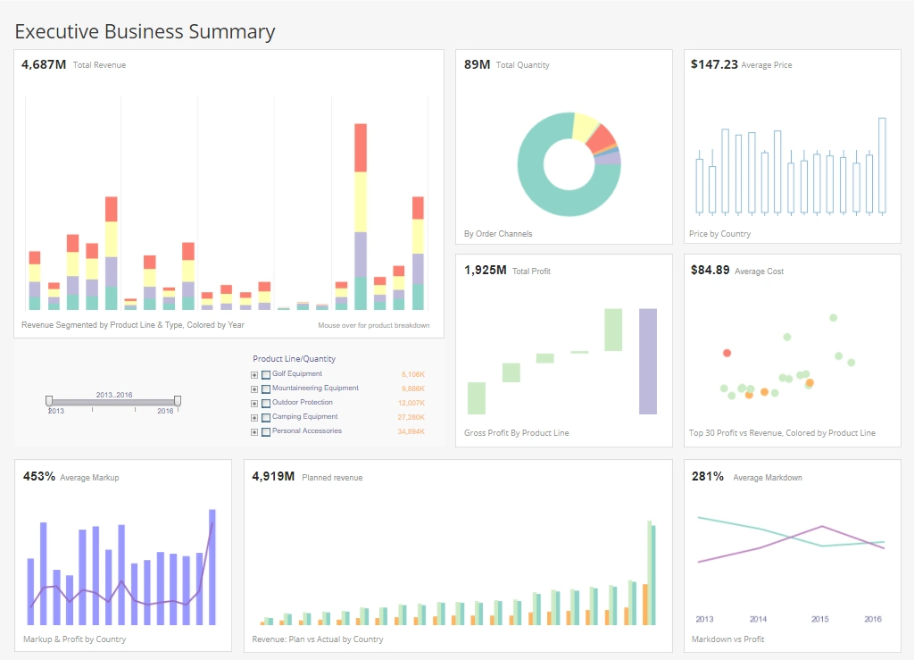
This sales department template gives a broad visual breakdown of revenue, prices, and profits, by product line. Color is used in several of the charts to add another dimension. The live version features a mouseover chart, packing in even more information without wasting dashboard real estate.
Campaign Analysis
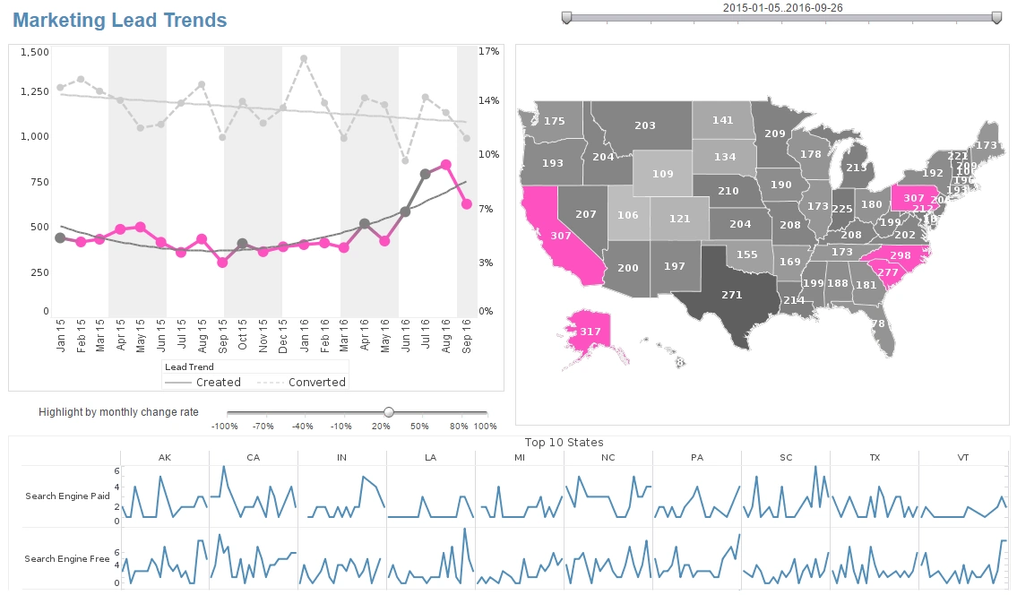
This marketing campaign analysis displays important aspects of the sales funnel, by displaying leads by source, state and date. Both top charts include a highlight feature based on monthly change rate, whose threshold can be adjusted using a slider which modifies the change rate that results in a chart highlight. The dashboard template gives an overall picture of new leads, their sources, and their conversion rates.
Heat Map
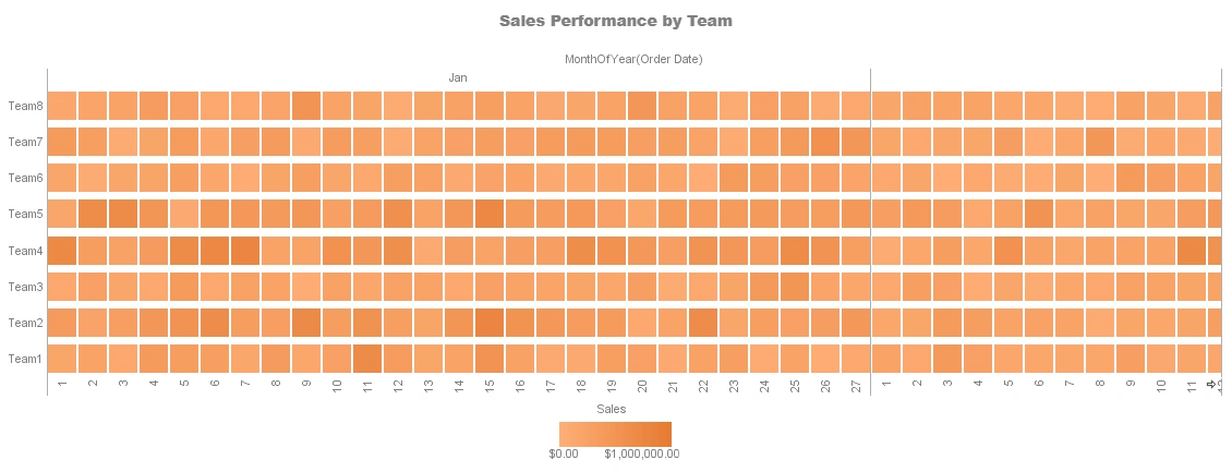
This heat map compares each sales team's performance for every month of the year. A heat map is a visual representation of data that uses colors to indicate the relative values of the data points. A heat map displays a measure using a colored grid, where the value of the measure for a given combination of dimension values is used to determine the color of the grid at that location. Heat maps are often used to visualize data that has a spatial or geographical component, such as weather data, traffic patterns, or population density. In a heat map, each data point is represented by a colored square or rectangle, with the color indicating the intensity of the value being represented.
Incident Management
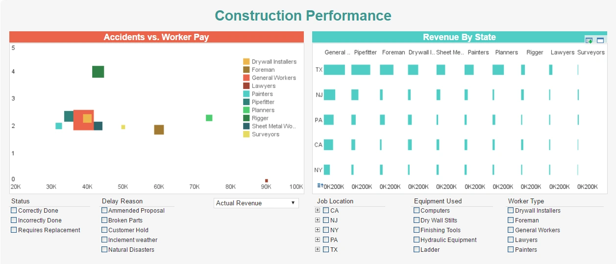
This dashboard gives property developers an overview of construction projects, including costs, timeliness, and worker safety. Drildown buttons on the Revenue by Quarter chart enables the user to pinpoint periods of high and low activity. The broad perspective oferred by this dashboard helps managers balance safety concerns with productivity expectations.
Engineering Dashboard
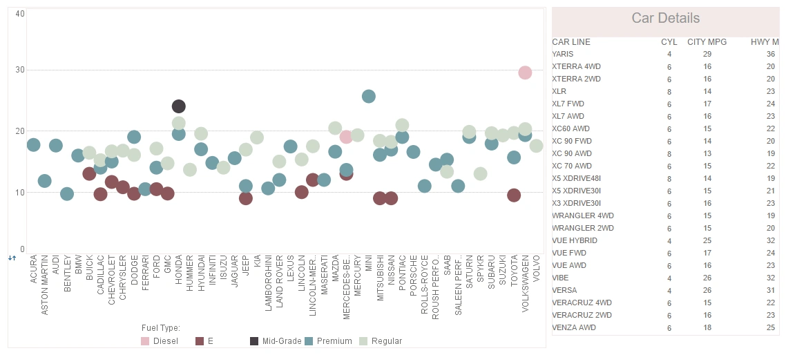
This engineering dashboard example uses multidimensional charting and KPI guages to display the fuel efficiency of over 500 different vehicles. A detail table displays each vehicle's individual data, enabling brand outliers to be identified. A detail table displays each vehicle's individual data, enabling brand outliers to be identified. A radio button changes the means by which efficiency is measured, enabling a simpler, clearer dashboard layout. Fuel type displayed using color helps add context to the comparison of different vehicle types.