InetSoft's Free Visualization Tool
InetSoft has created a free visualization tool that offer productivity to business users and Web developers as well as provide a way to evaluate some of the technology included in the company's commercial business intelligence software for interactive dashboards, visual analysis, charting, and reporting.
Click the Start Free button to use InetSoft's free visualization software application for performing data mining or exploring your data using visual analysis techniques.
If you have data in a spreadsheet, you can quickly upload it. Then with a drag and drop designer you can create a visualization, a multi-dimensional chart that you can use to sift through a lot of data with simple point and click filtering and formatting.
Once completed you can keep it private or share it with colleagues by simply sending them a URL to go to.

What Are Some Projects That a Student Could Do With a Data Visualization Tool?
Students interested in data visualization can undertake a variety of projects to explore and showcase their skills using data visualization tools. Here are some project ideas across different domains and skill levels:
-
Exploratory Data Analysis (EDA) of Public Datasets: Students can choose a publicly available dataset from sources like Kaggle, UCI Machine Learning Repository, or government data portals and perform exploratory data analysis using a data visualization tool like InetSoft, Tableau, Power BI, or Plotly. They can create interactive visualizations to analyze trends, patterns, and relationships within the data.
-
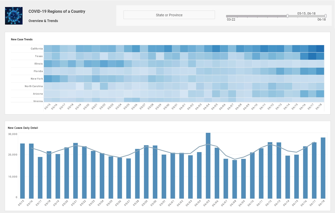
Public Health Dashboard: Develop a dashboard to visualize public health data, including cases, deaths, testing rates, and vaccination rates across different countries or regions. Students can use real-time data from sources like the World Health Organization (WHO) or Johns Hopkins University's dashboard and create interactive visualizations to track an illness' impact over time.
-
Financial Portfolio Analysis: Students interested in finance can create a dashboard to visualize stock prices, portfolio performance, and financial metrics using historical stock market data. They can use APIs like Alpha Vantage or Yahoo Finance to retrieve stock data and visualize key performance indicators (KPIs) such as return on investment (ROI), volatility, and correlation.
-
E-commerce Sales Dashboard: Build a dashboard to analyze e-commerce sales data, including revenue, sales trends, product performance, and customer demographics. Students can use transactional data from online retailers or simulated datasets to create visualizations that help businesses identify top-selling products, understand customer behavior, and optimize marketing strategies.
-
Climate Change Visualization: Create visualizations to illustrate the impact of climate change using historical climate data, satellite imagery, and environmental indicators. Students can visualize temperature anomalies, sea level rise, deforestation rates, and carbon emissions to raise awareness about environmental issues and promote sustainable practices.
-
Sports Analytics Dashboard: Develop a dashboard to visualize sports statistics and performance metrics for teams and athletes. Students can use sports data APIs like ESPN or sports analytics datasets to create visualizations that track player performance, team standings, game outcomes, and trends over multiple seasons.
-
Movie or Book Recommendation System: Build a recommendation system using collaborative filtering algorithms and visualize recommendations based on user preferences and ratings. Students can use movie rating datasets like MovieLens or book rating datasets from Goodreads to develop personalized recommendation engines and visualize recommended movies or books for users.
-
Social Media Analytics Dashboard: Create a dashboard to analyze social media data from platforms like Twitter, Facebook, or Instagram. Students can use APIs to collect social media posts, hashtags, and user engagement metrics and visualize trends, sentiment analysis, and influencer networks to understand online conversations and audience preferences.
-
Healthcare Analytics Dashboard: Develop a dashboard to visualize healthcare data, including patient demographics, medical conditions, treatment outcomes, and healthcare resource allocation. Students can use electronic health records (EHR) data or simulated healthcare datasets to create visualizations that help healthcare providers monitor patient populations, identify risk factors, and improve healthcare delivery.
-
Survey Data Visualization: Analyze survey data on various topics such as education, employment, lifestyle, or consumer preferences and create visualizations to present survey results effectively. Students can use survey data from research organizations or conduct their surveys and visualize survey responses using charts, graphs, and interactive dashboards.