Google Sheets BI Dashboards
Are you looking for a better solution for business intelligence dashboards for Google Sheets? InetSoft, a pioneer in dashboard reporting, offers the ability to mash up your Google Sheets data with almost any other data source, cloud-based or on premise. The easy to use drag-and-drop designer helps you build a dashboard in minutes. Any dashboard is shareable with full control over access permissions by user or role.
Continue reading below to learn more about InetSoft's solution for Google Sheets
Flexible Charts & Tables, Rich Visual Components
Charts are the easiest to understand visualization tool, and InetSoft offers many choices. Tables, as spreadsheets have demonstrated, can pack information in their special ways. InetSoft offers extremely flexible tables that can embed sophisticated inter-cell calculations.
Beyond charts and tables, many other familiar user interface components are equally useful in a dashboard setting. InetSoft treats all these components as first class citizens. That gives each component extensive functionality of its own.
How a Boutique Event Planning Company Uses Google Sheets Plus StyleBI
Boutique event planning companies thrive on organization, creativity, and timely execution. They juggle multiple clients, diverse event types, and detailed logistical requirements, all while managing tight budgets and high expectations. For small teams, data management is often handled in Google Sheets because it is flexible, collaborative, and accessible in real time. However, spreadsheets alone rarely provide the visual insights needed to make fast, data-driven decisions. This is where StyleBI comes in, transforming raw Sheets data into interactive dashboards that help planners optimize operations, track performance, and enhance client satisfaction.
Centralizing Event Data in Google Sheets
Every event generates a variety of data points: client information, budget allocations, vendor quotes, staff schedules, guest lists, and marketing campaign results. A boutique event planning company typically consolidates this information in Google Sheets. The spreadsheets may include:
- Budget Tracking: A detailed breakdown of expenses by category, including venue, catering, décor, staffing, and contingency funds.
- Vendor Management: Contact details, service pricing, availability, and contract dates for florists, photographers, caterers, and other service providers.
- Client Details: Preferences, special requirements, and historical data for repeat clients.
- Marketing and Leads: Data on inquiries, social media campaigns, and source channels for new client leads.
- Event Timelines: Checklists and schedules tracking tasks from initial planning through event execution.
Google Sheets allows multiple team members to access and update this information simultaneously, ensuring everyone is aligned on the latest changes. However, as the volume of events and complexity of planning grows, reviewing raw sheets becomes cumbersome and inefficient for making strategic decisions.
Transforming Data into Insights with StyleBI
StyleBI connects directly to Google Sheets and converts the structured spreadsheet data into interactive dashboards and visualizations. This enables event planners to gain a clear picture of operational performance and client engagement at a glance. Key use cases include:

1. Budget Analysis and Profitability
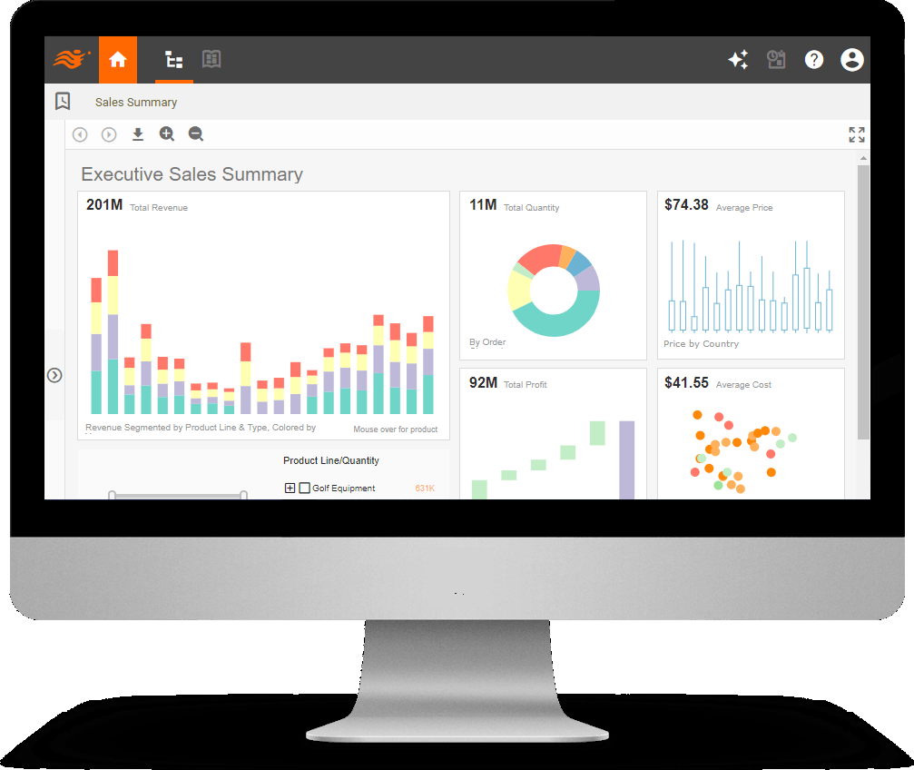
By linking Sheets budgets to StyleBI, planners can generate visual dashboards showing actual versus projected expenses, revenue per event, and overall profit margins. Color-coded charts help quickly identify overspending categories or underperforming revenue streams, enabling proactive adjustments before deadlines. Trend graphs can show profitability patterns across months, event types, or client segments, assisting in strategic pricing decisions.
2. Resource and Staff Management
StyleBI visualizations allow managers to see staff allocation across multiple events in real time. Heatmaps or calendar-based dashboards reveal overbooked or underutilized team members, making it easier to distribute workloads and reduce scheduling conflicts. Staff performance metrics, such as task completion rates or response times, can also be tracked and visualized, helping improve efficiency and accountability.

3. Vendor Performance Monitoring
Using StyleBI, planners can track vendor reliability, cost trends, and service quality. Interactive charts allow the team to compare multiple vendors across different events, identifying which ones consistently meet deadlines, stay within budget, and maintain high-quality standards. This insight supports negotiation, selection, and long-term partnership decisions.
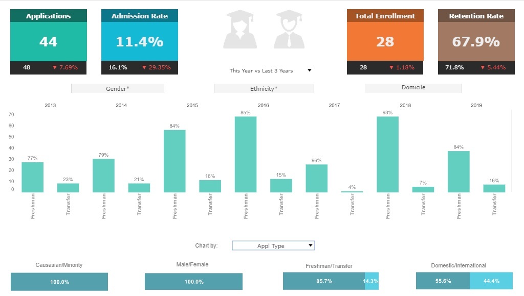
4. Client Engagement and Satisfaction
Google Sheets often collects client feedback and satisfaction scores post-event. StyleBI dashboards can visualize trends in satisfaction ratings, highlight repeat client behaviors, and segment clients by demographics or event type. This allows planners to identify areas for improvement, tailor future offerings, and prioritize high-value clients effectively.
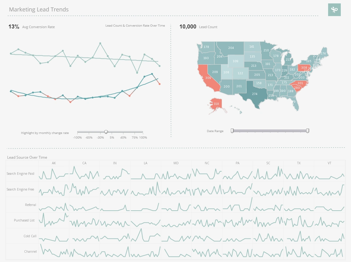
5. Marketing and Lead Tracking
Boutique event planners often run multiple marketing campaigns to attract new clients. By feeding lead source data from Google Sheets into StyleBI, the team can track which campaigns generate the most inquiries, how many leads convert into booked events, and the average revenue per channel. Interactive dashboards allow quick comparison of social media campaigns, email campaigns, and referrals, guiding smarter marketing investment decisions.
6. Event Timeline and Checklist Oversight
StyleBI can transform Google Sheets task lists into visual progress dashboards, showing completion percentages, overdue tasks, and upcoming deadlines. Color-coded Gantt-style visualizations allow the team to quickly see which events are on schedule and which require immediate attention. This reduces the risk of missed deadlines and ensures smoother event execution.
Benefits of Using Google Sheets with StyleBI
- Real-Time Collaboration: Teams update Google Sheets simultaneously, ensuring StyleBI dashboards always reflect current data.
- Data-Driven Decision Making: Visualizations reveal trends, patterns, and anomalies that are hard to spot in raw spreadsheets.
- Scalability: As the number of events grows, StyleBI dashboards allow planners to maintain oversight without manual reporting.
- Enhanced Client Experience: Insights into client preferences, satisfaction, and engagement help planners deliver personalized, high-quality services.
- Operational Efficiency: Dashboard visualizations reduce planning bottlenecks, optimize staff allocation, and improve vendor management.
Privacy and Limited Use of Your Data
Start for free or explore the commercial options. A free account requires only an email address to get started. InetSoft does not sell or share your personal information to any third parties. Our privacy policy is available here.
InetSoft's use and transfer to any other app or information received from Google APIs adheres to the Google API Services User Data Policy, including the Limited Use requirements.
InetSoft does not view or use your Google Sheet data for any reason. InetSoft's dashboard application only uses access to read Google Sheet data that you choose to display in the dashboards you create with the viewing permissions you control. InetSoft does not use any of your data to serve advertisements.
Per Google's requirements, the application does not allow humans to read this data unless we have your
affirmative agreement for specific sheets, doing so is necessary for security purposes such as investigating
abuse, to comply with applicable law, or for the App's internal operations and even then only when the data
have been aggregated and anonymized.