6 UI Design Tips for Dashboards
Now more than ever, there is more emphasis on the importance of UX in dashboards. This has, therefore, led to a rise in the variety and number of dashboard UI tools. All customer experience strategies have these tools as an essential piece.
However, the question is this: in what ways can you develop the user interface of a dashboard so that it gives the users quick access to all the information that they need? Before we start to talk about the different UI design tips for the dashboard, it is crucial that we adequately explain what the dashboard UI is.
The User Interface of a Dashboard
The dashboard allows the user to boost their retention rates and also influence the behavior of users. Designers can use all the data that they get from their research to develop a dashboard that shows relevant and actionable data. The only way that this is possible is with the UI design of the dashboard.
By designing a modern and proper UI dashboard, users can easily access all the information they need in one go. But this also means that the information on the dashboard has to contain only the essential details, and it must be easy to scan. Fortunately - or not- the availability of many tools makes it very difficult to choose the right one while not exaggerating the use of its components.
This is just one of several roles that the UX designer does, and it requires a knowledge of specific tips so that they can develop the dashboard in the best way. It's only ideal that your dashboard is user friendly, as it is a significant part of your decision-making process. Here are 6 UI design tips for a comprehensive dashboard that can help you reach your business goal.
1. Know your end goal
Before the design process starts at all, and the design elements are put into place, the end goal of the dashboard must be considered first.
To be successful with this, you have to assume the position of the audience. The style of the information displayed on the board will be impacted directly by the device and context that the users will access the dashboard regularly. Is the dashboard going to be viewed on-the-go or at the desk in the office in silence, or will it be in the form of a presentation before a large audience? These are things that have to be considered.
You must also make sure that you build an online dashboard that's responsive and will fit with different types of screens. If you're going to present or print it, it must have all the vital information that the users need in just one page.
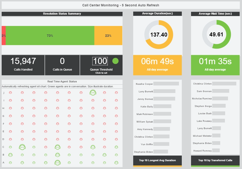
For the sake of reference, there are four primary dashboard types for different branch business activities. These dashboards are:
- Strategic dashboard: This type of dashboard focuses on the company's long-term strategies. You can use it to analyze and benchmark a vast number of the critical information based on trends.
- Operational dashboard: this is used for business intelligence as it is used for measuring, monitoring, and managing the operations and processes that require a short time scale or for an immediate result.
- Analytical dashboard: this type of dashboard has a large number of comprehensive data in it. This is something that the analysts have to drill into to extract insights that will help the company's progress at the executive level.
- Tactical dashboard: this is a dashboard that is rich in information and is mostly suited for mid-management and for helping to formulate growth strategies that depend on the weakness, strengths, and trends across different departments.
When the dashboard is designed, it should have one type of user group in mind and a goal or specific aim to assist the recipients in making the right business decisions. It is only when an action is directly actionable that we can say it is valuable. The user should be able to use the information for the goals and strategies of their business. So, it's essential to identify relevant information and keep them apart from the unnecessary ones to aid users' productivity.
2. Don't put all the information on one page
A crucial part of using the dashboard is the display of the information. It has to be precise and also target the right audience. There is no one-size-fits-all dashboard type, and all the information shouldn't be forced on one page if they all can't fit in. You have to think of the audience as some individuals with different needs. The marketing specialist and sales manager definitely do not need the same data; neither does the HR manager and logistics head. If you need to put all the information on one dashboard, make use of tabs so that the data is split per subject or theme. This makes it easy for each user to find information that relates to them.
For instance, a marketing dashboard can be split into different sections so that it refers to several parts of a website, such as the terms of use, blog, product pages, etc. But it helps everyone involved if different dashboards are created for various positions.
3. Choose the right KPIs
You must have the right KPIs to measure your business needs to have an effective dashboard design. Your KPIs will shape your dashboard directions because the metrics will show the visual representations of insights that are relevant to your business based on your business' specific areas. You can select the appropriate KPI to use in the dashboard after considering the ultimate goals and your target audience.
4. Be careful in choosing your layout
Charts and metrics are not the only things to consider in your dashboard. You have to consider how they place these charts on the dashboard. If the dashboard is well-organized visually, it will be easy to find the necessary information on it. But if the layout is weak, the users will find it harder to get their point. It's also harder to work with as no one wants to deal with a jungle of numbers and charts.
As a rule, you should first display the vital information at the top left corner of the screen. This is because many cultures read from left to right and from top to bottom. This means that people instinctively look at the top left corner first.
Another layout principle is starting with the bigger picture. The most important trend has to be the most visible in one glance. After this, you can go ahead to review the detailed charts. You can also group the charts based on the theme by placing the comparable metric next to themselves. This means that the users will not need to be jumping from one part of the dashboard to another to compare data.
5. Prioritize simplicity
There are many options that the dashboard designer has to play with when creating the chart, and it's tempting to try and use everything at the same time. However, it's effective to use these frills only sparingly. While they are all useful, the grid lines, frames, effect, backgrounds, etc., only use them if you have the reason to.
It will also help if you take your time with the legends or labels and even the color, font, and size. It should be very readable but not hide your chart. It would help if you also tried not to waste the space on unnecessary decorations such as numerous pictures.
6. Use color carefully
When using color in the dashboard, you can use colors that have the identity of your company or choose a different color palette entirely. What's important is to be consistent with the color that you use and not jump on too many colors.
You should choose just two or three colors that you will stick to and play around with the gradients. One mistake that is made commonly is to use colors that are highly saturated too often. Using intense colors will draw the attention of the user to a particular piece of data. But if there are only very saturated colors on the dashboard, users may get lost as they're overwhelmed. They wouldn't even know what to do or where to start from or even what they should look at first. Consistency in choosing your colors is critical.
Using the same color for the same items across the chart is the ideal thing to do. It will help the user minimize unnecessary mental effort, which makes it easy to comprehend the dashboard. Also, you shouldn't use random colors when you're displaying items in a group or sequence.
Conclusion
A good dashboard is usually visually balanced, straightforward even though it can be savvy. It is user friendly and accessible and also tailored to help the user achieve their goal.
All the dashboards that you create should have a focused group of users and have a specific aim of helping them tap into the process of decision making and also transform the insight into strategic actions. With the tips mentioned in this article, you will be able to create a good dashboard design.


