10 Dashboard Software Best Practices You Need to Know
How to get the most from your data analytics strategy
Dashboard software empowers businesses across sectors to take charge of their most valuable data and transform it into business-boosting insights.
From the utilities industry to retail, emerging tech, education, and beyond, data dashboard software is helping countless organizations achieve true business intelligence across every department.
But while data analytics dashboards have the potential to accelerate your business growth, if you don't handle them correctly, you won't enjoy the return on investment (ROI) you deserve.

To lead you towards data-driven enlightenment, we're going to look at ten essential dashboard software practices you need to know.
Estimated Reading Time: 12 minutes

Understand your dashboard software reporting needs
First and foremost, to get the most from your dashboard software, you need to understand your specific reporting needs.
The best BI solutions house a wealth of dashboards based on various departments and processes in one central location. To ensure every dashboard offers valuable insights, it's important to consider:
- Your core reporting aim
- The objectives or outcomes you're looking to achieve
Are you looking to improve your marketing department's paid marketing ROI? Do you want to boost your level of patient or customer care? Or is enhancing your fulfillment chain's efficiency by 25% your core goal?
Whatever your core goals or objectives, clearly defining them from the offset will give every one of your informational, functional, and design-based choices a definitive direction.

Know your dashboards and formats
Before you start curating your data and designing your dashboard, deciding which layout or style will best suit your needs is essential.
Here's a quick guide to the three main BI dashboard types available in today's business world:
- Strategic: Strategic dashboards showcase key information in a plain, simple format. The insights derived from strategic dashboards empower senior decision-makers to formulate initiatives and campaigns based on a mix of historical, real-time, and predictive data.
- Analytical: Analytical dashboards exist to provide detailed insights based on specific patterns or trends. These BI tools offer information based on a multitude of variables, providing highly focused, detail-oriented insights.
- Operational: Operational dashboards are particularly KPI-focused and offer deep-dive insights into the functional aspects of a business's key processes (fulfillment, supply, manufacturing, etc.). These are effective for capturing real-time information and benchmarking progress, as well as getting to the root of emerging issues swiftly.
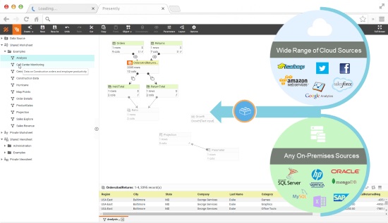
Curate your data using reliable sources
Around 30% of digital data is poor, inaccurate, or misleading. The cost of working with poor-quality insights is great: misleading insights will sap your budget and make your productivity levels dwindle.
To squeeze every last drop of value from your dashboard software, integrating data from reliable platforms or resources is vital.
If you carry out a detailed data audit (analyzing every one of your company's existing data sources), you will discover the insights that are redundant or offer little in the way of business-boosting value.
Be ruthless and cut all ties with the data that offers little insight or is potentially harmful to your organizational progress. With only reliable data sources remaining, you can proceed safely in the knowledge that your dashboard software will return top-quality visualizations that drive your organization forward.
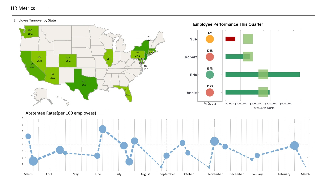
Provide data-driven context
Another dashboard BI best practice is to ensure that your data offers real-world context to your users. From the CEO to the go-getting intern, if you want everyone to benefit from the power of dashboard analytics, understanding the fundamentals is vital.
To put every one of your data-driven insights into the right context, you should place your data into definitive dashboard groups (marketing performance, paid marketing monitoring, supply chain metrics, sales leads, etc.). That way, you will avoid stray, non-contextual data being displayed on your dashboard and confusing your users.
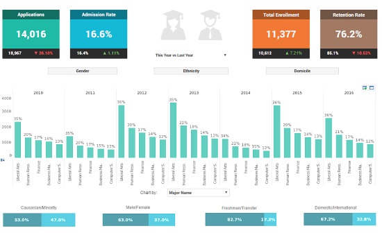
As you can see from our College Admissions dashboard example, the data displayed here is clear, cohesive, and completely contextual. All of the insights complement one another and align with the key institutional objectives.
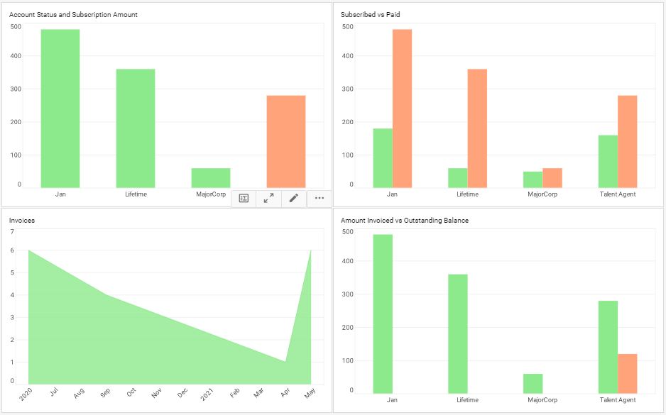
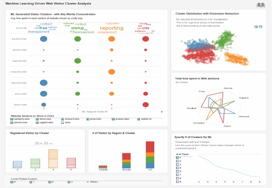
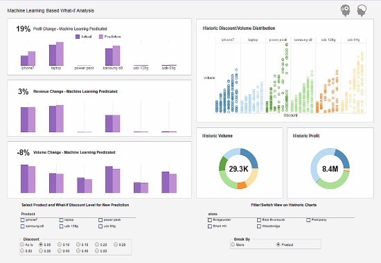
Pick the right key performance indicators (KPIs) & visualizations
Once you've curated your data sources and placed your metrics into contextual groups, it's time to
select your dashboard software KPIs.
If youve taken the time to segment your data, choosing the right KPIs and visualizations should be
relatively straightforward.
To pick the best possible visualizations for the task at hand, you should consult your dashboard's
core aims and objectives. Next, you should make your selections based on:
"The greatest value of a picture is when it forces us to notice what we never expected to see."-John W. Tukey

Get your dashboard software design right
Dashboard software design and customization are paramount to achieving sustainable BI success. Getting your dashboard design right will maximize the power of your insights while giving everyone in the business the tools to perform to the best of their ability.
One of the most critical things to remember when designing a data dashboard is that your layout should be 100% logical and clutter-free. Always prioritize substance over style, ensuring that every visualization on the page is clear, easy to understand, and has ample space surrounding it.
Here are some additional dashboard design tips to inspire your efforts:
- Use a simple color scheme (three colors are usually the visual sweet spot) with a smooth contrast for visual consistency. Pastel colors typically prove most effective.
- Value white space to give your dashboard clarity while helping your users navigate the most important information.
- Keep your alignment consistent across the board. Upper-left alignments usually help people digest information more effectively.
- Ask people to test your dashboards. If you identify anything unclear or confusing, you can make the right tweaks or improvements.
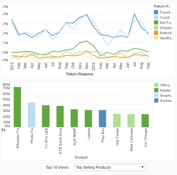
Tell a story with your data
Armed with your dashboard design tips, you can start arranging your visualizations for optimal analytical power.
Another essential BI best practice to consider when arranging your dashboard software is the power of data storytelling. The human brain responds best to strong stories or narratives. Tell a tale with your dashboard, and you will empower both your internal talent and external stakeholders with the power of information.
When approaching data storytelling, you should ensure your visual KPIs paint a vivid picture arranged into a logical beginning, middle, and end.
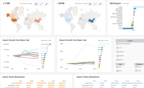
This Steel Trade Analysis dashboard example provides a panoramic analytical picture. Here, users can scan from left to right, working down the page to follow a clear-cut narrative based on geographical impacts, exports, and various performance breakdowns. This is easy to digest, and each visualization plays a pivotal part in telling a rich informational tale.

Train your internal talent
This is a simple point, but droves of data-driven businesses skip over it (usually to their detriment): when you're working with dashboard software, you must give everyone within the business the right level of training.
Hosting meetings and practical workshops will not only help everyone understand how dashboard software can benefit them personally but also maximize the ROI of your analytical strategy.
If everyone can use your new tools and solutions to their fullest advantage, your dashboard software will deliver positive results across the board, and your business will thrive.
Give everyone the right access
In addition to adequate training, it's also important to provide the right dashboard software access to the right people within your organization.
To protect the integrity of your data dashboards, you should grant permissions (editing, viewing, admins, etc.) to your internal talent based on their role and level of seniority.
You should also work with dashboard BI solutions that users can access across a multitude of devices 24/7 from wherever they are in the world. Doing so will boost productivity and give you the tools you need to respond to any issues any time, anywhere.

Assess your efforts and keep on evolving
We call this the "rinse and repeat" outlook. Once your dashboard software is up, running, and working wonders for your business, you should check in periodically to see if anything needs changing or updating.
We live in an age of constant change. What is relevant today may be redundant tomorrow. As such, you may need to make updates to your dashboards to ensure they remain relevant at all times.
Whether it's a KPI that needs changing or analytical parameters or benchmarks that need updating, running regular tests and checks means you will keep winning with your analytical efforts.
"Without big data, you are blind and deaf and in the middle of a freeway."-Geoffrey Moore, renowned author and consultant
We hope these best practices help you on your journey towards data dashboard success. For more business-boosting insights, check out these inspiring examples of data intelligence.