How Dashboard Software KPIs and Visualizations Can Optimize Your Business Operations

Propel your business forward with the power of data intelligence

#1 Ranking: Read how InetSoft was rated #1 for user adoption in G2's user survey-based index Read More

Businesses that can squeeze every last drop of value from the most relevant information available at their fingertips will win on the commercial battlefield.

These days, it's no longer enough to have access to insights. In a time where the digital landscape is becoming increasingly immersive and hyper-connected, you need to hone in on the data that truly counts with pinpoint precision. To achieve this across your organization, working with interactive data dashboards is essential.

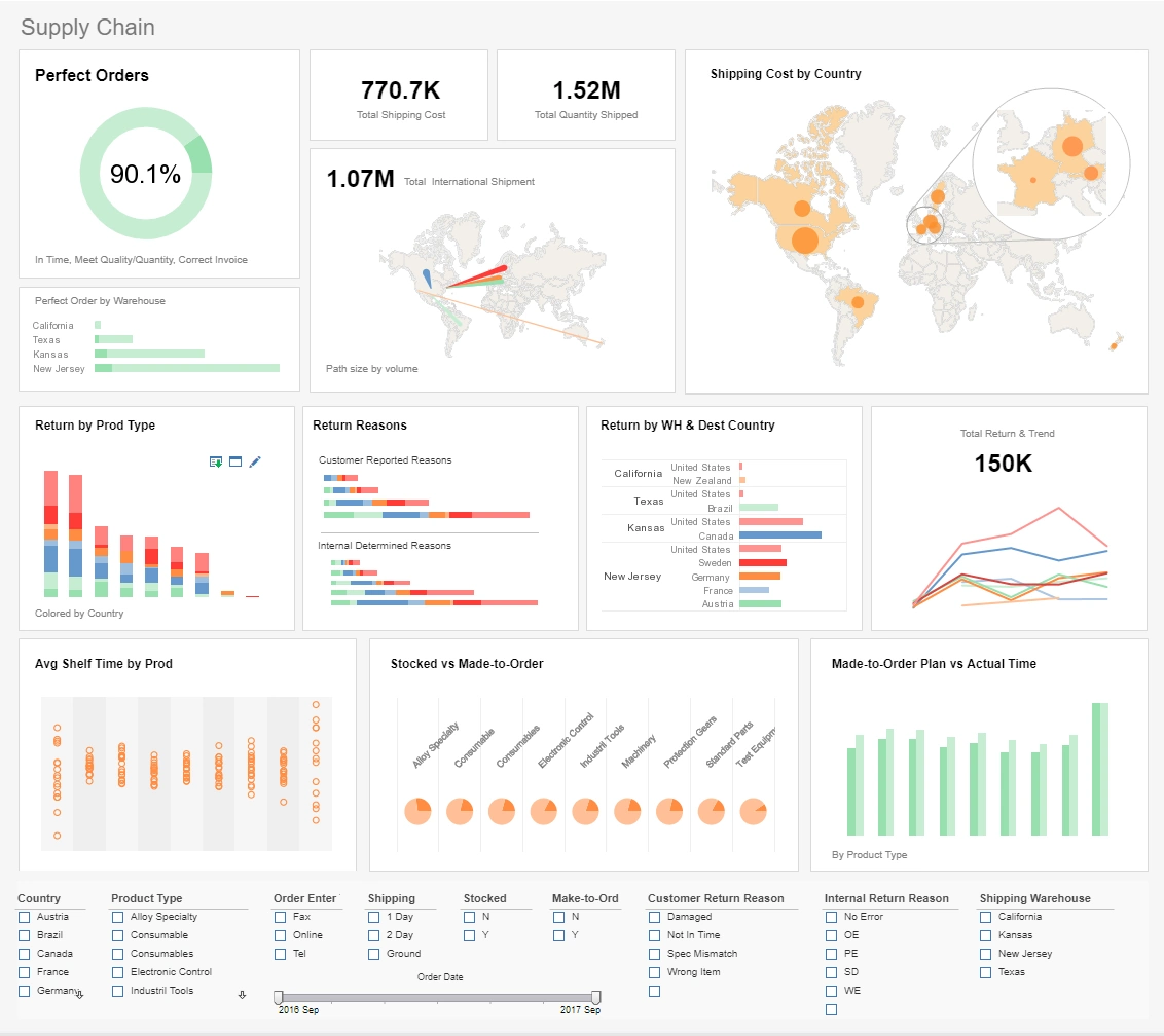
From supply chain management and fulfillment logistics to sales, marketing, and beyond, data dashboard software is designed to transform insight into business-boosting action.

According to Gartner, most forward-thinking business leaders are looking to make access to "composable data" an organizational standard over the next few years. Composable data refers to scalable insights that business users can easily analyze and transform into practical initiatives, strategies, or processes.

With this in mind, dashboard solutions offer the tools, visualizations, and innovations to propel every conceivable business operation to new commercial heights. Niche, vertical, and sector aside, working with a dashboard reporting tool will accelerate the growth of your organization.


Armed with the right key performance indicators (KPIs) and interactive visualizations, you will significantly enhance your decision-making across the board, improving communication and boosting your bottom line in the process.

Here, we explore the meaning of KPIs and data visualizations in a modern business context while looking at an inspiring mix of modern dashboard software examples.

Learn the advantages of InetSoft's small footprint BI platform.

What are data visualization and KPIs?

A KPI or key performance indicator is a value or metric designed to measure the efficiency or performance of a particular process, strategy, or function based on a specific benchmark (usually quantified in numbers, ratios, or percentages).

By tracking the right KPIs for your business using metrics that align with your various business goals or objectives, you can pinpoint where a particular strategy or process might need improvement. Conversely, if you notice a spike in performance in a certain area, you can apply this newfound strength (or strategy) to aspects of your business that are underperforming.


KPIs provide critical performance-centric intelligence that will inform you whether your business and its stakeholders are on track, while giving you a greater understanding of the best action to take.

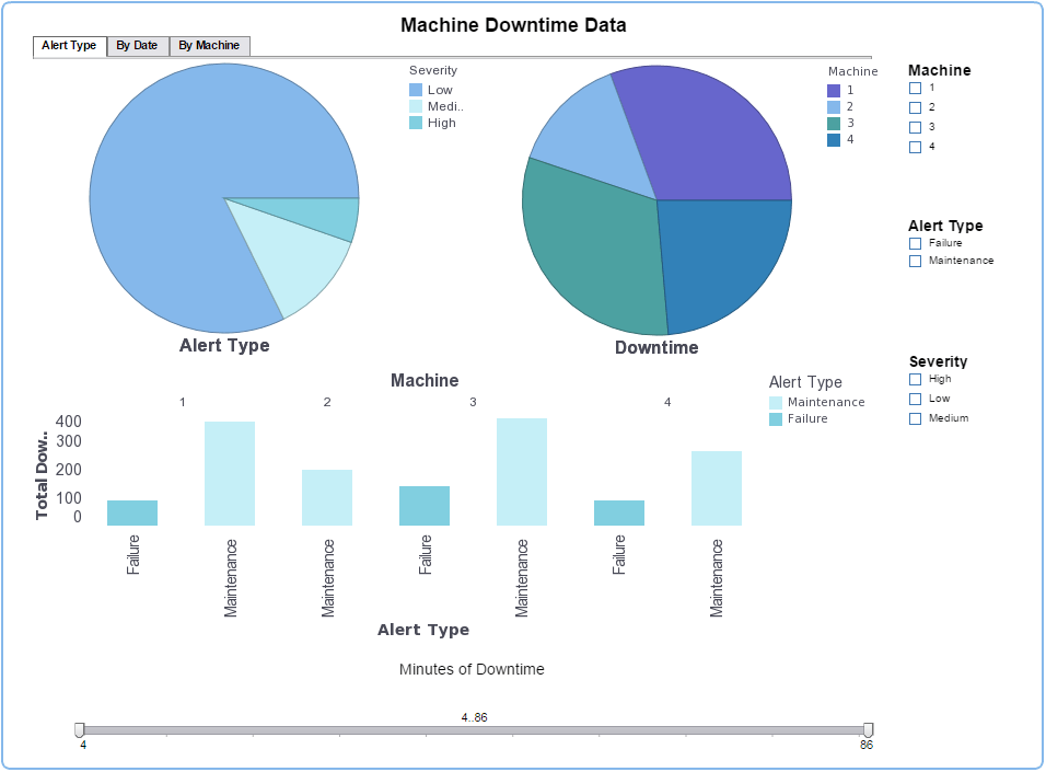
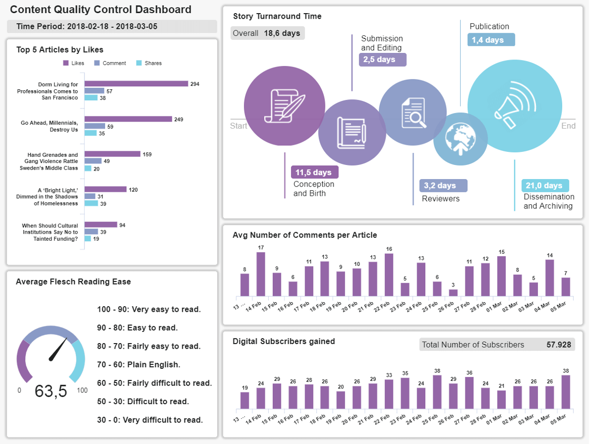
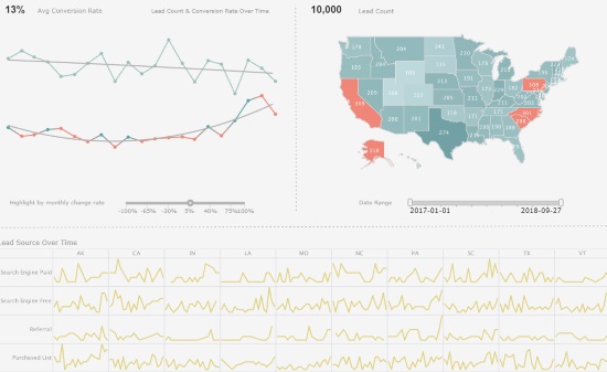
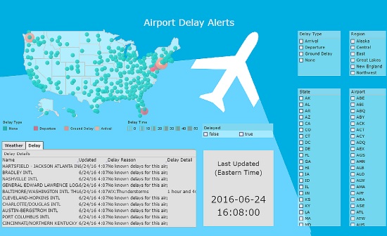
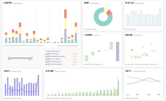
In the Age of Information, dashboard software offers the additional advantage of working data visualizations - interactive KPIs presented in an accessible graph, chart, or table.

Not only can you drill down deep into data visualizations and extract invaluable business-boosting insights; the highly digestible nature of dashboard software KPIs empowers users across the business to make faster, more impactful decisions, improving overall performance in the process.

The business-boosting value of visual KPIs

Did you know? The human brain processes imagery 60,000 times faster than text-based information, and 90% of the data transmitted to the brain is visual.

Based on this notion alone, visual KPIs bring a wealth of business-boosting value by presenting rafts of relevant information in a way that offers practical insight. Armed with logical, eye-catching, and interactive visualizations, everyone in the organization can leverage data to perform to the best of their abilities.

When everyone within the business has access to detailed visualizations tailored to their specific roles, internal information exchange is woven deep into the fabric of the company culture, and collaboration thrives. By working with a centralized data dashboard, everyone can sing from the same informational song sheet while honing in on the visual metrics relevant to them, driving efficiency in the process.


Read the Style Intelligence datasheet for a detailed explanation of the platform's capabilities and features.

For example, if you're looking to streamline the financial efficiency of your accounts department, working with a Vendor Error Rate KPI (presented in the form of a logical line chart) will give you insight into how successful your business is at processing invoices to creditors, suppliers, or vendors on time.

Should you notice your Vendor Error Rate falling below your benchmark or target, you can easily pinpoint the issue. This will help you enhance your overall financial efficiency while strengthening your vendor relationships - improving your brand reputation as a result.

view demo icon
View a 2-minute demonstration of InetSoft's easy, agile, and robust BI software.

In addition to collaboration, communication, and access to digestible insights, visual KPIs also offer:

  • Deep-dive insights: Digging deeper into critical aspects of your business's daily, weekly, and monthly processes or operations to develop fresh initiatives or build upon existing strategies.
  • Advanced performance measurement: By leveraging dynamic visual KPIs and data visualizations, you can set specific business performance metrics and quantify your performance while working towards clearly defined milestones for consistent growth and development.
  • Predictive forecasting & analytics capabilities: The highly visual nature of dashboard KPIs means that everyone in the business can uncover trends and patterns that will help nip any emerging issues in the bud while formulating strategies that are likely to push you ahead of the competition.


"Without big data analytics, companies are blind and deaf, wandering out onto the web like deer on a freeway." - Geoffrey Moore

The anatomy of data visualization

Data visualizations, or KPIs, sit inside dynamic dashboard software to help users take valuable data and transform it into actionable strategies.

Data dashboards consolidate all key data in one central location and present these insights through various visual KPIs or metrics. Here's a general breakdown of how the data visualization process works:

  1. Pull data from various sources
  2. Find aggregate meaning or contextualize the data
  3. Analyze, arrange, and clean data
  4. Interpret the data in a graphical format within the dashboard

In our marketing lead dashboard example, you can see three definitive visual KPIs that work in unison to showcase the number, success, and quality of marketing leads across a wealth of relevant geographical areas and sources (referrals, search engines, cold calling, social media, etc.)

Each of these KPIs or visualizations is presented in different formats, according to the information they're designed to convey. Essentially, they're formatted in a way that makes it as easy as possible for the user to connect with the actionable information they need.

Together, these KPIs offer a range of panoramic information that will help marketers or marketing managers assess conversion rates, trends, and the best sources to focus on for a specific initiative or campaign.

Read what InetSoft customers and partners have said about their selection of Style Scope for their solution for dashboard reporting.

Data Visualization Tools and Platforms

As you may have noticed, these three KPIs (like all dynamic data visualizations) share three common attributes:

  1. They offer essential information at a glance
  2. They present data according to preset parameters or timeframes
  3. They paint an informational picture that improves real-time decision-making

Gone are the days of linear lists and laborious Excel spreadsheets. Now, we live in the age of the visual KPI—a time where businesses across sectors can become more adaptable, responsive, and innovative with the power of business reporting software.

"No data is clean, but most is useful."-Dean Abbott, data analytics expert

Inspiring dashboard software examples and visual KPIs

Now that you're up to speed with the business-boosting value and anatomy of interactive KPIs and data visualizations, let's consider how they work within dashboard solutions.

Here are three inspiring data dashboard software examples that demonstrate the power of dynamic KPIs and data visualizations in an everyday organizational context.

Sales dashboard analysis

Using dashboard solutions equipped with a melting pot of impactful KPIs will ensure you capture critical insights at every stage of the buyer journey and across every channel or touchpoint.

This interactive executive sales summary dashboard example is equipped with a balanced mix of customizable visualizations geared towards confidently monitoring a mix of high-level data.

Armed with dynamic visual KPIs, including total revenue, total quality, average price, total profit, planned revenue, average cost, average revenue, average markup, and average markdown, sales managers can drill down into the performance of different product lines or categories, as well as costs and profits, in a matter of moments.


Every KPI featured in this dashboard offers a specific insight into the sales value of various initiatives while presenting a tapestry of information that assists in promoting the right products to the right leads across the right channels. In turn, sales reps and managers can optimize any processes or strategies that need improvement - an essential tool for effective sales leadership.

Read more about InetSoft's in-memory database technology to learn how it works and what its advantages are over a pure in-memory solution.

Law practice analytics

When it comes to law, every little detail counts. Any inefficiencies or internal mistakes can seriously damage the reputation of a law firm while hindering its overall performance. However, by setting clear-cut objectives and working with KPIs that align with these aims, it's possible to create cohesion, drive growth, and provide a better service. That's where a law practice summary dashboard comes in.

Every visualization fits neatly into this powerful data dashboard example, creating a narrative that offers law firm employees comprehensive insight into the performance of various competitors.

This data reporting tool also serves up definitive answers on successful cases, investment figures, client tickets, and proposal outcomes by type, among a host of other invaluable metrics.

This display of visual intelligence offers all of the key ingredients necessary to reach potential clients where they're most engaged, enhance pitch or proposal strategies, monitor organizational growth, and most importantly, stay on track in a fast-paced industry.

Human resources (HR) analytics

Managing and nurturing your internal talent while creating a healthy, progressive company culture is one of the core objectives of any modern HR department. But, as clear as the mission may be, achieving this can be easier said than done.

There are many facets of human resources to consider on a daily, weekly, and monthly basis, but employee attrition is arguably one of the most important.

Every eye-catching KPI contained within this data dashboard provides incredibly detailed information on attrition rates based on demographic factors and job role. Presented in a mix of charts and graphs, this powerful business reporting software example also showcases attrition share over a set timeframe, broken down into clear-cut categories.

Here, HR managers and decision-makers have everything at their disposal to understand where they may need to improve initiatives, including onboarding, training & development, team bonding, and issue management. As such, working with this dashboard will improve morale, boost productivity, and cement employee loyalty over time.

Read why choosing InetSoft's cloud-flexible BI provides advantages over other BI options.

Data dashboard analytics: A final word

"Big data is at the foundation of all of the megatrends that are happening today, from social to mobile to the cloud to gaming." - Chris Lynch

Finally, to illustrate the unrivaled power of KPIs and data visualizations, this scannable COVID-19 tracking dashboard offers a vivid breakdown of infection rates. Here, the data is broken down according to country, categorized into new deaths and cases.

In a crisis like the pandemic, decision-makers across a wealth of industries require access to highly digestible visual data to make vital choices that could result in organizational turmoil, or worse, death. Dynamic data visualizations have been key in weathering the storm with safety and success - a testament to the value of modern KPIs.

Whether you work in biotechnology or consumer fashion, one thing is clear: working with the right KPIs and visualizations will push your business ahead of the pack.


At InetSoft, we deliver simple, agile, and innovative business intelligence solutions that empower organizations and solution providers of all sizes to improve their businesses with big data analytics. We're a business intelligence software innovator that provides visually compelling, fully-interactive KPI-equipped dashboards equipped to offer actionable insights in a number of key organizational areas.

To date, we have helped over 5,000 organizations achieve their data dashboard goals worldwide, including 25% of Fortune 500 companies, spanning every kind of industry imaginable.

If you're ready to power up your business with dynamic KPIs and dashboard software visualizations, get in touch. We'll be happy to get things started.

top ranked BI
Read how InetSoft was rated as a top BI vendor in G2 Crowd's user survey-based index.