How City Governments Use Dashboards
To know how city governments use dashboards, let's understand what a dashboard is in the very first place. Dashboard, in brief, is the summarization of the most important information. It tells you what are the important goals for your organization and the best measures for them.
It offers proper analysis and context. Dashboards show the information in an aesthetic way. Readers will not get bombarded with massive information.
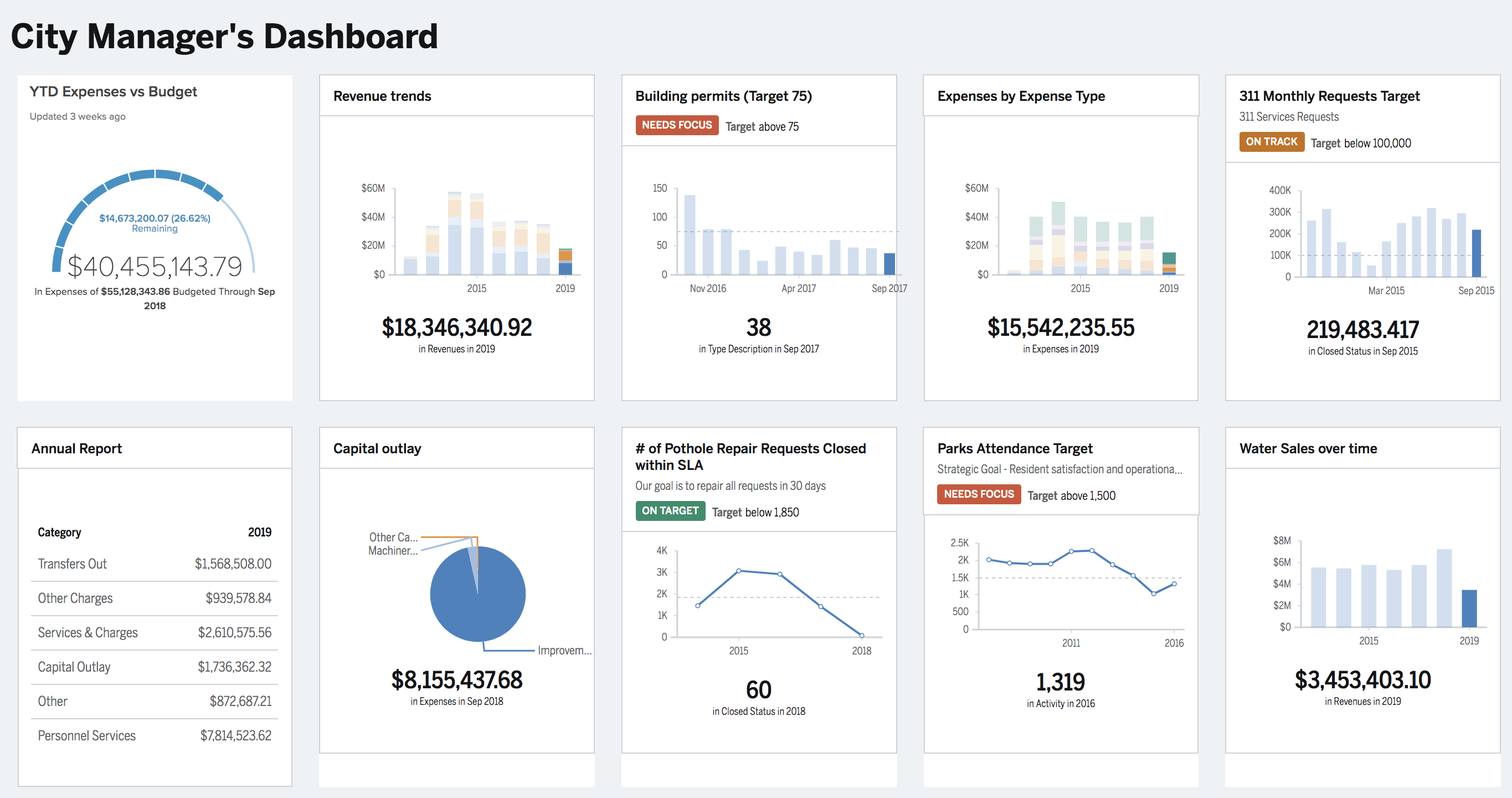
When it comes to municipalities or the local government, their dashboard is not just a sheet embedded with colorful graphs. It's more like a few pages of information, offering you information just like a story.
In this article, the examples that you will notice are mostly websites that convey relevant information in a sequential way. So, how do we start with telling the story of your organization? The first element is definitely a strong introduction.
1. Introducing Your Government Dashboard to Citizens
As citizens enter the landing page of the dashboard or site, provide them with some information on what is being offered. Don't forget to include the background information as well.
Think of making a first impression through a welcome message. Here, you're starting off by telling the citizens what they will be navigating through and also indicating your commitment to maintaining transparency.
Examples
On the Olathe, Kansas' website, their dashboard presents a statement that says the purpose of the site: "A community dashboard that measures progress toward achieving excellence in efficiency and service delivery to provide citizens of Olathe with the most value for every tax dollar."
Besides the statement, there is a pie chart showing the priority measures and their high-level status. The chart provides readers with a quick look at the overall performance.
On The City of Sugar Land, Texas' website, the home page shows just a single tagline: "Accountability. Transparency. Citizen-Focused." As you navigate to the About page, you'll come across a detailed explanation of the purpose, priorities, and background of the government dashboard.
2. Straightforward and Accessible Information is a Must
Remember who your readers are. The details that your internal stakeholders need are different from the citizens. Offering too much in-depth information may distract them. Your citizens will not be familiar with the different performance areas mentioned on your dashboard.
For the regular citizens, you need to simplify the data. It will help the community members to understand what information you have on offer.
For instance, choose to explain:
- Your status indicators
- Your fiscal year
- If data is missing, say when it'll be available
- Technical terms (Of course, in the simplest language you can. Avoid jargon!)
Examples
Let's talk about the City of Sugar as it offers some good examples. The "About" page of their website is where you'll find in-depth information regarding status indicators, quarters, and fiscal year.
Again, from the Responsible City Government page, you can navigate to each measure for more information and it is stated in clear and simple language. Once you click, it will lead you to a landing page that explains in detail the timeframe (fiscal year's quarters), definitions, importance, analysis, and data source.
Another example is the City of Fort Worth, wherein it illustrates how you can explain in brief why there are no targets for some measures. In the legend, when you hang around the No Target icon, you'll see a pop-up, stating "they are only monitored for change"
3. Display Key Measures and Projects
Do not overload your dashboards. Your aim is to highlight the priority areas and demonstrate how the tracking of data or the key projects are helping with improving the city's performance. That's it. Information overload is not necessary.
When it comes to reviewing your performance, your community needs an easy and simple way. They will not prefer turning over a multiple pages' report. So, offer them crisp information that is of the highest priority. You must display each measure and project.
In this context, you can:
- Add charts: Charts are visually pleasing and as you provide a qualitative analysis with it, every piece of information becomes crystal clear. Use visual aids. You've pie charts, bars, columns and several others. Choose the best one suited to the data!
- Identify and list out the ways how your targets were determined.
- Illustrate how and why you're tracking specific data and provide an analysis of the figures.
If you aren't willing to disclose the full data, you have the option of providing links to your full reports or data platforms.
Examples
The City of Sugar Land has a link to its previous year's complete quarterly report from the homepage of the dashboard.
The City of Fort Worth uses simple, clear language. They inject bar charts to show performance measures. Below the charts, you'll find the definitions, analysis, and related links in context.
4. Make Easy-To-Navigate Dashboards
What if no effort of yours is adding to the dashboard traffic?
Consider the difficulty in the navigation to be a possible reason behind it. Redesign the layout of the
dashboard and make navigation easier.
Use aids like top menus for navigation, visible links that can take the audience to their preferred information. You can take help of or hire quality developers to design your dashboard according to your choice. If the readers want to dig deeper, make it easy for them to find and access the information.
'Invisibility' is another reason why your dashboard has low traffic. It's not likely that citizens will know of the data you've collected and published. They will surely not know where to look for it.
So, advertise! Promote your dashboard by all means - through social media platforms, traditional channels, etc. Advertise the website in a way that citizens will know where to find the information they're seeking!
5. Create an Introductory Video
Add a personal touch to the government dashboard by creating an introductory video. Citizens connect immediately when they hear the city leadership speaking about priorities and performance.
Examples
A video on the Goal Measures page of the City of Sugar land's website shows the city manager explaining the process of creating measures, the priorities, and how to access the dashboard.
A local news channel picked up the launch of the City of Olathe's dashboard as a more convenient way for looking into the safety data of the city, including crime rates, and explaining that the priorities were chosen by the city council.
The video on the Olathe dashboard, accompanying the article, emphasizes the ease of use. The video says 'The new interactive dashboard basically puts city information on a handy, clickable website for instant information, replacing the often-arduous task of sifting through dozens of pages of annual reports."


