Analyzing Call Rep Performance
This is the continuation of the transcript of a Webinar hosted by InetSoft on the topic of "How Data Discovery Software Uncovers Stories in the Data." The speaker is Abhishek Gupta, Product Manager at InetSoft.
Let’s analyze the performances of the call reps, I have a variety of results. This is looking at the percent pledges to all the calls by callers. This side is good. These people are getting 5% and up response rates. These people are getting no response rate, and this is the common group of prospects I’m going after. Let’s look at the bottom end of this.
There is a goal here, at least one percent. If I click on the goal line, I’ve now selected the callers and the calls for the under one percent response rate. This is the problem. I may not want to also include zero response rates. These people weren’t getting pledges, but some of them were also getting a lot of refusals. In fact, this group above the red line is getting 5% of their attempts to this top group of donors as refusals.
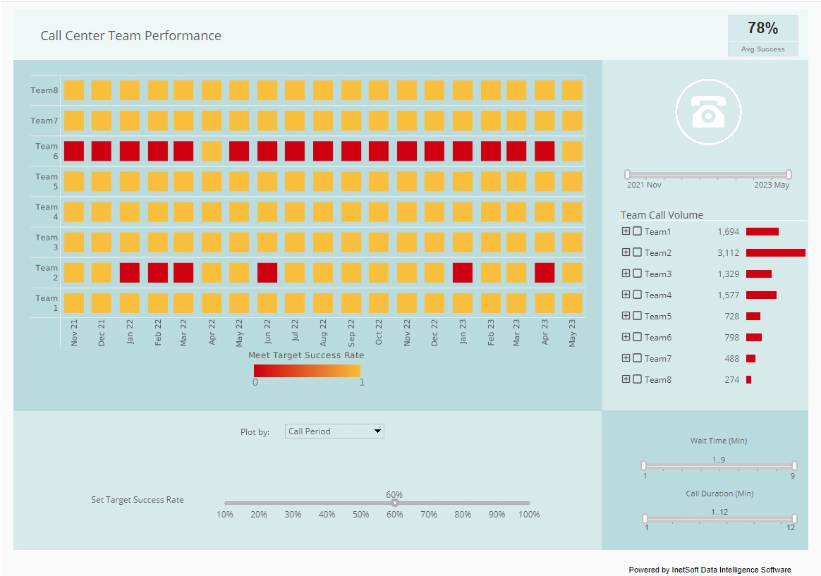
Let’s click that, and I’ve got the people who have done under one percent on the pledges and over 5% on the refusals. Who are they? From the student data I can tell more about these callers. This heat map shows the number of calls made and the caller’s percent pledges. Red is worse. Green is better. I can quickly see that I’ve got some problems with my sophomore grade. The bright red shows them.
I’ve got some problems, and some of these majors where those people are doing less well and some of the other majors are doing better. History is more green or lighter color. Hispanic studies, these people do better, these people worse. Let’s go back to the first tab. I’ve got 32 callers who have had problems with my large donors. Here is a list of them. You might want to explore this list, right click and put this out to my management. Let’s take action because we may need to do some more training, or find out if there is something going on with this group. Now I have the list in excel to take action on.
The other thing I might want to do at this point is drilling down on one of them. So let’s pick these people who have made a lot of calls. Amanda has made 169 calls but only got one pledge and 19 refusals. Something is going wrong here. Let’s go to the prospect list. So now here is the list of all the prospects she called who gave last year a large amount.
Let’s investigate who she was getting all these refusals from. I’d probably want to go through this list and discuss with her what happened. How come she has such a horrible record? So to summarize, I’ve gone from half a million calls roughly. I took a subset of people, drilled in and got down to a point where I can take action. That’s the beauty of data discovery applications because you can quickly work through a large set of data and get down to the point where you can take action and get results.
And in that process it’s highly collaborative. That’s the kind of thing that we see typically getting done with this request back to IT or central reporting. You get data, but then you get part of it and you think of another question. Now a team of three people can sit down and quickly do this analysis in a room together and put their common knowledge together about what the data means.
So let’s look at data visualization. What’s that all about? You saw a bit of it in the last demo, but that’s all about the second technology. Humans have a keen ability to process visual information. If you see it, you get insights out of it, and visual analytic is the science of analytical reason facilitated by visual interfaces. It helps you derive insight from large amounts of data, to detect the unexpected, discover the expected, and discover the unexpected, and then communicate it because it’s a in a visual way which is easy to communicate.
And so let’s look at another example of ad hoc analysis. So I’m going to play the role of a financial analyst. I’ve got a portfolio of mutual funds, and my job is to find and categorize the dogs in my portfolio. I’ve got 10 minutes to do this job, and there is not pre-set hypothesis. I’m going to have again fish in the data. Let the data tell the story and share my findings, and the theme here is data tell stories.
So let’s pull up the PowerPoint again. I’m going to now start this exercise, and instead of a pre-built project, I’m starting from scratch. There is a set of steps. I need to connect to some data. Built some charts. So let’s load some data. I’m going to go find the data source. It could be a text file or excel. It could be a database, Oracle, SQL Server, or MySQL, etc.
In this case it’s an excel file. I’m going to go find it. It’s on my desktop under demos. It’s called mutual funds data. I’m going to just quick load it in. So it’s pretty easy to get the data, and I’m going to find that this spreadsheet has two sheets. The data’s in first sheet here. I don’t need the charts in the back, and then it’s going to profile it, figure out the columns. I’m going to leave that alone. My data’s in.


