Choosing the Best Tool For Data Visualization Storytelling
What do business decision makers look for when choosing the best data visualization storytelling tool for their company?
Factors to consider include the ability to mashup different types of data sources, the ability to import data, integration with data warehousing, options for prototyping new data, accessibility, and user-friendly features that speed up decision making.
InetSoft's StyleBI BI suite ranks a strong first in all these categories.
Database Connectivity
StyleBI users are empowered by the ability to import data from various databases, including JDBC, XML, Microsoft Excel, and many others. This ability becomes especially useful when tracking trends and patterns that may be overlooked in traditional reporting. The end result – be it data, dashboards, or reports – can then be displayed in a unique manner and shared with other users.
Data Mashup
With data mashup, separate data sources of almost any type can be combined to produce reports and dashboards that tell new stories and create internal information management efficiencies.
InetSoft is a pioneer in data mashup and offers a unique capability of end-user defined data mashup, which means even business users can combine fields from different data sources that were not previously modeled, and import external data sources such as spreadsheets, to create a new dashboard or report to be shared in the BI environment. The end result is maximum self-service.
Ultimate Accessibility
StyleBI is unique in its ability to report across a multitude of data sources whether it is internal, external, or user generated. Users can select from a large variety of possible sources, without necessarily having to be aware of the underlying details.
Additionally, StyleBI is a completely Web-based, zero-client application. Users can connect to their data from any device with a web browser; this includes desktop computers as well as mobile devices such as iPads, mobile phones, Android tablets, etc.
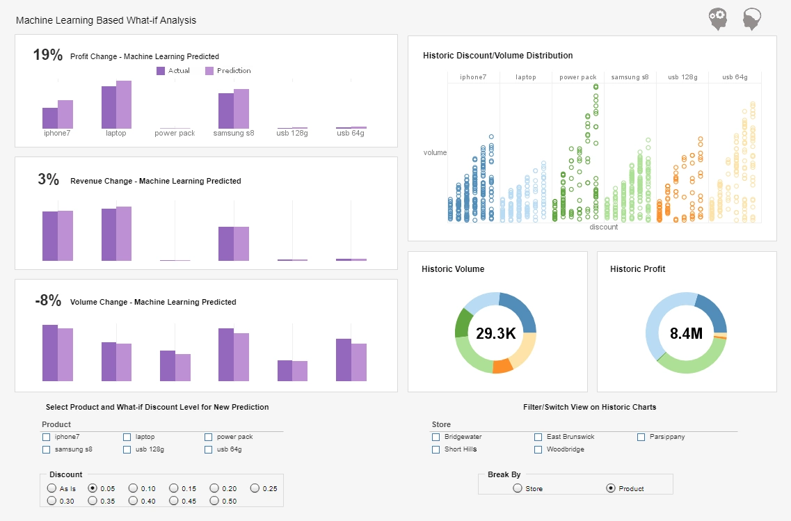
Server administrators can set a large variety of parameters to control exactly what their users can and cannot see. By doing so, the same dashboard can be personalized on a user-by-user basis, displaying only data sources that are deemed appropriate or applicable to the current user.Dashboard Storytelling with InetSoft
Eliminate desktop-based tools that were made with analysts in mind. StyleBI allows for any user to take advantage of the tool without having a background in advanced configuration or scripting. Once the infrastructure is in place, mash up and dashboard possibilities become endless and are no further than the click of a mouse. It has never been so easy for BI to become accessible to all company members no matter location or skill set.

Using Data Visualization in Sound and Music Cognition Research
Sound and music cognition research explores how humans perceive, process, and respond to auditory stimuli. As datasets grow in complexity—ranging from neural recordings to emotional response surveys—data visualization becomes essential for uncovering patterns and communicating insights.
Visualizing Auditory Features
Researchers often analyze features such as pitch, timbre, rhythm, and harmonic structure. Spectrograms and waveform plots are foundational tools for visualizing audio signals over time. Chromagrams and tonal centroid plots help map harmonic progressions and key changes, offering insights into musical structure and listener expectations.
Mapping Cognitive and Emotional Responses
To understand how music affects cognition and emotion, researchers use heatmaps, violin plots, and multidimensional scaling to visualize survey data, EEG signals, and physiological metrics. These visuals can reveal how different genres or tempos influence attention, memory, and mood across populations.
Cross-Modal Analysis
Music cognition often intersects with visual, linguistic, and motor domains. Sankey diagrams and network graphs can illustrate connections between auditory stimuli and other sensory modalities. For example, linking rhythmic patterns to motor responses or mapping lyrical content to semantic networks.
Interactive Dashboards for Experimental Design
Interactive dashboards allow researchers to explore participant data in real time, filter by variables such as age or musical training, and adjust experimental parameters dynamically. These tools enhance reproducibility and facilitate hypothesis generation.
More Articles About Data Visualization
-
Interactive Visualization Dashboards
Visualize Free is a cloud-hosted, zero-client app for building interactive dashboards. Users can upload spreadsheet data and create visualizations with drag-and-drop simplicity. It’s ideal for quick insights and sharing private or public dashboards. -
Multi-Dimensional Chart Designer
InetSoft’s free visualization tool lets users explore data with point-and-click filtering and formatting. It supports spreadsheet uploads and interactive chart creation. Students and professionals can use it for projects ranging from public health to financial analysis. -
Visual Analysis Product
This article introduces Visualize Free as a tool for data mining and visual analysis. It highlights how users can evaluate InetSoft’s commercial BI capabilities through the free version. The platform supports real-time dashboards and mashups of disparate data sources. -
Zero-Client Dashboard Designer
Style Scope is InetSoft’s commercial dashboard designer with zero-client architecture. It enables users to build interactive dashboards without installing software. The tool supports real-time data access and advanced visual analytics. -
Enterprise Reporting Platform
Style Intelligence combines dashboarding, reporting, and data mashup in one platform. It’s designed for scalable enterprise use with fine-grained access control. The software supports visual exploration of large, complex datasets. -
Visual Exploration Techniques
This page discusses how data visualization enhances decision-making across industries. It explains techniques for visual exploration, including dashboards and real-time analytics. InetSoft’s solutions help users uncover trends and outliers efficiently. -
Drag-And-Drop Designer
InetSoft’s interactive dashboards allow users to create visualizations with a drag-and-drop interface. The platform supports filtering, drill-downs, and mashups. It’s optimized for both technical and non-technical users. -
Disparate Data Sources
InetSoft’s data mashup technology enables integration of multiple data sources into unified dashboards. Users can combine spreadsheets, databases, and web services. The visual interface simplifies complex data blending tasks. -
Live Real-Time Access
Real-time dashboards from InetSoft provide up-to-the-minute insights. The platform supports streaming data and dynamic updates. It’s ideal for monitoring KPIs and operational metrics continuously. -
Agile BI Software
InetSoft’s BI solutions emphasize agility and ease of use. The software supports visual analytics, reporting, and dashboard creation. It’s designed to adapt quickly to changing business needs and data environments.


