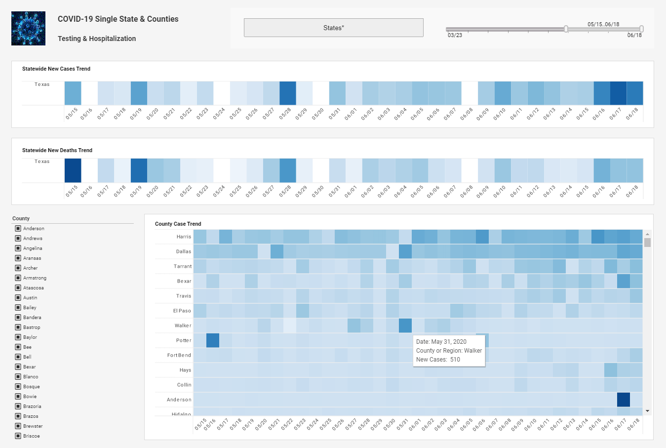
Heat Map Shows Contributions of KPIs
This is the continuation of the transcript of a Webcast hosted by InetSoft on the topic of "Faster Business Intelligence: Visual Reporting" The speaker is Mark Flaherty, CMO at InetSoft.
The heat map at the bottom of the page is a new feature on this page. It shows the performance of various table games grouped by pit location on the casino floor. The size and color of the shapes are determined by two key measures and quickly show the relative contributions of these KPIs. The settings for the heat map can be changed interactively. Different key metrics can be used to determine the size or color of the heat map. The color bandings and ranges can also be changed along with specifying filtering criteria and other facets of the heat map.
The marketing dashboard page shows details of marketing promotions targeted to certain customers. Changing selections again changes the area chart and the grid. It is quick and easy to segment the data by different customer data attributes. So in this short demonstration you can see how useful this dashboard application is to the casino manager.
This performance monitoring dashboard contains approximately 8 megabytes of data representing over 22,000 rows and with over 40 business measures analyzed from different perspectives. Not only does InetSoft offer dashboard technology, but InetSoft has a high volume, high efficiency dashboard platform that manages all tasks in extracting and formatting data including multi database access, high scale data compression, automatic personalization, dynamic assembly of dashboards into self running packages, and high volume distribution to thousands of recipients.
Powerful Dashboard Design
StyleBI is also notable for its powerful dashboard design and operations console that reduces development and administrative efforts because all dashboard designs are firstly made with a data driven query worksheet, or data block. This means that any other data worksheet can be assembled from other business data blocks.
That way they are reusable, easy to maintain, and easy to update as business changes. Number two, dashboard applications are graphically designed using drag and drop technology, so they can be built very quickly and do not require any programming to get the great interactivity. Thirdly, the platform offers operations control so that the entire implementation can be monitored and managed from one central console.
What is truly significant about dashboard applications is that it’s a breed of business intelligence that every organization has been looking for but has been unable to find because the technology did not exist to support it. Many companies have now implemented dashboards and improved information dissemination and as a result have been rewarded with productivity gains within the organizations.
Next I wanted to take a minute today to talk about InetSoft BI solution within the scope of delivering more information to more people within your organization. InetSoft’s goal is making our customers the most competitive players within your industries through pervasive BI. I don’t think there has been a better example of that in terms of making information available to more people and a much more immersive experience than with InetSoft BI over the last few months. You can see that we strongly believe that the mobile computing is revolutionizing how, when, and where information is consumed and decisions are made.
And there’s a new breed of information driven applications, information driven apps that combine analytical capabilities, information, and transactional capabilities. Organizations are going to need to build tens or hundreds of these enterprise apps and consumer apps in the next three years to take advantage of this new wave of information technology that is making business no longer tethered to the desk.
How a Museum Used Heat Maps to Rethink Discovery
A striking example of heat map visualization comes from a mid-sized science museum that wanted to understand how visitors actually experienced its galleries. Instead of relying on exit surveys and gut instinct, the museum instrumented its space with privacy-preserving Bluetooth beacons and overhead people counters. Over a month, millions of anonymized location pings were aggregated into high-resolution heat maps showing foot traffic density and dwell time at five-minute intervals. The goal was deceptively simple: reveal the invisible choreography of curiosity—where people slowed down, where they flowed, and where they stalled out altogether.
The first set of heat maps, layered over a floor plan, immediately challenged long-held assumptions. A newly installed “centerpiece” exhibit drew a burst of attention at opening each day but bled visitors within ninety seconds, forming a hot halo with a cool core—plenty of passersby, few engagers. Meanwhile, a modest hands-on station tucked along a side wall produced a persistent red knot from morning to close, signaling repeat engagement and social clustering. The café corridor, assumed to be a neutral conduit, showed a surprising warm patch at a narrow pinch point—evidence that stroller traffic and a looping video monitor were creating a subtle bottleneck that distorted circulation to two adjacent galleries.
The museum combined heat maps with time-sliced “river” overlays to see how movement changed during school field trips versus weekend family visits. On field-trip mornings, teachers gravitated toward exhibits with clear signage and short cycle times, creating periodic surges that overwhelmed an interactive robotics station. During weekends, the heat maps revealed a late-afternoon migration toward quiet zones where younger kids could sit, tinker, and recharge. In effect, the museum discovered two different visitor ecologies sharing the same physical space—and both needed design attention.
Acting on these insights, the team made three surgical changes. First, the underperforming centerpiece added a “landing pad” of quick-win interactions at its perimeter, extending average dwell time by 55% and converting passersby into participants. Second, the side-wall favorite was expanded and mirrored across the aisle, distributing demand and halving wait times without diluting the activity’s charm. Third, the café corridor monitor was rotated and the pinch point widened by 18 inches; subsequent heat maps cooled the choke to a comfortable glow, restoring flow to the neglected galleries.
What made this heat map project exceptional was not just the pretty gradients; it was the rigor behind interpretation. The team treated heat as a hypothesis, not a verdict. They annotated maps with program schedules, staff rotations, and weather data, then reran visualizations to separate seasonal quirks from structural truths. They also took ethics seriously: devices were hashed, no facial recognition was used, and wayfinding prompts made tracking transparent and opt-out friendly.
The results reached beyond operations. Retail conversion in the museum shop rose as traffic patterns were redirected past a maker demo table that sparked purchase intent. Donor reports featured before-and-after heat maps that told a simple story at a glance—evidence that design tweaks translated into learning, satisfaction, and revenue. Perhaps most importantly, staff culture shifted: curators began proposing experiments with clear success metrics, knowing that next month’s heat maps would either vindicate or refine the idea. In short, heat maps turned a static floor plan into a living laboratory—and that is where data visualization earns its keep.


