Locking the Contents of a Public Dashboard
This is the continuation of the transcript of a product demonstration provided by an InetSoft sales engineer for an enterprise prospect interested in our business intelligence software.
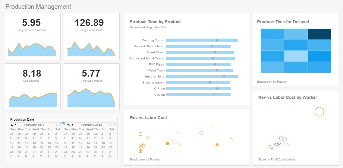
Question: Once you have created a dashboard, can you lock the contents of the dashboard, as published, as a public dashboard for people just to view?
Yes, if you don’t want interactivity, you just don’t add any of these selection fields, you just add the view fields.
Question: Good, you can lock it down because again we have plants where we have very large monitors, monitoring stats in real time about what's going through the service management area and reporting stats of number of calls, time to resolve, etc, etc, live at that time. So we could publish and create a dashboard, and just let it run as a large dashboard? So we can do that, yeah, very good.
I have another question. In that chart where you have got the multiple colors, if you click one of the attributes, one of the personnel, as an example. Can you drill into that that?
Yes, that this is the basic data, but if you want to have drill-down capabilities, for a cube like interactivity, where you can drill down from region to country to state, yes you can import that quite easily well. So yes, you can have a hierarchy and traverse up and down the hierarchy.
Question: Well cool, okay. I have another question. Can your BI software be deployed in a .NET environment?
Yes, we are completely Web-based application, and we have clients embedding us in .NET applications as well. If you are using Sharepoint, you are just basically passing on the right InetSoft URL to display a chart or a report. Everything is controlled with a URL and the right parameters. If I want to extract model, I can do as it easily by passing on a parameter.
This is the visualization module. Now let's take a look at the more traditional reporting module. The dashboards in the visualization module were all about hands-on interactivity, exploration analysis, and creating dashboards. Reporting modules are for the more traditional paginated pixel perfect report, with more emphasis on the presentation layout, printer-ready documents like display data.
You can have your basic interactivities. Let’s start with a summary report. Here I am summarizing my top 10 selling products. I can always hyperlink from one report to another and implement a drill down. If I click on this product, I can hyperlink to another report and look at all the orders placed for that product. Of course, this interactivity is all out of the box functionality. You just add a chart or cross tab or pivot table, and automatically interactivity buttons will be there for you, where you can click on them and view the details.
This report is more traditional. This is an example of what we call a formula table. A formula table is very Excel like. When we help clients develop reports, a lot of our clients are moving over from Excel. They have created these really complicated Excel spreadsheets where they have to run queries, get data from the database and copy and paste the data. Then they run macros and formulas.
You can take all that functionality and automate it in the form of a template using formula tables. So the formulas run just like in Excel. I can run queries against the database. I can extract portions of the database. I can define groups and subgroups. I can define formulas which reference these dimensions and perform applications. I can get a very precise layout, a precise arrangement with precise calculations embedded in my view.
Interesting Examples of Public-Facing Dashboards from Government Agencies
Government agencies around the world have increasingly embraced public-facing dashboards to make information more transparent, accessible, and actionable. These dashboards allow citizens, researchers, and policymakers to explore real-time data on topics ranging from public health and transportation to environmental monitoring and economic performance. By combining interactive visualizations with intuitive interfaces, government dashboards provide insights that were previously buried in static reports and fragmented datasets.
One prominent example is the U.S. Federal Reserve Economic Data (FRED) Dashboard. This platform provides real-time and historical economic indicators such as inflation rates, employment figures, interest rates, and consumer spending metrics. Users can interactively explore trends, compare different economic measures, and visualize relationships between variables over time. By making key macroeconomic data publicly accessible, the FRED dashboard supports informed decision-making for businesses, academics, and government agencies.
Another compelling instance is the U.S. Bureau of Transportation Statistics’ Freight Analysis Framework, which provides public access to supply chain and freight movement data. Users can explore flows of goods by mode of transportation, commodity type, and geographic region. This dashboard has been particularly useful for businesses, logistics planners, and regional authorities, enabling them to understand traffic patterns, identify congestion points, and optimize routes. By visualizing complex logistics networks, the dashboard translates raw transportation data into actionable insights for both public and private stakeholders.
Environmental monitoring dashboards also offer fascinating examples. The European Environment Agency’s Air Quality Dashboard aggregates data from hundreds of monitoring stations across Europe, providing real-time air pollution levels, historical trends, and forecasts. Citizens can quickly identify areas with high particulate matter or ozone levels, while policymakers can evaluate the impact of environmental regulations and emissions controls. These interactive dashboards often include maps, charts, and comparison tools, helping the public contextualize environmental data in meaningful ways.
Finally, economic dashboards, such as the U.S. Bureau of Economic Analysis’ GDP and personal income dashboards, present critical financial metrics in an accessible visual format. Users can explore GDP growth, personal income, and regional economic performance through interactive charts and maps, allowing comparisons over time and between states or metropolitan areas. By offering public access to detailed economic data, these dashboards support transparency, academic research, and policy analysis, demonstrating the value of visual analytics in government decision-making.


