Mapbox Integrations Dashboards and More
This part two of a transcript of a Webinar hosted by InetSoft demonstrating the new features of its 2022 release.
Part One can be found here
Katie Roussey: Next we'll go over some of the different charts and some of those enhancements that have happened for version 2022. The support for the new connections through either a Mapbox or Google Maps for use as the background when looking to do map based data presentation is something that I didn't hook up personally within my explicit design environment. So I'm going to be showcasing actually stuff on the website for you to be able to look out on gallery.
So if you go to our Atlantic Hurricane Seasons dashboard, you can see the Mapbox interface and what it looks like when you have a license key deployed. So all you have to do is have a Mapbox or a Google Maps API key, and follow some steps to deploy that within Enterprise Manager and you can select that instead of the traditional shapefile map style.

What is a MapBox Integrations Dashboard?
MapBox is a provider of many tools to build maps into websites and web-based applications. InetSoft's map charts can now run on Google Maps or Mapbox instead of just simple shape files.

Contour Map Plot
Now, with this enhancement, we've also added an additional chart type that is not just to plot on a map, but to plot on a map with contour. So a Contour chart, you can always do of course, a scatter Contour as well, which would be more of a measure showing a general density when doing a scatterplot. But with the Contour map, you can get that other perspective that you can still style to do a different type of analysis than plotting locations, plotting paths, or maybe sizing by certain amount or quantity. By getting these density maps, you can still zoom in and interact with your chart in various ways, all of the different interactivity is going to be in place. And you'll notice that I did this as a basic end user, which means that it's something that even interacting with it as an end user in that ad hoc ways, you would be able to have this type of experience. When you're using a scatter Contour, again, either on the classic shape file charts, or to actually have, the Zoom interaction over a Mapbox or a Google Map.

New Dashboard Chart Types
Some of the other chart types that were mentioned were version 2021 enhancement versus a 2022 enhancement. So this particular example has a jump line example where it's just a slight variation on plotting different points, different values and quantities, the line gives you a little bit more of a clear cut perspective on seeing that exact value.
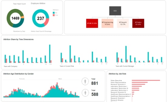
This HR example has a lightweight tree hierarchy displayed. We do also support network and circular network stylings where you're connecting the different points in spider webbing out from them. But we're just going to be showing a little bit more of that hierarchy style tree one for the different examples that we're going to cover today.
HR Dashboard Example
This HR example also covers the step areas, the jump line, so you can imagine that if you're then connecting the different lines that you're jumping to you become that step line style, well, we have a step area option. So you can do that nice fill below getting this stacked area perspective, and if your values are representing particular averages for the entire day, it represents the entire period of time has had that value.

Funnel Chart
Our take on the funnel chart does not do more of that pointed style. Instead, you're just seeing the proportional quantities as solid bars, but in a center of alignment styled perspective with our funnel. So, it is slightly more modern style on the classic funnel chart, but it can be another way that you can elect to visualize your different values.
Gantt Chart
Now Gantt charts in the past could be created using charts scripting, using a Gantt Chart Style script, but now it is going to be just simple chart binding so you can do project management, project timeline type visuals, etc. You can also use it as more of a scheduling style, but typically you want to have that start time and end time instead of just a point in time when you're doing this type of data representation, so project management would be the broadest application for leveraging these.

New Date Range Comparison Features
New date range comparison feature takes our previously supported change from previous period calculation, and also the comparison mode that you could enable with the calendar, and brings in a new user interface to provide more flexibility for standard comparisons in visuals and an even more dynamic option with custom periods, that would have been hard to capture with some of the standard ways that had been used in the past for creating these. The range comparisons are designed into the dashboard, such as change from previous month to month, year to date, or quarter to quarter year to date, the user can then actually make their own adjustments to the day of comparison.
As you can see, you would be able to set overall volume of periods, or if you wanted to have it shared amongst different components, you're given options for that. Do you want to see the change value or the percent change? The user would be able to make adjustments and customizations and capture it in their bookmark. And that date range comparison can be applied to both charts as well as crosstab tables. So this way, you can get the types of comparisons that you want to have visually, whether it's the flat details in the table or having more of that graphical perspective. The end user experience with creating the date range comparison will match what the designers and the developers are going to have when initially setting up a date range comparison.
All you need to get started with creating a date range comparison is a chart or a crosstab with a date field and some form of measure, some metrics, some calculation that you're working on, and then you're able to do a right click date range comparison. You can choose very specific custom periods that you want to compare, maybe it's that you want to have a certain volume of years and that you want to break down by week and show just the percent change. Depending on the combinations that you have selected, you might have other dimensions that you've factored into your chart it will just trigger default styling that should mirror what is going to be the most common, most popular and optimal way to visualize this type of comparison.
Now this particular dashboard has historical data of 2012, 2013, 2014 type data, so if I were to do only the last few years I'm actually going to trigger a warning that there's no data for the range that I've actually selected. So this is something where you're going to get that visual feedback of hey, it's an empty chart, you can jump back into your range comparison maybe up, you know, the periods that you want to have available. And once you do that, it's like oh, hey, you know, I can do the change differential for 2012 and 2013.
Dashboard Error Logging Console
Now, I had noticed my popup, but if I hadn't, our new console interface is going to capture your various error warning and general messages that are feedback given to you when you're designing a dashboard or data worksheet. You can now revisit and see it again, you can get that clarity of oh, it was complaining about this column or oh it was complaining about the fact that I was trying to use two measures and a dimension with a particular chart type and that's not compatible. What was it that it was warning me or giving me information on? I am able to see that right away instead of having to take a step out and go back to Enterprise Manager to get those additional details.
DSL Upgraded Storage
Now on a whole when you're looking to potentially upgrade to version 2022 and you're looking to take that on, we actually now have a way to pre convert your assets using a nice DSL upgraded storage command. But with the new storage, you're going to want to keep in mind that all those files will now be in this specialty storage structure. You would not be able to do just simple manual file inspections. As mentioned there is going to be command line options for extracting or putting back files as required but we are confident that all of the different properties and configurations that you need to be able to adjust, modify, or extract can all be done through the asset management within Enterprise Manager.
So you'll be able to just use that user interface going forward. And with this new back end storage structure, it might be a little bit different than what you're used to. But we're confident that it's going to help with stability and scalability of environments. And if you do find that you want to take on upgrading to version 2022, I would encourage you to reach out to your account manager or your technical point of contact so that way you can have an engineer work with you to begin the process of going through testing version 2022 assets and getting your environment upgraded.
Questions and Answers
Now, there are a few minor features that will be on the feature list that will be linked to with the follow up that you'll get from this demo. But we're going to go ahead and pass things back over to Ben in terms of questions that we'll address. And as mentioned before, if we don't necessarily get to everyone's questions, we will certainly follow up after.
Style Studio
Ben Williams: Thank you, Katie. We do have a number of questions here. I will go in the order that they were asked. For what functions are Style Studio still needed for?
Katie Roussey: So with Style Studio, if you are a customer that is utilizing our paginated reporting presentation layer, because there are some that are just dashboard only customers, yes the core of the paginated reporting still is created managed and maintained within Style Studio. Yes, we have the ad hoc reports that are created within the portal. But reports themselves fundamentally are still a Style Studio asset in terms of creation and management of those assets. So of course, the elements that go with the report would also be created in Style Studio. So those would be components such as themes and parameter sheet metal template.
Then you also have the table styles and reusable JavaScript functions that you've created that are custom for yourself. Those two that would be used for either dashboards or reports, you would still create manage and maintain those within Style Studio. You of course can work on your worksheets, your data source connections, and your data models now in the web, as well as within Style Studio. And same goes for the virtual private models. However, the historical queries created within Style Studio that are listed under your data source you would still create manage and maintain those within Style Studio as well to go hand in hand with the reports, table styles and JavaScript function..
Dashboard Error Logging
Ben Williams: Okay. Next question is, do the individual error logs capture all of the errors? If not, what errors do they leave out?
Katie Roussey: So the messages are more of the general high level message, whether it's a warning, an error, or an info based message that would normally pop up for the user to see just from the interface itself. It is giving you a way to be able to revisit and look at specific ones that are from your active designing session. It is not going to be full stack traces and it's not going to be full logging, such as the queries you executed and things like that, but would potentially be captured in Enterprise Manager normally in those logs depending on your setup. So instead, it is going to be just any of those general error warning or info level messages that would be those little pop ups that you get at design time for either dashboards or worksheets.
Chart Scripting
Ben Williams: We have time for at least one more question here. Do any of the new chart types require a script?
Katie Roussey: So there's the new set line jump line or even just integrating with the map box. In the past, we had options for Google Maps to be a coordinate background for your chart, you had to use our chart script in the past, the same thing for the Gantt chart. If you wanted to achieve that look, you had to do the chart scripting. All of these charts are now complete just chart binding base. You're able to explicitly set the chart type and use it. Now you can do scripting with these chart types as with all of our different chart types, and again, as mentioned, for like the map box or the Google Maps options, those you need to have the API keys deployed Enterprise Manager to leverage them but aside from that, you won't have to do any chart scripting to achieve any of the visual effects for these.

Ben Williams: Still a few more questions to answer, for those who are still waiting on an answer we're going to reach out to you via email to address those. Now, we will also be sending out an email to everyone who attended with a link to our extensive feature list, upgrade instructions and the new 2022 developer documentation. So thank you, Katie. And thank you everyone, for attending the 2022 StyleBI New Release Webinar. We hope you enjoyed the new product features. Have a great day.