InetSoft Presentation: Quick Summary Dashboard
This is the continuation of the transcript of an InetSoft presentation and demo for a business intelligence analyst. The highlights are in the area of collaborative BI.
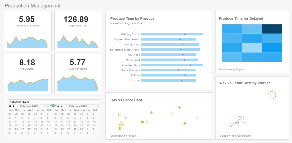
That’s it. That’s a quick summary dashboard made in a couple of minutes. What I can do is I can drag and drop a selection element, and then I can maybe take my customer company field, and I can drag it on there. By default, you’re going to be working in the live edit view, so you pull back at least the first 50,000s result based on the query to give you a small sample of what the dashboard looks like as you’re building it.
So, what I can do is I can drag and drop the customers. Because they’re row and column oriented, they fit to the grid instead of floating up like other elements. I can go ahead, and I can resize and format this however I want. If I choose a specific day, it’s going to show me which companies fall within that date.
My initial selections, these are considered valid selections. I don’t have to do anything to give the filtering, to give the interactivity to the dashboard based on that backend. How we know the columns relate is that our tool automatically does it for you.
I can drag and drop a range slider, and I can drag and drop order date on it. That way I can enable people to look at all of the historical data or just the most recent, the past couple of months or so. So, I can automatically start changing the date range which I’m looking at for my data. Maybe I want to look at my overall revenue numbers data in my selection. I can choose the date.
I can change the look and feel of the dashboard if I want. I can set a highlighting in it. That way using red and green, what is the goal I’m looking to hit there, and I can just go ahead and I can drag and drop. Now, of course drag and drop doesn’t work for all elements. Chart elements which are typically the central part of most interactive dashboards, those have multi-dimensional visualizations.
You use the edit button where this will look very much like, if you remember, when I was creating my own bookmark, and I was making the ad hoc changes to the data binding, it had this view. So, this is the view that you work from. You can just drag and drop a column such as my product category right there on to my chart. I can look at my different clients’ purchases for the different categories.
I can see which sales person did which portion of which category sales. I can just drag and drop these elements into the binding area, and I can have my chart. So, now as a user, with my permission to save in my repository or whichever folders I can save to, that controls which dashboards I have permission to view and what actions I can or cannot perform on certain dashboards.
Certain ones I can view and modify. You can control all that with the data level security, and so now I can go ahead, and I can save my dashboard. Now end users with permission to see the dashboard at that level where I was able to save it can now go in and view my dashboard and start interacting with it right away, choosing the specific company to look at the sales for, choosing a specific date.
All of that interactivity is there because I’m a user who has the right security enabled. I can also go ahead and do that ad hoc editing and I can change up my chart a little bit if I want to, and I can bookmark that view, and I can save that view and save it for later. I can go ahead, and I can save this new bookmark and again, you give the bookmark a name, you choose whether or not you want to share it, if you want to share with all the users.
Some of the things whether or not they have permissions to change that bookmark, you can go ahead, and you can make all of these decisions, and save that bookmark. You can start to annotate on the element, and you can just start that interactivity right away once you saved it. And again, based on permissions other users can now come and use the dashboard, or they can make changes to it. They can just make comment on my bookmark that I just shared if it’s editable.
All of that is for multiple end users to be able to use the same components. That was a simple example where I was able to create a dashboard based off of a data model that my developers have provided. The data worksheet is a more advanced tool where you can actually pull data from more than one database. Here I have all my order information. One database here has my return information.
I can choose which columns that I want to pull in, and then I can define the relationship between these two databases, join them together, and I can use now this combined results set, or data mashup, as a basis for my dashboard or report. Again, you can enable end users to do that and use the drag and drop mechanics in the data worksheet area to join data sources together. They don’t even have to be same type. One could be an Excel file, and one could be a relational database, and you can mash that data together, and then you can report off it.


