Sales Team Reporting
This is the continuation of the transcript of a Webinar hosted by InetSoft on the topic of "What are the Benefits of a Visual Reporting Solution?" The speaker is Abhishek Gupta, Product Manager at InetSoft.
Ok, the next question comes from Lexie.
Lexie: Can you hear me?
I can hear you, yes.
Lexie: I was just hoping maybe you could expand a little bit on your ability to do sales team reporting, being able to report on the performance of individual members of the sales team and some of the different ways that you might be able to represent their performance graphically? What you already mentioned was really interesting here so I just thought that maybe you could give us an overview of what would be available in that regard?
Yes, that’s a good question. Let me go back to the last demo which has several sales analysis charts in it. So this set of dashboards is about sales pipeline and sales performance, and there are a couple of charts in here that are about comparing the different sales staff. This one, and this is a small team with a demo data set, this is called a heat map.

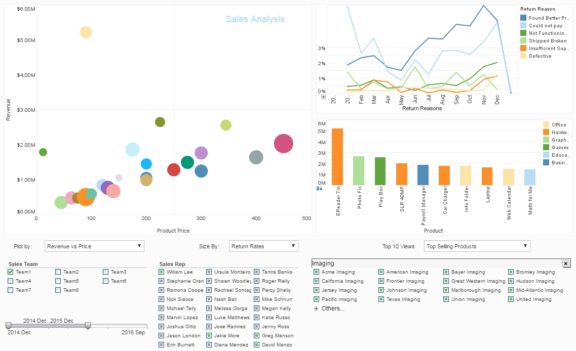
Sales Team Performance Overview
This is taking two levels of performance, one is Sarah Foster, with the circles sized by how much of our revenue she has in her pipeline, and her circles are colored by the average probability of what's in our pipeline so would you like to see big green circles here. Sarah has big circles. She’s got a lot. She is not as far up in the spectrum as Mark who is the strongest, and he is a lot better than these other three.
So you’re actually looking at this performance across the whole sales team. There are three people who have smaller pipelines, and they are less far along. There are three more that look like they’re doing pretty well, and there is somebody in the middle. This scales are better if you have a large team. This could be sub grouped into regions, and you could have several 100.
We have this kind of visualization done for some stock portfolios and retail stores where you can have thousands of things in this, but the concept is the same, we’re using size and color that quickly highlight patterns. Now we got some good examples how this can communicate well with management.
This particular chart is really helpful not only in looking at are we going to reach our numbers. It also shows us is our sales staff performing in a way that we expect. Several of our customers are using this as a really good coaching tool to help to improve the overall performance in their team. You don’t want to be smaller and red.
Then there is more traditional view that is basically the same data where we have laid it out in bar chart with metrics. So there is a goal line here. You want to have a hundred opportunities. It looks like three people have a dollar amount over. It was like two million dollars sales quota. You can also see the same chart for expected revenue. You see the average amount the probability as well.
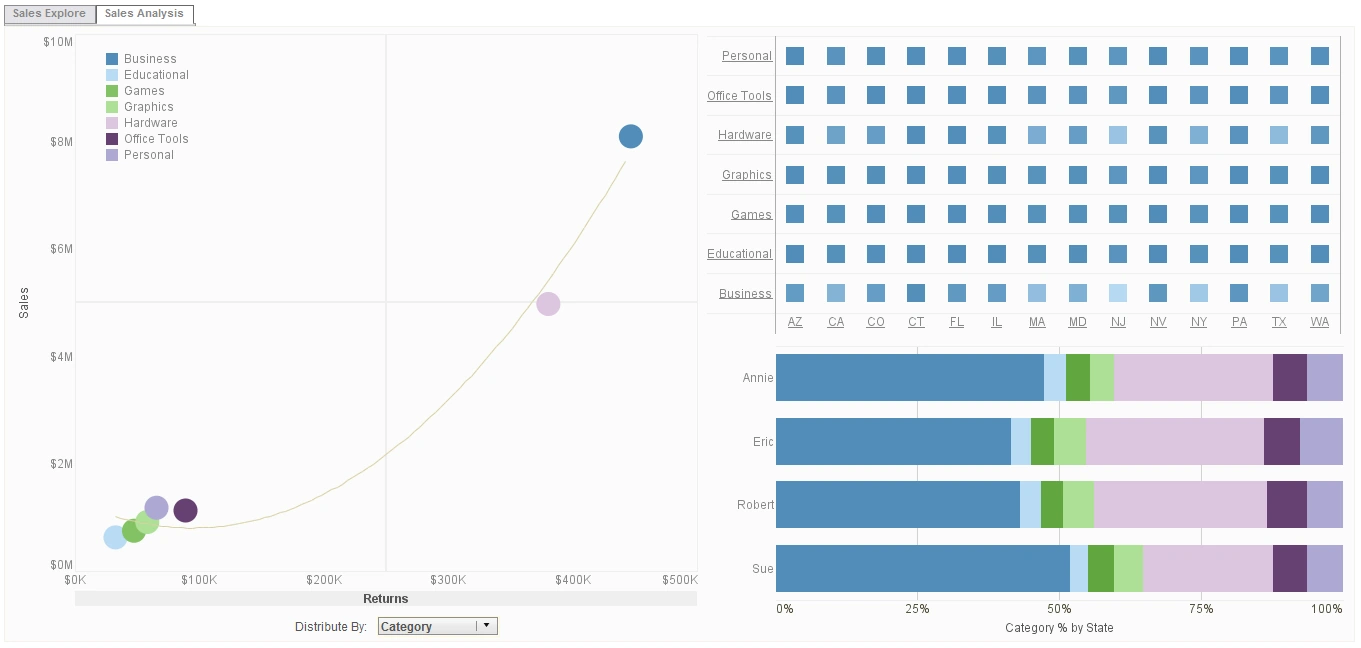
Sales Performance Insights
So this is another sales reporting tool that lets you grab the salespeople who have the highest amounts. This will change the coloring on the others. So they actually have the most opportunities, the most expected revenue, the average, but they don’t have the biggest deal sizes. They’re actually in the middle, the ones with the bigger average deal sizes or smaller deals. So you can go back and forth this way as well.
And the third sales performance chart highlights under performance. There’s a variety of ways, but this is showing individual deals, and it's using time to close and probability. There is size. So there is lot going on in here, but you could say, what are these deals over here. So these are the one that are stuck. So this is showing problems in the sales team. I can come back over here and see who has them.
By coloring by salesperson, now out of the deals that are stuck, and I see that Liz and Emma and Jess are little bit underperforming. Those deals and these people don’t have issues. So I’m actually seeing how these people are comparing across different aspects of performance.
There are a lot of other things we can do, but there are sort of three classical approaches to looking at a sales team which would be analyzing the whole portfolio, which would be something like this, comparing against a set of metrics which could be activities. It could be a variety of things and have a format like this. The next is looking at movement across time, and there is a trend line here. You can see how some are getting stuck, and some are getting hung up and slowed down.

The Three Classical Approaches to Looking at a Sales Team
Behavioral Approach
The behavioral approach to examining a sales team emphasizes the individual actions, habits, and interpersonal skills of sales representatives. This perspective looks closely at how salespeople engage with clients, manage relationships, and perform daily routines that either drive or inhibit success. Sales coaching under this model often focuses on training communication techniques, improving listening skills, and refining persuasive abilities that can positively impact customer interactions. By evaluating observable behaviors, managers can pinpoint patterns that correlate with both high and low performance, making it easier to tailor interventions.
From a management standpoint, the behavioral approach is highly actionable because it provides concrete areas for development. For example, if a sales rep struggles with objection handling, targeted training and role-play scenarios can be implemented immediately. However, this method also risks overlooking broader systemic issues, such as market conditions or structural misalignments in compensation. Nevertheless, it remains a popular lens because it translates directly into coaching strategies that can produce measurable improvements in sales performance.
Quantitative Approach
The quantitative approach views the sales team primarily through metrics and performance data. This perspective relies heavily on key performance indicators (KPIs) such as conversion rates, average deal size, customer acquisition cost, and revenue per salesperson. By focusing on numbers, this approach provides objective benchmarks that can be used to compare individual and team performance, track progress over time, and forecast future outcomes. The quantitative model is especially valuable for large organizations where managers need a standardized way to evaluate dozens or even hundreds of sales representatives.
One of the main strengths of the quantitative approach is its ability to identify trends and patterns that might not be visible through intuition alone. For instance, data may reveal that a team is closing deals effectively but struggling with renewals, highlighting a retention issue. On the other hand, over-reliance on metrics can sometimes reduce complex human interactions into oversimplified figures, potentially demoralizing salespeople who feel treated as numbers rather than professionals. To balance this, many organizations combine quantitative insights with qualitative assessments.

Structural Approach
The structural approach to analyzing a sales team examines how the team is organized, incentivized, and supported by the company’s broader systems. This perspective includes evaluating the division of territories, the alignment of roles (such as hunters versus farmers), the structure of compensation plans, and the integration of sales with marketing and customer success. Structural analysis often reveals whether bottlenecks or inefficiencies are rooted in the organization rather than the individuals themselves. For example, overlapping territories may create conflict among sales reps, while unclear commission plans can lead to disengagement.
This approach is particularly useful for leadership when considering long-term strategies, as structural adjustments can drastically reshape outcomes without requiring changes in personnel. A poorly designed compensation system, for example, may discourage collaboration, whereas a more balanced one can align incentives with company goals. At the same time, the structural approach requires careful consideration, as even small changes can disrupt morale or productivity if not communicated properly. When used alongside behavioral and quantitative methods, it offers a holistic view that ensures both people and systems are aligned for sustainable success.