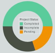
Status Dashboard Examples
InetSoft provides a powerful application for creating real time status dashboards that can meet the demands of even the most sophisticated consumers. With the ability to pull in fresh data from all sources every time the dashboard is refreshed or loaded, managers can always have the most up to date information, without any time lag or manual update process.
InetSoft has combined high-performance data accessibility with the ability to easily generate visualizations and reports, so business owners can analyze data in new ways without needing tech help. Whether your preference is paginated reports or interactive charts and visualizations, they will all load with the most

Status Monitoring with Intelligent Caching
With InetSoft's technology, data access happens in real time by default, which means constant accessibility to the most recent status data possible. InetSoft's data mashup engine has the ability to access almost any data source, seamlessly extracting and combining data from multiple sources simultaneously. The range of sources includes relational databases such as Oracle, SQL Server, PostgreSQL, and MySQL via a JDBC driver, multidimensional databases, salesforce.com, Microsoft Excel spreadsheets, Hadoop/HIVE, Google Adwords and Analytics, SAP, and many more.
While having a real time dashboard constantly updating with real time data is desirable in some cases, sometimes the sheer volume of data being loaded makes this impractical. These large sets of data are made manageable with InetSoft's combination of caching, materialized views, and pre-aggregation techniques. For when massive data volumes create slow load times, InetSoft's data grid cache technology can be set at desired time intervals so the data can be relatively up to date, in accordance with the user's needs. A dashboard can be set to pull in and cache necessary data every day, every hour, or at whatever interval fits your organization's needs. With InetSoft's robust data caching, dashboards which process millions of records can be loaded and interacted with in real time.
With the data compression of InetSoft's intelligent caching technology, the processing of Big Data can now occur on a normal sized server. InetSoft's BI platform has a 90% compression rate and can scale up as performance, usage, and database sizes grow. The flexibility of InetSoft's real time vs cache technology will enable you to strike a happy medium between fast load times and up-to-date information.
Interactive Real Time Status Visualizations
The flexibility of the InetSoft tool extends to the production of visually compelling status dashboards that enable analysts to interact with data in real time. Rather than having to rely entirely on pre-built database queries, InetSoft's Data Block technology allows for a user-friendly data mashup in a Lego-like block fashion, visually representing data in a way that is understandable to business users.
From there, the mashed up Data Blocks can be transformed and assembled into personalizable, interactive dashboards, complete with capability for drilldown, brushing, and other features for robust data exploration.
With InetSoft's award-winning real time dashboard software, business users can get the up to date insights without having to rely on IT help.

About InetSoft
Since 1996 InetSoft has been delivering easy, agile, and robust business intelligence software that makes it possible for organizations and solution providers of all sizes to deploy or embed full-featured business intelligence solutions. Application highlights include visually-compelling and interactive dashboards that ensure greater end-user adoption plus pixel-perfect report generation, scheduling, and bursting. InetSoft's patent pending Data Block™ technology enables productive reuse of queries and a unique capability for end-user defined data mashup.
This capability combined with efficient information access enabled by InetSoft's visual analysis technologies allows maximum self-service that benefits the average business user, the IT administrator, and the developer. InetSoft was rated #1 in Butler Analytics Business Analytics Yearbook, and InetSoft's BI solutions have been deployed at over 3,000 organizations worldwide, including 25% of Fortune 500 companies, spanning all types of industries.

10 InetSoft Dashboard Example Articles
-
Interactive Dashboard Examples
This page presents a gallery of live, interactive dashboards across industries (marketing, operations, healthcare, etc.). Users can click the examples to open working dashboards and get a feel for InetSoft’s capabilities. The examples showcase real-time updates, filtering, mashups, and dynamic visuals in action.
-
Dashboard Examples Gallery
This article shows sample dashboards such as admissions KPI, census, supply chain, construction, and account manager performance dashboards. The purpose is to demonstrate how diverse use cases can be realized via InetSoft’s platform. It also includes interactive filtering and visual breakdowns of key metrics.
-
Best Dashboard Designs
This write-up offers examples of dashboard designs (manufacturing KPIs, accounts receivable, service operations) that follow good design principles. The examples emphasize consistent layout, clean visuals, and clarity in presenting multiple measures. It guides users by showing how to combine charts and KPIs in effective dashboards.
-
Sample BI Dashboards
Here you’ll find a set of sample dashboards like call center monitoring, fraud management, healthcare informatics, and credit approvals. Each dashboard emphasizes interactivity: filtering, brushing, and data-driven updating. The page demonstrates how different domains can use a unified dashboard model within InetSoft.
-
BI Visualization Gallery
This gallery contains dashboards such as geographic tracker, sales summary, efficiency analytics, construction, insurance, and call center views. It’s intended to spark ideas by showing how visual components are arranged on real dashboards. Users can explore print and live versions of these dashboards to see layout and navigation patterns.
-
Business Dashboard Examples
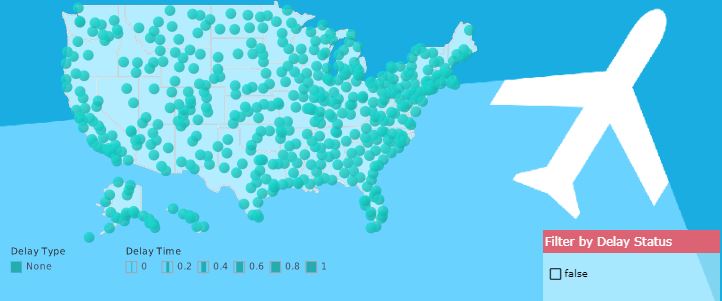
This article features business dashboards like account manager scorecards, census analysis, operations KPI, marketing lead maps, and call center auto-refresh. The purpose is to showcase business use cases of dashboards in sales, operations, and service domains. It highlights interactivity, auto-refresh, and map visualizations tied to business metrics.
-
Monthly Dashboard Examples
This page describes how dashboards can be structured around monthly cycles to track evolving business metrics. It emphasizes automating the delivery (scheduling, email, archival) of monthly dashboard reports. The examples show how sales, production, and operations metrics can be aggregated monthly for management review.
-
Daily Dashboard Examples
The article demonstrates dashboards that refresh daily (or in real time) with up-to-date metrics like production efficiency, inventory, sales, and quality. It shows how users can build mashups of live data blocks and incorporate interactive features (drill-downs, filtering) into daily dashboards. The idea is to deliver actionable insights with minimal lag behind data updates.
-
Completed Dashboard Example
This page describes a completed dashboard example (e.g. customer service performance monitoring) built using InetSoft’s full toolset and data mashups. It emphasizes how users can build “full” dashboards combining multiple data sources and visuals in a cohesive layout. The narrative also points out deployment flexibility and mobile/ browser access.
-
Using Dashboard Examples
This article surveys several dashboard use cases — machine maintenance, risk management, social media analytics, loan origination, customer service, etc. It frames the examples as templates or inspirations users can adopt in their domains. The page also emphasizes how the dashboards support interactive filtering and embedded analytics use.