Ways You Can Visualize Data
This is the continuation of the transcript of an InetSoft presentation and demo for a business intelligence analyst. The highlights are in the area of collaborative BI.
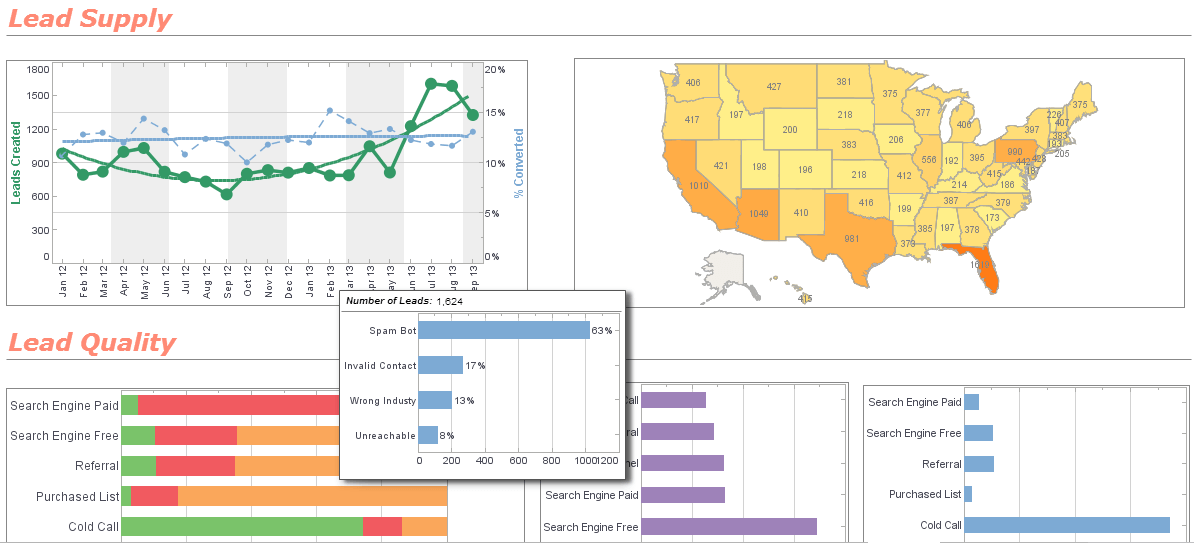
Some other ways you can visualize the data instead of a simple X and Y is multi dimensional visualization. Here we’re looking at data where we not only have an X and Y, but we have colored, sized and shaped our data. Again we can do explicit filtering. I can choose to look a specific region, say the west coast, and you notice that whenever you make a selection with the selection element all of the other selections are filtered based on the same underlying data.
The reason for that is because within the west region there are only two divisions. So we’re saying, based on your initial selection, these are the other valid selections that you can make. So only this state would be considered based on your initial selection. With charting another possibility is that you can find outliers. You can see that we have this hover tool. It shows you what the data looks like.
Highlighting Data Points
With that you can always highlight data points instead of doing a show details or instead of brushing it. You can also zoom in to see how those cluster of points relate to each other because those outliers are causing such a wide scaling of the X axis. So here we can highlight a little bit more of the movement toward collaboration. As long as you do not disable this option, any business user can actually make ad hoc changes, on the fly changes, on demand changes to the data binding.
So I can go ahead, and I can start changing the settings a little bit and removing some of my multi dimensional visualization. I can even pull in other columns that are available in that underlying data source onto an axis of this chart. I can set up my own view of the chart and bookmark it. So again as Mark mentioned before, that bookmark view I can then revisit it. So here I have some bookmarks that I created, and I can always go back to them.
So any user who has permission to do this can create their own bookmarked view of any dashboard they have permission to see. Now with the new functionality when I create a new bookmark I can actually explicitly say, yes share it with other users who have permission to see the dashboard or even share it within my group, my security group. You can see here that I have a different view. Now I’m looking at that analysis of bachelor’s degrees vs. incomes with the nice linear trend.
We can make this chart change, and now my dashboard is more than one dashboard. It can be a collection of different bookmarked views. On this next bookmark view we’re looking at magnitude versus change. We have the magnitude of the population in the horizontal expansion of the bar and the change in population in the vertical expansion. You’ll notice that we’ve actually taken a point of noting, here the high percent change.
Annotating and Sharing Bookmarks
What we did was annotate on this point. This is the other new functionality that works with the sharing of the bookmark. So you can annotate and keep the bookmark to yourself, or on a shared bookmark you can make these annotations, make these comments, and you can enable other users to edit your bookmark and save over it. So then they can make a comment and you can have the whole comment trail.
We are commenting on specific points in the chart, or you’re commenting on certain elements or some form of data display where you want to make a note that something is out of the ordinary or that the specific sales person is doing such a great job or not such a great job and maybe someone can look into that. So you can have this back and forth and then save it all in the bookmark.
You have this annotation noted and the annotation itself when you’re using the chart. It actually pulls up that data information as well. So you don’t even have to hand type that in it. It does it for you, and you can choose to include it or not include it in your note. So this is really nice new functionality that it’s helping with the overall concept of the collaborative BI solution that is easily enabled. All users need is a web browser and the permission to log in to be able to have access to that.
The last dashboard example that we like to highlight is a what if scenario.
Attendee: So Katie, I have a question about the collaborative kind of functionality. Is that something you got a lot of demand from your customers to implement, or is it something that you see that would be good for future.
Presenter: It seems like annotations and bookmarking, those were mainly product development ideas about improvements with bookmarking. We introduced personal bookmarking, and it was a natural request to make it sharable. We gather feedback from users in our forums, and this was a popular one.
Attendee: Okay.


