Advanced Visualizations and Time to Insight
This is a continuation of the transcript of a Webinar hosted by InetSoft titled "What's New in BI." The speaker is Mark Flaherty, CMO at InetSoft.
Mark Flaherty: Now let’s talk about advanced visualization. This one is really about time to insight. Or showing us what is beneath the tip of the iceberg. At the tip of the iceberg, that’s where the BI industry does really well, answering the bread and butter questions such as what are my sales by customer or even time period analysis. What are my sales by customer this year versus last year?
But where the BI industry lags in general is answering those complex questions, such as what is different about those customers with higher sales? So the less precise or the more exploratory questions, such as what are some of the characteristics of those customers? Or even what are characteristics of customers that are likely to churn? So if your users are asking more of these exploratory type questions, that are a big signal that advanced visualization, should be on your radar.
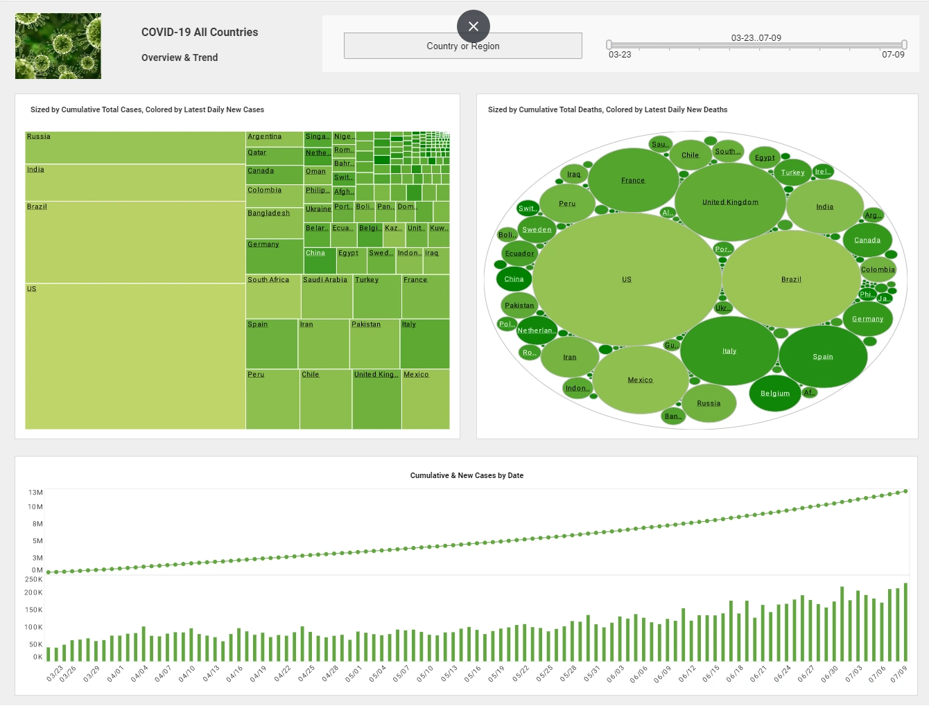
Visualization as a term gets thrown around a lot, so what do we mean by advanced visualization versus general visualization? General visualization is any kind of common chart type. All of the common BI tools support things like bar, line and pie charts, but they might make it more engaging.
Things like adding gradients or different color hues make prettier charts. Some people will say that is an advanced visualization. But I would differentiate it by the degree of interactivity, the process to get there, and whether less common chart types are supported.
Some of the less common chart types that you will only see only in a niche product, an advanced visualization tool, or you might only see it in the dashboard interface are examples such as small multiples where you are comparing the same time period, the x-axis and y-axis, but across different categories. Waterfall charts or network charts where you are trying to look at relationships, heat maps, or spark lines, or bullet graphs, are all types of advanced visualization chart types.
So the idea behind these less common chart types is that you’re getting more insight per pixel. So you are communicating more information. So think about that data overload. You’re trying to get to more information but distill it in a singled display or dashboard.
Advanced visualization tools tend to be much more interactive. Whereas a general purpose visualization within a report, there may not be any interactivity. It’s not guaranteed. Sometimes these advanced visualization capabilities are a separate tool, or a few of the vendors, like InetSoft, incorporate it as part of the core BI platform.
Case Study: Leveraging Data Visualizations for Enhanced Operations at Timberland Hunting Lodge
Background
Timberland Hunting Lodge, nestled in the scenic hills of Montana, is a premier destination for hunting enthusiasts. The lodge offers a variety of hunting experiences, from guided big-game hunts to small-game expeditions. With increasing competition and a need to improve operational efficiency and customer satisfaction, Timberland's Operations Manager, Jake Larson, decided to leverage data visualizations to streamline operations and enhance the lodge's overall performance.
Challenge
Timberland Hunting Lodge faced several operational challenges:
- Seasonal Fluctuations: Hunting seasons and animal migration patterns created variable demand, complicating staffing, resource allocation, and inventory management.
- Customer Preferences: Different types of hunters preferred varying amenities, gear, and hunting experiences, making it difficult to tailor services effectively.
- Wildlife Management: Ensuring sustainable hunting practices required careful monitoring of wildlife populations and adherence to conservation regulations.
- Marketing Effectiveness: Understanding which marketing campaigns were most effective in attracting guests was crucial for maximizing return on investment.
Solution
Jake implemented a comprehensive data visualization strategy using InetSoft's data mashup tool to address these challenges. The tool allowed him to integrate and analyze data from various sources, including booking systems, customer surveys, wildlife monitoring systems, and marketing platforms.
-
Seasonal Demand Forecasting:
- Visuals Used: Line charts, heat maps
- Data Sources: Historical booking data, weather patterns, migration reports
- Implementation: Jake used line charts to analyze historical booking patterns and heat maps to visualize peak periods. This helped in forecasting demand, optimizing staffing levels, and ensuring adequate inventory of gear and supplies.
-
Customer Preferences Analysis:
- Visuals Used: Bar charts, pie charts, scatter plots
- Data Sources: Customer surveys, booking preferences, on-site activity logs
- Implementation: Bar charts and pie charts illustrated the popularity of different hunting packages and amenities. Scatter plots helped identify correlations between customer demographics and preferred activities, enabling tailored marketing and service offerings.
-
Wildlife Population Monitoring:
- Visuals Used: Geographic information system (GIS) maps, trend lines
- Data Sources: Wildlife tracking data, conservation reports, regulatory guidelines
- Implementation: GIS maps displayed wildlife populations across different regions. Trend lines highlighted changes over time, ensuring sustainable hunting practices and compliance with conservation regulations.
-
Marketing Campaign Analysis:
- Visuals Used: Funnel charts, ROI graphs
- Data Sources: Marketing platform analytics, booking conversions, social media engagement
- Implementation: Funnel charts showed the conversion rates of different marketing campaigns, while ROI graphs tracked the effectiveness of each campaign. This enabled Jake to allocate marketing budgets more efficiently and focus on high-performing strategies.
Results
The implementation of data visualizations transformed Timberland Hunting Lodge's operations:
- Improved Operational Efficiency: Accurate demand forecasting allowed for better resource allocation, reducing wastage and ensuring optimal staffing levels during peak seasons.
- Enhanced Customer Experience: Understanding customer preferences enabled the lodge to offer personalized services, leading to higher customer satisfaction and repeat bookings.
- Sustainable Wildlife Management: Effective monitoring ensured compliance with conservation regulations, promoting sustainable hunting practices and preserving the lodge's reputation.
- Increased Marketing ROI: Data-driven insights led to more targeted marketing campaigns, increasing the lodge's visibility and attracting more guests.


