Metrics Reporting Guide: KPI Tracking, Dashboard Best Practices & Everything You Need to Know
Metrics reporting is the practice of defining, collecting, analyzing, and communicating the measures that indicate how a business is performing against its objectives. For a comprehensive key metrics definition and understanding their role, it connects the full data lifecycle—data capture, transformation, analysis, and presentation—so leaders can see what is happening and why, then take action. Unlike traditional reporting that delivers static, backward-looking summaries, modern metrics reporting emphasizes continual monitoring, rapid iteration, and context-rich insights that support day-to-day decisions as well as long-term strategy.[1]


The transition from static reports to dynamic metrics tracking has been driven by the availability of real-time data, self-service analytics, and sophisticated visualization techniques.[2] This evolution compresses decision-making cycles, shortens feedback loops, and helps teams respond to risks or opportunities in time to make a difference.
Effective metrics reporting brings together several core components: clear business objectives; well-defined data sources and integrations; a semantic model that aligns definitions across teams; visualization-driven reporting that highlights trends and outliers; and governance processes that protect data quality, privacy, and security.
Real-time or near-real-time data plays a critical role. From monitoring supply chain delays to tracking campaign responses as they happen, timely data allows organizations to adjust quickly and learn faster. This is where integrated platforms become essential. InetSoft's Style Intelligence combines a data mashup engine with visualization-driven reporting and dashboards, enabling teams to unify disparate data sources, explore them visually, and operationalize insights without waiting on slow, manual processes.
Metrics reporting matters because it closes the gap between data and decision-making. When organizations align measurement with strategy and bring data into the daily rhythm of the business, they create a culture where performance is visible, accountable, and improvable.
Understanding KPI metrics: the foundation of performance measurement
Key performance indicators (KPIs) are the small set of measures that reflect the outcomes most vital to achieving a strategy. All KPIs are metrics, but not all metrics are KPIs. A metric becomes a KPI when it is tightly coupled to a business objective and signals whether you are on track to reach a goal. Website traffic is a metric; qualified pipeline growth tied to a revenue target is more likely a KPI.
The SMART framework is a useful litmus test for KPI quality. Effective KPIs are specific (clearly defined), measurable (quantified with trusted data), achievable (realistic given resources), relevant (aligned with strategy and business model), and time-bound (tracked over a defined horizon with milestones).[3] SMART KPIs focus attention and reduce ambiguity, which is crucial for accountability.
Balance leading and lagging indicators. Lagging indicators capture outcomes that have already occurred—revenue, churn, or on-time delivery rate—while leading indicators predict future results, such as demo requests per week or first-contact resolution.[4] Leading indicators help teams act before a result is locked in; lagging indicators confirm whether those actions worked.
Selecting the right KPIs starts with strategy. Map objectives to outcomes, then to drivers. Many teams use an objectives-and-key-results (OKR) or strategy map approach to trace how inputs and activities influence outputs and outcomes.[5] From that cascade, choose a small, balanced set of KPIs that reflect both impact and health. Common pitfalls include choosing too many KPIs, favoring what's easy to measure over what matters, and failing to revisit KPI definitions as the business evolves.
Ensure every KPI has an owner, a target, and a defined method for calculation. Consistent definitions reduce debate, and ownership creates accountability. When KPIs align to strategic goals and are measured consistently, they become reliable signals that guide action.
What is a KPI dashboard and how does it work
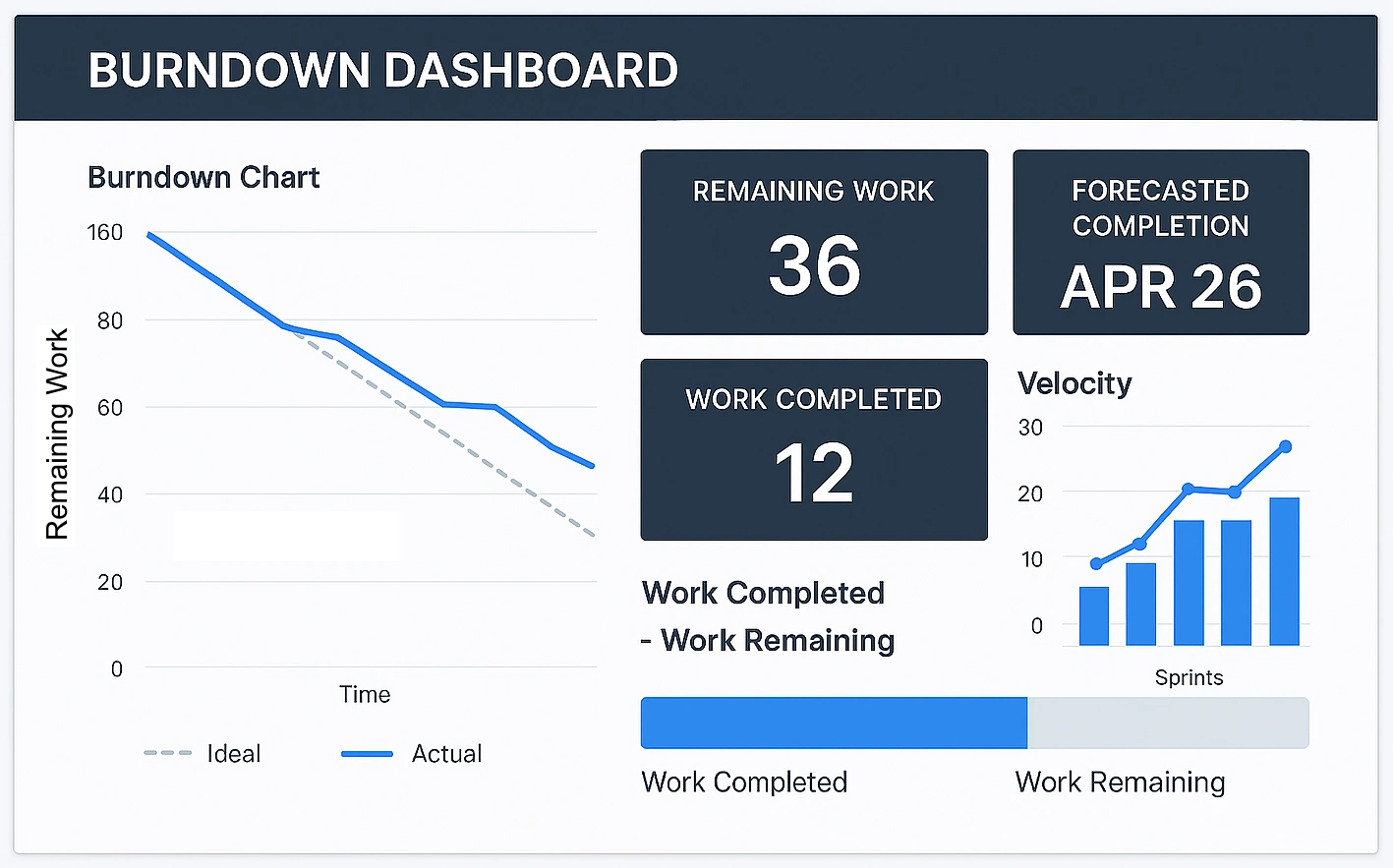
A KPI dashboard is a visual environment that consolidates critical measures, trends, and thresholds into a single, glanceable view. Its purpose is to transform raw data into understandable, actionable information for specific audiences—from frontline teams to executives. Dashboards differ from traditional reports by offering interactivity, immediate context, and updates that can range from scheduled refreshes to real-time data streaming.[6]
Dashboard systems follow a familiar architecture. They connect to sources such as databases, SaaS applications, files, and APIs; shape and join those data sets; apply calculations and business rules; and then render results through visualizations. Modern tools support drill-down (from summary to detail), drill-through (to related content), and filtering so users can answer the next question without waiting for a new report. Caching, incremental loading, and semantic layers help performance and consistency.
An effective dashboard includes a clear purpose, a succinct set of KPIs aligned to that purpose, intuitive layouts with strong visual hierarchy, and concise, accurate labeling. It should make the status of each KPI obvious and provide context with comparisons to targets, benchmarks, or prior periods. The best dashboards streamline cognitive effort: the key takeaway is evident within a few seconds, and deeper exploration is just a click away.
Real-time processing—whether true streaming or very frequent refreshes—adds value where timeliness changes decisions. An operations dashboard that shows current throughput and bottlenecks supports same-shift adjustments. For monthly strategic reviews, scheduled updates may be sufficient. The right cadence depends on use case and cost-benefit trade-offs.
InetSoft's Style Intelligence platform exemplifies this model with a visualization-driven approach and an embedded data mashup engine. By blending disparate data and presenting it through interactive dashboards, teams can move from "What happened?" to "Why?" and "What's next?"—all in the same environment.
Types of KPI dashboards and their specific use cases
Different audiences need different views of performance. Four dashboard types cover most organizational needs, each optimized for a distinct purpose and level of detail.[7]
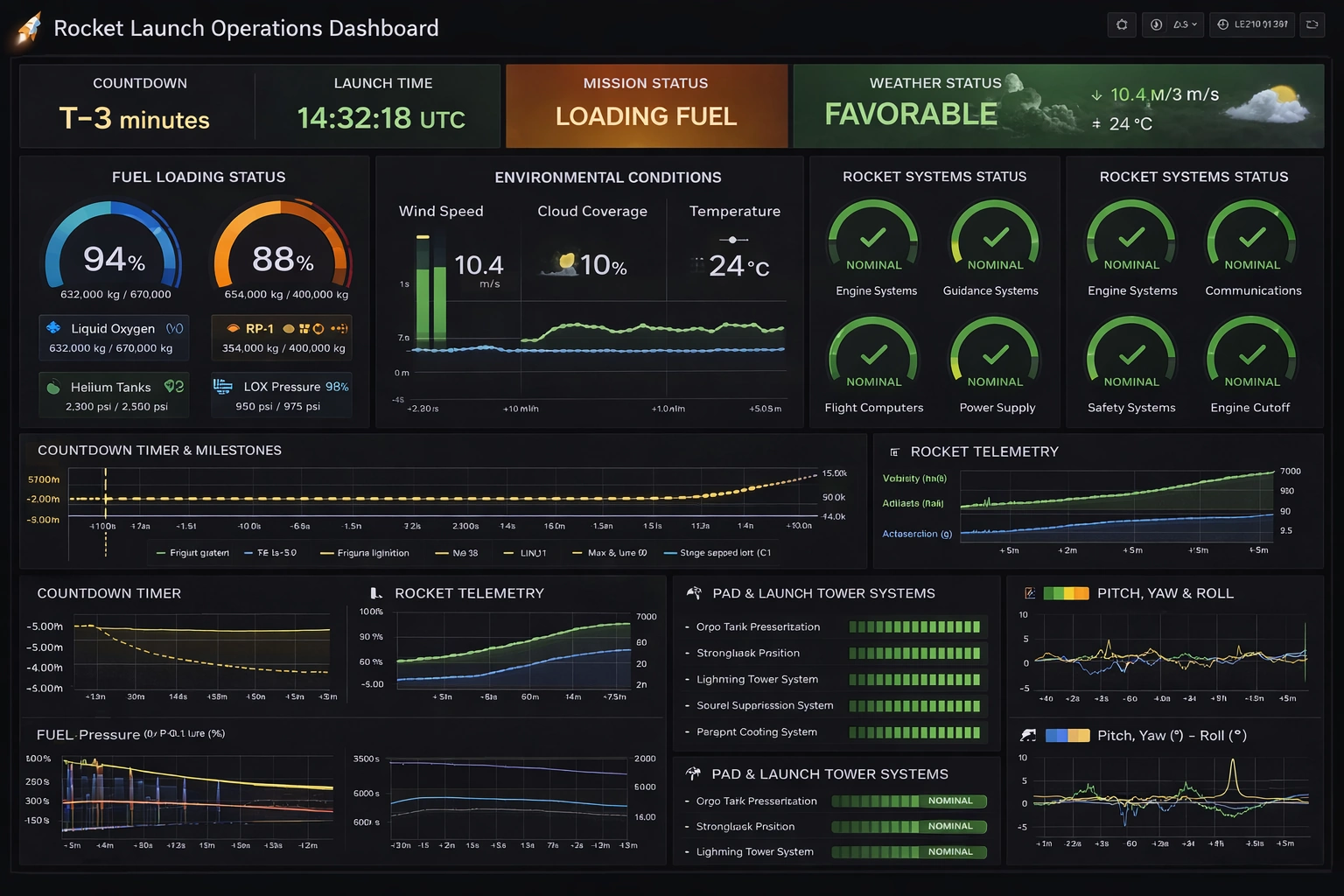
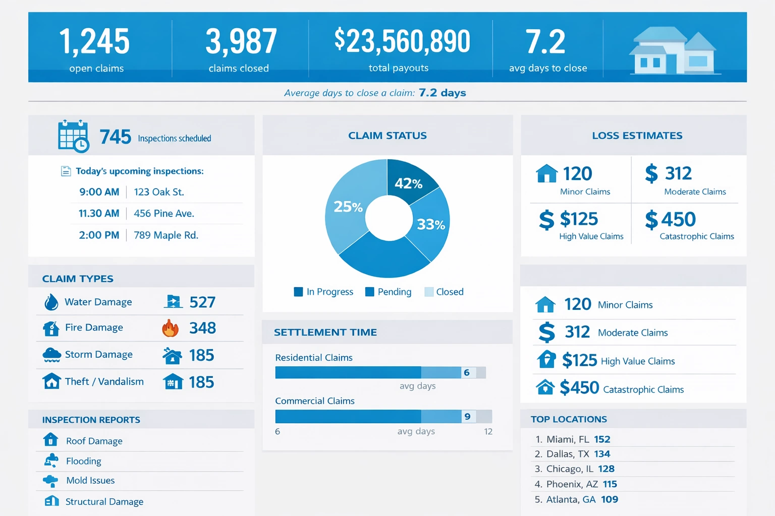
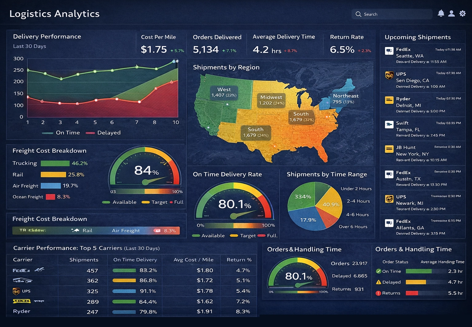
Operational dashboards support day-to-day execution. Used by frontline staff and supervisors, they highlight current workload, SLA adherence, output, and exceptions. Think of a contact center screen with real-time queue lengths, first-response times, and abandonment rates, or a fulfillment board tracking pick rates, on-time shipments, and inventory alerts. The goal is to detect and correct issues quickly.[7]
Tactical dashboards serve mid-level managers who coordinate teams and processes. They blend short-term outcomes with drivers and resource utilization—sales velocity by region, campaign performance by channel, production yield by line, or staffing levels versus demand. These dashboards guide weekly plans, coaching, and process improvements.[7]
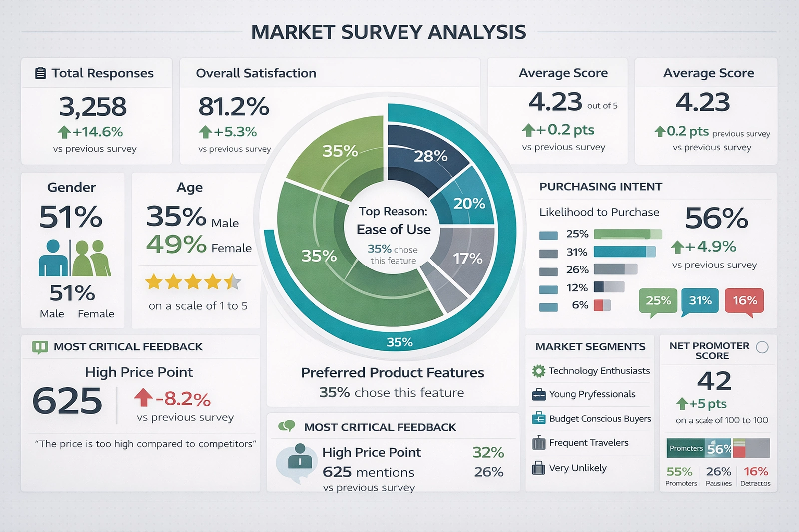
Analytical dashboards enable deep dives, trending, segmentation, and root-cause analysis. Data analysts and business partners use them to explore hypotheses, test correlations, and surface new opportunities—such as identifying segments with rising lifetime value or finding the factors most associated with project delays. These dashboards lean on richer interactivity, flexible filters, and drill-down.[7]
Strategic or executive dashboards distill the health of the business to a concise set of outcome KPIs—revenue growth, profitability, market share, retention, NPS, cash conversion, and risk indicators—framed against targets and forecasted trajectories. They are used in monthly and quarterly reviews to evaluate strategic initiatives, allocate capital, and course-correct.[7]
Choosing the right type starts with the decision cadence and audience. Operators need immediacy; executives need clarity and context. Analytical dashboards inform the other three by exposing the drivers behind results. A mature metrics program typically uses all four, linked by consistent definitions and drill paths.
Essential components of an effective KPI reporting dashboard
The most useful dashboards feel effortless to understand and navigate, yet they rest on deliberate design choices. Several elements consistently separate high-performing dashboards from the rest.
Start with purpose and audience. Every dashboard should answer a small set of questions for a specific role. That focus guides the KPIs you select and the level of detail you include. Apply user interface principles: use visual hierarchy to lead the eye from the most important metrics to supporting detail; group related content; and keep labeling crisp. Color should signal meaning (status, variance, category), not decorate.
A great dashboard communicates its main message in about five seconds and supports deeper questions without clutter.[8]
Match visualization types to the story. Bars and columns compare categories; lines show trends; scatterplots reveal relationships; bullet and gauge charts convey progress to target; tables with sparklines help when precise values matter. Use annotations to call out noteworthy events and thresholds to make exceptions obvious.
Interactivity accelerates insight. Filtering should be intuitive and relevant. Drill-down and drill-through should follow natural lines of inquiry (from company to region to account, or from a KPI to the underlying transactions). Personalization matters too—let users save views that reflect how they work.
Accessibility and sharing increase impact. Responsive layouts make dashboards effective on desktops and mobile devices. Distribution options—scheduled emails, links, and embed codes—ensure stakeholders see what they need, when they need it. Collaboration features like comments and snapshots help teams align on interpretation.
Simplicity is a feature. Resist the urge to cram everything on one page. If a metric doesn't inform a decision, remove it. Fewer, better signals reduce noise and build trust. Mind the data-to-ink ratio: remove gridlines, 3D effects, and decorative elements that don't convey information.[9]
KPI tracker tools and technologies for metrics reporting
Choosing a KPI tracking platform means balancing usability, connectivity, scalability, and governance. The best tools make it easy to blend data from many sources, define consistent measures, and present those measures in dashboards and reports that people actually use.
Evaluation criteria typically include: breadth of data connectors and API support; data preparation features (joins, calculations, blending, and governance); visualization flexibility and interactivity; performance at scale; embedded analytics and multi-tenant capabilities; security and access controls; and total cost of ownership. Consider who will build and consume content—self-service features are essential for business users, while IT teams value central governance and performance management.
Deployment model matters. Cloud services speed time-to-value and reduce maintenance. On-premises or private cloud may be preferred for strict data residency or compliance requirements. Many organizations adopt a hybrid approach—cloud where it fits, on-premises where needed.
InetSoft's portfolio addresses these needs end to end. Style Intelligence is a complete operational BI platform that pairs a data mashup engine with visualization-driven reporting, dashboards, and visual analysis—ideal for organizations that need to unify disparate data quickly and embed insights into workflows. Style Scope focuses on interactive data visualization and monitoring dashboards for broad business adoption. Style Report Enterprise delivers scalable enterprise reporting. All are 100% web-based and designed to be embedded, with multi-tenant hosting and white-label options that make it easy to deliver analytics to customers and partners at scale. For a comprehensive guide to metric reporting software, including KPI scorecards and real-time analytical reporting, explore our resources.
When weighing price and ROI, look beyond license cost. Account for the time saved on manual reporting, faster decision cycles, reduced data ambiguity, and improved outcomes. A platform that shortens the path from question to answer—and from answer to action—often pays for itself quickly.
Real-time reporting and automated data updates
Real-time reporting provides data as events occur, while automated reporting ensures the right people receive refreshed insights on a defined cadence or trigger. Both reduce manual effort and shorten the lag between change and response.
Real-time systems rely on streaming ingestion, low-latency processing, and dashboards that can display changes as they happen. In practice, many use near-real-time refreshes (every minute or five minutes) because they deliver similar value at lower cost. The right choice depends on how time-sensitive the decisions are and the complexity of your data sources.
Automated refreshes and distribution close the loop. Schedule data updates aligned with business rhythms—daily for finance, hourly for warehouse operations, continuous for fraud detection. Use alerting to notify owners when a KPI crosses a threshold, and deliver snapshot reports to stakeholders who need records for compliance or audits.
When to go real-time? It's essential when a delay changes the decision: plant floor monitoring, logistics exceptions, trading and risk controls, or website conversions during live campaigns. Otherwise, a frequent schedule may suffice and be easier to manage. Always consider latency sources—source system lags, processing time, and network overhead—and set expectations accordingly.
InetSoft platforms support automated updates and distribution, so teams can mix real-time dashboards for operational use with scheduled reports for governance and record-keeping, all within a single environment.
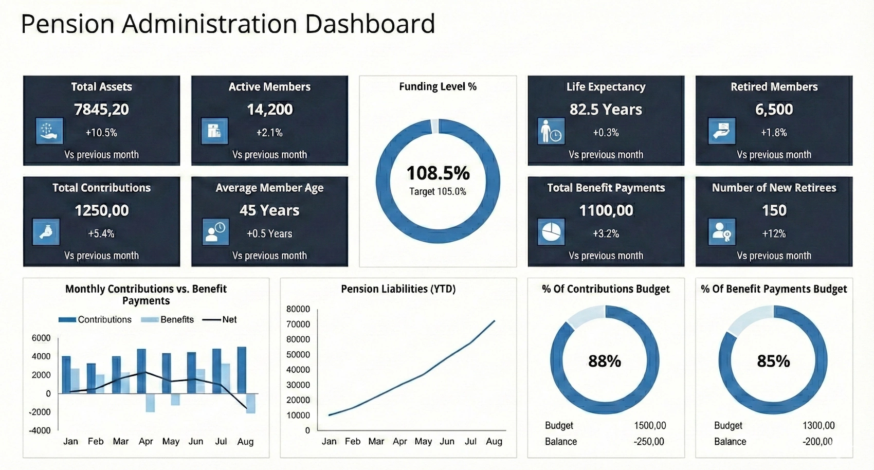
Industry-specific KPI dashboards and metrics
Dashboards become most valuable when tailored to a function or industry. The metrics that matter, and the pace of decision-making, vary widely across domains.
Sales and marketing: Track pipeline coverage, win rate, average deal size, sales cycle length, conversion rates by channel, cost per acquisition, and lifetime value. Align leading indicators (meetings booked, demo requests) with lagging outcomes (bookings, revenue). Combine CRM, marketing automation, and web analytics to see the full funnel.
Finance: Monitor revenue growth, gross and operating margins, expense ratios, cash conversion cycle, DSO/DPO, forecast accuracy, and variance to budget. Use waterfall charts for variance analysis and trend lines for forecasts. Integrate GL/ERP data with planning systems for a single version of truth. Learn more about leveraging financial reporting dashboards for real-time visibility into financial performance.
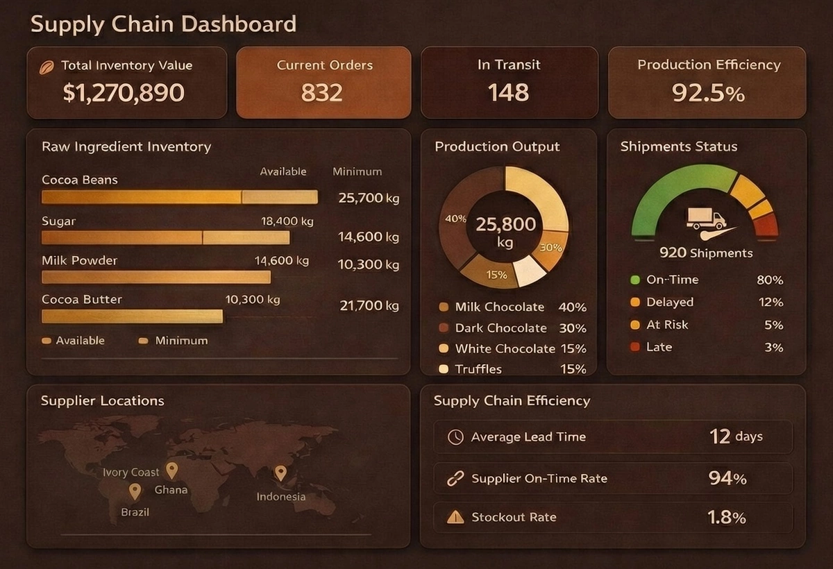
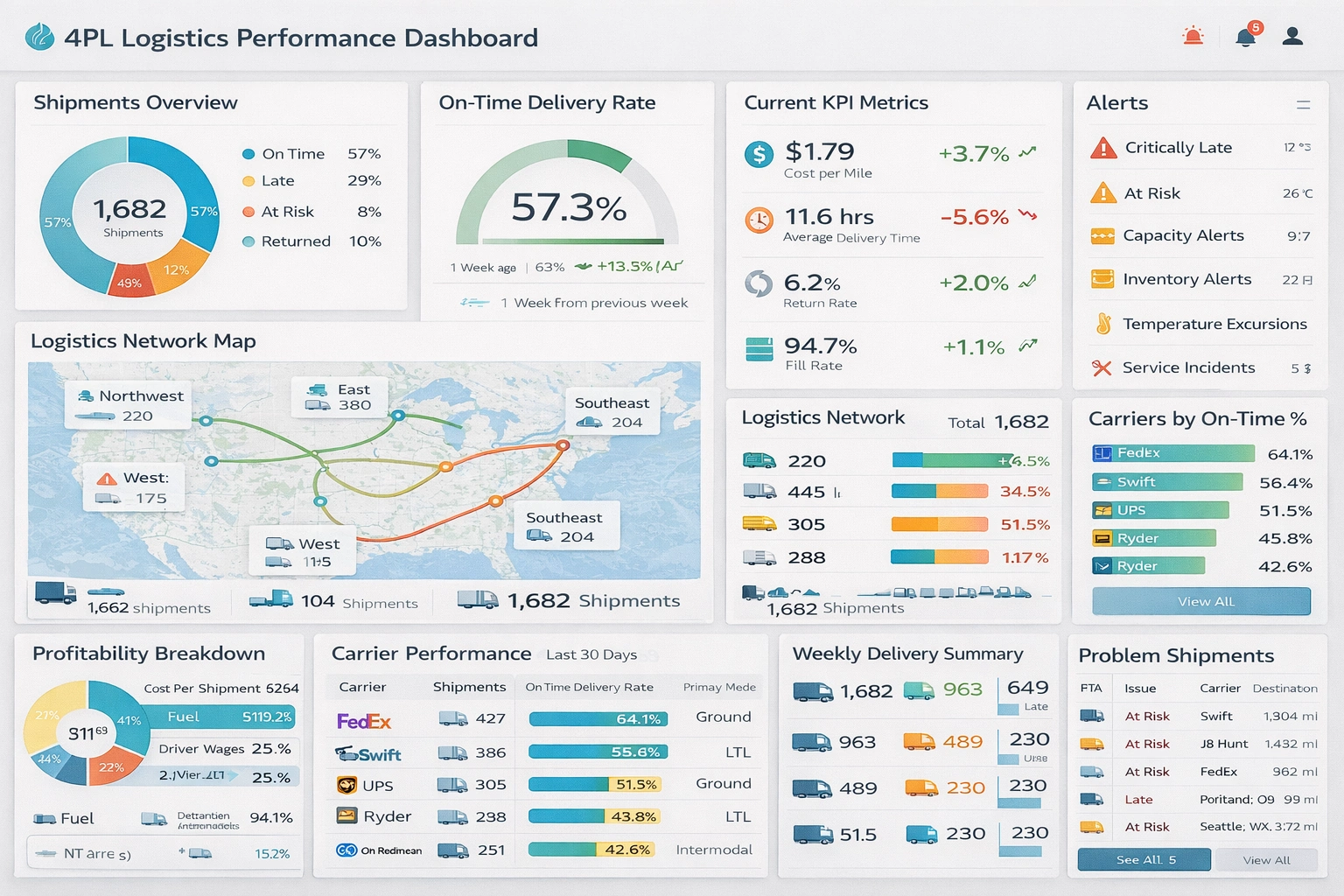
Operations and manufacturing: Focus on overall equipment effectiveness (OEE), throughput, yield, scrap rate, first-pass quality, downtime by cause, and on-time delivery. Real-time views help supervisors respond to bottlenecks; historical analytics support root-cause investigations and continuous improvement.
Customer service and support: Key measures include first response time, first contact resolution, backlog, SLA attainment, CSAT, and NPS. Segment by product, channel, and severity to spot patterns. Tie cases to product quality or release cycles to drive upstream fixes.
HR and workforce analytics: Track headcount, turnover and retention, time to hire, quality of hire, diversity and inclusion measures, absenteeism, and engagement scores. Link people metrics to business outcomes—productivity, revenue per employee, and safety incidents—for a holistic view.
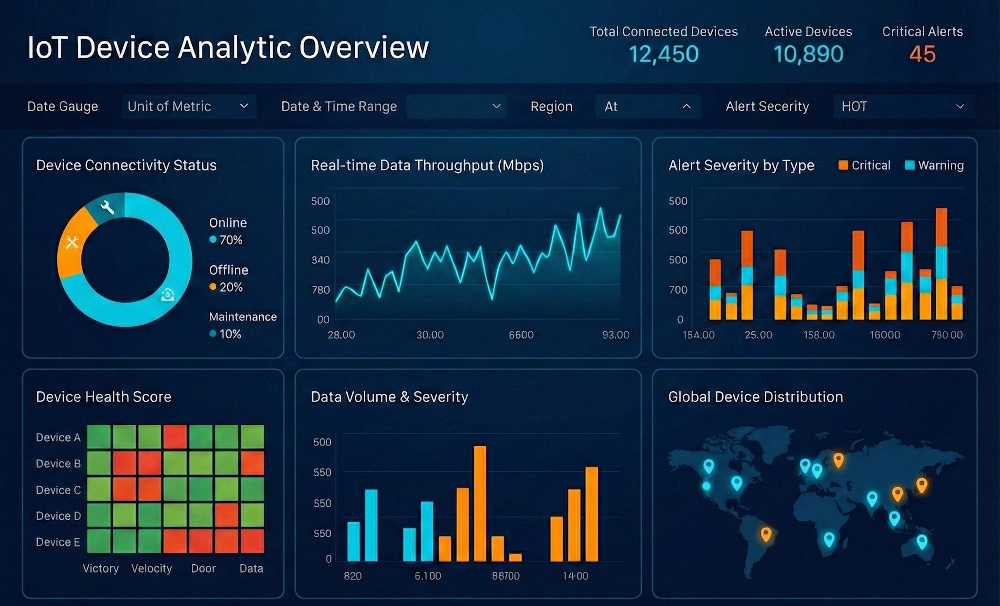
IT and infrastructure: Monitor uptime, MTTR, incident volume and severity, capacity utilization, change success rate, and security posture (vulnerabilities, patch status, threats). Combine monitoring tools with ticketing data to correlate events and prioritize resilience.
Healthcare: Patient throughput, length of stay, readmission rates, appointment no-shows, clinical outcomes, and staffing ratios underpin quality and efficiency. Privacy and access controls are central to compliant analytics and reporting.
Retail: Same-store sales, basket size, sell-through rate, markdown impact, inventory turns, stockouts, and footfall. Merge POS, eCommerce, and loyalty data to personalize offers and optimize assortment.
Professional services: Utilization, realization, billable hours, project margin, backlog, DSO, and client satisfaction drive profitability. Project dashboards should surface risks early—scope creep, staffing mismatches, or delayed milestones.
With Style Intelligence and Style Scope, organizations can tailor dashboards to these contexts while reusing governed metrics and visual components. That balance—shared definitions plus custom views—reduces friction and accelerates adoption across functions.
How to create an effective KPI report: step-by-step process
While dashboards support ongoing monitoring, KPI reports provide structured narratives and context—ideal for monthly and quarterly reviews. A disciplined approach ensures your reports are focused, credible, and actionable.
1) Define objectives and audience: Clarify the decisions the report should inform and who will read it. Executive audiences need concise outcome KPIs with commentary; operational teams need more driver metrics and detail.
2) Inventory and validate data sources: Identify systems of record and owners. Reconcile differences in definitions and timestamps. Establish a clear lineage so results are defensible.
3) Select and prioritize KPIs: Choose a small set aligned to strategy, balancing leading and lagging indicators. Document calculation rules, filters, and granularity. For a deeper dive into creating report metrics and defining them within a business intelligence platform, additional resources are available.
4) Set targets and thresholds: Use budgets, historical benchmarks, and external references to define success. Visual cues for variance make interpretation easier.
5) Choose appropriate visuals: Match chart types to the story and label clearly. Where precision matters, include tables; where patterns matter, emphasize trends and variance.
6) Structure the narrative: Lead with a summary page of KPIs and key takeaways, followed by supporting analysis and drill-downs by segment, product, or region. Include a short commentary that answers "What, so what, now what?"
7) Review and QA: Validate numbers with data owners; test filters and links; proof for clarity. Consistency builds trust.
8) Distribute and schedule: Align report cadence with business rhythms and automate delivery. Archive snapshots for audit needs.
InetSoft's Style Report Enterprise streamlines these steps with scalable enterprise reporting, while Style Intelligence unifies the data preparation and KPI definitions used across dashboards and reports, ensuring consistency end to end.
Dashboard design best practices and principles
A great dashboard communicates its main message in about five seconds and supports deeper questions without clutter.[8] Achieving that balance requires attention to visual and cognitive principles.
Establish a strong visual hierarchy. Place the most important KPIs at the top-left (or where users look first), then move to contributing drivers and details. Group related content and use consistent scales and formats to minimize mental switching costs.
Use color sparingly and purposefully. Reserve strong colors for alerts and exceptions; use muted tones for context. Ensure sufficient contrast and accessibility for all users, including color-blind-friendly palettes. Always pair color with labels or icons so meaning does not rely on color alone.
Mind the data-to-ink ratio: remove gridlines, 3D effects, and decorative elements that don't convey information.[9] Favor compact designs—sparklines, bullet charts, and small multiples can show a lot without overwhelming the reader. Thoughtful white space improves readability and focus.
Avoid common pitfalls: too many KPIs, inconsistent time ranges, axes that distort comparisons, and navigations that hide critical filters. Test with representative users and iterate based on feedback; watch how they scan and click to refine layout and interactions.
Design responsively. Many users will view dashboards on laptops, tablets, or phones. Responsive layouts and mobile-friendly interactions (bigger touch targets, simplified filters) ensure insight travels with the user.
Data reporting dashboard integration and connectivity for comprehensive metrics reporting
Comprehensive metrics reporting depends on connecting the dots across systems. That means reliable integrations, consistent definitions, and governance that preserves trust as data flows.
Common patterns include native connectors to SaaS apps and databases, REST APIs for custom systems, and file-based feeds for flat files. ETL/ELT pipelines extract, transform, and load data into analytical stores—data warehouses for structured reporting and data lakes for flexible exploration. A semantic layer translates raw sources into governed, business-ready fields and KPIs.
Quality controls are essential. Apply validation rules at ingestion, profiling to find anomalies, and reconciliation checks across systems of record. Standardize calendars, currencies, and hierarchies to keep comparisons accurate. Data lineage and cataloging help teams understand where numbers come from.
Security and governance should be designed in, not bolted on. Role-based access, row-level security, encryption in transit and at rest, and audit trails protect sensitive information. Compliance requirements (like GDPR and CCPA) inform retention and access policies.
Real-time versus batch integration is a trade-off. Use streaming and micro-batches for operational decisions; rely on scheduled loads for financial consolidation and planning. Many organizations use both, depending on the use case.
InetSoft's Style Intelligence includes a data mashup engine that simplifies blending disparate data sets—operational, cloud-based, or on-premises—and exposes a unified model for dashboards and reports. That approach reduces the friction between integration, analysis, and action.
Using KPI dashboards to drive action and decision-making
Dashboards only create value when they prompt action. Turning insight into outcomes requires alignment, ownership, and routines that tie metrics to decisions.
Start by linking every KPI to a strategic objective and a playbook: who owns it, what good looks like, and the likely levers to pull if it goes off track. Ownership brings accountability; published targets and thresholds clarify expectations.
Design for decisions. Make thresholds visible, surface exceptions, and use annotations to explain changes. Provide direct links to systems where action happens—open the CRM opportunity list from a revenue shortfall tile or a ticket queue from a rising backlog chart. Alerts and subscriptions should reach people who can act, with enough context to triage quickly.
Institutionalize review cadences. Weekly operational huddles, monthly business reviews, and quarterly strategy sessions each use dashboards differently. Establish simple rituals: begin with the KPI summary, discuss gaps and causes, agree on actions and owners, and track follow-up. That rhythm prevents analysis paralysis and keeps attention on outcomes.
Socialize and train. Make dashboards easy to access, teach people how to interpret them, and encourage questions. As adoption grows, refine content based on what users search, filter, and click most. The goal is a self-reinforcing loop: better dashboards, better decisions, better results.
Advanced dashboard features and capabilities
As analytics matures, dashboards are evolving from descriptive status boards to intelligent assistants. Several capabilities are accelerating that shift.
Predictive analytics and forecasting extend trend lines into the future, using statistical techniques and machine learning to estimate likely outcomes. When paired with scenario controls, managers can test "what if" changes—pricing, staffing, or marketing spend—and see projected impacts on KPIs.
AI and machine learning assist in pattern detection and anomaly spotting, surfacing unusual spikes, dips, or correlations without manual hunting. Automated insights explain key drivers behind a change—why churn rose in one segment or why conversion jumped after a campaign tweak—saving teams hours of diagnosis.
Natural language experiences lower the barrier to analysis. With natural language queries, users can ask questions in plain English—"Show revenue by region this quarter vs. last"—and receive an appropriate visualization plus a short narrative. Natural language generation can summarize dashboards in a few sentences for quick takeaways.
Interactivity continues to deepen: drill-down, drill-through, cross-filtering across tiles, and personalized bookmarks speed exploration. Mobile optimization ensures these features work on the go, while collaboration tools enable comments and shared snapshots to capture decisions in context.
Embedded analytics brings insights into the applications people already use—CRM, ERP, or customer portals—reducing context switching and expanding the reach of analytics beyond internal users. InetSoft's web-based architecture, multi-tenant hosting, and white-labeling make it straightforward to embed dashboards into products and partner ecosystems while maintaining security and brand consistency.
KPI dashboard implementation: from planning to deployment
A successful rollout depends as much on change management as it does on technology. A practical roadmap helps teams deliver value quickly and scale with confidence.
Begin with stakeholder alignment and requirements. Document objectives, users, decisions, and success criteria. Prioritize use cases with clear ROI and visible champions. Next, assess data readiness—sources, owners, definitions, quality—and plan integration work.
Design and prototype quickly. Start with a minimal, high-value set of KPIs and iterate with real users. A pilot phase reduces risk and builds momentum by demonstrating quick wins. During development, define governance: metric definitions, access roles, and processes for change requests.
Before launch, conduct thorough testing—data accuracy, performance at target concurrency, permission checks, and usability. Provide targeted training tailored to roles: creators, power users, and casual consumers. Publish a simple guide with definitions and navigation tips.
Choose an adoption-friendly rollout. A phased approach—team by team or use case by use case—lets you learn and refine as you expand. Monitor engagement, solicit feedback, and address gaps rapidly.
InetSoft's 100% web-based deployment reduces friction at this stage—no desktop installs, easy scaling, and centralized administration. Multi-tenant and white-label options further simplify delivering analytics to customers or business units under different brands, without duplicating infrastructure.
Measuring dashboard success and ROI
To sustain investment, measure both usage and business impact. Start with adoption metrics: active users, viewing frequency, time on page, and feature usage (filters, drill-downs). Track which dashboards deliver the most engagement and which content users ignore—then iterate accordingly.
Next, assess decision impact. Capture examples where dashboards prompted actions: inventory reductions due to better demand signals, faster case resolution from queue monitoring, or improved conversion from campaign optimizations. Tie those actions to outcomes like cost savings, revenue gains, or risk reduction.
Time saved is a powerful proof point. Compare hours spent on manual reporting and ad hoc queries before and after deployment, multiplied by labor rates. Include reductions in error correction and rework due to better governance.
Gather qualitative feedback through brief surveys and interviews. Ask if dashboards are clear, relevant, and timely, and what's missing. Overlay this with quantitative metrics to prioritize improvements.
Institutionalize continuous improvement. Set a cadence to review KPIs, definitions, and dashboard layouts. Use A/B tests to evaluate design choices—layout, chart selection, or alert thresholds—and adopt what performs best. Treat your analytics environment as a product that evolves with the business.
Common challenges and limitations of KPI dashboards
Awareness of typical pitfalls helps teams avoid them. Data quality and integration challenges are the most common—duplicate records, inconsistent definitions, and missing fields erode trust.[10] Address them with robust validation, standardized definitions, and clear ownership.
Implementation complexity can overwhelm teams if scope is too broad. Start small with a high-value use case, then expand. Templates and governed components accelerate consistency and reduce rework.
User adoption is never guaranteed. If dashboards feel confusing or irrelevant, they won't be used. Engage users early, design for their decisions, and provide practical training. Measure adoption and refine based on real behavior, not assumptions.
Metric fixation and gaming are real risks when targets drive behavior. Mitigate them with a balanced KPI set, transparent calculation methods, and regular reviews to detect unintended consequences. Encourage context and judgment over chasing a single number.
Performance issues—slow load times, laggy filters—sap confidence. Optimize data models, pre-aggregate where appropriate, and test at expected loads. Uphold security and privacy with role-based permissions, row-level security, and audit trails. Treat dashboards as windows into data, not copies of it.
Future trends in metrics reporting and KPI dashboards
Several trends are reshaping how organizations create and consume metrics.
AI-driven insights will become table stakes, automatically surfacing anomalies and explaining drivers without manual effort. Augmented analytics will automate data preparation and visualization, putting powerful analysis in the hands of non-specialists. Natural language interfaces will let users ask questions conversationally and receive narrative answers alongside charts. Predictive and prescriptive analytics will move from specialized tools into everyday dashboards, enabling forward-looking reviews and recommended actions. Automation will expand—from data prep to alert workflows—reducing latency between observation and response. Visualization will evolve as well, with richer interactivity and, in some cases, augmented or virtual reality for spatial and operational contexts. Embedded analytics will continue to blur the boundary between insight and action as more organizations deliver dashboards inside line-of-business applications and customer-facing products. Edge computing and distributed analytics will push processing closer to where data originates—factories, stores, and devices—lowering latency for time-sensitive use cases and improving resilience. The convergence of BI with operational systems will make metrics an integral part of how work gets done, not a separate activity.[11]
Maximizing business value through effective metrics reporting
The organizations that gain the most from metrics aren't just good at charts—they're good at connecting data to decisions and decisions to outcomes. That starts with aligning KPIs to strategy, defining clear ownership, and building dashboards that reveal the signal in the noise. It continues with routines that turn insight into action and a culture that values evidence over opinion.
To get started or level up: clarify the top decisions your teams must make; define a concise set of KPIs that reflect those decisions; unify the data and definitions behind them; and design dashboards that put the answer up front and the "why" a click away. Establish alert thresholds and review cadences, and close the loop by documenting actions and outcomes. Measure adoption and ROI, and iterate relentlessly.
Choosing the right platform accelerates this journey. InetSoft's StyleBI provides a unified environment for data mashups, visualization-driven reporting, dashboards, and analysis. With broad monitoring and scalable enterprise reporting, InetSoft offers a 100% web-based, embeddable, multi-tenant, and white-label-ready foundation to deliver metrics where they matter most—inside daily workflows and customer experiences. When measurement is this accessible and actionable, data-driven decisions become the default, and performance improves as a matter of routine.