InetSoft Product How-To: Dashboard Image Properties
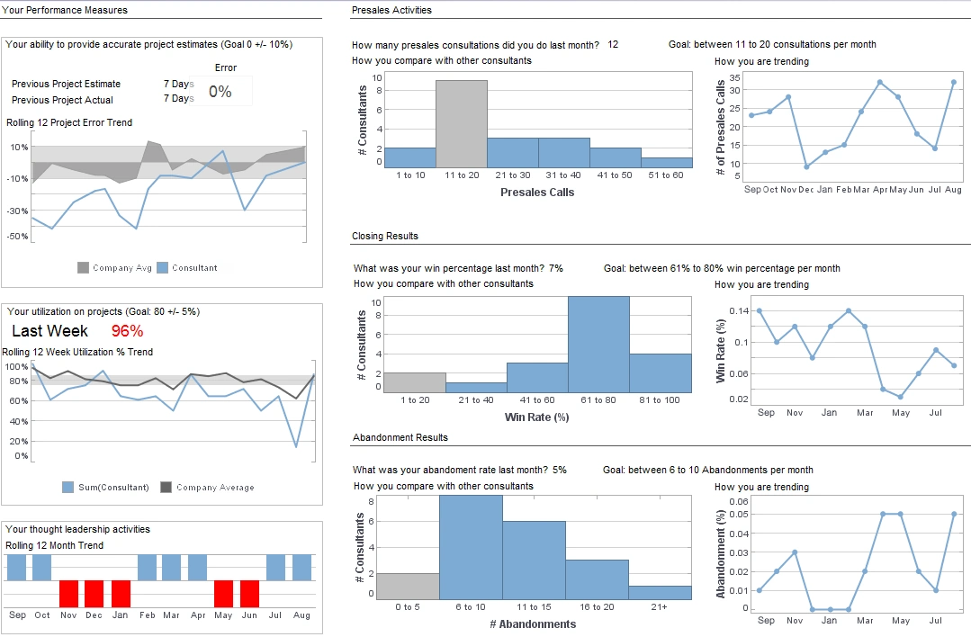
InetSoft's BI software applications include an easy dashboard image properties setup that even novice users can master almost immediately. View the dashboard design template below to learn more about the Style Intelligence solution.
To scale an image, you need to enable image scaling, and then choose the method by which images should scale. Follow the steps below:
1. Right-click the Image component, and select ‘Properties’ from the context menu. This opens the ‘Image Properties’ dialog box.
2. Click the Advanced tab, and enable the ‘Scale Image’ option.
3. To keep image proportions constant during scaling, select ‘Maintain Aspect Ratio’. This allows the image to scale without distortion.
4. To selectively scale only parts of the image (e.g., the middle of the
image), select ‘Scale (9-Cell Grid)’. Tip: For an image with a border, you may want to keep the
border width constant as the image is scaled. To do
this, set the pixel values slightly greater than the border thickness.
5. If you have selected ‘Scale (9-Cell Grid)’, enter the desired sizes of the ‘Top’, ‘Bottom’, ‘Left’, and ‘Right’ regions in pixels.
6. Click ‘OK’ to close the dialog box. The image will now be scaled in the specified manner when you adjust the Image boundaries.
The Process of Proliferating Business Intelligence
This page describes how a company leveraged StyleBI from InetSoft Technology Corp. to expand business‑intelligence capabilities across the enterprise. The narrative explains that after initial deployment, users began exploring data immediately via mobile devices such as iPads and iPhones, which created demand for broader access. The company cleaned up their data model and quickly set up a cloud‑based evaluation environment to show business users what was possible, leading to internal excitement and adoption. The emphasis is on making BI accessible to many more users (proliferation) rather than restricting it to a few analysts. The platform’s intuitiveness and browser/mobile support lowered barriers to entry, allowing teams in finance, operations, and the field to ask questions of their data without heavy IT involvement. This broad rollout helped transition BI from a centralized function into a pervasive capability embedded in everyday workflows.
Data Visualization
This page highlights the visualization strengths of StyleBI, presenting dashboards, interactive charts, and exploratory analytics as core capabilities. It discusses how modern organizations face a diversity of data and require tools that enable “see and tell” scenarios rather than static reports. The product’s data mash‑up engine allows joining disparate sources easily, while browser delivery means desktops, tablets and phones are all supported. This enables non‑technical users to explore trends and anomalies visually and gain insights quickly. For teams seeking more dynamic and interactive analytics across departments, the approach shows how visualization can be both self‑service and governed, combining freedom with centralized data management. In essence, this narrative positions the platform as bridging the gap between raw data and meaningful, accessible visual stories for business users.
Business Intelligence Self Service Software
This page emphasizes giving business users—rather than just IT—direct access to dashboards, ad‑hoc reports and analytics via StyleBI. It notes that traditional BI has heavy bottlenecks because business users must wait for IT to build reports; instead this platform offers drag‑and‑drop design, interactive reports and web delivery. Self‑service is extended further by including pixel‑perfect output for formal reports alongside exploratory dashboards, so business users gain flexibility without sacrificing governance. For frontline teams (sales, marketing, operations) this means fewer dependencies and faster insight cycles. The narrative also underscores that IT still retains oversight via a central metadata layer, ensuring consistency and reducing proliferation of unmanaged tools. Thus the platform brings agility and ease of use while preserving enterprise controls.
Easy Dashboard Software
This page presents the dashboard‑creation capabilities of the InetSoft platform as simple and fast for users of all levels. The key messages: web‑based delivery with zero client install, drag‑and‑drop user interface, pre‑built templates, and data mash‑up features that allow joining fields from multiple sources in a “Lego‑like” fashion. Users can upload spreadsheets or connect to relational databases, build worksheets, and produce dashboards without complex coding. The software supports desktop, tablet and mobile access, enabling business users to track KPIs, detect trends and share insights quickly. By reducing the technical barrier to dashboard creation, the solution empowers departments to build and iterate their own visualizations, accelerating decision‑making and reducing reliance on centralized BI teams.
Live Reporting Tools
This page underscores the live‑reporting and real‑time analytics strength of InetSoft’s platform: it combines a high‑performance data‑access engine and a report‑generation engine capable of delivering paginated reports or interactive visuals in real time. The platform supports connectivity to many data sources including JDBC, OLAP, flat files, SOAP and more, enabling operational dashboards to reflect current states. Delivered as a 100 % web‑based solution, the platform can update visuals as fast as the underlying database allows. For organizations with streaming or real‑time data demands, this means decisions can be made on the freshest data available rather than stale batch updates. The ability to mix interactive dashboards and formal reports on a unified platform simplifies architecture and reduces tool‑sprawl.
SaaS BI Tools
This page addresses the criteria for selecting a cloud‑hosted, on‑demand BI solution and positions StyleBI as a lightweight, cloud‑native choice for mid‑sized companies or divisions of larger enterprises. Key advantages include no installation or infrastructure investment, browser/mobile access, and minimal IT overhead. The platform supports multi‑tenant deployments, enabling SaaS providers or business units to scale across tenants without cost‑prohibitive licensing. The self‑service interface and schema‑less data mash‑up features enable rapid response to new business questions, which is especially valuable for agile organizations. By offering these capabilities, the solution helps companies become more data‑driven without the upfront inertia of traditional on‑premise BI systems.
Report Designer Download
This page offers insight into the reporting authoring component of InetSoft’s platform, which includes a downloadable report designer enabling creation of interactive reports, visual layouts and scheduled bursting. The narrative points to the ease of building sophisticated reports in a web environment, the reuse of query blocks, and the ability to distribute results via dashboards, PDF exports or embedded in other applications. Business users can design, preview and share reports from one tool, simplifying the development lifecycle. For organizations seeking to streamline report design and distribution, the tool reduces development time, ensures consistent formatting, and integrates seamlessly with dashboards for unified reporting experiences.
Marketing Dashboard Software
This page targets marketing teams and describes how InetSoft’s dashboard and analytics platform enables marketers to integrate disparate data—social media, POS, campaign metrics, inventory and regional sales—into a unified visualization environment. The drag‑and‑drop designer allows rapid creation of campaign‑tracking dashboards, ROI analyses and KPI boards that are accessible via browser or mobile. The platform supports data mash‑up, enabling marketers to blend spreadsheet exports with enterprise systems without heavy IT assistance. By giving marketing stakeholders their own tools, the solution accelerates insights, fosters data‑driven decisions in campaign management, and reduces reliance on technical teams. Sharing and embedding dashboards helps teams collaborate and monitor performance in near‑real time.
Software Report Tool
This page presents the reporting capabilities of InetSoft’s platform as comprehensive, bridging dashboards and production reports where both interactive and formal outputs are required. It talks about pixel‑perfect output, scheduling, bursting, and embedding in applications, illustrating how users can serve executives, regulators and operational staff from one platform. The narrative emphasizes that consolidating reporting and analytics reduces the number of tools to maintain, simplifies development and cuts overall cost. For enterprises managing both ad‑hoc dashboards and formal report distribution, the solution delivers consistency, reuse and governance, while enabling business user autonomy in visualization and exploration.
InetSoft vs Syncfusion Dashboard Platform Comparison
This page presents a comparative evaluation of InetSoft’s platform against a component‑toolkit visualization vendor, illustrating key differentiators such as unified metadata, dashboards plus reports in one platform, embedding capabilities and better governance. The narrative argues that toolkits often require heavy custom development, lack production‑grade reporting, or force multiple products for dashboards and reports. The InetSoft platform is presented as a more holistic BI solution enabling rapid deployment, lower total cost, and broader user adoption. For organizations seeking to avoid building and maintaining multiple components, the platform delivers a single architecture that supports self‑service, governance and embedding, making it a pragmatic choice for modern analytics requirements.
Here are summaries for five of the provided pages from InetSoft.Worldwide BI Vendor
This page presents InetSoft’s flagship platform StyleBI as a global business‑intelligence solution able to support organizations across geographies and devices. The software is described as web‑based and mobile‑friendly, enabling consolidated access to all of an organization’s data from anywhere. It emphasizes combining large volumes of data into a single source of truth and then making that accessible to business and field users alike. The narrative highlights that this kind of deployment helps companies scale analytics to global operations, enabling smarter operational decisions, cross‑region collaboration, and democratized insight. By offering full browser delivery and support for mobile access, the platform supports field or remote teams in addition to headquarters. The pitch is that enterprises needing a truly worldwide BI footprint can rely on this solution to unify data, present consistent insights, and support growth across boundaries.
InetSoft vs Syncfusion Dashboard Platform Comparison
This page uses a comparison of StyleBI with the Syncfusion Dashboard Platform as a way to highlight key differentiators. It frames the selection of BI tools as difficult and possibly biased, then uses independent user‑review data to show here that InetSoft rated strongly on categories such as reports, self‑service, advanced analytics, and platform. One of the key points is that the same metadata layer feeds both dashboards and reports, thereby providing a “single version of the truth.” The discussion underscores that organizations needing both interactive visual analysis and production reporting—together with controlled deployment, embedding, and self‑service—see value in this architecture. The message is that replacing or choosing beyond component‑toolkits (like Syncfusion) with a unified BI platform provides faster development, stronger governance, and broader adoption.
Business Intelligence Self Service Software
This page emphasizes the self‑service dimension of InetSoft’s BI platform: that business users, not just IT experts, should be able to build dashboards, run analyses and explore data easily. It notes the traditional bottlenecks in BI (heavy IT dependence, delays in report preparation) and positions the product as breaking through those barriers. Key features described include drag‑and‑drop dashboards, interactive reports, customized ad‑hoc chart editing, and pixel‑perfect output—all in a web environment. The emphasis is on rapid deployment, minimal training, and enabling non‑technical users to get insights. For organizations trying to empower front‑line staff, marketing, sales or operations analysts, the argument is that this platform makes BI accessible, lowers dependence on centralized BI teams, and accelerates decision cycles.
Data Visualization
This page presents visualization as a core capability of the platform—interactive charts, dashboards, analytics all delivered via the web. It emphasizes that modern organizations deal with large and diverse datasets and need tools that enable exploration, visual discovery and narrative visualizations. The product is positioned as enabling users to “see and tell” rather than just static reporting. It also mentions data‑mashup capability (bringing together disparate sources) plus device/browser flexibility. For teams aiming to go beyond static reports to more dynamic, interactive visual analysis—especially across departments—the visualization story says this platform is designed for that purpose. It supports business users who want self‑service visual analytics and IT teams who want control and governance.
Software Report Tool
This page describes the product’s capacity for production‑reporting – pixel‑perfect output, scheduling, bursting, and embedding in applications. It presents the capability to deliver not just interactive dashboards but also formal reports (for financial closing, operations summary, regulatory, etc). By combining reporting and analytics in one platform, it argues companies avoid tool‑sprawl and duplication. Key value points are that development times are shortened, maintenance is simplified, and business users have access to both visual dashboards and traditional reports from the same metadata layer. Organizations with mixed needs (ad‑hoc analytics + scheduled reports) are told they benefit from consolidation and consistency in delivery.

