Dashboard Sliders: Functionality, Utility, and Best Practices in Business Intelligence
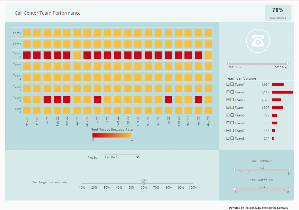
Dashboard sliders are interactive controls that allow users to adjust values dynamically and instantly see the effect of those changes on visualizations and underlying data queries. They provide a means for users to filter data, adjust parameters, or simulate scenarios directly from the dashboard interface without navigating away from the visual display.
While commonly associated with business intelligence (BI) dashboards and data visualization platforms, their application extends across analytics, reporting, and embedded operational dashboards. Understanding how and when to use dashboard sliders, as well as their implementation in tools like StyleBI, can significantly enhance the usability and interactivity of dashboards.

What Are Dashboard Sliders?
At their core, dashboard sliders are user interface elements that represent a continuous or discrete range of values. Users manipulate a handle along a track to select a specific value or range. The slider control then communicates this value to the dashboard’s underlying queries or visualizations. Depending on the platform, sliders can control numeric variables, dates, percentages, thresholds, or any parameter that can influence visual output.
For example, a slider might allow a user to filter sales data for a specific year, adjust a threshold for highlighting high-performing products, or simulate a change in budget allocation to observe impacts on financial KPIs. Unlike static filters or dropdown menus, sliders offer an intuitive, visual mechanism for exploration, enabling users to engage more actively with the data.
Utility of Dashboard Sliders
Sliders offer several advantages that make them a powerful addition to dashboards:
- Interactivity: Sliders allow users to manipulate data dynamically without leaving the dashboard or running additional queries manually.
- Scenario Analysis: By adjusting a slider, users can model hypothetical situations, such as increasing sales targets, adjusting budget allocations, or testing thresholds for operational alerts.
- Visual Feedback: Sliders provide immediate visual feedback, which can reinforce understanding and aid in decision-making.
- Data Exploration: Users can investigate data trends over a continuum, such as analyzing performance over a range of months, revenue thresholds, or temperature readings in an industrial process.
- Space Efficiency: Instead of adding multiple filters, dropdowns, or input fields, sliders consolidate parameter selection into a single compact control.
When to Add Sliders to a Dashboard
Sliders are most effective in scenarios where users benefit from continuous or incremental adjustments and where immediate visual feedback is valuable. Some specific use cases include:
- Time-Based Analysis: When tracking trends over months, quarters, or years, a slider enables the selection of a specific time frame, making it easier to observe changes and patterns dynamically.
- Threshold Setting: Sliders are useful for setting thresholds or ranges, such as determining which customers fall above or below a certain profitability margin.
- Scenario Planning: In financial dashboards, sliders allow users to adjust budget allocations, forecast parameters, or risk tolerance levels to see real-time projections and outcomes.
- Parameter Tuning: In operational dashboards, such as production or logistics monitoring, sliders can adjust variables like temperature, speed, or load capacity to model different scenarios or sensitivity analyses.
- Interactive Filtering: For dashboards with large datasets, sliders offer an intuitive way to filter numeric or date values incrementally without requiring multiple clicks.
When Not to Add Sliders
While sliders enhance interactivity, they are not always the best choice. Certain situations call for alternative controls or no control at all:
- Non-Numeric or Categorical Data: Sliders are not effective for categorical variables like product categories, regions, or customer segments. Dropdown menus or multi-select filters are preferable.
- Large Discrete Value Sets: When there are too many discrete options, sliders may become difficult to use accurately. For example, choosing from hundreds of individual product IDs is better handled with search or multi-select filters.
- Precision Requirements: If users need exact values, sliders may lack precision, especially on touch screens or when the value range is very large.
- Performance Concerns: Applying sliders to very large datasets without appropriate aggregation or indexing can slow down the dashboard due to repeated query execution as the slider is adjusted.
- Overcrowding the Dashboard: Adding too many interactive elements, including multiple sliders, can make dashboards cluttered and confusing, reducing usability.
How to Add Sliders to a Dashboard Using StyleBI
StyleBI supports slider controls as part of its interactive dashboard design features. The process for adding sliders involves the following steps:
- Create a Widget or Parameter: Start by defining the variable or parameter that the slider will control. This could be a numeric range, a date range, or another measurable dimension.
- Add a Slider Control: In the dashboard editor, select the slider component from the list of available controls and associate it with the parameter.
- Configure Range and Steps: Set the minimum and maximum values for the slider, as well as the step size, which defines how granular each movement of the slider is. This ensures that the slider provides meaningful adjustments.
- Link to Visualizations: Bind the slider to the relevant widgets or charts on the dashboard. This linkage ensures that any adjustment to the slider immediately updates the associated visualizations and queries.
- Enable Optional Features: Configure additional options such as default values, formatting, or tooltips. For instance, a date slider might show month names or fiscal quarters along the track for better clarity.
- Test Interactivity: Preview the dashboard to ensure that the slider correctly updates the visualizations, maintains performance, and provides a smooth user experience.
How to Use Sliders Effectively
Using sliders effectively requires attention to both user experience and analytical context. Key considerations include:
- Provide Context: Display axis labels, value ranges, or descriptive tooltips to help users understand what the slider controls.
- Optimize Performance: For large datasets, ensure that aggregations or pre-filtered views minimize query load as the slider is adjusted in real time.
- Default Values: Set sensible default positions for sliders so that dashboards load with meaningful insights immediately visible.
- Combine with Other Controls: Sliders often work well alongside dropdowns, search boxes, and checkboxes to provide multi-dimensional filtering without overwhelming users.
- Visual Feedback: Ensure charts update dynamically and visibly in response to slider adjustments to reinforce the cause-and-effect relationship between user actions and displayed results.
- Test Across Devices: Sliders should remain usable on both desktop and touch-based devices. Consider step size and control size for mobile accessibility.
Commonality of Sliders in Other Dashboard Tools
Sliders are a widely used feature in many modern BI and analytics platforms. Tools such as Tableau, Power BI, Qlik Sense, and Looker provide slider controls for filtering, date selection, and scenario analysis. Each platform implements sliders with slightly different capabilities and visual styles, but the fundamental principle remains the same: allowing interactive adjustment of a parameter to immediately update visualizations. StyleBI aligns with this common pattern while emphasizing embedded analytics, flexibility, and direct integration with OLAP and relational databases.
In Tableau, for instance, sliders can control continuous variables, date ranges, or numeric thresholds, often with real-time updates on visualizations. Power BI provides similar functionality via slicers configured as sliders, allowing users to filter data on numeric or date fields dynamically. Qlik Sense uses range sliders to enable visual exploration of data ranges and conditional highlighting. These implementations highlight the universal value of sliders in interactive dashboards and scenario modeling.
Summary of Best Practices
Effective use of dashboard sliders depends on careful consideration of when they add value and how they are implemented. Best practices include:
- Use sliders for continuous or numeric variables rather than categorical fields.
- Ensure the range, step size, and default value provide meaningful interaction without confusing the user.
- Link sliders to visualizations in a way that provides immediate feedback, reinforcing analytical insights.
- Test performance and usability, particularly when working with large datasets or embedded dashboards.
- Complement sliders with other dashboard controls to provide a flexible and complete user experience.
- Avoid overcrowding the dashboard with multiple sliders or unnecessary controls.
When applied thoughtfully, sliders enhance user engagement, improve scenario analysis, and streamline exploration of complex datasets. StyleBI’s interactive dashboards support the creation of sliders that can control OLAP queries, adjust visualizations dynamically, and enable embedded, responsive analytical applications. In comparison to other BI tools, StyleBI offers similar functionality while focusing on seamless embedding and direct connectivity to multidimensional data sources.
Overall, dashboard sliders are a versatile and widely recognized tool in the design of effective business intelligence dashboards. They provide a clear visual mechanism for interaction, improve the analytical depth of dashboards, and support rapid exploration of data trends and scenarios. Properly implemented, they enhance the decision-making process by offering intuitive, real-time control over the underlying data and visual outputs.


