Do you need to have KPIs on a company's dashboard usage?
Below is a continuation of the transcript of a Webinar hosted by InetSoft on the topic of Best Practices for Key Performance Indicators. The presenter is Mark Flaherty, CMO at InetSoft.
Mark Flaherty (MF): Most BI software provides that type of metric reporting, how many people log in each day, time spent, dashboards or reports created, et cetera. And it is a useful KPI best practice for finding your power users and your laggards. You can now even ask you power users to mentor the laggards.
Still the process-change approach is necessary to ensure adoption. That means making the tool the required common language at weekly departmental and monthly business review meetings. That way everybody becomes aware that they are responsible for certain of the measures. Their name is right next to them, and they have to make things happen to ensure their results match the expectations for those key metrics.
If people aren’t using a particular performance management dashboard or scorecard application, it probably means they don’t perceive anything of value out of it. When you show them their performance, and they realize that other people are seeing these KPIs, it will absolutely drive a behavioral change.
Beyond that, there remain some cases where a user might not be able to find the data that would be pertinent to what they are doing, that it wasn’t made available in the BI system. And you should periodically poll users for issues like this.


High-Visibility Usage Is Key
But overall the key is that high-visibility usage of the performance management system that will lead to highest adoption and usage levels. Somebody who is reluctant to adopt something that is new, or something that is intimidating, instead thinks, if I don’t look at this every day, I am going to be at a disadvantage when talking with my management or versus my peers who I might compete with for advancement in the enterprise.
This is all very important, and these are some of the reasons why we are seeing more and more interest in measuring BI, or business intelligence on business intelligence. Think about the manager whose performance is going down, and he is not even opening his dashboard. That kind of correlation is the ultimate goal here. Using the KPI software actively should lead to better operational management and the ability to more quickly affect deviations in performance. You’re beginning to see some advanced companies looking at this correlation in behavior and results, correlating corporate performance with the usage of metrics and analytics.
What Are the KPIs Tracked for a Company’s Usage of Its Dashboard Reporting Platform?
Dashboard reporting platforms are no longer passive tools that simply display charts. They are active systems that reflect how an organization consumes data, makes decisions, and operationalizes insight. Tracking usage KPIs for a dashboard reporting platform helps companies understand whether the investment is driving real adoption, improving decision quality, and supporting business outcomes rather than existing as a decorative layer on top of raw data.
The most useful KPIs fall into several categories: adoption metrics, engagement, performance, governance, and impact. Each metric tells a different story, and taken together they provide a clear picture of whether the platform is becoming part of daily workflows or slowly drifting into irrelevance.
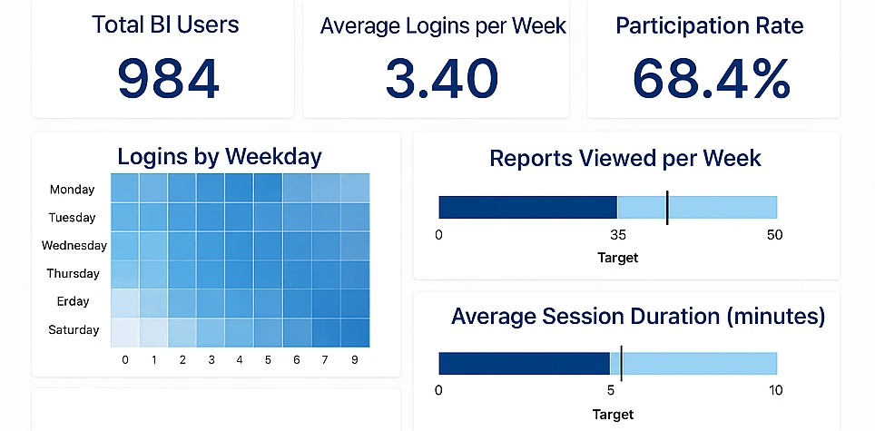
User Adoption Rate
User adoption rate measures how many intended users actually log into the platform over a given period. This KPI is often expressed as a percentage of licensed or invited users who are active monthly or weekly. High adoption suggests the platform is accessible, trusted, and relevant to day-to-day work. Low adoption almost always signals deeper problems with usability gaps, data relevance, or organizational alignment.
Improving adoption typically requires reducing user friction. Single sign-on, intuitive navigation, and role-based dashboards all help. More importantly, dashboards must answer real questions users already have, rather than forcing them to adapt their thinking to predefined visuals.
Active Users and Usage Frequency
Active users track how many people use the platform within a defined window, while usage frequency measures how often they return. A dashboard used once a month for a board meeting serves a very different purpose than one used daily by operations teams.
Frequent usage indicates that dashboards are embedded in operational habits. Infrequent usage often means dashboards are treated as reference material rather than decision tools. To affect this KPI, organizations should align dashboards with business rhythms, such as daily standups, weekly reviews, or monthly planning cycles.
Dashboard and Report Views
This KPI measures how often individual dashboards or reports are viewed. It highlights which assets deliver value and which ones are ignored. A small number of heavily viewed dashboards combined with many unused ones usually indicates dashboard sprawl.
Improving this metric involves pruning unused dashboards and consolidating similar reports. Clear naming conventions and descriptions also matter more than many teams expect, as users tend to avoid dashboards they do not immediately understand.
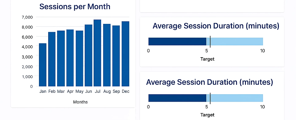
Time Spent per Session
Time spent per session is a nuanced KPI. Extremely short sessions may suggest users are not finding meaningful value, while extremely long sessions may indicate difficulty interpreting data or navigating dashboards. Healthy usage typically shows moderate session lengths with focused interactions.
Optimizing this KPI requires thoughtful design. Clear KPIs, minimal clutter, and purposeful interactivity reduce cognitive load and help users reach conclusions faster without oversimplifying the data.
Filter and Interaction Usage
This metric tracks how often users apply filters, drill down, or interact with visual elements. High interaction rates suggest curiosity and exploratory behavior. Low interaction often means dashboards are static or that users do not understand how to interact with them.
To increase interaction, dashboards should be designed around business questions rather than visuals. Filters should be meaningful and limited, and drill paths should follow logical dimensions rather than technical data structures.
Data Freshness and Refresh Success Rate
Data freshness measures how up-to-date the data is when users view it, while refresh success rate tracks whether scheduled updates complete without errors. These KPIs are foundational because trust in dashboards collapses quickly when data is stale or inconsistent.
Improving these metrics often requires investment in data pipelines rather than dashboard features. Clear monitoring, alerting on failed refreshes, and realistic refresh schedules aligned with data availability all contribute to higher data reliability.
Query Performance and Load Time
Query performance tracks how long dashboards take to load or respond to interactions. Slow dashboards discourage exploration and reduce overall adoption. Users may stop trusting the platform altogether if performance is unpredictable.
Performance can be improved through data modeling, aggregation strategies, caching, and limiting overly complex visuals. Treating performance as a core KPI rather than a technical afterthought is a hallmark of mature analytics teams.

Self-Service Usage Rate
This KPI measures how often users create or modify their own dashboards and reports without help from analysts or engineers. A high self-service rate indicates that the platform empowers users rather than creating dependency.
Improving self-service usage requires well-defined semantic layers, governed datasets, and clear documentation. Without these, self-service efforts often result in confusion or inconsistent metrics.
Metric Consistency and Governance Indicators
Governance-related KPIs include the number of duplicate metrics, conflicting definitions, or ad hoc calculations. While harder to quantify, these indicators directly affect data trust and decision quality.
Reducing inconsistency involves centralizing metric definitions, encouraging reuse, and providing visibility into how KPIs are calculated. Strong governance does not restrict usage; it enables scalable analytics.
Decision Impact and Business Alignment
The most advanced KPI category focuses on impact rather than activity. This includes tracking which dashboards are referenced in meetings, linked in documentation, or used to support specific decisions. While qualitative, these signals matter more than raw usage counts.
Improving impact requires continuous feedback between dashboard creators and stakeholders. Dashboards should evolve alongside business priorities rather than remaining static representations of historical requirements.
Why Usage KPIs Matter
Tracking platform usage KPIs transforms analytics from a reporting function into a measurable internal product. These metrics reveal whether dashboards are influencing behavior, supporting decisions, and justifying their operational cost.
Companies that actively monitor and act on these KPIs tend to build leaner, more trusted analytics ecosystems. Those that ignore them often accumulate unused dashboards, frustrated users, and growing skepticism about the value of data.
Customer Testimonial
"We selected InetSoft's Style Report Professional for a time-tested, dependable publishing engine and a powerful, yet easy-to-use report designer that would save resources associated with internal development of publishing capabilities and client customization requests. We were looking for a Java-based publishing solution that could be easily integrated with our own. We have been pleased with deployment, and the reporting software's part in our ability to help companies of all sizes realize cost reduction and revenue acceleration associated with critical configuration and accurate quoting solutions."
