Providing Detail Data in a Dashboard
This is the continuation of the transcript of a Webinar hosted by InetSoft on the topic of "Building a Winning Dashboard" The speaker is Abhishek Gupta, sales engineer at InetSoft.
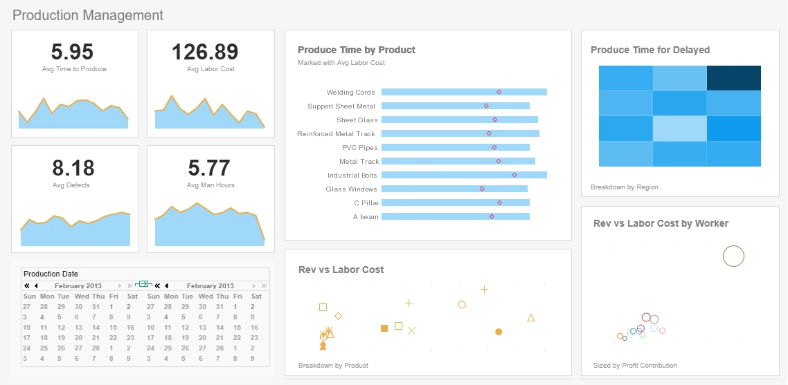
So in this dashboard, you can see if you hover the mouse over a data point a box displays with detailed information about it. That information tooltip helps me provide a lot of information and explain the dashboard to the dashboard viewer. It can be information such as what does the metric represent, how it was calculated, what data is included or excluded, may be what the target of visuals I should have for my data.
I could even include information around what type of interactions are there on the dashboards, so I can maybe save time on training or helping the user understand how this dashboard works or even in times what actions they need to take when they see the values under a certain condition or status.
Another important thing to note about his help overlay is that it is designed in a way, which is semi-transparent, so I can still see the original values and the context of the explanation when I am looking at the explanation itself by using using the Show Details toolbar item. It's allows me to see the detail data behind the chart and even export it to a spreadsheet for other use such as in a powerpoint chart or some offline excel analysis.
The number four dashboard design best practice is this: avoid cute graphic effects. Many of the dashboards I often see today remind me a lot of some of the Power Point presentation by itself, and probably lot of other people started doing this when they first started using Power Point. A lot of people couldn't resist of turning on every switch, animation, effect, every kind of Word Art or shapes or every fun card they could find, and it was just Power Point for the sake of Power Point.
We saw much of the same things when people started creating the dashboards or websites. What inadvertently happened is that people started realizing that their creativity, so called creativity, is starting to get in their way. So, I think it is important to understand here that I am not trying to say that beautiful dashboards are a bad thing.
I don't want to say that you have to be using a minimalist approach, and I do that only because I like things to be simple and clear. What I think you should think about is, is that it is not the result of something that you really spend a lot of time thinking about. So if you really thought something is true enough to be able to dstill it down to its very essence, the byproduct of that is the least amount of design possible.
Now, what about emotion? What about that visual appeal that a dashboard has? That's not important, design can support quick user adoption. If you have a beautiful dashboard that lot of people like from the get go, that's a good thing. Definitely I had lots of people interested in it and engaged at the beginning, at least, but still that's not certain you are going to make that dashboard adoption last over time if the value of the dashboard for them is low. So you want to create a visual appealing dashboard. Often it may be something which is familiar to users and to your organization's design, but not at the risk of creating too much design for the sake of design.
If you just Google "bad dashboard", you can see a lot of examples, again, these are lot of examples of unnecessary design for the sake of design. If I click on this bottom one here on the right, you can see here on this dashboard, nearly 40% of the things on this dashboard are just clutter, not anything useful at all to the user, and that I would argue that the design of the dashboard is not very appealing to me at least either.
Effective dashboards provide clarity and actionable insights, but bad dashboard design undermines these objectives. One major element of poor design is information overload. Overcrowding a dashboard with excessive data, charts, or widgets creates cognitive strain and prevents users from identifying key insights. This issue is often exacerbated by a lack of prioritization in visual hierarchy, where all elements compete for attention, leaving users unsure of where to focus. Additionally, using too many colors, unnecessary 3D effects, or overly complex visuals can make the dashboard visually chaotic and difficult to interpret.
Another critical flaw is misaligned or irrelevant metrics. Dashboards are meant to provide concise, decision-oriented information, but poorly designed ones often include data that isn't aligned with the intended audience's goals. For example, a sales team dashboard focusing on operational metrics rather than sales performance metrics fails to meet user needs. Similarly, displaying redundant or trivial data clutters the interface and diminishes the value of critical information. Ensuring dashboards have a clear purpose and focus is essential to avoid these issues.
Finally, poor usability and interactivity detracts from dashboard effectiveness. Dashboards that are not intuitive or fail to consider user workflows hinder adoption and productivity. For example, unclear labels, inconsistent layouts, or overly complex navigation confuse users and lead to frustration. Additionally, a lack of interactivity, such as the ability to drill down into data for more detailed analysis, limits the dashboard's functionality. Good design should prioritize simplicity, consistency, and responsive features to ensure a seamless user experience.

