AARRR Dashboards
Dave McClure introduced the AARRR framework in 2007 as a way to map user behavior across five stages: Acquisition, Activation, Retention, Revenue, Referral. The acronym is frequently called Pirate Metrics.
An AARRR dashboard consolidates data from these stages into one interface so teams can track funnel flow, spot conversion leaks, and measure experiment impact without switching between multiple tools.
Most dashboards pull data from product analytics (Amplitude, Mixpanel), web analytics (Google Analytics 4), payment processors (Stripe, Chargebee), and marketing platforms (Google Ads, Meta).
The output is usually a set of linked charts: funnels, cohort tables, trend lines, and segmented KPIs. The value lies in showing how changes in one stage affect later stages—for example, whether a new landing page increases acquisition volume but lowers activation quality.


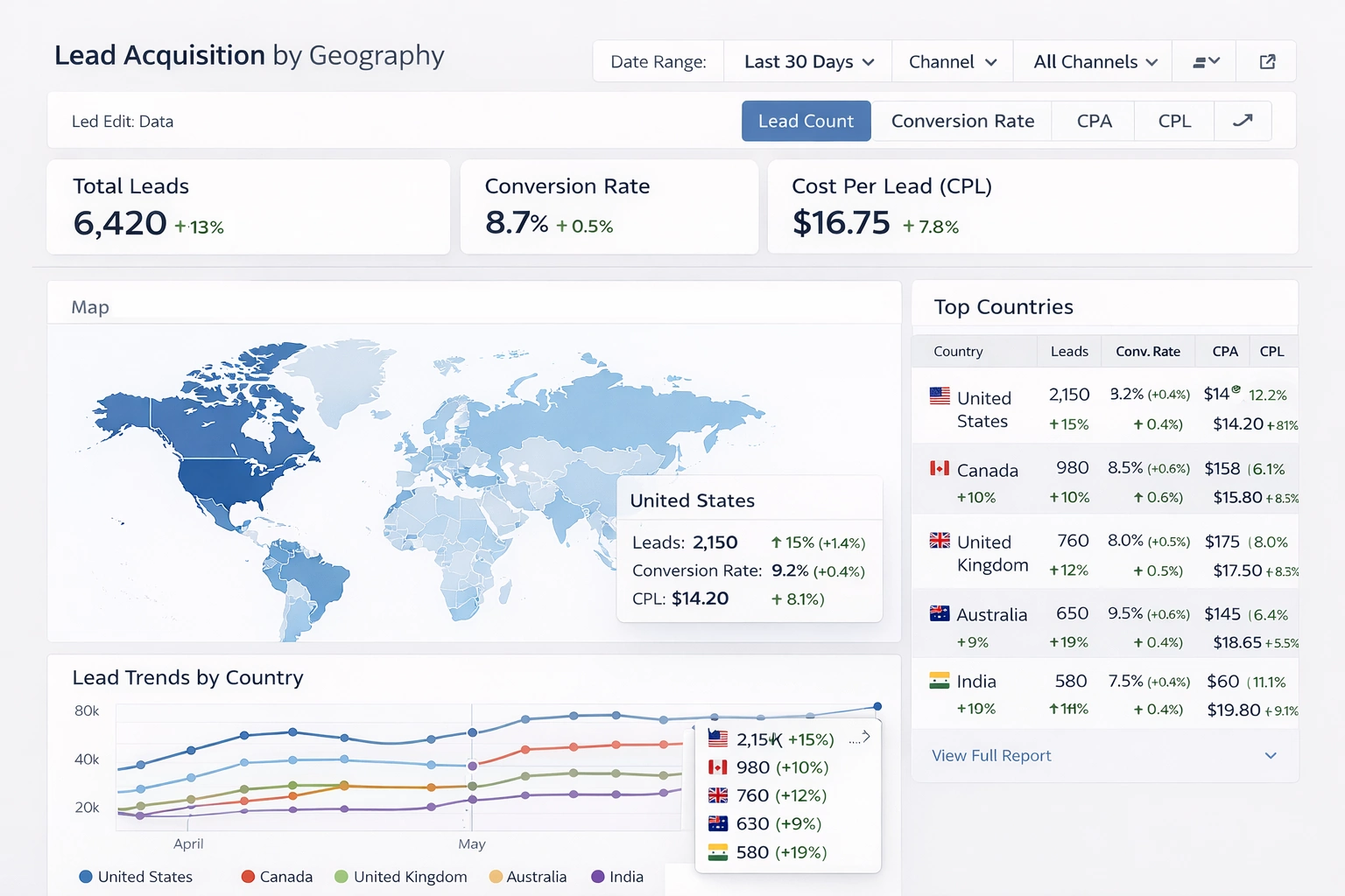
Acquisition
Acquisition tracks how users reach the product. Primary metrics include:
- New users / sign-ups per day or week
- Traffic volume by channel (organic, paid search, social, direct, referral)
- Cost per acquisition (CPA) = total spend / new users
- Channel-specific conversion rate to sign-up
Dashboards visualize this with stacked bar charts for channel mix, line charts for daily trends, and tables ranking sources by volume and CPA. A common view shows CPA next to downstream LTV so teams can see whether paid channels are profitable.
Example: A B2B SaaS company runs LinkedIn ads and SEO. The dashboard reveals that LinkedIn CPA is $180 while organic is $22, but organic users have 40% higher activation. The team shifts budget toward content that targets high-intent keywords.
This funnel diagram illustrates a typical acquisition-to-activation drop-off. Numbers decrease at each step; the steepest drops indicate optimization targets.
Activation
Activation captures the moment a user first experiences core value. Metrics depend on product type but often include:
- Percentage of sign-ups that complete key action (e.g., connect bank account, upload first photo, send first message)
- Time from sign-up to first value moment
- Activation rate by device, geography, or acquisition source
Dashboards use step-by-step funnel charts to show drop-off at each onboarding step and cohort bars to compare activation across user groups. Heatmaps or flow diagrams reveal common paths that lead to success.
Example: A mobile fitness app finds only 28% of sign-ups log a workout in the first session. After simplifying the onboarding from six screens to three and adding a guided first workout, activation rises to 51%. The dashboard tracks this lift in real time and segments by acquisition channel to confirm the change works across sources.
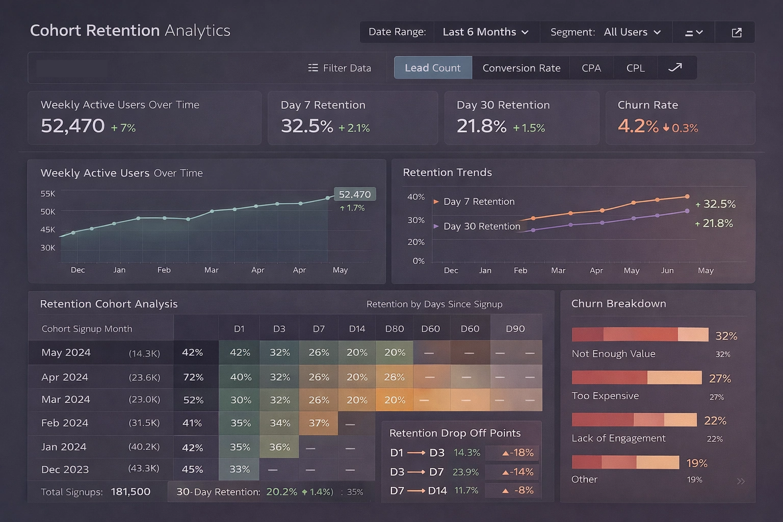
Retention
Retention measures whether users return. Standard metrics are:
- Day 1, Day 7, Day 30 retention rates
- DAU / MAU ratio (stickiness)
- Churn rate = lost users / active users at start of period
- Cohort retention curves
Cohort tables and curved line charts dominate retention views. Each row or line represents users acquired in the same week or month, with columns showing percentage still active after N days. Color gradients highlight improvement or decay.
This cohort retention heatmap shows how different user groups retain over time. Declining colors from left to right indicate typical drop-off; flat or improving curves signal product improvements.
Example: A project management tool notices Day 30 retention falls from 22% to 14% after a major UI update. The dashboard isolates the affected cohorts and correlates the drop with low usage of a new collaboration feature. Rollback and targeted tutorials bring retention back above 20%.
Revenue
Revenue quantifies monetization. Key metrics include:
- Monthly Recurring Revenue (MRR) and Net New MRR
- Average Revenue Per User (ARPU)
- Customer Lifetime Value (LTV) = ARPU × average lifespan
- Conversion rate from free to paid
- Paying users as % of active users
Dashboards display MRR waterfall charts (new, expansion, contraction, churn components), ARPU trends segmented by plan or acquisition source, and LTV:CAC ratio (target usually >3:1).
Example: An e-commerce analytics platform sees ARPU from organic sign-ups at $89 while paid sign-ups average $42. The dashboard flags that paid users convert to paid at half the rate and have higher support tickets. The team pauses low-quality ad placements and improves onboarding for paid leads, lifting blended ARPU by 18%.
Conversion funnel views like this one help identify where free users stop before becoming paying customers.
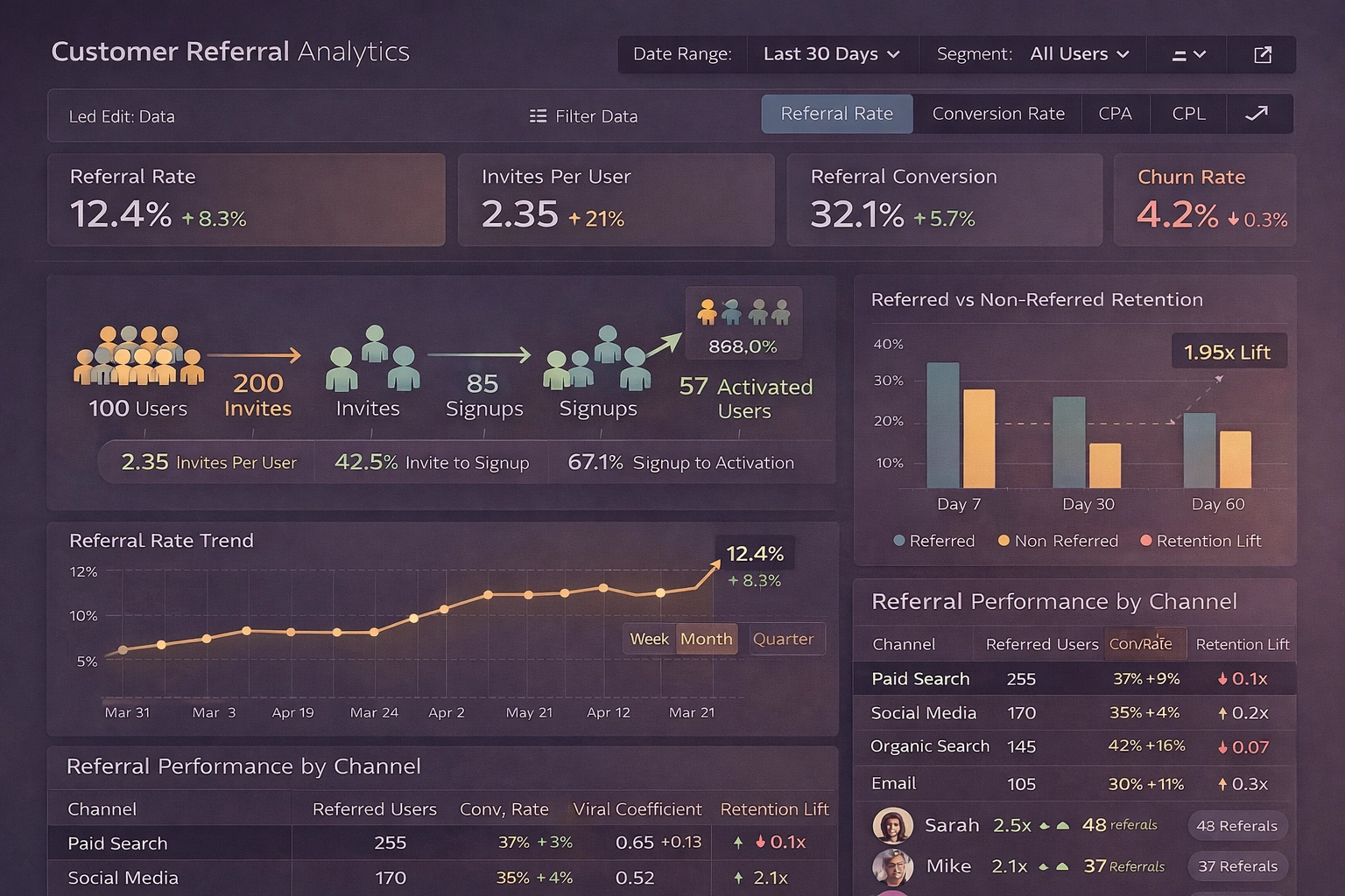
Referral
Referral tracks organic growth through invites, shares, or word-of-mouth. Core metrics:
- Referral rate = invites sent per active user
- Conversion rate of referred sign-ups
- Viral coefficient (K-factor) = average new users per existing user through referrals
- Net Promoter Score (NPS) or % of users who refer
Dashboards show K-factor as a single gauge (goal >1.0 for viral growth), bar charts for referral sources, and cohort views comparing referred vs non-referred user quality (retention, revenue).
Example: A team collaboration app offers extra storage for every successful referral. The dashboard tracks K-factor rising from 0.4 to 0.9 after adding in-app prompts at peak engagement moments. Referred users show 35% higher Day 30 retention than organic, justifying further investment in the program.
Building and Maintaining an AARRR Dashboard
Choose a tool stack based on team size and data volume:
- Lightweight: Geckoboard, Klipfolio, or Google Looker Studio with GA4 + Stripe connectors
- Product-focused: Amplitude, Mixpanel, or PostHog for event-based funnels and cohorts
- Custom: Metabase, StyleBI, or Superset on top of a data warehouse (Snowflake, BigQuery)
Best practices:
- Limit to 8–12 core tiles; avoid clutter
- Use consistent time periods (WoW, MoM, cohort-based)
- Add annotations for launches, experiments, or external events
- Set thresholds and alerts (e.g., Day 1 retention < 40% triggers Slack notification)
- Segment relentlessly—by source, device, plan, geography—to find patterns
- Refresh data at least daily; real-time for high-velocity products
An effective AARRR dashboard does not replace deep analysis, but it surfaces the questions that justify deeper work. When acquisition grows but revenue stagnates, or when retention improves but referrals stay flat, the dashboard makes those disconnects visible immediately.