A Comprehensive Astronomical Data Visualization for Modern Astronomy
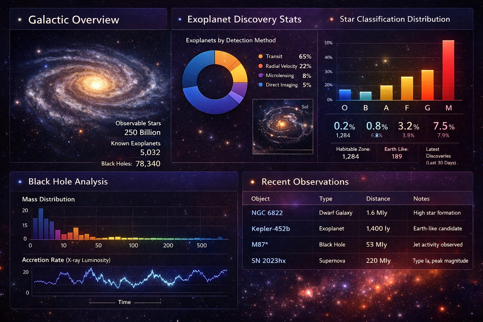
This astronomical data visualization presents a carefully structured, information-dense dashboard designed to support professional astronomers, astrophysicists, and data scientists working with large-scale cosmic datasets.
Its layout, color palette, and visual hierarchy reflect both scientific rigor and modern data visualization best practices, balancing aesthetic appeal with analytical clarity.
By integrating multiple domains of astronomical data—galactic structure, exoplanet discovery, stellar classification, black hole physics, and recent observations—the dashboard provides a unified interface for understanding the universe at multiple scales.
The overall design uses a dark, space-inspired background that mirrors the natural observational environment of astronomy while minimizing eye strain during extended analysis sessions. Against this backdrop, luminous accent colors—blues, golds, purples, and reds—are used selectively to encode meaning rather than decoration. This ensures that visual contrast serves interpretability, allowing astronomers to quickly identify patterns, anomalies, and relationships across datasets.
Galactic Overview: Context at a Cosmic Scale
The upper-left “Galactic Overview” panel establishes context by presenting a high-resolution visualization of a spiral galaxy, resembling the Milky Way. This image is not merely decorative; it anchors the dashboard conceptually by reminding viewers that all subsequent data points—stars, planets, and black holes—exist within this larger galactic system. The accompanying numerical summaries quantify this vastness, listing approximately 250 billion observable stars, 5,032 known exoplanets, and 78,340 known black holes.
These figures provide a critical macro-scale reference. Astronomical research often involves studying extremely small samples relative to the total population of cosmic objects. By juxtaposing precise counts with a galactic visualization, the dashboard emphasizes both the achievements and the limitations of current observational science. This framing helps researchers contextualize discoveries within the immense scale of the universe, reinforcing the importance of statistical inference and probabilistic modeling in astronomy.
Exoplanet Discovery Statistics: Methods and Biases
At the center of the top row, the “Exoplanet Discovery Stats” panel uses a donut chart to display the relative prevalence of detection methods. Transit detection dominates at 65%, followed by radial velocity at 22%, microlensing at 8%, and direct imaging at 5%. This visualization communicates not only discovery counts but also methodological bias. Certain detection techniques are inherently more sensitive to specific types of planets, orbital periods, and stellar environments.
By visualizing detection methods side by side, the dashboard allows astronomers to critically assess how instrumental capabilities shape scientific knowledge. For example, the dominance of transit data highlights why many known exoplanets have short orbital periods and why Earth-like planets remain comparatively rare in catalogs. The inclusion of a miniature planetary system image reinforces the connection between abstract statistics and real astrophysical systems.
Star Classification Distribution: Population Insights
The “Star Classification Distribution” panel translates stellar astrophysics into an immediately legible bar chart. Spectral classes O, B, A, F, G, and M are shown with corresponding percentages and counts, revealing the overwhelming dominance of M-type stars and the relative rarity of massive O- and B-type stars. This distribution has profound implications for galactic evolution, habitability, and stellar lifecycles.
The use of a warm-to-cool color gradient aligns intuitively with stellar temperature, reinforcing domain knowledge through visual encoding. Supplementary metrics below the chart, such as habitable zone counts and Earth-like planet estimates, bridge stellar classification with planetary science. This integrated approach encourages interdisciplinary thinking, highlighting how stellar properties influence planetary formation and the potential for life.
Black Hole Analysis: Extremes of Physics
The lower-left “Black Hole Analysis” section shifts focus to one of the most extreme phenomena in astrophysics. A mass distribution histogram illustrates the range of known black hole masses, from stellar-mass black holes to supermassive giants. The logarithmic-like spacing and color gradient emphasize how rare the most massive objects are while still acknowledging their outsized influence on galactic dynamics.
Below the histogram, a time-series line chart tracks accretion rate variability as measured by X-ray luminosity. This temporal dimension introduces dynamism into the dashboard, reminding users that astrophysical systems evolve and fluctuate. The chart’s clean design allows astronomers to identify trends, bursts, and anomalies that may correspond to physical events such as tidal disruption or changes in accretion disk structure.
Recent Observations: From Statistics to Stories
The “Recent Observations” table grounds the dashboard in ongoing scientific work. By listing specific objects—such as NGC 6822, Kepler-452b, M87*, and SN 2023hx—alongside type, distance, and observational notes, the visualization bridges large-scale statistics with individual discoveries. This narrative layer is essential for maintaining scientific relevance and situational awareness.
Tables are often overlooked in visualization design, yet here the structured layout and restrained color use ensure readability without distraction. The inclusion of notes provides qualitative context, reminding viewers that behind every data point lies a complex observational campaign involving telescopes, instrumentation, and human expertise.
Design Principles and Analytical Value
From a design perspective, the dashboard exemplifies strong visual hierarchy. Primary insights are delivered through charts and imagery, while secondary details are accessible without clutter. Consistent typography, spacing, and alignment guide the eye naturally across panels. Importantly, the visualization avoids unnecessary animation or ornamentation, prioritizing clarity and scientific integrity.
Analytically, the dashboard supports both exploratory and explanatory use cases. Astronomers can scan for high-level trends, compare distributions, or focus on specific phenomena. Educators and communicators can also leverage the visualization to explain complex concepts to broader audiences without oversimplification. This dual utility reflects the growing importance of well-designed visual tools in data-intensive sciences.
A Successful Astronomical Data Visualization
This astronomical data visualization succeeds by integrating diverse datasets into a cohesive, full-screen analytical environment. It respects the scale and complexity of the universe while remaining accessible and interpretable. By combining statistical rigor, domain-aware design, and visual elegance, the dashboard demonstrates how modern data visualization can enhance discovery, understanding, and communication in astronomy. As observational capabilities continue to expand, such interfaces will become increasingly vital for navigating the cosmos through data.


