Varying Levels of Complexity in using Data Visualization
This is the continuation of the transcript of DM Radio’s program titled “What You See Is What You ‘Get’ – How Data Visualization Conveys Insight,”.
Eric Kavanagh: Yeah. That actually brings up a good question I’ll throw over to Mark and then maybe to Dale for some closing comments here. Mark, do you have or do you offer different levels of complexity?
In other words, if they are very new clients you’d stick with a very simple design kind of to what Wayne was talking about there. But over time when they get savvier with using these data visualizations, you can kind of upgrade them to a more complex environment. Is that a fairly typical process?
Mark Flaherty: Well, I would say not from the perspective of what we provide to enterprise or to the technology company. We’re giving them a tool set with the capability to deliver different levels of visualization that cater to different skill sets in the company.
So yeah, I agree with that. There are role based concepts. The business users are consumers of a well built interactive durable dashboard that a power user creates.
The power user is the one who knows the data. They’ve got the other tools that let them do data mash up. Then the highest skill levels are the developers and the IT folks who might be the ones in portals and using API to customize data access. So it's really the different skill sets in the end customer that we enable.
Eric Kavanagh: Right. Okay and, Dale, I’ll give you the last word here any thoughts on understanding how savvy someone is with using these kinds of tools and being careful to cater a solution to that level?
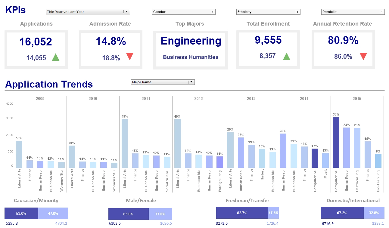
Dale Skeen: Well, I think that’s absolutely important. It is important that you offer an array of tools that adapt to the users’ maturity. Now, for example, a lot of the users sit down and create KPI. This creates plans and sort of what you’ll call your standard dashboards for that. And that's good enough for users; maybe for some users forever. But for the more savvy users, after about five or six months, they would say, “I want to see additional dimension. I want to be able to explore this a little differently. I want to present and correlate it with something else.”
A Tool To Do Their Own Data Mashups
Then we have another tool that, once the user has a grasp of some of those core concepts, they can now do their own mash up. They don't just have pre digested or pre created dashboards. So through having just more exploration from a visual element they can pull together easily things and start creating their own. Then you have for several power users a tool in which you have that data analyst. And some users will actually progress through the whole range of tools there.
Eric Kavanagh: Mm-hmm. Okay good folks. Well, we tried to offer some perspective on how to build solution using data visualization today. Big thank you to our sponsor of course who is all about that kind of stuff -- InetSoft. Big thank you to all of our guests for dialing in and including our guest analyst of the week.
What Are the Steps to Making a Data Visualization to Show Climate Zones in the United States?
Creating a data visualization to show climate zones in the United States can vary in complexity depending on the level of detail and interactivity you desire. Here's a breakdown of the steps and considerations for creating such a visualization:
- Data Collection:
- Obtain data on climate zones in the United States. This data may include temperature ranges, precipitation levels, and other relevant climatic factors. Sources like the U.S. Department of Agriculture (USDA) or the National Oceanic and Atmospheric Administration (NOAA) provide climate zone maps.
- Data Preparation:
- Organize and clean the data. Ensure that it is in a format suitable for visualization. This may involve aggregating data by region or climate zone and converting it into a format compatible with your chosen visualization tool.
- Choose a Visualization Tool:
- Select a data visualization tool based on your preferences, skills, and the desired level of complexity. Tools like Tableau, Power BI, or D3.js offer varying levels of complexity and customization.
- Map Visualization:
- Use a map visualization to represent the United States. Many tools support geo-mapping, allowing you to display data based on geographic regions. You can either use predefined geographical regions or create custom boundaries for climate zones.
- Color Coding or Shading:
- Assign different colors or shades to represent different climate zones. This makes it easy for viewers to distinguish between zones. Consider using a color scale that reflects the characteristics of each climate zone.
- Interactive Features:
- Enhance the visualization with interactive features. For example, users might be able to hover over a specific region to see detailed climate information, or they could click on a region to drill down into more specific data.
- Annotations and Labels:
- Add annotations and labels to provide additional context. This could include labels for major cities, key geographical features, or other relevant information that helps users understand the climate zones better.
- Legend:
- Include a legend to explain the meaning of colors or shades used in the visualization. This is crucial for ensuring that viewers can interpret the data accurately.
- Data Transparency:
- Consider incorporating transparency in your visualization, especially if there are overlapping regions. This makes it easier to see patterns in areas with multiple climate zones.
- Testing and Refinement:
- Test the visualization with different user groups to ensure it effectively communicates the intended information. Gather feedback and refine the visualization as needed.
The complexity of the visualization depends on your specific requirements. A basic static map with color-coded regions might be relatively straightforward, while a highly interactive and dynamic visualization with detailed climate information could be more complex. Additionally, your choice of visualization tool and your familiarity with it will influence the ease with which you can implement these features.


