Best Practices in Using Data Visualization
This is the continuation of the transcript of DM Radio’s program titled “What You See Is What You ‘Get’ – How Data Visualization Conveys Insight,”
Eric Kavanagh: Mm-hmm. Yeah, that makes sense to me. And Dale, any best practices that you’d want to share?
Dale Skeen: I would just like to emphasize on a comment that Wayne made, which I think is very important. Wayne said the best presentations are really layered delivery system and I think that cannot be over emphasized.
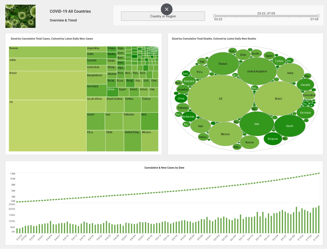
More to that, they also invite user exploration. They are set up to allow users to navigate that in flexible ways. And they can do things like zooming and panning so you can see the level of detail.
Also, they can filter out outliers so that you can understand better what the data is. So I think that type of really designing these dashboards or these presentations of data to support this type of user exploration is extremely critical.
Eric Kavanagh: Yeah. That makes a lot of sense to me and, Robin, I’ll throw it back over to you. Any good ideas you’ve got in terms of best practices or things to avoid?
Data Visualization Must Be Accessible
Dr. Robin Bloor: Well, Wayne has it in terms of principles. It is definitely important how useful the dashboard is, how accessible is that, how can you get from the presentation of that data as it’s done to the details.
But, you know there is completely different context and, for info-graphics, it’s just a matter of being honest with the way the data looks. I am not trying to blow it up, which is the common behavior pattern of the marketing world -- different feel to people actually investigating data and going into. And all this really has to do with is the context but what is the user expecting to see?
If the user is only expecting to see a general dashboard sharing how the business is doing right now, the user actually has to do something about it if they want to see what can go bad or actually see a figure go good. So I think it's actually horses for courses really fitting something to the context is what matters.
Eric Kavanagh: Yeah. Now that makes a lot of sense and, you know, it certainly seems to me that what Wayne was talking about there in terms of the sort of layered design of your dashboard is something that you need to update over time. Right, Wayne?
Modify the Visualization Over Time
In other words, let's say you get it right. Well, that's probably not going to be right for longer than a quarter or half a year. After a year and half, you need to go in and re-adjust how those layers are modeled. That's not a terribly simple process it seems to me, right?
Wayne Eckerson: Yeah. With dashboard design and visualizations your first try is never going to be your final try. You always learn once you throw something against the wall you see what sticks and go back and refine. That's just how you do it. You just can’t get perfect the first time for sure.
And then you have to really watch, well, first of all you have to know who your users are and what their culture is.
Also, pay attention to how they are maturing in the ways that they handle data, use data, and use the tool and the visual representation. What is ideal for the user when they first start out using a new dashboard or visualization is not ideal in a month or six months or a year or two because they are able to actually absorb more information over time.
I always recommend that you start with sparse displays and then gradually evolve to more dense displays as you become more familiar with the environment. Enhancing a data visualization based on user feedback is a continuous process that improves clarity, usability, and impact. Initially, a visualization may be designed based on assumptions about what users need, but real-world interactions often reveal gaps in comprehension, accessibility, and interpretability.
The first step in refinement is gathering structured feedback from users, which can be done through surveys, usability testing, or direct observations of how they interact with the visualization. Key areas to analyze include whether users understand the data presented, whether they can interact effectively, and if the visualization supports their decision-making needs.
Once feedback is collected, iterative improvements should follow. For example, if users struggle to interpret a complex chart, simplifying the design with clearer labels, tooltips, or different visualization formats (e.g., switching from a stacked bar chart to a heatmap) may help. If users request more interactivity, adding filtering options, dynamic tooltips, or drill-down capabilities can enhance their ability to explore the data.
A crucial aspect of the enhancement process is ensuring that adjustments don't sacrifice essential details. Maintaining a balance between comprehensiveness and simplicity is key—removing unnecessary clutter while preserving critical insights.
As enhancements are made, retesting and validation are essential. Each iteration should be tested with users to ensure that the modifications actually improve understanding and usability. Additionally, incorporating automation, such as AI-driven adaptive visualizations, can dynamically adjust based on user preferences and historical interaction patterns.
Over time, a well-refined visualization evolves into an intuitive tool that users trust for analysis and decision-making. By continuously integrating feedback and embracing flexibility, data visualizations can remain effective and relevant, ensuring they meet evolving user needs and business objectives.


