Defining Management Scorecards
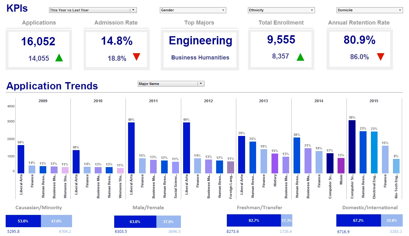
A management scorecard, commonly referred to as a balanced scorecard, takes an organization's in-the-background business plan and converts it into daily marching orders.
Instead of passively working towards company goals, a management scorecard sets the stage for what needs to be done in the future and lays out the plan on how to get there.
It accomplishes this goal by "scoring" the business and its employees in different categories which, in turn, allows management to see where action needs to be taken. It provides a framework and enables executives to truly execute their business strategies.
Why Implement a Balanced Scorecard for your Business?
- Places a strong emphasis on strategy and results
- Aligns organization strategy with employees' daily tasks
- Focus on what will drive future success
- Enhance organizational performance by measuring only the important metrics
- Improves internal communication of vision and strategy
- Makes deviations from plan recognizable
- Prioritizes plans and projects
How InetSoft's Solution Helps
Our software offers capabilities for data mashup, which enables data from disparate sources to be combined for a unified view of corporate performance. This is especially important for management scorecarding since the key performance goals span multiple departments and operational systems.
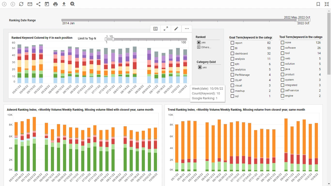
InetSoft’s drag and drop software allows developers and even end-users to quickly create sophisticated scorecards and dashboards. With intuitive point-and-click capabilities, managers can drill into scorecard metrics to identify root causes of performance problems for faster responses.
The server-based application can be installed in hours, not weeks, and requires only a browser on the client device, whether it’s a PC, Mac, mobile phone, or tablet (including those running Apple’s iOS).
Building a High-Impact Scorecard for a Building Products Distributor with InetSoft's Style BI
Traditional business intelligence solutions can be cumbersome, expensive, and slow to adapt to the dynamic needs of the industry. This is where a flexible and powerful BI platform like InetSoft's Style BI can be a game-changer, particularly with its open-source-rooted, developer-friendly approach to creating impactful scorecards.
This article will delve into how IT teams at building products distributorships can leverage InetSoft's Style BI to develop comprehensive scorecards. We'll explore the key performance indicators (KPIs) that matter most in this sector, the ideal chart and visualization choices for conveying performance at a glance, and the underlying analytics that can uncover hidden opportunities and risks.
Why Style BI is a Compelling Choice for an IT Audience
Before we dive into the specifics of scorecard creation, it's important to understand why InetSoft's Style BI is particularly well-suited for an IT-savvy audience. While not a fully open-source platform in the traditional sense, Style BI offers a free, self-hosted open-source version that allows for experimentation and development without initial investment. This is a significant advantage for IT departments looking to prove a concept before committing to a larger-scale rollout. The commercial offerings then provide enterprise-grade features and support as the solution scales.
From a technical standpoint, Style BI is built on a Java-based, service-oriented architecture (SOA), making it highly embeddable and extensible. For IT teams, this means easier integration with existing enterprise applications and a more seamless fit into their overall technology stack. The platform's powerful data mashup engine, known as Data Block™ technology, allows for the real-time combination of data from disparate sources without the need for a traditional data warehouse. This is a crucial feature for building products distributors who often rely on a variety of systems, including ERPs, CRMs, and warehouse management systems (WMS).
A Real-World Example: A Motor Distributor's Success with Style BI
Consider the case of a distributor of three-phase, totally enclosed C-face motors. They faced a common challenge in the distribution industry: data siloed across their SAP ERP system, Salesforce CRM, a custom MySQL-based WMS, and various supplier portals. This fragmented data landscape made it difficult to get a unified view of their operations, leading to inefficiencies in inventory management and a reactive approach to supply chain disruptions.
By implementing Style BI, their IT team was able to:
- Seamlessly connect to their diverse data sources using Style BI's built-in connectors for JDBC, REST/JSON APIs, and flat files.
- Create a unified, logical data model through the Data Block™ technology, enabling them to blend inventory data from SAP with sales data from Salesforce and logistics information from their WMS.
- Develop a suite of interactive dashboards and scorecards that provided real-time visibility into key operational areas.
The results were transformative. They achieved a 20% improvement in on-time delivery rates and realized significant cost savings by opting for Style BI's flexible licensing model over more rigid, proprietary alternatives. This case study underscores the tangible benefits of leveraging a versatile BI platform like Style BI in a distribution environment.
Crafting the Building Products Distributor Scorecard: KPIs and Visualizations
A well-designed scorecard for a building products distributor should provide a holistic view of the business, encompassing inventory management, sales performance, operational efficiency, and customer satisfaction. Here are some of the most critical KPIs to track, along with suggestions for how to visualize them effectively within Style BI:
Inventory Management
- Inventory Turnover Ratio: This KPI measures how many times inventory is sold and replaced over a specific period. A higher ratio generally indicates efficient inventory management. In Style BI, this can be visualized as a prominent gauge or a single, large number with a trend line to show performance over time.
- Days Sales of Inventory (DSI): This metric indicates the average number of days it takes to turn inventory into sales. A lower DSI is preferable. A historical line chart can effectively track DSI and highlight seasonal fluctuations.
- Stock-to-Sales Ratio: This KPI compares the amount of inventory on hand to the number of sales. A bullet chart is an excellent choice here, as it can show the current ratio against a predefined target.
- Carrying Cost of Inventory: This is the total cost of holding inventory, including storage, insurance, and obsolescence. A stacked bar chart can break down the carrying costs into their constituent parts, making it easy to identify areas for cost reduction.
Sales Performance
- Gross Margin by Product Category: Understanding the profitability of different product lines is crucial. A treemap is a powerful visualization for this KPI, with the size of each rectangle representing the sales volume of a product category and the color indicating its gross margin.
- Order Fill Rate: This measures the percentage of orders that are shipped in full and on time. A simple percentage gauge with a color-coded indicator (e.g., green for good, red for poor) can provide an immediate visual cue. Drill-down capabilities can then allow users to explore the reasons for unfilled orders.
- Sales by Region and Salesperson: A geographic map chart is ideal for visualizing sales by region, with color gradients representing sales volume. A horizontal bar chart can then rank the performance of individual sales representatives.
Operational Efficiency
- On-Time Delivery: This is a critical customer satisfaction metric. A combination of a percentage scorecard and a historical line chart can track performance over time and identify trends.
- Order Picking Accuracy: Inaccurate orders lead to costly returns and dissatisfied customers. A simple scorecard with the percentage of accurate orders is effective. For deeper analysis, a Pareto chart can identify the most common picking errors.
- Warehouse Capacity Utilization: This KPI helps in optimizing warehouse space. A gauge chart or a horizontal bar chart can show the current utilization against the total capacity.
The Power of Analytics in Style BI
Beyond simply displaying KPIs, Style BI's analytical capabilities allow IT teams to embed deeper insights into the scorecards. For example:
- Predictive Analytics: By leveraging historical sales data, you can build predictive models to forecast future demand. This can be visualized as a line chart showing historical sales, forecasted sales, and confidence intervals.
- What-If Analysis: InetSoft's platform allows for the creation of interactive sliders and input fields. This enables managers to perform "what-if" scenarios, such as modeling the impact of a price change on gross margin or the effect of a change in lead time on inventory levels.
- Root Cause Analysis: The drill-down capabilities within Style BI are essential for root cause analysis. For instance, if the on-time delivery rate drops, a user can click on the KPI to see a breakdown by carrier, warehouse, or product line to pinpoint the source of the delay.


