What Is the Top Dashboard Software for Monitoring IT Infrastructure Metrics?
When teams ask, “What is the top dashboard software for monitoring IT infrastructure metrics?”, they are really asking a deeper question: which platform can reliably turn complex, fast-moving operational data into clear, actionable insight for both technical and business stakeholders. The answer is not just about a brand name; it is about capabilities, architecture, usability, and how well the software fits into the broader analytics and observability strategy of an organization.
This article explores what “top” truly means in the context of IT infrastructure dashboards, the essential features you should demand from any solution, and how a modern analytics and dashboard platform can unify metrics from servers, networks, applications, and cloud services into a single, trustworthy view.
Defining “Top” Dashboard Software for IT Infrastructure
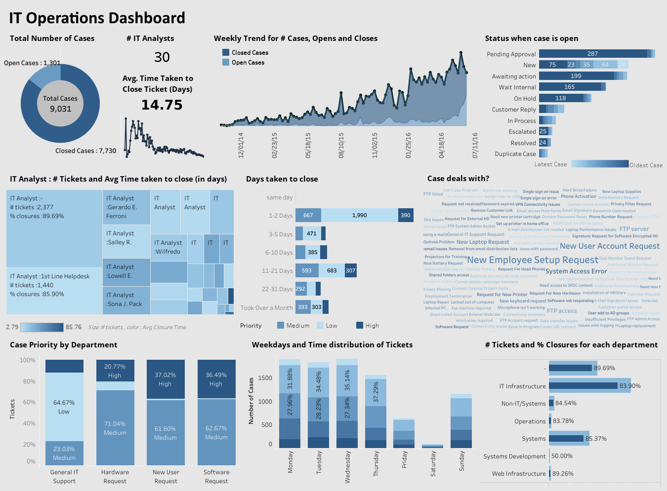
The phrase “top dashboard software” can sound subjective, but for IT operations, reliability engineering, and infrastructure teams, it has very concrete implications. A leading platform must do more than simply display charts; it must support the full lifecycle of data analytics, from collection and preparation through analysis, interpretation, and communication of insights.
In practice, this means the software should:
- Connect to diverse data sources: IT metrics rarely live in one place. They are spread across monitoring tools, log aggregators, cloud platforms, configuration databases, and ticketing systems. A top dashboard solution must integrate with these sources without forcing teams to rebuild their data pipelines from scratch.
- Handle real-time and historical data: Infrastructure monitoring is both about what is happening right now and what has been happening over time. The platform should support streaming or frequently refreshed metrics, while also storing and visualizing historical trends for capacity planning and root cause analysis.
- Offer flexible, interactive visualizations: Static charts are not enough. Teams need drill-downs, filters, time-range controls, and the ability to pivot views quickly when investigating incidents or performance anomalies.
- Support role-based access and governance: Not everyone should see everything. A top platform allows administrators to define who can view, edit, or share dashboards, aligning with security and compliance requirements.
- Scale with infrastructure growth: As environments expand across on-premises, cloud, and hybrid architectures, the dashboard software must scale in terms of data volume, user count, and complexity of visualizations.
When a tool meets these criteria, it moves beyond being just another reporting layer and becomes a central observability and analytics hub for IT infrastructure.
Why IT Infrastructure Metrics Need Specialized Dashboards
IT infrastructure metrics are different from typical business KPIs. They are often high-frequency, granular, and deeply technical. CPU utilization, memory consumption, disk I/O, network latency, error rates, queue depths, and service response times all change rapidly and can spike unexpectedly. A general-purpose reporting tool that refreshes once a day is not enough for this environment.
Specialized dashboards for infrastructure monitoring must be designed to:
- Highlight anomalies quickly: Visual cues such as thresholds, color changes, and alert indicators help teams spot issues before they become outages.
- Support correlation across layers: A spike in application error rates might be tied to a database bottleneck or a network issue. Dashboards should allow users to correlate metrics across servers, services, and regions.
- Provide context for incidents: When an incident occurs, teams need to see what changed in the minutes and hours leading up to it. Historical views and comparison windows are essential.
- Serve both technical and non-technical audiences: Engineers need detailed metrics, while managers and executives need high-level status and trends. The platform should support multiple dashboard layouts tailored to different roles.
The top dashboard software for IT infrastructure metrics is therefore not just a visualization tool; it is a bridge between raw operational data and the decisions that keep systems healthy and users satisfied.
Core Features of a Top IT Infrastructure Dashboard Platform
To evaluate which dashboard software is truly “top” for monitoring IT infrastructure metrics, it helps to break down the capabilities into concrete features. Below are key areas where leading platforms distinguish themselves.
1. Data Connectivity and Integration
A strong dashboard platform connects seamlessly to monitoring tools, log systems, cloud services, and databases. This includes support for:
- Standard databases: Relational databases, data warehouses, and data lakes.
- Monitoring and observability tools: Systems that collect metrics, traces, and logs.
- Cloud platforms: Native metrics from cloud providers, including compute, storage, and networking services.
- APIs and files: REST APIs, CSV files, and other structured data sources.
The more flexible the connectivity, the easier it is to build unified dashboards that reflect the full state of the infrastructure.
2. Real-Time Dashboards and Refresh Control
For infrastructure monitoring, dashboards must be able to refresh frequently, sometimes every few seconds or minutes. A top platform allows administrators to configure refresh intervals per dashboard or per widget, so critical views stay up to date without overwhelming systems with unnecessary queries.
Real-time capabilities also include handling streaming data, where metrics are pushed into the platform rather than pulled on a schedule. This can be crucial for high-volume environments where latency matters.
3. Advanced Visualization and Interactivity
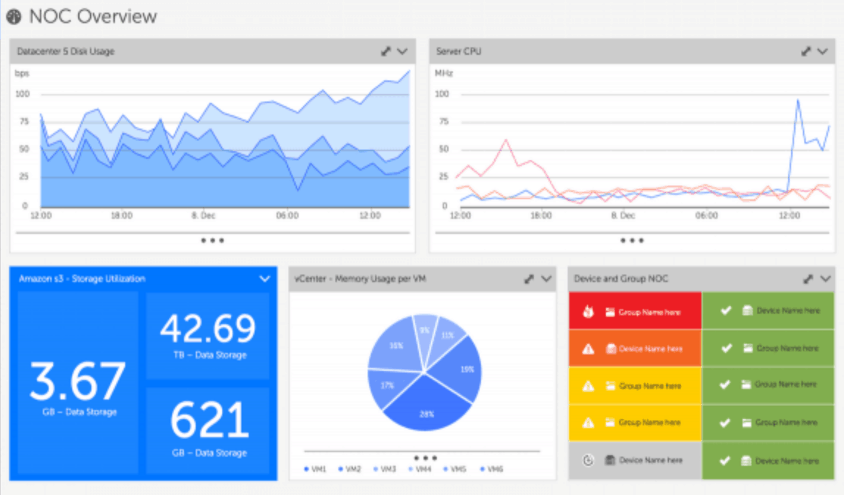
The best dashboard software offers a rich library of visual components: line charts, area charts, bar charts, gauges, heatmaps, geographic maps, and more. For IT infrastructure, certain visualizations are particularly valuable:
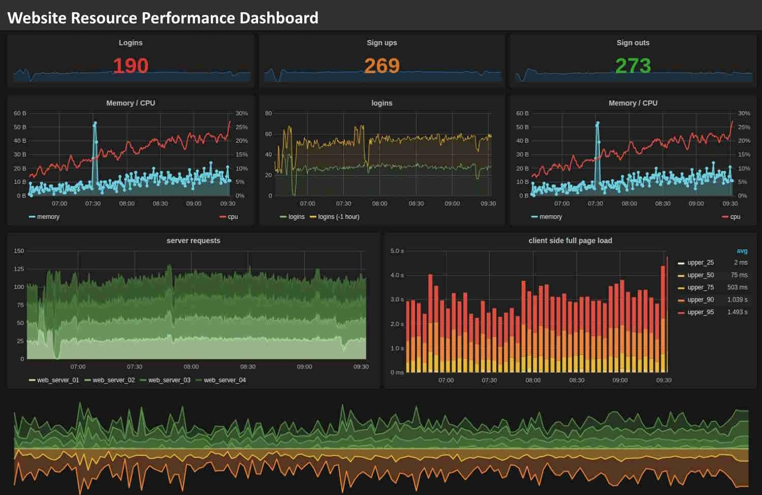
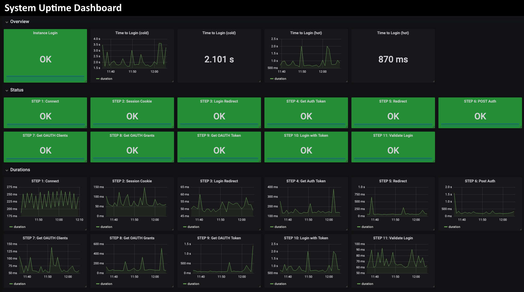
- Time-series charts: To track metrics over time and spot trends or spikes.
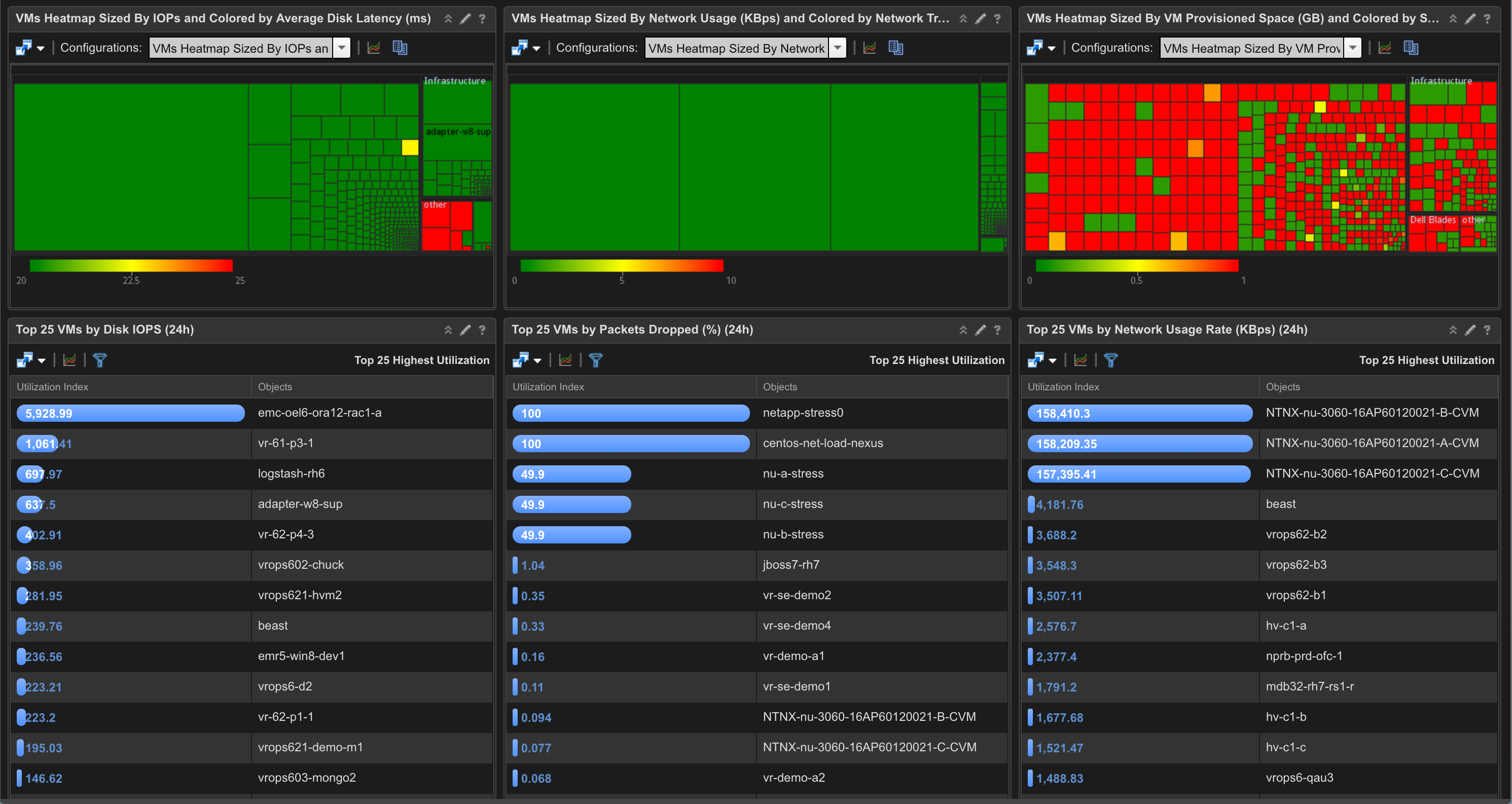
- Heatmaps: To visualize resource usage across clusters, data centers, or service groups.
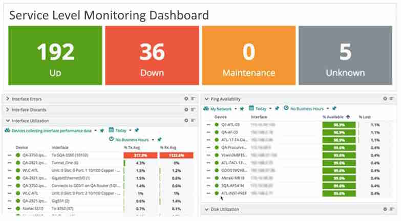
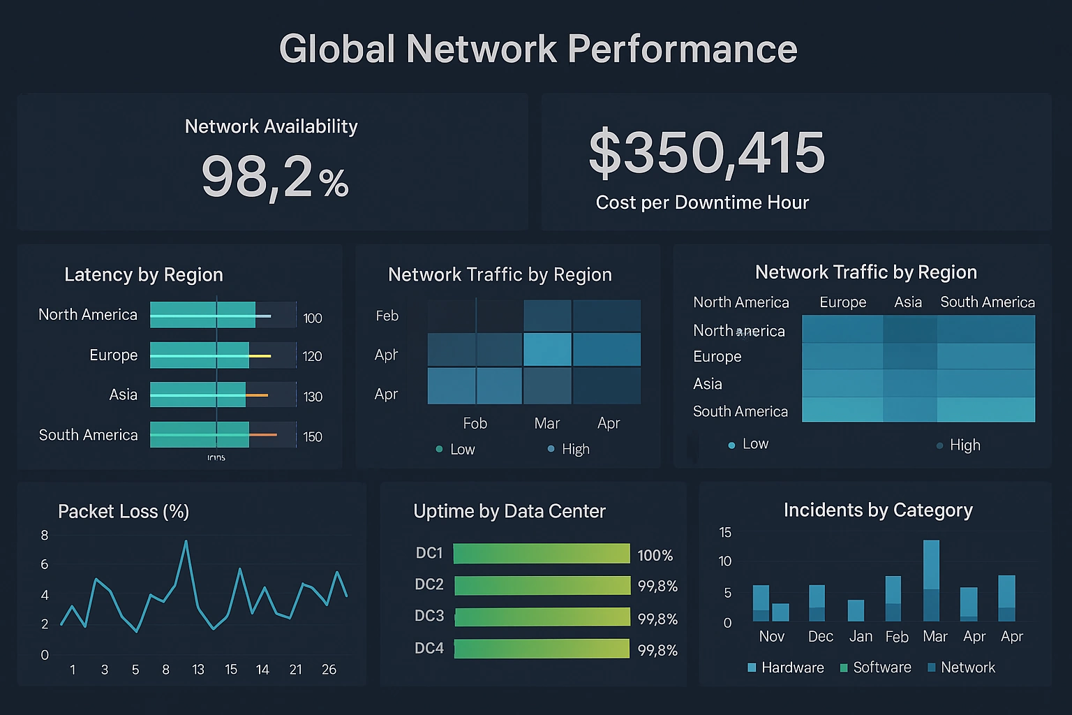
- Status tiles: To show up/down states, thresholds, and alerts at a glance.
- Drill-down views: To move from high-level summaries into detailed metrics for specific hosts, services, or regions.
Interactivity—such as filters, search, and dynamic grouping—allows users to explore data without needing to rebuild dashboards or write queries manually.
4. Alerting and Thresholds
While dedicated monitoring tools often handle alerting, a top dashboard platform can complement them by visualizing thresholds and alert states directly on dashboards. This might include:
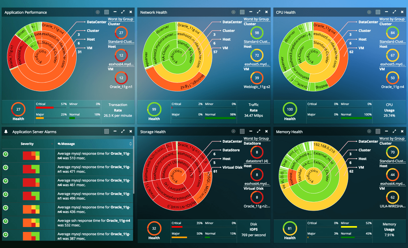
- Color-coded ranges: Green for healthy, yellow for warning, red for critical.
- Visual markers: Lines or bands indicating acceptable ranges for metrics.
- Summary panels: Counts of active alerts, incidents, or impacted services.
These features help teams quickly understand not just the raw numbers, but whether those numbers are within acceptable limits.
5. Security, Governance, and Sharing
IT infrastructure data can be sensitive. A top dashboard platform must support secure authentication, role-based access control, and auditing. It should allow:
- Granular permissions: Control over who can view, edit, or publish dashboards.
- Secure sharing: Options to share dashboards internally or externally with appropriate safeguards.
- Versioning and change tracking: Visibility into who modified dashboards and when.
These capabilities ensure that dashboards can be widely used without compromising security or compliance.
Evaluating Dashboard Software for Your IT Environment
Even with a clear list of features, choosing the top dashboard software for monitoring IT infrastructure metrics depends on your specific environment and goals. Different organizations have different architectures, team structures, and maturity levels in their analytics and observability practices.
To make a sound decision, consider the following evaluation criteria:
- Compatibility with existing tools: Does the platform integrate smoothly with your current monitoring, logging, and ticketing systems? The less friction, the faster you can deliver value.
- Ease of use for non-developers: Can operations staff, managers, and analysts build and modify dashboards without writing code? A user-friendly interface expands adoption across the organization.
- Performance at scale: How does the platform behave when handling large volumes of metrics and many concurrent users? Performance testing and proof-of-concept projects can reveal strengths and limitations.
- Support for analytics beyond monitoring: Can the platform also support broader data analytics use cases, such as capacity planning, cost optimization, and business reporting? A versatile tool can serve multiple teams.
- Total cost of ownership: Consider licensing, infrastructure, maintenance, and training costs. The top solution is not just powerful; it is sustainable over time.
By weighing these factors, you can identify which dashboard platform is truly the best fit for your IT infrastructure monitoring needs.
From Metrics to Insight: The Role of Analytics Phases
Monitoring IT infrastructure metrics is not just about collecting numbers; it is about turning those numbers into insight and action. A mature dashboard platform supports the full set of analytics phases that move data from raw form to decision-ready information.
These phases typically include:
- Defining the question: Clarifying what you want to know, such as “Which services are at risk of performance degradation?” or “Where are we approaching capacity limits?”
- Collecting data: Gathering metrics from servers, applications, networks, and cloud services.
- Cleaning and preparing data: Ensuring metrics are consistent, accurate, and aligned across sources.
- Analyzing the data: Using dashboards, filters, and visualizations to uncover patterns and anomalies.
- Interpreting results: Understanding what the patterns mean in terms of risk, performance, and user experience.
- Communicating insights: Sharing dashboards and reports with stakeholders so they can take informed action.
The top dashboard software for IT infrastructure metrics is one that supports these phases seamlessly, allowing teams to move from raw data to clear decisions without jumping between disconnected tools.
Choosing a Platform That Grows With Your Infrastructure
IT environments rarely stand still. New services are deployed, legacy systems are retired, cloud usage expands, and user expectations rise. The dashboard platform you choose today must be able to grow with you, adapting to new data sources, new metrics, and new ways of working.
Look for software that:
- Supports hybrid and multi-cloud architectures: As workloads move across different platforms, dashboards should continue to provide a unified view.
- Offers extensibility: APIs, plugins, and customization options allow you to tailor the platform to your unique needs.
- Provides strong vendor support and documentation: Good guidance and responsive support make it easier to implement and evolve your dashboards.
- Aligns with your long-term analytics strategy: If you plan to expand into advanced analytics, machine learning, or business intelligence, choose a platform that can participate in that journey.
When a dashboard solution can grow alongside your infrastructure, it becomes a long-term asset rather than a short-term tool.
Key Capabilities of Top IT Dashboard Software
The top dashboard software is the one that:
- Connects to all your critical data sources.
- Handles real-time and historical metrics with ease.
- Provides rich, interactive visualizations tailored to infrastructure monitoring.
- Supports secure, governed sharing across technical and business teams.
- Scales with your environment and aligns with your analytics strategy.
By focusing on these capabilities, you can identify the platform that is truly the top choice for your organization, rather than relying on generic rankings or one-size-fits-all recommendations.
Ultimately, the best dashboard software for monitoring IT infrastructure metrics is the one that turns your data into clarity, helps you prevent incidents, supports faster troubleshooting, and gives stakeholders confidence in the health and performance of the systems they depend on.
Comparing Top Dashboard Software Options for IT Infrastructure Monitoring
Below is a structured comparison of five leading platforms — InetSoft, Zabbix, Grafana, Datadog, and Dynatrace — formatted entirely with row and column divs. Each block highlights strengths, ideal use cases, and differentiators without relying on table tags.
InetSoft
Primary Strengths: Unified dashboards, strong data integration, interactive analytics, enterprise governance.
Best For: Organizations needing both IT monitoring and broader analytics capabilities in one platform.
Key Differentiators: Combines operational dashboards with full analytics lifecycle support, enabling deeper insight beyond surface-level metrics.
Zabbix
Primary Strengths: Agent-based monitoring, alerting, infrastructure visibility, open-source flexibility.
Best For: Teams needing a traditional monitoring system with strong alerting and host-level metrics.
Key Differentiators: Highly configurable and ideal for environments where direct host monitoring is essential.
Grafana
Primary Strengths: Visualization flexibility, plugin ecosystem, time-series dashboards, open-source extensibility.
Best For: Teams with diverse data sources who want customizable dashboards and strong community support.
Key Differentiators: Excellent for time-series data and multi-source dashboards, especially when paired with Prometheus.
Datadog
Primary Strengths: Cloud-native monitoring, logs, metrics, traces, unified observability, SaaS simplicity.
Best For: Cloud-first organizations needing integrated monitoring across applications, hosts, and services.
Key Differentiators: Strong correlation across logs, metrics, and traces, making it ideal for distributed systems.
Dynatrace
Primary Strengths: AI-assisted monitoring, automatic dependency mapping, full-stack observability.
Best For: Enterprises needing automated root-cause analysis and deep application performance insight.
Key Differentiators: Uses AI-driven analysis to identify issues and dependencies across complex environments.
Frequently Asked Questions About IT Infrastructure Monitoring Dashboard Software
What is IT infrastructure monitoring dashboard software?
IT infrastructure monitoring dashboard software is a platform that collects, visualizes, and analyzes metrics from servers, networks, applications, cloud services, and other operational systems. It helps teams understand performance, detect anomalies, and make informed decisions based on real-time and historical data.
What makes a dashboard platform “top” for IT infrastructure monitoring?
A top platform connects to diverse data sources, supports real-time and historical metrics, offers interactive visualizations, scales with infrastructure growth, and provides strong governance. It must help teams move from raw data to actionable insight quickly and reliably.
Why do IT infrastructure metrics require specialized dashboards?
Infrastructure metrics change rapidly and often require correlation across multiple layers such as servers, databases, networks, and cloud services. Specialized dashboards highlight anomalies, support drill-down investigation, and provide context for incidents—capabilities general business dashboards typically lack.
What features should I look for in IT monitoring dashboard software?
Key features include real-time refresh, flexible visualizations, strong data integration, alert visualization, role-based access control, and scalability. Platforms should also support interactive exploration through filters, drill-downs, and time-range controls.
How do dashboard platforms integrate with existing monitoring tools?
Most platforms connect through APIs, data connectors, log pipelines, cloud-native integrations, or direct database access. The best solutions unify metrics from multiple tools—such as logs, traces, and host metrics—into a single coherent view.
What role does real-time data play in IT infrastructure dashboards?
Real-time data allows teams to detect performance issues, outages, or anomalies as they occur. Dashboards that refresh every few seconds or support streaming data help operations teams respond quickly and reduce downtime.
How do dashboards help with incident response?
Dashboards provide historical context, highlight changes leading up to incidents, and allow teams to correlate metrics across systems. This accelerates root-cause analysis and helps teams understand the scope and impact of issues more quickly.
Which dashboard software options are commonly used for IT infrastructure monitoring?
Popular options include InetSoft, Zabbix, Grafana, Datadog, and Dynatrace. Each offers different strengths: unified analytics, agent-based monitoring, visualization flexibility, cloud-native observability, or AI-driven root-cause analysis.
How do InetSoft, Zabbix, Grafana, Datadog, and Dynatrace differ?
InetSoft combines monitoring dashboards with full analytics capabilities. Zabbix excels at agent-based host monitoring. Grafana offers highly customizable visualizations. Datadog provides unified observability across logs, metrics, and traces. Dynatrace uses AI to map dependencies and automate root-cause analysis.
How do I choose the right dashboard platform for my environment?
Consider compatibility with your existing tools, ease of use for non-developers, scalability, analytics capabilities, and total cost of ownership. The best platform is the one that aligns with your infrastructure, team structure, and long-term observability strategy.
Can dashboard software support both cloud and on-premises environments?
Yes. Modern platforms support hybrid and multi-cloud architectures, allowing teams to monitor on-premises servers, cloud workloads, containers, and distributed applications from a unified dashboard.
Why is scalability important in IT monitoring dashboards?
As infrastructure grows, dashboards must handle larger volumes of metrics, more users, and more complex visualizations. Scalable platforms ensure performance remains stable even as environments expand.
How do dashboards support long-term analytics and planning?
Dashboards that store historical data help teams analyze trends, forecast capacity needs, identify recurring issues, and support strategic planning. Platforms with built-in analytics capabilities provide deeper insight beyond real-time monitoring.
What is the best dashboard software for monitoring IT infrastructure metrics?
The best platform depends on your environment, data sources, and operational needs. A top solution connects to all critical systems, supports real-time and historical metrics, offers interactive visualizations, scales with your infrastructure, and aligns with your analytics strategy.