How-to: Setting the Colors on a Dashboard Output Gauge
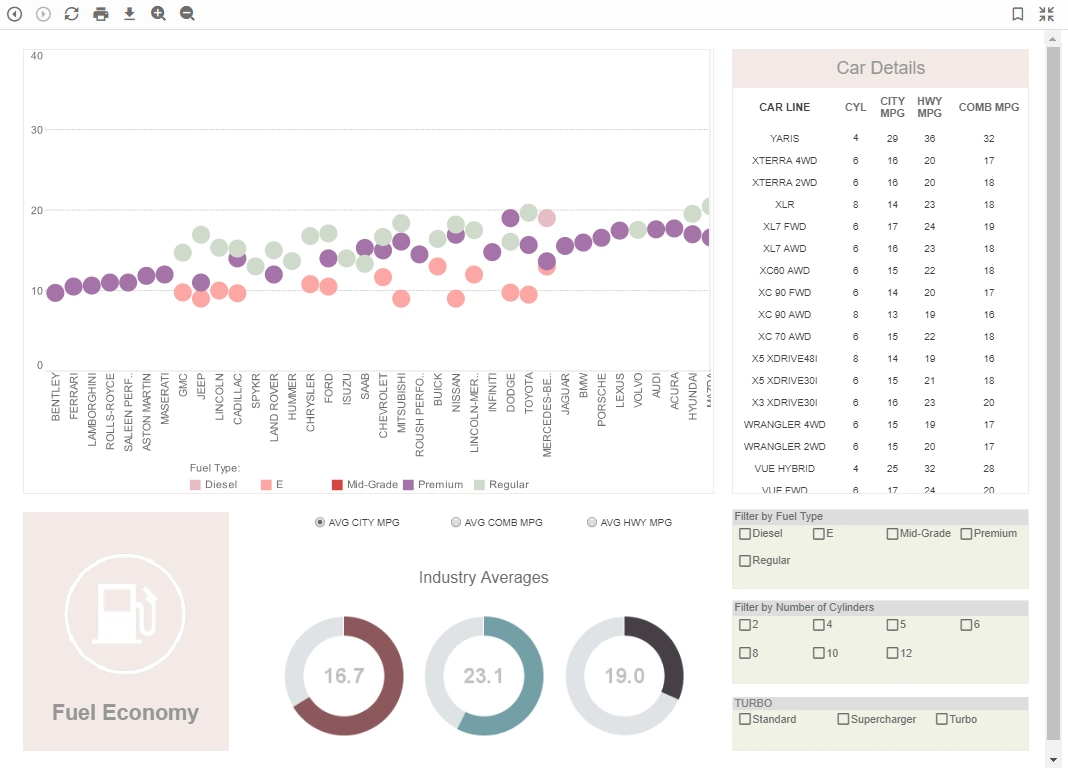
The "Dashboard Output Gauge" is a specific component or widget within InetSoft's dashboarding platform. A gauge, in this context, is a graphical representation of a single value or a set of values. It's designed to provide a visual indication of the status, progress, or performance of a particular metric or KPI (Key Performance Indicator).
Here are some common features and functionalities you might find in InetSoft's Dashboard Output Gauge:
-
Visual Representation: The gauge provides a visual representation of a data point. This could be in the form of a needle on a dial, a bar, a pie chart, or any other graphical element that conveys the information effectively.
-
Customization: Users can often customize the appearance of the gauge to suit their specific needs. This might include options to change colors, fonts, and scales.
-
Data Binding: The gauge is usually connected to a data source, allowing it to display real-time or updated information. This is crucial for making dynamic and responsive dashboards.
-
Thresholds and Alerts: Gauges often allow you to set thresholds or target values. If a metric falls outside of these bounds, it can trigger an alert or visual indication, drawing attention to potential issues.
-
Interactivity: Depending on the software, the gauge might be interactive. This means users can interact with it to drill down into more detailed information or to view related data.
-
Support for Different Gauge Types: Different types of gauges might be available to suit different types of data. For instance, a speedometer-style gauge might be used for measuring progress towards a goal, while a radial gauge might be used for displaying a percentage.
-
Trend Indicators: Some gauges include trend indicators like arrows or color-coded indicators to show whether the metric is improving, declining, or stable.
-
Annotations and Labels: Users can often add labels or annotations to provide additional context to the information being displayed.
-
Export and Sharing: Users may have the option to export the gauge or the entire dashboard for sharing with others, either as static images or as interactive reports.
How to Specify the Colors for Each Section of a Gauge
To set multiple ranges for an output component, follow the steps below:
1. Open the Advanced tab of the Properties dialog box. In the ‘Range’ panel you will see three editable drop-down lists.
2. Enter a value for ‘Range 1 to’ and choose a color from the pop-up menu. This sets the region from the minimum value on the scale to the specified value.
3. Enter a value into ‘Range 2 to’ and choose a color from the pop-up menu. This sets the region from the end of ‘Range 1’ to the specified value.
4. Enter a value into ‘Range 3 to’ and choose a color from the pop-up menu. This sets the region from the end of ‘Range 2’ to the specified value.
5. Select the default color of the scale in the top color menu. Range A set of colored zones to display on the output component. See Setting Ranges for Output Components. Show Value Provides a digital display of the current value shown on a Gauge.If the specified value in ‘Range 3’ is less than the maximum value on the scale, the remainder of the scale is rendered in this default color.
6. Select ‘Gradient’ to smoothly blend the zone colors, if desired.
What Are the Reasons to Use a Dashboard Output Gauge?
Using a Dashboard Output Gauge provides several benefits for businesses and individuals across various industries. Here are some compelling reasons to incorporate a Dashboard Output Gauge into your reporting and visualization tools:
-
Visual Clarity: Gauges offer a clear, intuitive visual representation of data, making it easier for users to quickly understand and interpret information.
-
Instant Insights: Gauges provide immediate feedback on critical metrics, allowing users to assess performance or status at a glance.
-
Focus on Key Metrics: They enable users to concentrate on specific KPIs or metrics that are most crucial to their objectives, helping them avoid information overload.
-
Goal Monitoring: Gauges are effective for tracking progress towards predefined targets or goals, making it easy to see whether objectives are being met.
-
Alerts and Thresholds: Users can set thresholds within the gauge. When a metric falls outside of these bounds, it can trigger an alert, ensuring timely attention to potential issues.
-
Real-Time Data Display: Gauges can be linked to real-time data sources, allowing users to monitor changing metrics dynamically.
-
Comparative Analysis: They facilitate easy comparison of current data against historical performance or against established benchmarks.
-
Efficient Decision-Making: Gauges provide quick, digestible information, enabling faster and more informed decision-making.
-
Simplicity and Accessibility: Gauges are typically easy to understand, making them accessible to a wide range of users, including those who may not have extensive data analysis expertise.
-
Space Efficiency: They can convey a significant amount of information in a compact space, making them ideal for dashboards with limited screen real estate.
-
Motivation and Engagement: For teams or individuals, gauges can serve as motivational tools by visualizing progress towards targets, fostering a sense of achievement.
-
Customization: Gauges can often be customized to match the branding, color schemes, and visual preferences of the user or organization.
-
Anomaly Detection: They can highlight abnormal or outlier values, drawing attention to potential issues or areas that require further investigation.
-
Interactive Exploration: Depending on the dashboard software, gauges may support interactivity, allowing users to click or hover for additional details or to explore related data.
-
Cross-Platform Compatibility: Gauges are typically designed to work well across various devices, including desktops, laptops, tablets, and mobile phones.


