Rocket Launch Operations Dashboards: Design, Purpose, and Operational Value
A rocket launch is one of the most complex engineering operations undertaken by humankind.
It involves thousands of interconnected systems, strict timing constraints, volatile propellants, and rapidly changing environmental conditions.
To manage this complexity, modern spaceflight operations rely heavily on centralized monitoring systems known as rocket launch operations dashboards.
These dashboards aggregate telemetry, system health data, environmental measurements, and procedural milestones into a single, coherent visual interface that supports decision-making in real time.
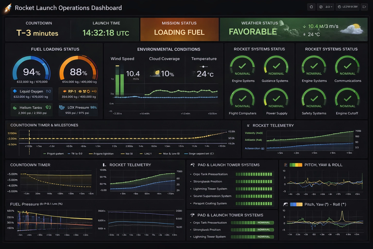
The Rocket Launch Operations Dashboard presented here is inspired by modern infrastructure monitoring tools and adapts their proven visual language to the unique demands of launch operations.
Purpose of a Rocket Launch Operations Dashboard
The primary purpose of a rocket launch operations dashboard is to provide launch controllers with immediate situational awareness. During countdown and launch, there is no time to manually correlate data from separate systems. Engineers, flight directors, safety officers, and weather specialists must all see a shared operational picture. The dashboard consolidates critical information so that anomalies can be detected early, trends can be evaluated quickly, and go/no-go decisions can be made with confidence.
Beyond real-time operations, the dashboard also serves as a historical analysis tool. Telemetry trends, countdown milestones, and system performance can be reviewed after the launch to support investigations, improve procedures, and refine future mission designs. In this sense, the dashboard is both an operational control surface and a long-term knowledge repository.
Overall Layout and Visual Style
The dashboard uses a dark theme optimized for control rooms and extended viewing periods. Dark backgrounds reduce eye strain and allow color-coded alerts to stand out clearly. Bright greens indicate nominal conditions, amber signals caution or transitional states, and red highlights critical issues requiring immediate attention. This color language is consistent across all panels to reduce cognitive load.
The layout follows a top-down priority structure. At the top of the dashboard are the most critical mission-level indicators: countdown status, launch time, mission status, and weather conditions. These panels answer the most important questions at a glance: How close are we to launch? What phase are we in? Is the weather acceptable? Below these, progressively more detailed subsystem and telemetry data are presented for engineers who need deeper insight.
Countdown and Mission Status Indicators
The countdown timer is the heartbeat of the launch operation. Displayed prominently, it shows the remaining time to liftoff or the current hold point if the countdown is paused. The use of a “T-minus” format aligns with standard aerospace conventions and reduces ambiguity. Adjacent to the countdown is the scheduled launch time in UTC, ensuring synchronization across international teams and systems.
The mission status panel communicates the current operational phase, such as “Fuel Loading,” “Terminal Count,” or “Go for Launch.” This status is derived from procedural milestones and system states rather than manual input alone. By automating mission phase detection, the dashboard reduces the risk of human error and ensures that all teams share the same understanding of the mission’s progress.
Weather and Environmental Monitoring
Weather is one of the most common causes of launch delays and scrubs. The dashboard dedicates a prominent panel to weather monitoring, summarizing conditions as favorable, marginal, or unfavorable. This high-level indicator is supported by detailed environmental data, including wind speed, temperature, and cloud coverage.
Wind speed is particularly critical, as high-altitude winds can affect vehicle loads and trajectory. The dashboard presents wind data both numerically and graphically, allowing controllers to identify trends rather than relying on single-point measurements. Temperature readings are monitored closely for their impact on propellant density, material performance, and avionics reliability.
Fuel Loading and Propellant Systems
Propellant loading is one of the most hazardous phases of launch preparation. The dashboard represents fuel loading status using circular gauges that clearly show fill percentages and absolute quantities. Separate indicators for liquid oxygen, RP-1 or liquid hydrogen, and pressurant gases such as helium ensure that each subsystem can be evaluated independently.
Pressure readings are displayed alongside quantity measurements to confirm that tanks are not only full but also within safe operating limits. Any deviation from expected pressure curves can indicate leaks, valve issues, or thermal problems. By visualizing these parameters together, the dashboard helps engineers quickly determine whether an anomaly is isolated or systemic.
Rocket Systems Health Monitoring
Rocket systems health is presented through a series of status gauges labeled with clear subsystem names, such as Engine Systems, Guidance Systems, Communications, Power Supply, and Safety Systems. Each gauge uses a simple nominal or non-nominal indicator, often accompanied by a checkmark or warning symbol. This approach prioritizes clarity over excessive detail during critical phases.
Behind each high-level indicator lies a vast network of sensors and diagnostics. The dashboard abstracts this complexity, surfacing only the most relevant information to the launch team. If a subsystem transitions out of a nominal state, engineers can drill down into more detailed views without cluttering the main operational display.
Countdown Milestones and Event Tracking
The countdown timeline panel visualizes key events such as engine chill, ignition sequence start, clamp release, and liftoff. These milestones are plotted along a time axis, providing context for both past and upcoming events. This data visualization helps teams anticipate upcoming actions and verify that completed steps occurred within expected time windows.
In the event of a hold or abort, the timeline becomes especially valuable. Controllers can immediately see which milestones were completed and which remain pending, simplifying the decision to recycle the countdown or stand down operations.
Telemetry and Flight Dynamics
Telemetry panels display critical flight parameters such as velocity, altitude, and acceleration. Even during pre-launch phases, these panels may show simulated or baseline values to verify sensor readiness. Once the vehicle lifts off, these graphs become the primary means of tracking flight performance against predicted profiles.
Attitude data, including pitch, yaw, and roll, is visualized using line graphs that show both magnitude and stability over time. Sudden deviations or oscillations can indicate guidance issues or structural anomalies. By presenting these parameters together, the dashboard supports rapid diagnosis during the most dynamic phase of the mission.
Pad and Ground Systems Monitoring
Launch operations do not involve the rocket alone; ground systems are equally critical. The dashboard includes dedicated panels for pad and launch tower systems such as tank pressurization, strongback position, lightning protection, and sound suppression. These systems must all be in the correct configuration before launch commit.
Status bars and nominal indicators allow ground controllers to confirm readiness at a glance. Any failure or misconfiguration is immediately visible, reducing the risk of proceeding with unsafe conditions.
Human Factors and Decision Support
A well-designed dashboard is as much about human factors as it is about data. The Rocket Launch Operations Dashboard minimizes unnecessary text, uses consistent labeling, and avoids ambiguous abbreviations. Every title and label is spelled correctly and clearly, ensuring that there is no confusion during high-stress situations.
The dashboard also supports collaborative decision-making. By providing a shared visual reference, it reduces miscommunication between teams and enables faster consensus when critical calls must be made.


