Introduction to Sprint Burndown Dashboards
A sprint burndown dashboard is one of the most widely used visual tools in Agile and Scrum environments. It provides a clear, at-a-glance view of how much work remains in a sprint and how quickly a team is completing that work.
When designed and interpreted correctly, a burndown dashboard becomes more than a reporting artifact—it becomes a decision-making aid that helps teams adapt, forecast, and improve.
At its core, the dashboard answers three essential questions: How much work did we plan? How much work have we completed? And are we on track to finish by the end of the sprint?
These answers are expressed through visual clarity, time-based progress, and work transparency.


What a Sprint Burndown Dashboard Represents
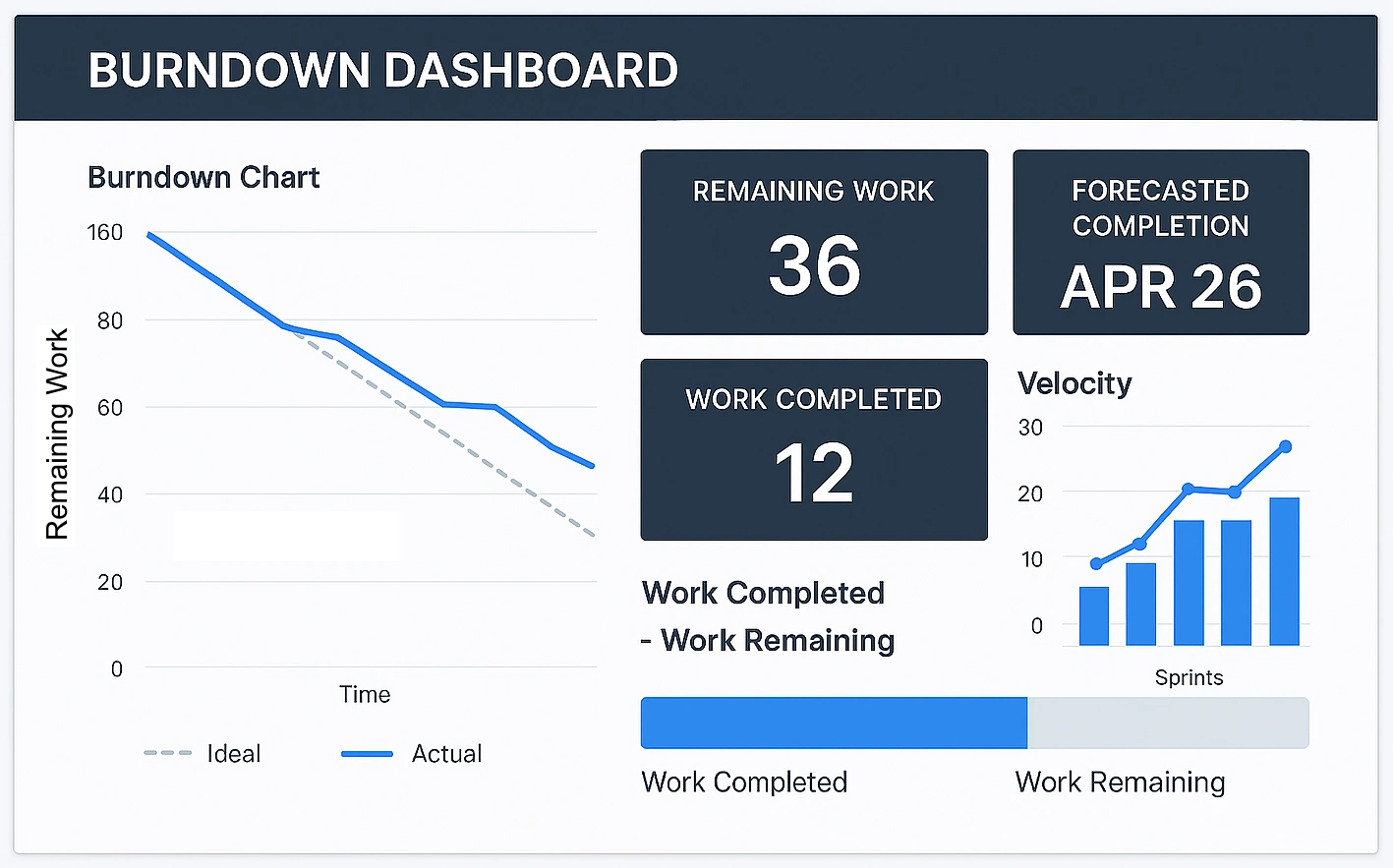
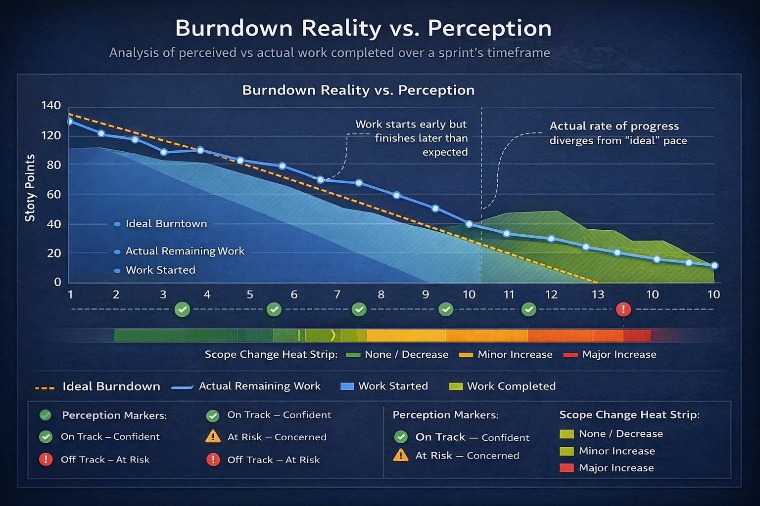
A sprint burndown dashboard visualizes remaining work over time, typically measured in story points, hours, or tasks. The x-axis represents time (usually days in the sprint), while the y-axis represents remaining effort. Two key lines are often present: the ideal burndown line and the actual progress line.
The ideal line shows a straight, linear path from total planned work at sprint start to zero work at sprint end. The actual line shows what is really happening. The gap between these lines highlights risk, opportunity, and reality. This simple comparison is what makes burndown dashboards so powerful for progress tracking, delivery forecasting, and team alignment.
Core KPIs Commonly Found on Burndown Dashboards
Most sprint burndown dashboards include a set of key performance indicators (KPIs) displayed as summary cards at the top. These KPIs provide instant context before anyone looks at the charts or tables. Common KPIs include total story points, completed points, remaining points, sprint duration, and days remaining.
These metrics are not meant to evaluate individuals. Instead, they reflect system performance and team flow. When teams treat KPIs as learning signals rather than judgment tools, they unlock continuous improvement, predictable delivery, and sustainable pace.
Total Story Points
Total story points represent the sum of all estimated work committed to the sprint at planning time. This KPI establishes the baseline for the entire sprint. It reflects both scope and team capacity assumptions.
If this number changes mid-sprint, it usually indicates scope creep or replanning. While changes are sometimes necessary, frequent fluctuation can undermine forecast reliability. Teams affect this KPI by improving estimation techniques, refining backlog items before sprint planning, and resisting unnecessary mid-sprint additions.
Completed Story Points
Completed story points show how much work has met the team’s definition of done. This KPI is critical because it reflects actual value delivered, not just work started. Items that are “almost done” do not count.
To positively affect this metric, teams should focus on finishing work rather than starting new tasks. Limiting work in progress, swarming on blocked items, and clarifying acceptance criteria all help increase completed points. This KPI directly supports delivery confidence and stakeholder trust.
Remaining Story Points
Remaining story points represent the difference between total and completed work. This KPI feeds directly into the burndown chart and highlights how much effort is still required.
A slow decrease early in the sprint often signals stories that are too large or poorly sliced. Teams can improve this KPI by breaking work into smaller increments, delivering vertical slices, and integrating continuously. The goal is steady, visible progress rather than last-minute drops.
Days Remaining in the Sprint
Days remaining provide temporal context to all other KPIs. Without time, story points alone lack meaning. This metric helps teams assess urgency and pacing.
Teams affect this KPI indirectly by managing interruptions and protecting focus time. Excessive meetings, unplanned work, or context switching reduce the effective capacity of remaining days. Maintaining time awareness helps teams make smarter trade-offs.

Ideal vs Actual Burndown
The ideal burndown line is not a performance target—it is a reference. Comparing actual progress against this line highlights trends. Being above the ideal line indicates risk, while being below suggests early completion or over-estimation.
Teams should resist the urge to “game” this comparison. Instead, they should use it to ask better questions: Are stories too large? Are dependencies slowing us down? Are we discovering unknown work late? Honest interpretation leads to better planning and healthier sprints.
Tasks by Status
Many dashboards include a bar or column chart showing tasks by status, such as To Do, In Progress, and Done. This visualization complements the burndown chart by revealing flow and bottlenecks.
A large “In Progress” column is often a warning sign. Teams can improve flow by limiting work in progress, encouraging collaboration, and finishing tasks before pulling new ones. This KPI reinforces flow efficiency and team focus.
Daily Progress and Trends
Daily progress tables or charts show how many points were completed each day and how remaining work changed. These trends help teams understand their working rhythm.
Consistent daily completion indicates healthy flow. Long periods with no completion followed by sharp drops often point to oversized stories or late testing. Improving daily progress usually requires smaller stories, earlier testing, and clearer ownership.
How Teams Can Actively Improve Their Burndown KPIs
Improving burndown KPIs is less about working harder and more about working smarter. Better backlog refinement leads to clearer stories. Smaller work items lead to faster feedback. Strong definitions of done prevent false progress.
Regular retrospectives are essential. Teams should review their burndown trends, not just sprint outcomes. Asking what slowed progress, what accelerated it, and what was unexpected drives learning loops and incremental gains.

Common Misinterpretations to Avoid
One of the biggest mistakes is using burndown dashboards as performance scorecards for individuals. This undermines trust and encourages unhealthy behavior, such as inflating estimates or delaying updates.
Another pitfall is expecting perfectly linear burndowns. Real work is messy. The value lies in understanding patterns, not enforcing straight lines. A burndown dashboard should support team conversations, not replace them.
Further Reading and References
- The Scrum Guide – Official Scrum Framework Documentation
- Atlassian Agile Coach: Burndown Charts
- Mountain Goat Software: Understanding Burndown Charts
- Agile Alliance Glossary: Burndown Chart
- Planview Guide to Agile Metrics
More InetSoft Articles About Development
- Team Development Environment - Style Intelligence is a dashboard and reporting solution that provides tools for developers to shorten the development cycle. It addresses issues like reusable components by offering meta-templates, report beans, parameter sheets, and scripts that can be shared and reused. The software includes a team development environment for sharing components across developers, with locking features for protection. Hot deployment allows quick testing of reports in a web environment directly from the designer. Live editing enables designers to preview reports with live data while modifying properties, reducing design time.
- Customizable Dashboards With Interactive Visualizations - Open-source dashboard tools provide flexibility, customization, and cost-effectiveness for organizations of all sizes, with the article exploring ten top options along with their pros and cons. Dashbuilder stands out for its support of multiple data sources and lightweight deployment, though it has a smaller community and limited advanced analytics. Grafana is highly popular for its wide data source compatibility, customizable plugins, and real-time monitoring, but it requires technical expertise and has a steeper learning curve. StyleBI, from InetSoft, offers web-based access, customizable dashboards, and seamless integration with various data sources, making it user-friendly and responsive, despite needing IT support for deployment. Other tools like Kibana, Metabase, and Redash excel in specific areas such as Elasticsearch integration, user-friendliness, and SQL-based querying, but each has drawbacks like limited customization or performance issues with large datasets.
- Sections Render Data In Different Manner - Sections and tables present tabular data differently, with sections using bands as containers for elements that must be bound to data fields for precise layouts, and InetSoft's Report Designer enables manual binding or automatic generation via a pseudo-table for tailoring. The Section Wizard simplifies creation by allowing data binding, grouping, summarization, and structure generation, which users can then adjust for appearance and layout. In a walkthrough, users bind a section to an 'Order Model' data source, select 'Customer' attributes, remove specific columns, group by 'Customer.State' with a named group for NJ and NY as 'Local', summarize with counts, and enable options like fitting multiple rows. The wizard generates nested bands with headers, footers, and detail fields bound to query fields, after which users can resize bands, rearrange elements, and add labels for customization. Previewing changes completes the process, ensuring the section displays grouped and summarized data effectively.
- Static Color Frame Configuration - InetSoft provides a graphing API for developers to programmatically render web charts. The StaticColorFrame object allows setting explicit colors for chart elements using constructors or methods like setColor and setNegativeColor. CircularColorFrame and GradientColorFrame offer continuous color gradations based on data fields or specified color ranges. Code examples demonstrate creating charts with interval elements and binding color frames in reports or viewsheets. The article includes detailed scripting syntax for integrating color frames into web-based visualizations.
- Data Binding Process In Designer - Data binding involves associating data models or query results with report elements such as tables, charts, and sections in InetSoft's business intelligence software. It can be performed through the Designer interface, where binding details are stored in the report template, or programmatically via scripting and static embedding. Elements like tables, sections, charts, maps, text, and textboxes can be bound to data sources including queries, data models, assets, report data, worksheets, and parameters. The process allows refinement of bindings by hiding columns, setting conditions, and adding grouping or summarization. Different data sources for binding include global queries, local queries embedded in templates, data models, report data from other elements, worksheets, and input parameters.
- Drag And Drop Designer For Rapid Development - InetSoft provides a flexible reporting application designed for OEMs and SaaS providers to embed interactive charts and reports into their own platforms using a zero client, Web-based environment. The StyleBI microservice offers a modular, RESTful architecture that simplifies embedding business intelligence features without integrating bloated tools. It supports language-agnostic integration, advanced charting types, and dynamic interactivity like drill-downs and filtering. Developers benefit from rapid prototyping, data mashup capabilities, white-labeling options, and real-time or scheduled refresh support. StyleBI is available as an open-source edition with enterprise upgrades for scaling needs.
- Visual Query Builder Interface - InetSoft's Style BI provides a robust platform for business intelligence query software that supports easy deployment, adaptability to changing needs, and scalability for organizations of any size. Developers can work with queries through SQL editing for power users, visual query building for non-SQL users, and a data mashup layer to combine multiple sources without ETL pipelines. The platform extends queries with formula languages, parameterization for interactivity, and options for caching and preprocessing to optimize performance. Reusable data models, integration with custom apps via APIs, and security filters ensure governance and controlled access across dashboards. Version control and deployment options allow for managing BI assets in a structured lifecycle.
- Server-Side Scripting In Reports - Dashboard report scripting is an integral feature in InetSoft's dashboard software that allows users to customize data. JavaScript serves as a standardized scripting language ideal for report scripting needs due to its web origins and integration with Style Intelligence for flexible report generation. This section provides an overview of JavaScript programming and its embedding in Viewsheets for server-side scripting. JavaScript in Style Intelligence is object-oriented, involving properties, methods, and events to control reports and client-side interactions. The purpose extends to understanding key concepts for effective use in reporting environments.
