What Are the Top 10 Open-Source Dashboard Tools for 2026?
Open-source dashboard tools offer flexibility, customization, and cost-effectiveness, making them ideal for organizations of all sizes. Below, we explore ten of the best open-source dashboard tools, along with their advantages and drawbacks.
1. Dashbuilder
Dashbuilder is a flexible tool for creating interactive dashboards.
Pros:
-
Supports multiple data sources.
-
Highly customizable layouts and widgets.
-
Lightweight and easy to deploy.
-
Open-source and free to use.
Cons:
-
Smaller community and less documentation. This can make troubleshooting issues more difficult and limit the availability of tutorials, plugins, and third-party integrations compared to more established tools.
-
Limited advanced analytics features. Users seeking complex statistical analysis, predictive modeling, or machine learning integration may need to supplement Dashbuilder with additional specialized tools.
-
May require technical expertise for setup. Non-technical users might struggle with initial configuration, data source connections, and customization without support from developers or IT staff.
2. Freeboard
Freeboard is a lightweight tool for building real-time dashboards.
Pros:
-
Simple and intuitive interface.
-
Ideal for IoT and real-time data visualization.
-
Supports multiple data sources.
-
Lightweight and fast.
Cons:
-
Limited customization options.
-
Smaller community and less documentation.
-
Lacks advanced features like alerting.
3. Grafana
Grafana is one of the most popular open-source dashboard tools, known for its powerful visualization capabilities.
Pros:
-
Supports a wide range of data sources, including Prometheus, Elasticsearch, and MySQL.
-
Highly customizable with plugins and themes.
-
Active community and extensive documentation.
-
Real-time monitoring and alerting features.
Cons:
-
Steeper learning curve for beginners.
-
Advanced features may require technical expertise.
-
Limited built-in data manipulation capabilities.
4. StyleBI
InetSoft's StyleBI is an open-source dashboard tool designed for business intelligence and data visualization. It offers a flexible and scalable solution for organizations looking to analyze and present data effectively.
Pros:
StyleBI is accessible entirely through a web browser, which means users do not need to install any software on their local machines. This makes deployment and maintenance much simpler for IT departments, as updates and patches are managed centrally. It also allows users to access dashboards from any device with a browser, supporting remote work and mobile access.
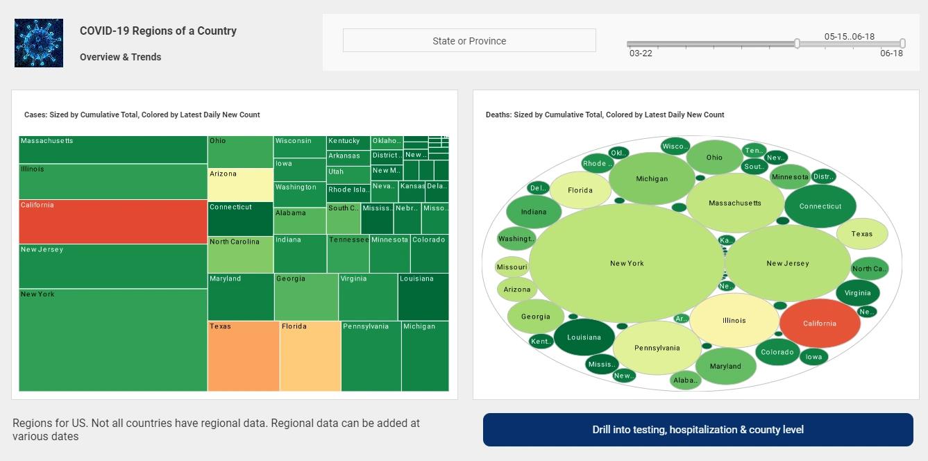
Users can design dashboards that include interactive, multidimensional visualizations such as heatmaps, treemaps, and drill-down charts. Dashboards are highly flexible, enabling filtering by dimensions like time, region, or department in real-time. The customization extends to layout, themes, user interaction controls, and responsive behavior for different screen sizes.
StyleBI connects seamlessly to a wide range of data sources including relational databases, spreadsheets, web APIs, cloud platforms, and big data systems. It supports direct, live connections as well as federated queries across sources without requiring a centralized data warehouse. This capability accelerates time-to-insight and lowers infrastructure costs by avoiding data duplication.
StyleBI features a clean, intuitive interface designed for both business users and data professionals. Drag-and-drop components, natural language filtering, and guided workflows help non-technical users build meaningful dashboards quickly. At the same time, power users can access advanced features like calculated fields, expression builders, and scripting when needed.
Since StyleBI is built as a responsive web application, it adapts automatically to different devices, screen sizes, and resolutions. Whether you’re using a desktop monitor, tablet, or smartphone, dashboards remain usable and visually appealing. This mobility makes it easy for decision-makers to stay informed on the go.
Dashboards in StyleBI can be securely shared with individuals, groups, or published to broader audiences using public links. Collaborative features like annotations, versioning, and dashboard-level commenting help teams work together more effectively. This makes StyleBI a strong fit for cross-functional initiatives where multiple users need a shared understanding of the data.
Developers can extend StyleBI’s functionality using REST APIs and JavaScript SDKs to embed dashboards, automate workflows, or integrate with other enterprise systems. This makes it easy to bring analytics into custom apps or create bespoke reporting portals. The open architecture supports flexibility and innovation in analytics-driven development.
Cons:
-
Requires IT Support for Deployment: Initial setup may need assistance from IT staff.
-
Limited Advanced Analytics: While it provides strong visualization, it may lack some advanced predictive analytics features.
-
Smaller Community: Compared to tools like Grafana or Kibana, StyleBI has a less extensive user base
5. Kibana
Kibana is a part of the Elastic Stack and excels in visualizing Elasticsearch data.
Pros:
-
Seamless integration with Elasticsearch.
-
Excellent for log and time-series data analysis.
-
Intuitive interface with drag-and-drop functionality.
-
Offers machine learning capabilities for anomaly detection.
Cons:
-
Limited support for non-Elasticsearch data sources.
-
Can be resource-intensive for large datasets.
-
Requires Elastic Stack setup, which may be complex.
6. Metabase
Metabase is a user-friendly tool designed for non-technical users.
Pros:
-
Simple and intuitive interface.
-
No coding required for basic queries.
-
Supports a variety of databases, including PostgreSQL and MongoDB.
-
Offers embedding options for dashboards.
Cons:
-
Limited customization compared to other tools. While Metabase excels at simplicity, users seeking highly tailored visualizations or complex dashboard layouts may find its options restrictive. Organizations with specific branding or design requirements might need to supplement Metabase with custom development.
-
Performance issues with large datasets. Metabase can experience slowdowns when processing queries against very large tables or when rendering dashboards with numerous complex visualizations simultaneously. Users working with millions of rows may need to optimize their queries, implement data aggregation strategies, or consider alternative tools better suited for big data scenarios.
-
Advanced features may require SQL knowledge. While Metabase's visual query builder handles simple questions well, unlocking its full potential for complex joins, subqueries, or custom metrics requires familiarity with SQL syntax. Users without database querying experience may need to invest time in learning SQL or rely on technical team members to create more sophisticated reports and analyses.
7. Mozaïk
Mozaïk is a dashboard tool designed for developers, offering a modern and responsive design.
Pros:
-
Highly customizable with JSON configuration.
-
Supports multiple data sources.
-
Responsive design for various screen sizes.
-
Lightweight and fast.
Cons:
-
Requires coding knowledge for setup.
-
Limited pre-built widgets.
-
Smaller community compared to Grafana or Kibana.
8. Tipboard
Tipboard is a simple tool for creating real-time dashboards.
Pros:
-
Straightforward YAML-based configuration.
-
Ideal for real-time data visualization.
-
Lightweight and easy to deploy.
-
Supports multiple tile types, including graphs and text.
Cons:
-
Limited customization options.
-
No recent updates or active development.
-
Lacks advanced analytics features.
9. Redash
Redash is a powerful tool for querying and visualizing data.
Pros:
-
Supports a wide range of data sources.
-
SQL-based querying for advanced users.
-
Offers embedding options for dashboards.
-
Active community and regular updates.
Cons:
-
Requires SQL knowledge for effective use.
-
Limited customization for non-technical users.
-
Performance issues with large datasets.
10. Smashing
Smashing is a fork of Dashing, designed for building beautiful dashboards.
Pros:
-
Simple and elegant design.
-
Active community and regular updates.
-
Supports a wide range of widgets.
-
Easy to set up and use.
Cons:
-
Limited scalability for large datasets.
-
Requires Ruby knowledge for customization.
-
Not as feature-rich as Grafana or Kibana.
More Articles About Dashboard Reporting Tools
-
personalized report builder for users
This page describes InetSoft’s Custom Report Tool, offering drag‑and‑drop design tailored to each user’s needs. It emphasizes self‑service reporting that avoids IT dependencies and enables real‑time reshaping and distribution. The tool supports export into multiple formats and integrates with business rules and alerts. -
next‑generation reporting systems overview
The Reporting Systems article showcases Style Report’s ability to produce interactive, web‑based reports with minimal technical effort. It highlights over 30 chart types and pixel‑perfect layouts for operational and analytical reporting. Users benefit from powerful query capabilities across formats and platforms. -
evaluate highly rated reporting solutions
This article reviews InetSoft’s flagship reporting tools, noting its G2-recognized user adoption and ease-of-implementation. It explains how the platform supports diverse visual styles from speedometers to waterfall charts. The platform is praised for combining rich visuals with self-service agility. -
free visualization tool for exploration
This page introduces InetSoft’s free visual analysis tool that enables spreadsheet users to upload data and build interactive charts quickly. It emphasizes drag‑and‑drop simplicity and point‑and‑click filters ideal for evaluation or light analytics. Users can share results with others via links without installation. -
dynamic reporting tool introduced in 2025
This article presents InetSoft’s newest dynamic report builder designed for rapid deployment and self‑service reporting. It frames the tool as agile, robust, and suitable for executives to adopt with minimal training. The tool also supports scalable deployments and executive‑ready dashboards. -
team status reporting application explained
The Team Reporting Tool article focuses on reporting designed for collaborative team and status tracking environments. It delivers pixel‑perfect reports that are web‑accessible and ideal for distributed project updates. The solution streamlines team communications with consistent, shareable output. -
real‑time status reporting tool features
This tool overview explains how InetSoft supports building status dashboards for operations and project tracking. It highlights interactive visuals, report scheduling, alerting, and self‑service analytics. The platform is designed to deliver information efficiently across roles and departments. -
automated report generation tool set
This article outlines InetSoft’s web‑based report generation tools that support interactive ad‑hoc and scheduled production reporting. The system uses caching, bursting, and HTML‑like layout templates for rich output formats. Users benefit from automation features that deliver accurate, formatted reports on demand. -
comprehensive report creation capabilities
This page explains InetSoft’s Report Creation Tool, which enables business users to build dashboards and reports without coding. It emphasizes the combination of production‑grade formatting and self‑service design. The platform streamlines reporting workflows for both pixel‑perfect and analytical use cases. -
BI developer tools and data mashup
studio
This article covers Style Studio, InetSoft’s toolkit for developers to model data sources and build mashup logic visually. It supports complex data modeling, virtual private models, and scriptable report design. The suite enables developers to construct reusable dashboards and data definitions with no-code drag‑and‑drop ease.


