Business Dashboard Examples
Below are examples of business dashboards built with InetSoft's business dashboard software, some of which you can try out with the free downloadable 5-day evaluation copy of Style Intelligence.
Account Manager Scorecard Example
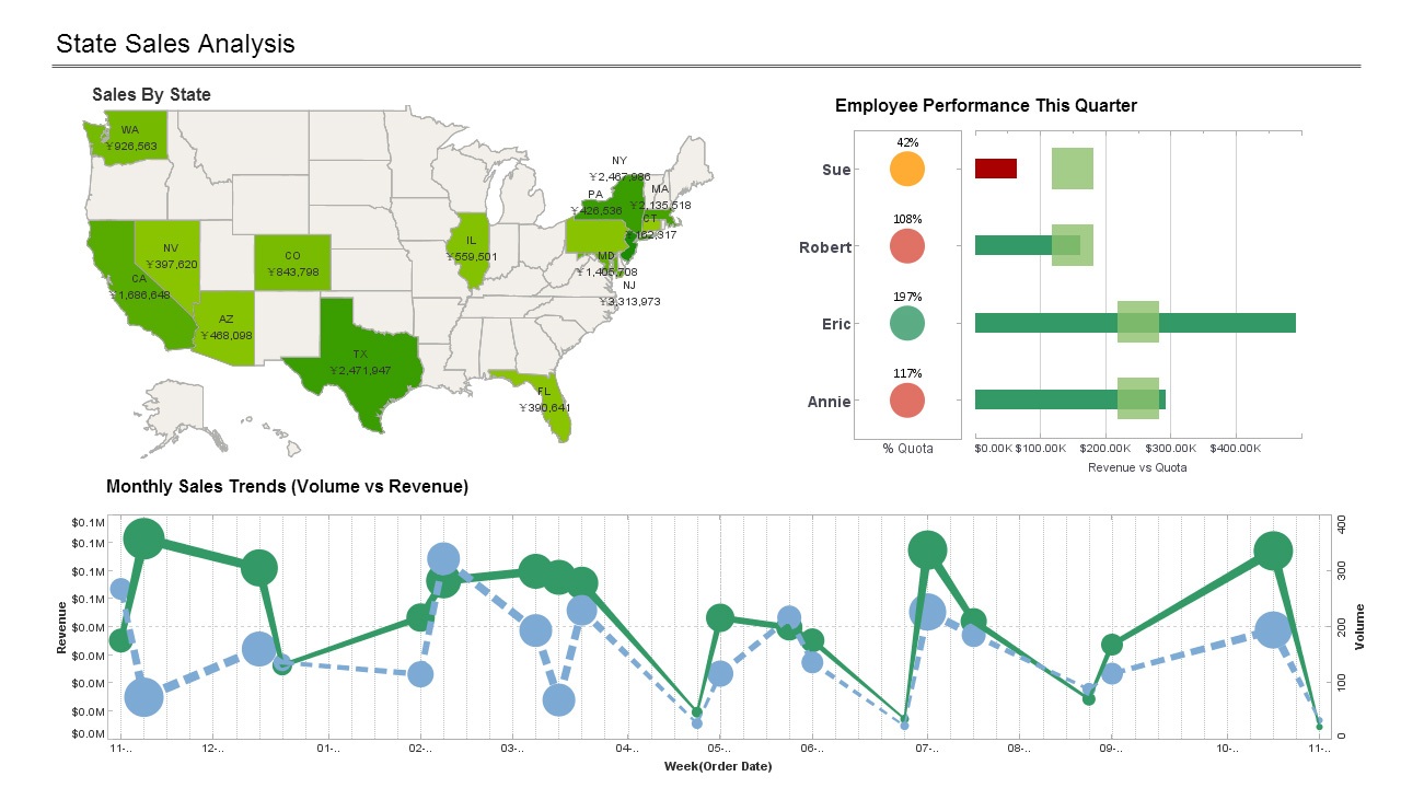
This scorecard example gives a broad visual breakdown of revenue, prices, and profits, by product line, with the performance of each account maager compared to set benchmarks. The live version features a mouseover chart, packing in even more information without wasting dashboard real estate.
An Interactive Census Dashboard Example
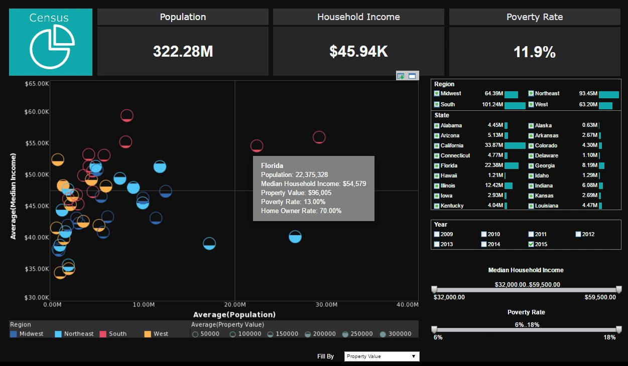
This interactive dashboard of United States census data uses fill and color to add two extra dimensions to it's main chart. A drop down list with 5 different measures to plot by fill adds another level of interactivity.
A Multidimensional Product Return Analysis Dashboard
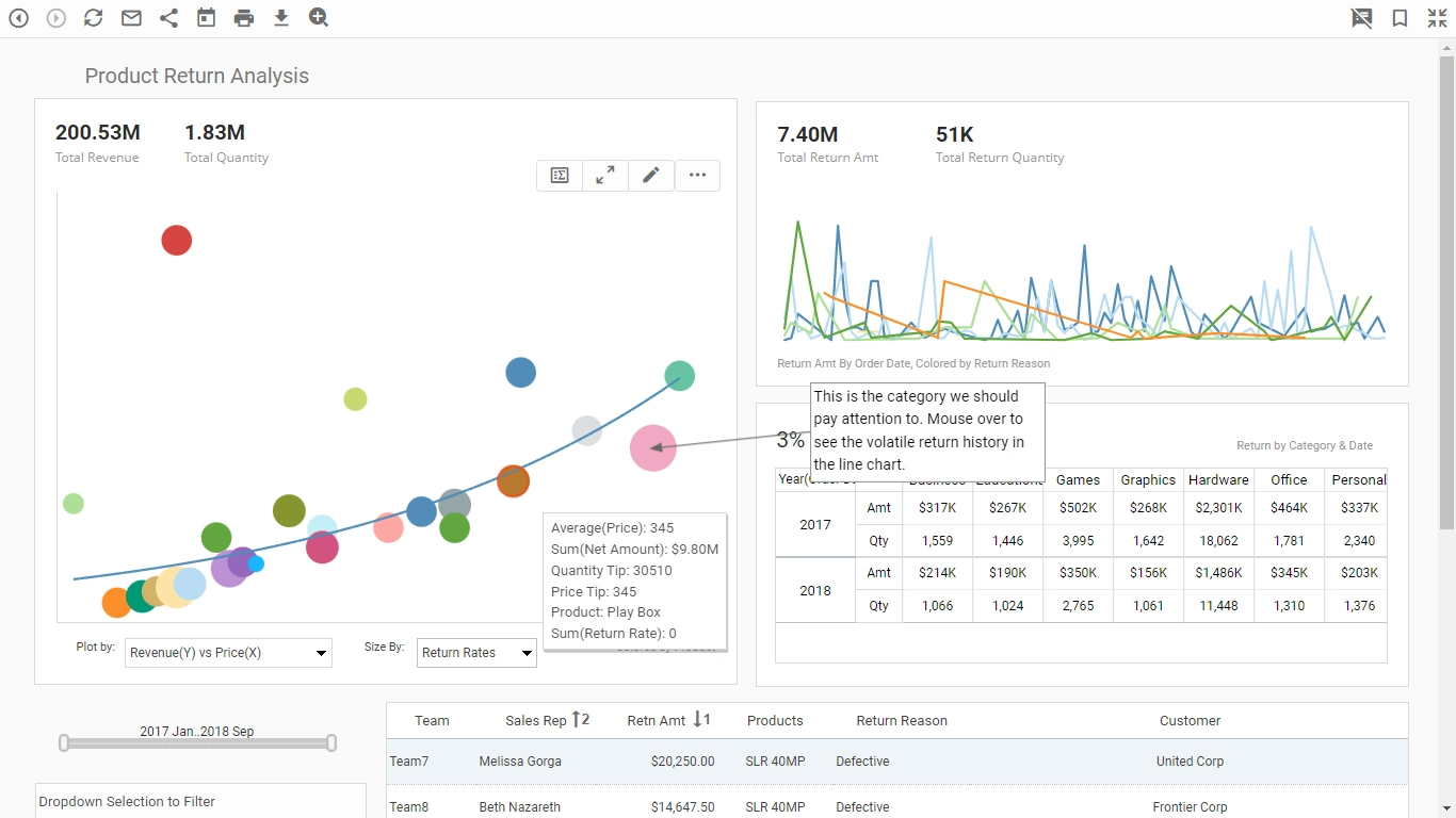
This multidimensional product return analysis dashboard highlights how a dashboard can incorporate many different pastel shades and not be overwhelming. This allows color to be used as an additional dimension on both dashboard charts. Hovering the mouse over any of the colored data points reveals which categories are signified by which colors.
An Operations KPI Dashboard Example
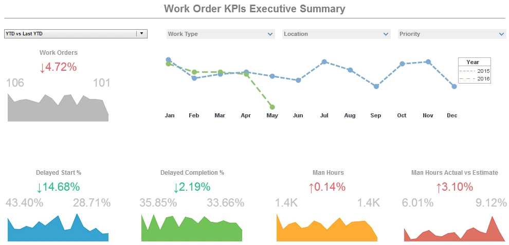
This operations KPI dashboard example displays the percentage of work orders started and completed, and tracks the man hours necessary for completion of said work orders.
A number of line charts display the fluctuations in these various measures over time, enabling managers to pinpoint where specific issues occurred.
A Manufacturer Sales Performance Dashboard Example
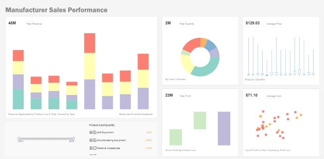
This manufacturer sales performance dashboard example gives a broad visual breakdown of revenue, prices, and profits, by product line.
Color is used in several of the charts to add another dimension.
A Marketing Lead Map Dashboard Example

This marketing lead map dashboard dashboard gives an overall picture of new leads, their sources, and their conversion rates, with a large map chart displaying new leads performance by state. A slider below one of the line charts modifies the change rate that results in a chart highlight.
A Call Center Auto Refresh Dashboard Example
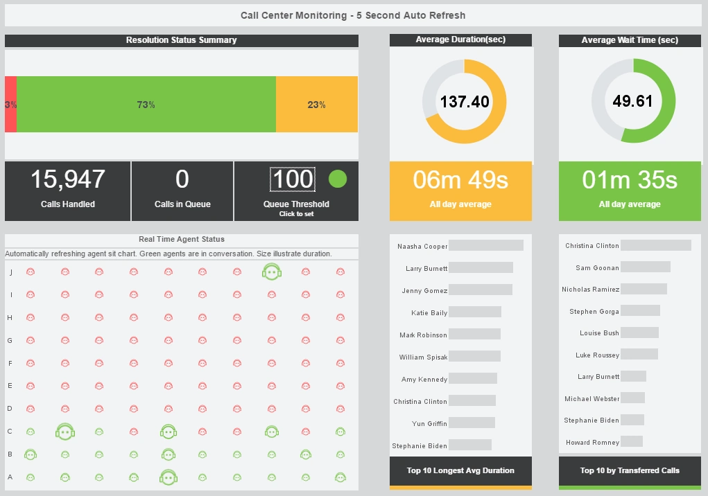
This call center auto refresh dashboard helps call center managers supervise their customer service reps in real time. An agent status chart shows, in real time, who is on the phone and for how long.
A Risk Management Visualization Dashboard Example
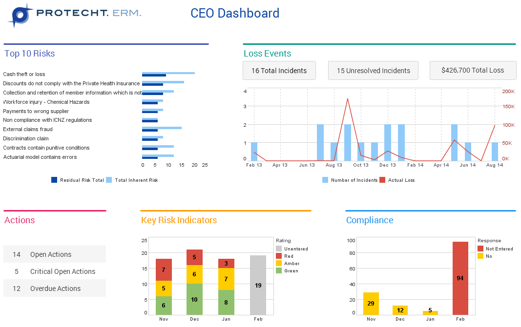
This risk management CEO dashboard from InetSoft partner Protecht displays various measures of risk and compliance.
An incidents by date chart features a red line tracking actual losses, utilizing color to draw the users attention to what's most important.