Mobile BI Samples
View samples below of mobile BI dashboards from different departments and industries built using InetSoft's easy and flexible business intelligence application, Style Intelligence. InetSoft has been a software pioneer since 1996 delivering self-service oriented data intelligence solutions with over 5,000 happy customers worldwide.
Automotive Dashboard on an iPhone
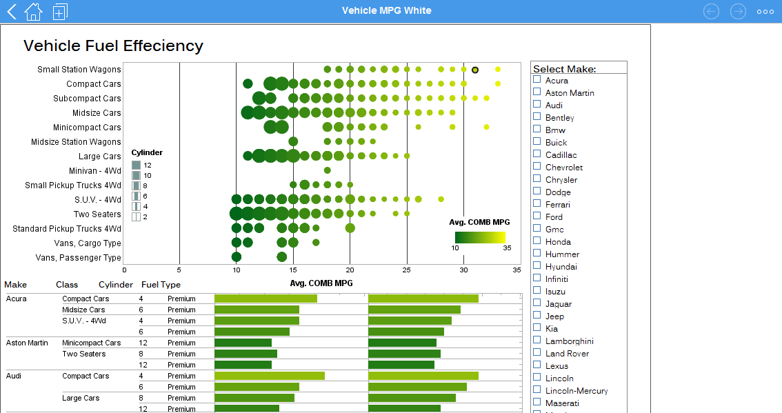
This automotive dashboard displays the fuel efficiency of various vehicles which are organized a long a number of variables. While average mpg is displayed with position and color, sizing is also used to display the number of cylinders in a vehicles' engine. A large selection list provides easy interactivity on a touch screen.
Healthcare Analytics on an iPhone
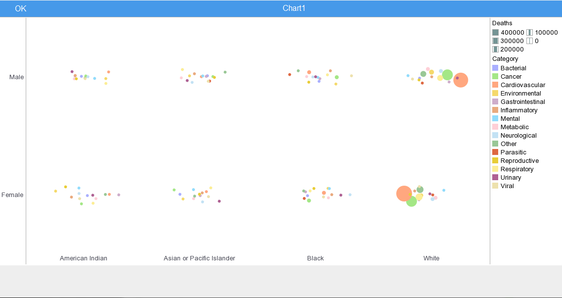
This health analysis breaks down mortality causes along a variety of demographics categories, including, race, age, and sex. This type of analytics can help healthcare providers asses patient risk for various ailments and adjust care accordingly.
Heat Map Analysis on an iPhone
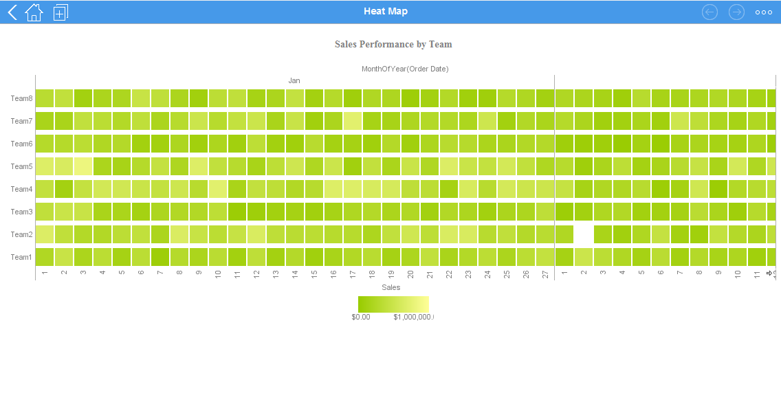
This heat map compares each sales team's performance for every month of the year. A heat map is a visual representation of data that uses colors to indicate the relative values of the data points. A heat map displays a measure using a colored grid, where the value of the measure for a given combination of dimension values is used to determine the color of the grid at that location.
Manufacturing Dashboard on an iPhone
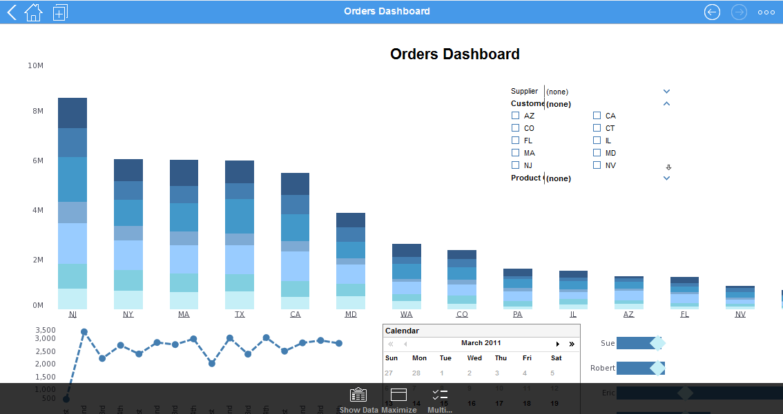
This mobile orders dashboard breaks down orders by state, date, and sales team member. A calendar display enables drilldown by individual week or month.
Visual Dashboard on an iPhone
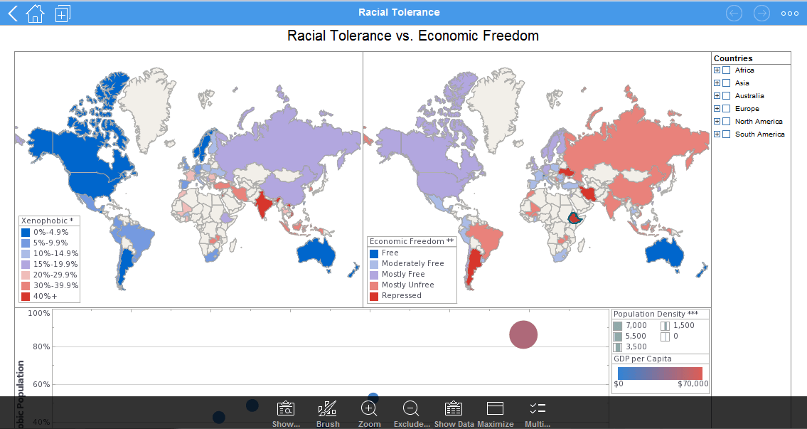
This mobile racial tolerance dashboard makes it easier for NGO leaders to analyze the sociological factors of intolerance. Large, easy to read map and bubble charts are used, with the end result displaying the relationship between racial/ethnic tolerance, population, and economic freedom.
Performance Dashboard on Android
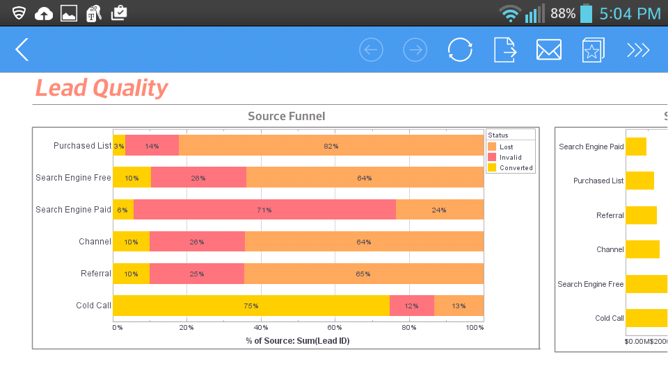
This marketing department dashboard gives an overall picture of new leads, their sources, and their conversion rates. Lead status is displayed by color, making it easy for the proportion of converted leads to be seen even on a smartphone screen.
Performance Dashboard on an iPhone
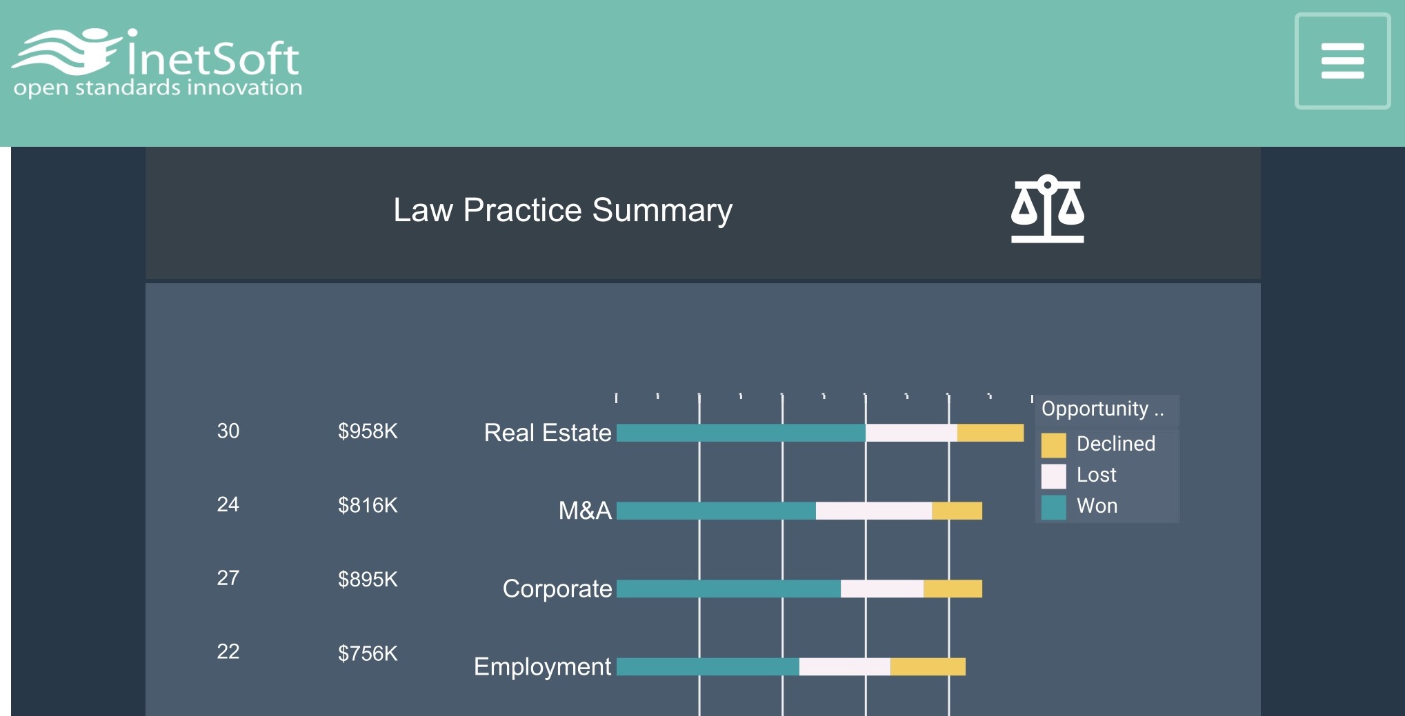
This law firm analytics sample gives an overview of cases won and lost as well as opportunities. Text KPIs next to each bar display the total number of cases and potential revenue in each category of case, enabling a top partner to see what is the best use of the firms hours.
Service Dashboard on iPhone
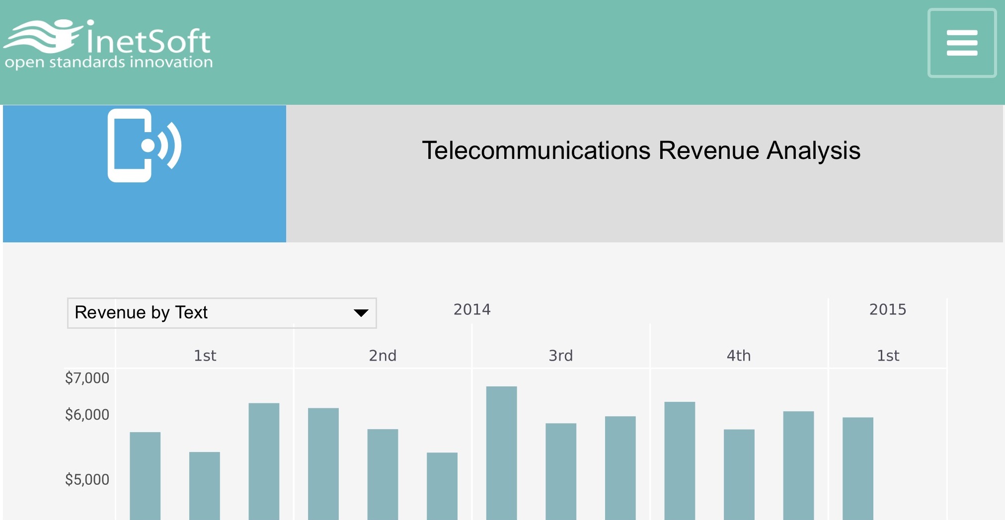
This telecom revenue analysis displays revenue by month and quarter. A dropdown selector gives the option to switch the chart binding to different telecom revenue sources.