-
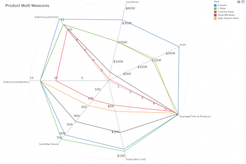
Plotting Many Variables with a Radar Chart
Read moreThe mashup post on dual axis charts showed how an extra axis is useful for compare two metrics of...
November 7, 20170 -
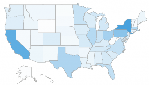
Visualizing Data in a Map
Read moreWhile aesthetics are not the most important element of dashboard design, it is good to try and vary the...
-
New White Paper about InetSoft’s Native Spark Integration
Read moreCTO, Larry Liang, has written a paper that details our approach to big data analytics tools and machine learning...
-
Best Visual Dashboard Design: Keep Your Time Series Distinct From Categories
Read moreIn previous posts we’ve discussed how certain dashboard design examples are best for certain types of data. Continuing with this...
-
Best Dashboard Design: Labeling a Dashboard
Read moreMaking the right choices when it comes to colors, chart types, filters, and layouts are common considerations when discussing...
