In a previous mashup post, we discussed the benefits of plotting data by geographic region, providing more context for the data and exposing regional patterns. But there is another way to use map charts, a way that is similar to how paper maps have traditionally been used: plotting paths on a map chart to track regional movements. For an example of this, see our Geographic Tracker Dashboard pictured and linked to below.
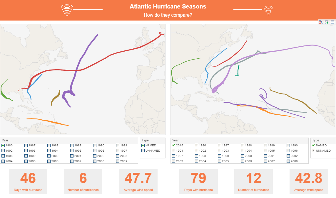
This geography dashboard allows you to select a year for each chart and see the path of the hurricanes that occurred on that particular year. Hover the mouse over any hurricane path to see what that hurricane’s wind speed was at those coordinates. Having two identical charts side by side like this enables easy comparisons of the number of hurricanes, as well as the length and location of hurricane paths. While our example involves tracking storms, this kind of visualization could be used to track any kind of geographic movement over time, such as animal migrations or human population flow.
Keep following The Mashup for more tips on telling stories with your data.