Project management, or the process of optimizing team workflow in order to properly meet deadlines, has grown from a science specific to managing engineering projects into a methodology used across a diverse variety of fields and organizations. It consists of various methods and strategies that attempt to answer the elusive question of “How do I get my team to finish projects on time?”
With its various strategies of how to break down and properly manage project teams, project management can get rather complex. This complexity has spurred the use of interactive dashboards to help track projects, many using the type of charts, calculations, and analyses that are useful for BI in general. However, there is a type of chart which was created specifically for project management: The Gantt chart.
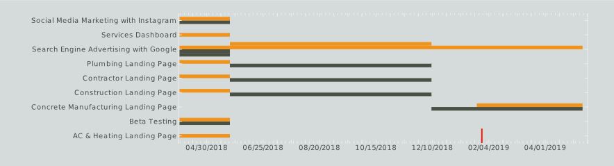
The Gantt chart example (click on the image above to interact with a complete project management dashboard) was invented by engineer and management consultant Henry Gantt. It’s a specialized type of bar graph that is designed to show a project’s schedule by plotting tasks and project statuses in blocks along a timeline. This particular Gantt chart is from a digital marketing project management dashboard; it illustrates the status of various projects in different colors (yellow=planning phase, black=in progress) showing the length of each project and the amount of time that went into planning vs action, etc.
A Gantt chart can be incorporated into InetSoft reports and dashboards using a simple script.
Keep following The Mashup for more ideas on how to display and analyze your data.