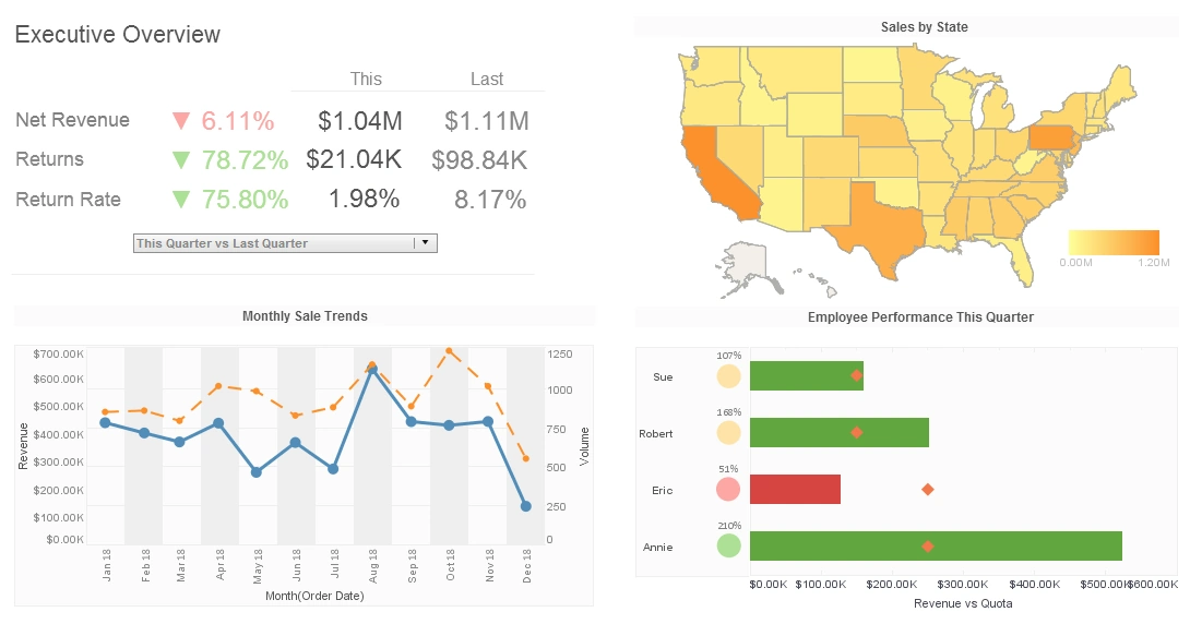
Dashboards To Show Executive Team
Below is the continuation of the transcript of a Webinar hosted by InetSoft on the topic of Dashboards for Marketing Departments. The presenter is Mark Flaherty, CMO at InetSoft.
InetSoft's dashboard application connects to virtually any data source you've got in your organization, and you can just start playing around. Again, the point is dashboards are important. They can help you tell your story internally.
Dashboards can show your executive team the great stuff you're doing and help them understand it in a quick and easy way, you need to just get started so you can get down the journey of how analytics can help you achieve your goals. So, I think we have time for a couple of questions, Jessica?
Jessica: Yes we do, we do have a couple here. One question Mark, maybe you can go back to the dashboard you were referring to. They are asking about how do you know which visualization will be best to use to present the data or the story you're trying to tell?
Mark: Sure, that's a great question. So, I'm going to go back into this particular data source. I'm looking again just that sample data which is kind of boring but still useful. Let's say we have a question about city and order quantity and profits. Okay, I have three variables that I have questions about. So what helps me decide what the right visualization is or a right visualization because there is no one right visualization.
Explaining the Annotations Feature
Jessica: That's great Mark, and now there is a question about the visualization you're showing. They're asking about the annotations, were those handwritten, or were those pulled from the data source.
Mark: Well those are actually pulled from the data source, but it is very easy to actually do both things. So one thing for example I might want to do is I might want to annotate this particular visualization or this particular data point that we identify, so I can say let's annotate that, let's annotate this mark, let's add a data post about the total reach out for all this, and then right away it just annotates it right there. There it is right there, so I have annotated it very quickly.
Now, I may want to do some commenting or some formatting. I might want to go over to this one, and I want to annotate this this one is one that I knew came from my customer conference. And it doesn't necessarily say that but I'm going to say conference 1st Day. So, I can also not only bring it from the data, but I can also annotate it with some color commentaries. So then I know that the data is telling the story but I can also add other information, or opinion, or my thoughts, or my summary of a particular point. So, annotating data visualizations and dashboards is very easy from the data or literally from the language that you want to supplement the visualization with.
InetSoft data visualization platform offers a comprehensive suite of annotation tools that empower users to add context, insights, and commentary directly to their visualizations. These annotations serve as valuable markers, enhancing the understanding of data and facilitating collaboration among stakeholders. One type of annotation available in InetSoft is text annotations. Users can add textual comments, explanations, or labels directly onto their visualizations, providing additional context or highlighting key insights. Text annotations are highly versatile and can be used to annotate specific data points, trends, or regions of interest within the visualization.
Another type of annotation supported by InetSoft is image annotations. Users can upload images, logos, or icons and place them directly onto their visualizations to provide visual cues, additional information, or branding elements. Image annotations can be used creatively to enhance the visual appeal of dashboards or to emphasize important data points or events. This feature enables users to customize their visualizations and create engaging and informative presentations.
InetSoft also offers shape annotations, allowing users to draw various shapes such as rectangles, circles, arrows, or lines directly onto their visualizations. Shape annotations can be used to highlight specific areas of interest, delineate trends or patterns, or illustrate relationships between data points. By leveraging shape annotations, users can effectively communicate complex concepts or insights and make their visualizations more interactive and engaging.
Users can create dynamic annotations using parameters and variables within InetSoft's data visualization platform. These dynamic annotations can be linked to data fields or calculations, enabling them to update automatically as underlying data changes. Dynamic annotations enhance the flexibility and interactivity of visualizations, allowing users to create personalized annotations that adapt to evolving data conditions. Overall, InetSoft's comprehensive set of annotation tools empowers users to enrich their data visualizations with textual, visual, and dynamic annotations, enhancing understanding, collaboration, and decision-making.


