Call Center Dashboard Examples
Call center dashboards are needed in order to monitor key metrics that can change on a minute-to-minute basis. Therefore, data needs to be accessed in real time and be readily available to all team members throughout the day. InetSoft offers companies a comprehensive solution to tracking key metrics such as success rate, productivity, service level, and more in order to increase company efficiency and decrease overhead costs.
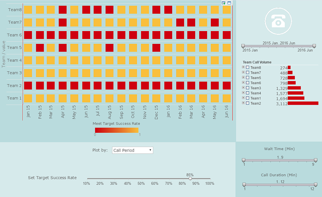
When using a dashboarding software, it is important that all necessary information can be displayed in an understandable, comprehensive manner as it is in the call center dashboard example to the right. At a single glance, the user can clearly use the heat map visual to see where there have been successful or unsuccessful calls based on where there are yellow or red dots for each team and month.
This gives the initial overall view so that the user can get a general idea of what is going on. With InetSoft's dashboarding software, users have the ability to create dashboards that are both compelling and informative at first glance as well as through multiple methods of data drilldown.

Drilldown In A Dashboard
With just a few simple clicks users can drill down on this data in order to find out more comprehensive information than what is available at first glance. For example, maybe you see a red point on the heat map and want to find out more about it. Hovering over that data point will display more information about the call such as team, month, and success rate. From there, if you'd like to find out even more you can use the brushing tool in order to isolate all other data throughout the dashboard that has to do with that data point.
By doing that, we can see additional information pertaining to that specific delay on the table such as last update time and reason for the delay. You can also click on a point a choose the "show details" button, which will bring up all relevant information for chosen data points in table format. This feature of InetSoft's software allows users to look deep into data and answer all possible queries without having to rely on help from the IT department.
On the other hand, maybe the user wants to drill down by specific teams or team members rather than by selecting points on the graph. To do this, simply click on the desired selection components on the righthand side of the dashboard and only information relevant to these components will be displayed. For example, if you wanted to see the success rates coming from a specific team member on team 6, you would click his or her name and more detailed information about his or her calls would be displayed on the heat map, including the specific call type that was engaged in and the success rate of that area.
Another way users can select desired areas of information to be displayed is through the range sliders placed on the dashboard. Users can utilize the sliders in order to select a desired date range, wait time, call duration, and target success rate. Range sliders are increasingly useful as more information is added and specific details get harder to view at first glance. For example, if the data is dealing with a time ranage of multiple years, users have the ability to filter down the information displayed to a few months in order to get a clearer view of that timeframe. When designing a dashboard with InetSoft's tool, adding these selection elements is as easy as dragging the desired data column onto the dashboard.
Another great tool that is used on this call center dashboard is the combo box that is placed below the heat map. By using this form of selection component, the user can change between having call period, call time, call status, and wait time displayed on the x axis. Using the combo box on visuals allows users to display more information in multiple ways on the same chart without having to take up more space.


InetSoft's Dashboard Approach
Managing a call center requires constantly being connected to the most up-to-date data so that handling time can be reduced while success rate can be increased. InetSoft's easy-to-use and easy-to-deploy dashboarding software provides maximum self-service to both business users and casual users alike, allowing for a hands-on experience that reduces the need to wait on IT to access information.
Using InetSoft's drag-and-drop technology, users have the ability to easily create powerful dashboards by simply dragging lego-like blocks of data into various kinds of charts, tables and crosstabs, making the possibilities virtually limitless. With dashboarding made simpler than ever before, just about anyone with a basic understanding of Excel can create and deploy dashboards in a matter of minutes, not months.
No matter what kind of information you need to display, InetSoft can help you meet all of your dashboarding and reporting goals. Interested in finding out more? Request a personalized demo of InetSoft's award-winning software today!
