Data Analyzing Software
Do you have difficulty accessing all the data you need to in order to analyze what you want? InetSoft is your solution. With InetSoft's data analyzing and visualization software, you can expect fresh new insights that will increase both the internal and external performance of your organization.
Data analysis is the process of evaluating data and drawing conclusions. When used properly it can help an organization discover things that they would not have otherwise known. Data analysis is implemented in many different fields, such as construction, healthcare, and education as well as many others.
For example, in the construction industry, modern construction projects involve various cost reports to make sure money and labor hours are all accounted for correctly. This is where InetSoft's data analyzing software comes in.
Using InetSoft's data visualization software takes data analysis to the next level, giving the user a visual representation of the data in charts, graphs, and other various special features that can help decipher certain patterns and trends from the data as a whole.

InetSoft's data analyzing software is superior to any competitors due to its easy to use interface which allows any kind of user, whether beginner or expert to manipulate any kind of data. InetSoft's program requires very little training and meets most ad hoc reporting needs. Complicated data transformations and queries are also possible from an array of different data sources. Expensive BI experts or consultants are not needed, which eliminates additional costs.
- Business reports are complex. Report writers are often large applications that have a steep learning curve.
- Business information is complex. Report writers often require that you understand the database query language and know how the data is stored. StyleBI solves both these problems. It addresses the first with an Ad Hoc tool that is lightweight, web-based, and easy to use. It addresses the second by automatically handling all the technical details of accessing data.

Interactive Dashboards
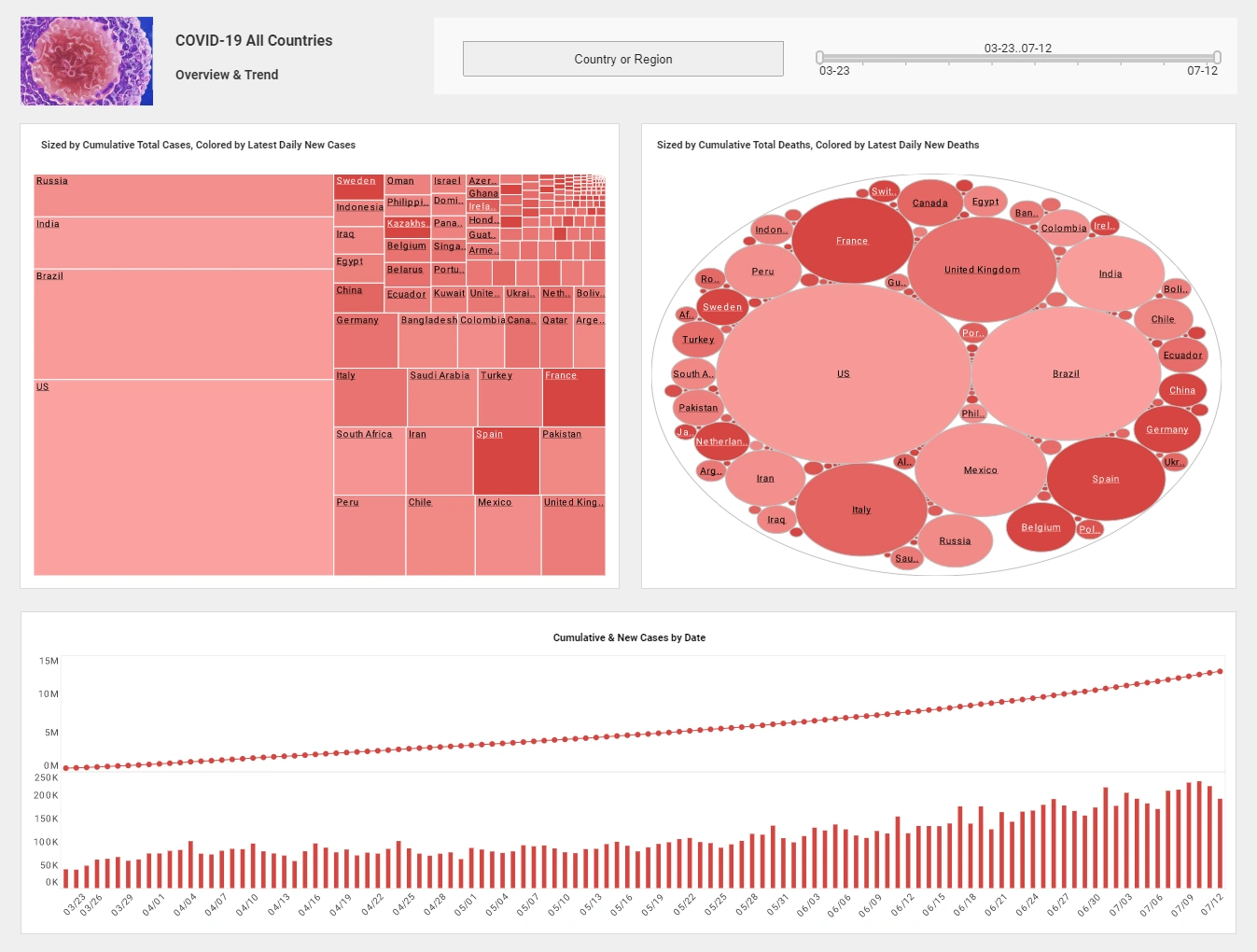
InetSoft's interactive dashboards provide the user with a visual representation of analysis. By visually interpreting the data the user can then see possibilities they couldn't before. The dashboard can be manipulated to show only certain data points, isolating one single variable and seeing how it affects the group as a whole.
For instance, the pencil tool can be used to change the dimensions and measurements of the chart as well as what data is actually being shown and how that data is shown visually. The user also has the option of changing the shape, size, color, and text to their own specifications.
The individual charts can also be increased in size from the dashboard itself to isolate the chart from the dashboard, making the chart clearer to the user. Lastly, the actual data from an individual chart can also be shown, allowing the user to take a closer look at segments of the data that show interesting results.