Demographic Analysis Examples
If you are looking for some ideas on how to analyze demographic data, take a little time to examine these demographic dashboard examples. Data can be explored using a wide range of built-in functions as are detailed in the different sections (with screenshots) below. The more you experiment with this demographic dashboard example, the more you will see how a well-designed dashboard with powerful interactive features can analyze data effortlessly.
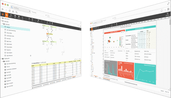
This interactive dashboard is hosted live by InetSoft. It is designed with InetSoft's flagship data intelligence software StyleBIs. It fuses data mashup to pull data from a variety of disparate sources with visualization to rapidly produce interactive dashboards.
Right away you will notice that the main chart contains different charting styles to visually present information. Hover your mouse over a bubble, bar, or line in any of the charts, and you will instantly see the chart elements aggregated data in numerical form as "tool tips".

In Depth Chart Based Analysis
Filtering & Visual Customization
On the right, there are selection lists and sliders that act as filters. Furthermore, selection will automatically update to show only compatible selections. For example, if you select the"Northeast" region, the State selection list will hide California and other states under "Others."
For the chart, we see the dropdown list can be used to change the fill of chart bubbles. The chart menu bar offers rich functions to customize visual properties of the chart for on the fly analysis.

Ad Hoc Chart Editing
The chart editor can be enabled for power users to totally remake the chart. From here, not only visual properties can be modified, but all available data columns are exposed as well. Users can replace or add additional data to show more demographic information within this single chart.
Users can simply drag and drop data items to change what is presented in the chart. Furthermore, calculations and new formulas can also be created and enhanced that were not anticipated in original design.

Data Mashup + Visualization = the Right Tool
So far we have seen visual analysis aspects. Demographic analysis normally requires a good deal of data. Normally this data must be collected from different sources. These sources have their own formats and delivery mechanisms. In most cases, data collecting, cleansing and transformation consumes the majority of time and resources.
Futhermore, this tends to be a iterative process where data work and visual work are intertwined. Therefore, the tool must be as much a visual tool as a data tool.
The example dashboard is developed with InetSoft's Style Scope software. InetSoft's software fuses data mashup with visual analysis to deliver rapid analysis development. The single web app empowers analysts, power users, and casual users with different levels of self-service functionality.