KPI Monitoring Dashboard Software That Is Easy to Deploy and Easy to Use
Are you looking for KPI monitoring dashboard software that is:
Robust enough to
- grab the attention of executives
- meet the demands of power users
- scale up for organizations of all sizes
Easy enough to be
- deployed in weeks, not months
- learned by end-users with minimal training
Flexible enough to
- adapt to changing data structures and business needs
- accommodate data exploration through visualization and maximum self-service
Examples of KPI Dashboards and Reports
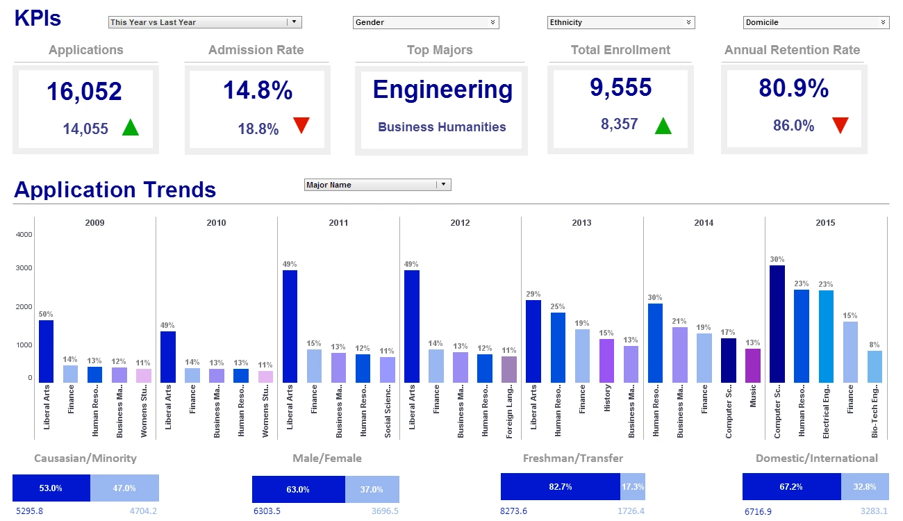
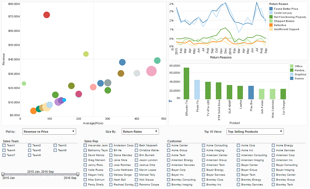
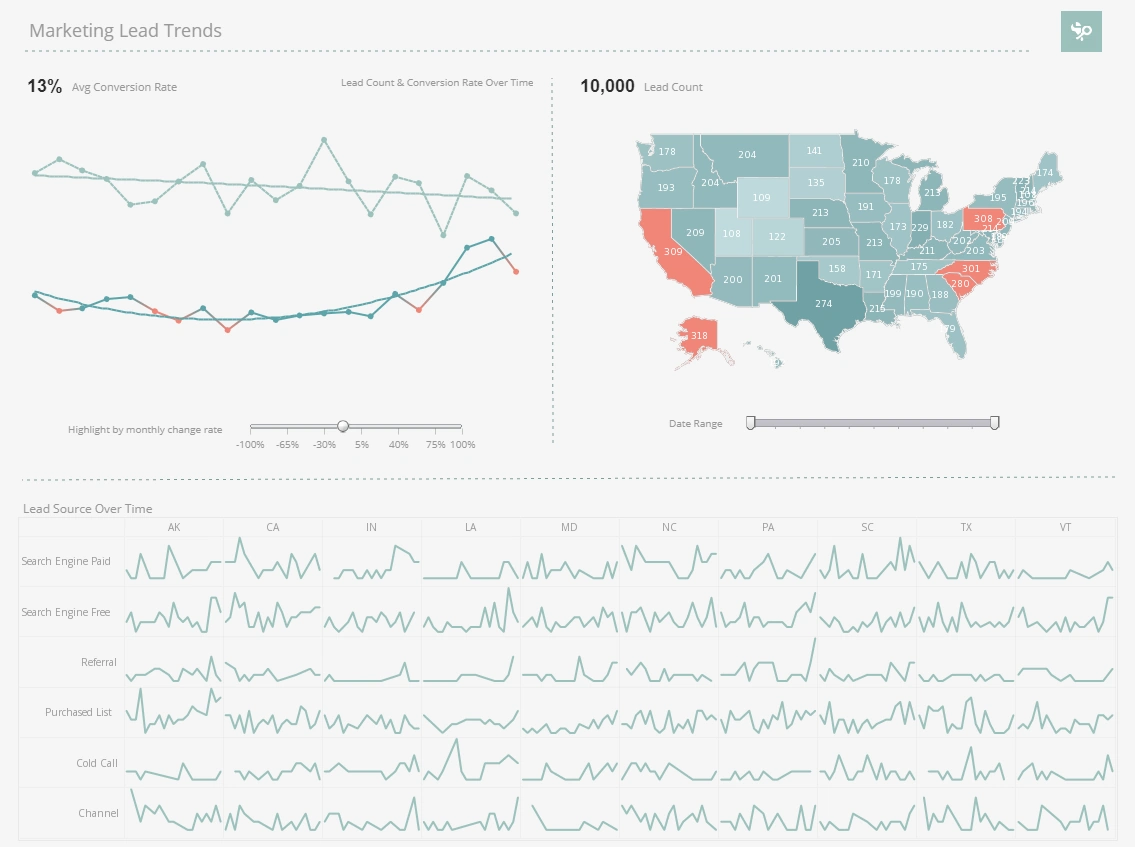
The examples of KPI dashboards shown on this page come from a set of interactive dashboards that InetSoft has developed to showcase the kind of self-service reporting that front-line employees and c-level executives can have at their access.
The same intelligence-packed, highly-interactive, server-based KPI software can be deployed with InetSoft's on-premise or cloud-hosted versions of Style Intelligence. Save money and resources with this small-footprint solution that can be installed whereever is closest to your primary data sources. To see more examples of KPI dashboards, visit our gallery.
Executive Marketing Dashboard with a KPI Report
This dashboard is the prototypical executive marketing dashboard designed for both the executive who is managing many marketing managers as well as the marketing manager keeping track of just his own marketing activities. In one screen you have eight charts multiplied by as many employees in your organization thanks to a selection list.
Checking off one or more of those employee name refreshes all of the other charts to show information associated with their roles. For organizations with dozens or hundreds of staff, the selection lists can be organized hierarchically, and view permissions by user are also hierarchical.
Commonly Reported KPIs
- Year-to-date sales versus last year's for the same period
- Size of the current sales pipeline versus the same period last year
- Sales opportunity close ratio, this year compared to last year
- Monthly closed-won sales
- Dollar-sizes of all opportunities in the sales pipeline by sales stage
- Number of new leads created by month
- Top sales opportunities in the pipeline - you can drill through the account names to get to the specifics of the opportunity.
- Exception reporting - you can see a count and drill through to the list of leads that have not been touched in the last x days that you specify as inactive, as well as the number of opportunities deemed inactive.
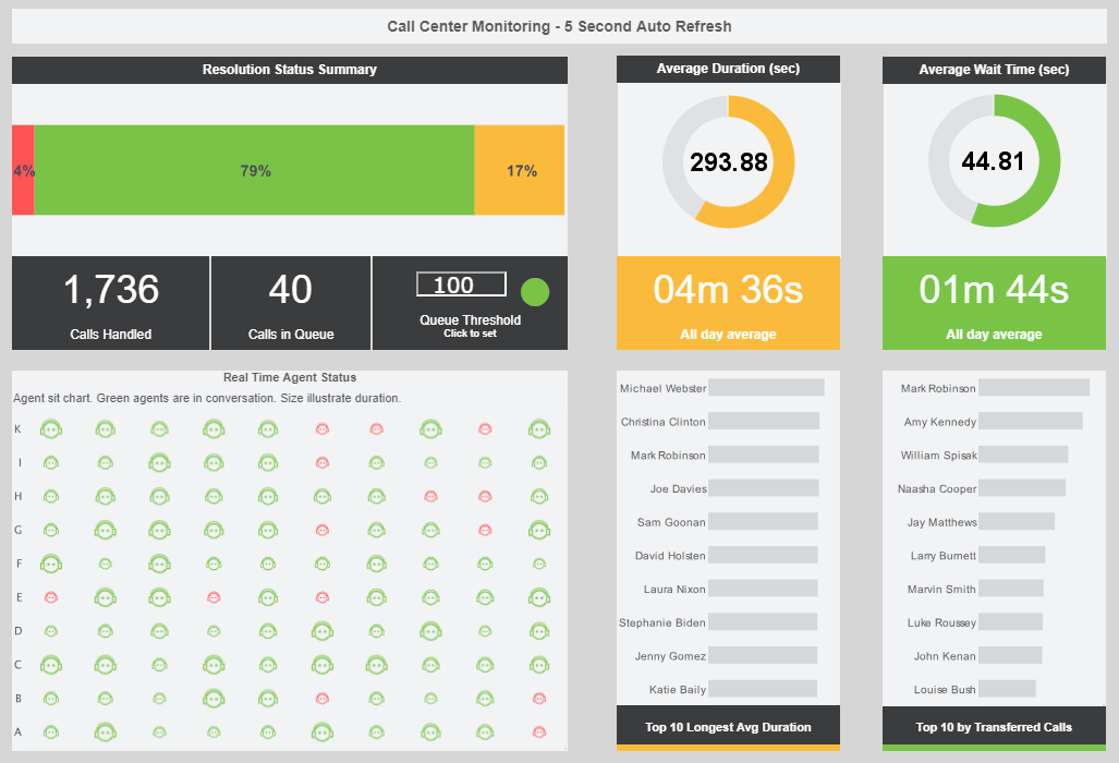
Customer Service Operations Dashboard using InetSoft's KPI Software
This is a powerful interactive dashboard for customer service managers and executives to monitor key performance indicators for a service operations department. In one view, you have seven information-packed charts and two embedded reports multiplied by the number of customer service representatives in your organization.
For organizations with dozens or hundreds of sales representatives, the selection list seen in the upper right corner can be organized hierarchically, and view permissions by user are also hierarchical.
- Open cases by status, priority and age
- Current case load by agent and status
- Employee performance by cases closed and time to close
- Overall case open vs. close rate
- Same day close rates – overall and by agent
- Open high-priority cases – summary and detail by owner and case age
- Exceptions reporting – number and detail of inactive cases
More Articles About KPI Monitoring
BI Tools for Nutraceuticals - To overcome these challenges, NutriHealth decided to implement a Business Intelligence (BI) solution integrated with its MySQL database. The primary goals were to streamline data management, automate reporting, and enhance data-driven decision-making. Implementation: The implementation of the BI solution was carried out in several stages: Assessment and Planning: NutriHealth conducted a thorough assessment of...
How to Effectively Present Analytics Data - Presenting web analytics data to executives who have little or no experience data digging themselves can be a challenge for any analyst. There are dozens of metrics in your analytics account- page views, time on a site, unique visitors, cost per click, bounce rate, conversions-the list is endless. Reports containing all of these metrics are not only confusing but completely worthless. Some metrics in your analytics account will speak loudly to your online marketing team but will mean little to nothing to your CEO. When you communicate with the Big Guns you need to use persuasive presentation skills to make your arguments loud and clear...
Premium Paid on BI - Now I will tell you the BI or BA is something that we pay some premium on. It is a skill set that can be learned, but it's not something that you typically do in a application requirements definition. There is an art and a science to the BI or BA to work with the businesses and being able to draw these types of questions out of the business. So if we look at that question, the next step of the process is to decompose the question into a set of business terms to create the data dictionary. From there we allocate the different business terms to their object type. So we say, oh this is a dimension. This is a measure. This is an attribute that kind of stuff...
Public Health Service Use a Dashboard - Public health services leverage dashboards as powerful tools to enhance their capacity for monitoring, managing, and improving population health. These dashboards are designed to consolidate and visualize a wide array of health-related data, providing public health officials with real-time insights and comprehensive overviews. One primary use of these dashboards is in disease surveillance, where they play a crucial role in tracking the spread of infectious diseases...
Reading Comprehension Metrics - Pinpointing the key metric for tracking reading comprehension can feel like searching for a needle in a haystack. The thing is, there's no such thing as must-track metrics for everyone, as different datasets and objectives demand unique approaches. However, amidst this complexity, there are some essential, common metrics that you should consider tracking when it comes to big data reading comprehension...
Subscription and Billing Report Solutions - Priced to scale from midsize to large sized businesses, InetSoft products are customized to fit enterprise needs snuggly. To accomplish this InetSoft works with companies to figure out how many concurrent end-users they expect to have, and which features they can utilize best, to avoid paying for licenses and features that do not complement their business needs. As businesses find more success they also find more data needs to answer, so Style Intelligence was designed to effortlessly upgrade with the scale of growing enterprises...
