Articles About Dashboard Solutions
Are you looking for articles about dashboard solutions? InetSoft has written articles about how dashboards are used and the most important features that a dashboard solution must have. Learn why a serverless dashboard solution is superior.
Which Power BI Dashboards or Reports Should You Use? - The fastest route to a solution, according to someone wise, is simplicity. You'll understand what they meant if you've ever used Power BI. Microsoft's top business analytics solution has an intuitive user interface that makes it simple for anybody to operate. We've spoken about it in great depth, from how workplaces operate to what models are accessible to the general public. This blog article focuses on dashboards and reports, which are what Power BI is best known for. Both will make your life easier, provide you more clarity, and help you make better business decisions. However, there are some variations in how and when to employ them. Continue reading to find out what they are. A Power BI dashboard is described by Microsoft as "a single page, sometimes referred to as a canvas, that tells a narrative using visuals. A well-designed dashboard simply includes the story's highlights on one page so that readers may explore related reports for further information...
Which Is The Best Dashboard Tools For Maximizing Self-Service? - One of the key aspects of dashboard tools is the level of self-service they provide. Self-service means that users can access, analyze, and share data without relying on IT or other experts. Self-service dashboard tools enable users to explore data, create their own dashboards, and customize them according to their requirements. Self-service dashboard tools also allow users to collaborate and communicate with others, as well as to embed dashboards into other applications or websites. Self-service dashboard tools can benefit users in many ways, such as: - Reducing the time and cost of data analysis and reporting - Increasing the agility and responsiveness of data-driven decision making - Empowering users to discover new insights and opportunities from data...
Who Uses Executive Program Management Dashboards? - Executive Program Management Dashboards are used by a wide range of organizations across different industries. These dashboards serve as a crucial tool for senior executives, program managers, and decision-makers to gain real-time insights and monitor key performance indicators (KPIs) related to various projects and programs. Here are some of the types of organizations and professionals who commonly use Executive Program Management Dashboards: Large Corporations Large corporations in industries like finance, technology, manufacturing, healthcare, and more use executive program management dashboards to oversee complex projects and programs. These dashboards provide a holistic view of the status and performance of various initiatives. Government Agencies Government organizations at various levels (federal, state, local) use program management dashboards to monitor and manage initiatives related to public services, infrastructure, healthcare, education, and other areas. Non-Profit Organizations Non-profit organizations use program management dashboards to track the progress of initiatives related to social causes, humanitarian efforts, community development, and more...
Why is having KPI dashboards crucial for a company? - The way that firms can utilize and learn from the vast amounts of data about their company and consumers is changing thanks to business intelligence (BI) software and solutions. The KPI dashboard is one of the most helpful tools businesses can use to visualize the performance of many different parts of their organization...
Why Project Managers Use Dashboards - As any project manager will know, a project management dashboard is a helpful tool that contains and displays information about current projects. Dashboards generally try to show information in a clear format. Pulse of the Profession conducted a global survey about trends in the project management sphere, which indicated that project management tools are often forgotten about by companies. The study reports that 67% of organizations undervalue the importance of project management tools and the entire concept of project management. However, a lack of organization within a project can become a major issue and can ultimately cause projects to fail. This is where project management dashboards can make a huge difference. Ultimately, a project management dashboard can set critical matters in motion leading to more effective operations. Seeing all the information you need in a centralized location opens the door to promising possibilities. It also offers a plethora of advantages. Notably, it can present valuable information that improves project completion and helps achieve an organization's long-term goals. It's also all-encompassing and flexible. Not to mention, it provides actionable data, clarity, and in-depth user controls...
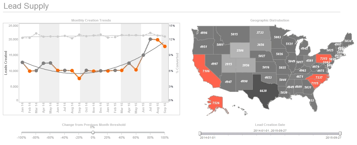
Why Real Estate Agents Rely on Dashboards - Though real estate agents serve under a broker, their day-to-day work - i.e., networking, generating leads, working with clients - is carried out independently. When you take on this role, you're not only working as an agent but as a one-person digital marketing team. Your ability to earn a commission hinges on how well you adapt to the roles of content creator, marketer, sales representative, and adviser to your clients. To thrive in the real estate industry long-term, you have to get really good at managing each of these roles simultaneously and tracking your growth year-over-year. This is where using a dashboard works to your advantage. A dashboard is a data hub that takes all of your important analytics and presents them in the form of graphs, tables, and charts. This allows you to keep the wide view - we're talking big picture growth - even as you work one-on-one with your clients in the here and now...
WordPress Dashboard Application - Looking for a good solution for WordPress dashboard analytics? InetSoft's pioneering BI application produces great-looking dashboards that mashup content creation data with other marketing campaign data and give greater self-service to all types of users in your organization. View a demo and try interactive examples...
Workflow Dashboards for ServiceNow - Looking for a good solution for ServiceNow dashboard reporting? InetSoft's pioneering BI application produces great-looking cloud-based dashboards with an easy-to-use drag-and-drop designer. View a demo and try interactive examples...
Why Is InetSoft a Good Solution for Creating Dashboards on Google App Engine? - InetSoft could be considered a good solution for creating dashboards on Google App Engine for several reasons: Adaptability to Cloud Environments: InetSoft is known for its adaptability to cloud environments, making it suitable for deployment on platforms like Google App Engine. Its architecture allows for seamless integration with cloud services, ensuring a smooth experience when building and deploying dashboards in the cloud. User-Friendly Interface: InetSoft provides a user-friendly interface for creating dashboards, making it accessible to both technical and non-technical users. This can be beneficial for teams working on Google App Engine, where collaboration and ease of use are essential. Data Connectivity: InetSoft supports various data sources and connectors, including cloud-based databases and services. This is crucial when working on a cloud platform like Google App Engine, as it allows for easy integration with different data repositories and services. Scalability: Google App Engine is designed to automatically scale applications based on demand. InetSoft's scalability features ensure that dashboards created using its platform can handle varying levels of data and user interactions, aligning well with the dynamic scaling capabilities of Google App Engine...
Why Would a Developer Use a Portlet Dashboard? - A developer might choose to use a portlet dashboard for several compelling reasons, each contributing to enhanced user experience, efficient development, and improved management of web applications. Portlet dashboards, often associated with portal frameworks like Java Portlet Specification (JSR 286) or other portal technologies, offer developers a versatile and modular approach to designing and organizing web applications. Here are key reasons why a developer would opt for a portlet dashboard: Modularity and Reusability: Portlet dashboards allow developers to create modular components (portlets) that can be independently developed, tested, and maintained. Developers can reuse existing portlets across multiple pages or applications, fostering a more efficient and scalable development process. Customization and Personalization: Portlets in a dashboard can be personalized and configured based on user preferences. Developers can create dashboards with configurable layouts, enabling users to arrange and prioritize content according to their specific needs and preferences. Centralized Information Hub: Portlet dashboards serve as centralized information hubs where users can access relevant data and functionality from various sources in a unified interface...
Zendesk Sell Dashboard Application - Looking for a good solution for Zendesk Sell dashboard reporting? InetSoft's pioneering BI application produces great-looking dashboards that give you more self-service analytic capabilities. View a demo and try interactive examples...

Zero-Client Dashboards and Reporting - InetSoft's offers a zero-client business intelligence platform that features award-winning dashboard & reporting, and ensures a faster deployment time than most other solutions on the market...
Zero Client University Dashboard System - Looking for a good university dashboard system? InetSoft makes dashboard software that is easy to deploy and easy to use, and its unique data mashup capabilities enable unified views of organizational performance and maximum self-service. Examples of InetSoft users in higher education are: Carnegie Mellon University, Florida International University, Gallaudet University, Northwest Nazarene University, and Rutgers University...