A Travel Loyalty Solution Provider Embeds InetSoft's Scorecarding Tool into its Platform
In the bustling city of Nexus, where skyscrapers gleamed under a perpetually vibrant sky, Clara Voss ran Horizon Rewards, a travel loyalty solution provider that had carved a niche in the competitive travel industry. Horizon's platform connected airlines, hotels, and car rental services, offering travelers seamless ways to earn and redeem points across a global network.
But Clara knew the market was shifting—customers demanded more than points; they craved personalized experiences, and her competitors were catching up fast. To stay ahead, Horizon needed a game-changer, and Clara had her eyes on a bold move: embedding InetSoft's scorecarding tool into their platform.
Clara's office overlooked Nexus's vibrant downtown, a fitting view for a woman whose mind was always on the move. She leaned back in her chair, sipping coffee, as her CTO, Raj Patel, burst in with his usual energy. "Clara, I've been digging into InetSoft's StyleBI. Their scorecarding tool could be the edge we need," he said, sliding a tablet across her desk.
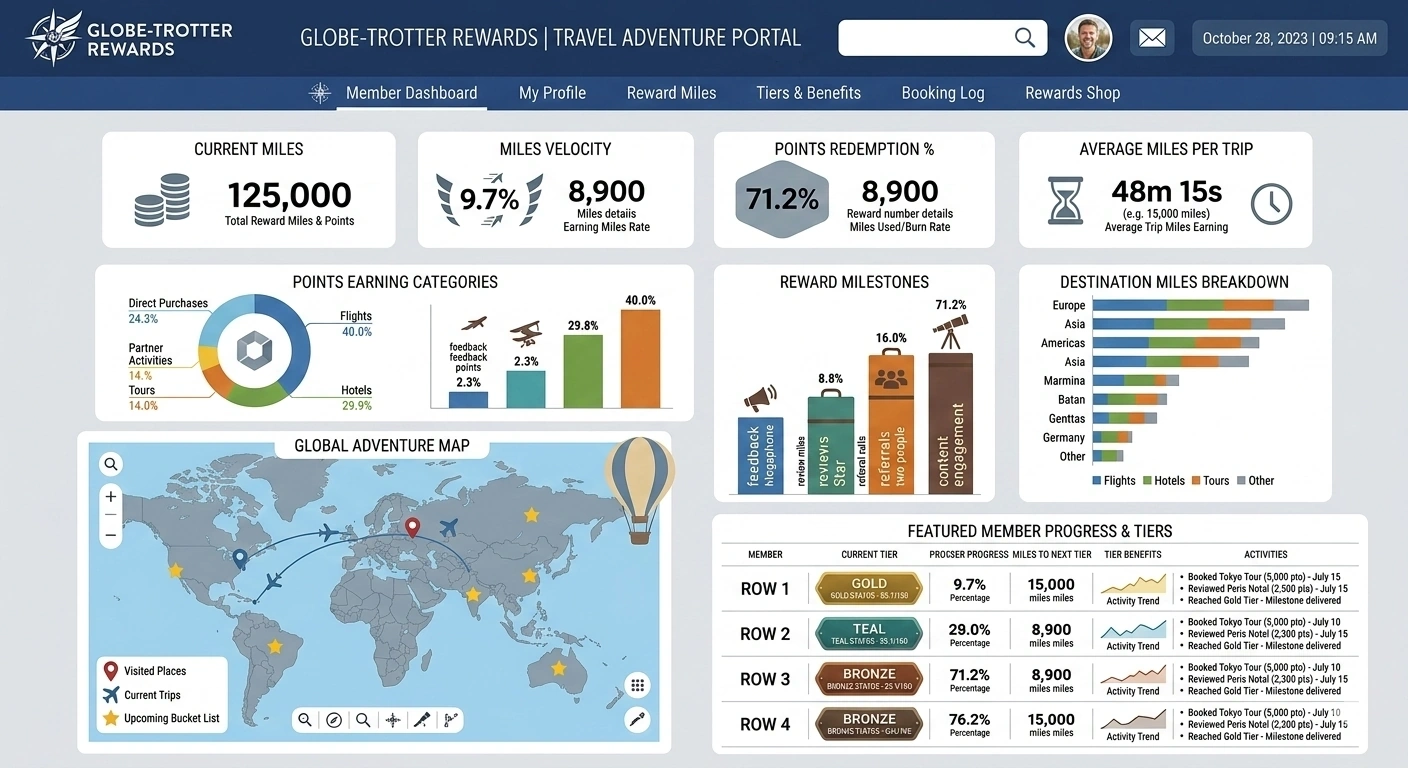
The screen displayed a sleek dashboard mockup, vibrant with metrics—customer retention rates, redemption trends, and engagement scores—all tailored to Horizon's branding. "Talk me through it," Clara said, her curiosity piqued.
Raj explained that InetSoft's scorecarding tool, part of their Style Scope platform, was designed for seamless integration. It could pull data from Horizon's disparate sources—booking systems, customer feedback, partner APIs—and transform it into real-time, actionable insights. Unlike generic analytics tools, this one allowed customizable scorecards that could track key performance indicators (KPIs) like customer lifetime value or program profitability with precision. "It's white-label friendly," Raj added. "We can make it feel like Horizon built it from scratch."
Clara nodded, envisioning the possibilities. Horizon's current analytics were clunky, relying on static reports that took days to generate. Customers like Elena, a frequent flyer who'd emailed Clara last week, complained about opaque point systems and irrelevant offers. A dynamic scorecard could change that, showing Elena exactly how her points stacked up and suggesting tailored rewards—a spa day after a long flight, perhaps. But integration wasn't trivial. Horizon's platform was a complex web of legacy code and modern APIs. Could they pull it off without disrupting service?
The decision was made at the next board meeting. Clara pitched the idea with conviction, emphasizing how personalized insights could boost retention by 20%, based on industry benchmarks. The board, initially skeptical about costs, greenlit the project when Raj demoed a prototype, showing how a scorecard could predict when a customer might churn and suggest interventions. "This isn't just data," Clara said. "It's loyalty engineered."
The integration began in earnest. Raj assembled a crack team: Mia, a data scientist with a knack for pattern recognition; Leo, a UI designer obsessed with simplicity; and Aisha, a backend engineer who could tame any API. They partnered with InetSoft's support team, who provided a sandbox environment to test Style Scope's capabilities. The first hurdle was data unification. Horizon's partners used different formats—XML from airlines, JSON from hotels. Mia spent late nights crafting a data mashup layer, leveraging Style Scope's Data Block technology to blend these streams into a cohesive feed.
Weeks in, the team hit a snag. The scorecard's real-time updates lagged during peak traffic, frustrating Aisha, who muttered about "gremlins in the code." Clara, sensing tension, called a team huddle at a local diner, Nexus's neon glow filtering through the windows. Over burgers, Raj admitted they'd underestimated server demands. InetSoft's engineers suggested optimizing queries with caching, and Aisha reworked the backend. By the next sprint, the lag was gone, and the scorecard hummed with live data—points earned, redemptions processed, even sentiment scores from social media mentions.
Leo, meanwhile, obsessed over the user interface. He wanted the scorecard to feel intuitive, like a travel companion rather than a corporate dashboard. He designed a mobile-first view where customers could swipe through KPIs—miles to their next free flight, say—while partners saw aggregate trends, like which rewards drove bookings. Clara tested an early version, imagining Elena's delight at seeing a clear path to a first-class upgrade. "This could be our soul," Clara told Leo, who grinned, tweaking the color palette to match Horizon's teal-and-gold aesthetic.
As the launch neared, Clara faced a new challenge: convincing partners to adopt the enhanced platform. She flew to Miami to meet Javier, CEO of SunWing Airlines, a key client. Over ceviche, Javier expressed doubts. "Our loyalty program works fine. Why fix it?" Clara pulled out her tablet, showing him a mock scorecard. It highlighted that 30% of SunWing's frequent flyers hadn't redeemed points in a year—a missed revenue opportunity. The scorecard suggested targeted campaigns, like double points on winter routes. Javier leaned forward, intrigued. "If this predicts behavior that accurately, I'm in," he said. By the meeting's end, SunWing signed on for a pilot.
Back in Nexus, the team prepped for rollout. They stress-tested the platform, simulating a million users redeeming points simultaneously. Mia fine-tuned the algorithms, ensuring the scorecard's predictive models stayed sharp. Aisha secured the system against data breaches, knowing trust was Horizon's currency. Clara, ever the strategist, crafted a marketing campaign: "Horizon Rewards: Your Journey, Your Score." It promised transparency and personalization, qualities travelers craved in a post-cookie world where privacy mattered.
Launch day arrived, a crisp Nexus morning. Clara gathered the team in the office, where screens displayed the platform's live metrics. At 9 a.m., the updated Horizon Rewards went live. Customers logged in, greeted by their personalized scorecards. Elena, the frequent flyer, was among the first, posting on X: "Finally, a loyalty program that gets me. Horizon's new dashboard is 🔥." Partners like SunWing saw immediate upticks in engagement, with redemption rates climbing 15% in the first week.
Clara watched the numbers roll in, relief mixing with pride. The scorecard wasn't just a tool; it was a bridge between Horizon, its partners, and their customers. It turned raw data—flights taken, nights stayed—into stories of loyalty, like Elena's dream vacation funded by points she'd forgotten she had. Raj, ever the optimist, raised a toast: "To Horizon, where loyalty isn't just points—it's personal."
Months later, Horizon Rewards was the talk of the industry. Competitors scrambled to mimic the scorecard's clarity, but Horizon's first-mover advantage held strong. Clara, reflecting in her office, knew the journey wasn't over. The travel world evolved daily—new partners, new tech, new traveler whims. But with InetSoft's scorecarding tool embedded in their platform, Horizon was ready to navigate whatever came next.
At a travel expo, Clara took the stage, sharing Horizon's story. "Loyalty isn't about locking customers in," she said, the crowd hanging on her words. "It's about giving them reasons to stay." Behind her, a giant screen displayed a Horizon scorecard, pulsing with live data—proof that in the chaotic dance of travel, clarity was the ultimate reward.
As Nexus's skyline twinkled beyond the expo hall, Clara felt a quiet certainty. Horizon Rewards wasn't just a platform; it was a promise kept, one scorecard at a time.
Articles about a Flexible Enterprise Balanced Scorecard Tool
Searching for a balanced scorecarding tool? InetSoft's BI software has a drag and drop design tool for quick creation of any balanced scorecard. View a demo.
Dashboard Component Properties - In InetSoft's StyleBI application, dashboard component properties grant end-users full control over the changes they wish to make to data visualizations. The ‘Properties’ dialog box for output components provides the following tabs: General, Data, Advanced, and Pre-Aggregate. The next sections discuss the output-specific properties available under these tabs. The General tab in the ‘Properties’ dialog box provides the following unique properties for output elements. Note: If you are connecting to the server via “https” in Internet Explorer, you may need to change the following Internet Explorer setting in order for the ‘Face’ property to update correctly: In Internet Explorer, open the ‘Internet Options’ dialog box, and click the ‘Browsing History Settings’ button to open the ‘Temporary Internet Files’ dialog box. Select ‘Every time I visit the web page’ under ‘Check for newer versions of stored pages’...
Dashboard Composer - InetSoft's dashboard composer is a unique and innovative approach to business intelligence that allows you to customize the way your data is displayed. When Visual Composer cannot automatically match your geographical data to the locations in the geographical database, the ‘Geographic Feature Names’ dialog box will prompt you to manually create the correct mapping. To manually match the geographical data with locations in the database, follow the steps below: 1. In the Hierarchy tab of...
Dashboard Conference Mailing - Users can create templates that efficiently mail conference reports out ahead of time, saving a great deal of time and effort, and available in InetSoft's comprehensive real-time analytical reporting solution and dashboard software. Compiling a custom mailing list for an upcoming conference is a necessary, but laborious, task. The functions provided by the Data Worksheet simplify this task. Say we are hosting a conference for select customers and we would like to send them printed invitations. Seating is limited, so sending an invitation to every customer would not be cost effective. Therefore, to narrow down the list of the customers to whom we will send the invitation, we can use their order history...
Dashboard Creation Best Practices - Dashboards allow users to create visual displays to monitor their business. They are executive information systems designed to be easy to follow. Not all dashboards are created equal, however. Depending on who or what makes a dashboard, some may experience one or many problems that come between the data and the user. A cluttered dashboard, for example, does not get its message across and may be detrimental to a business...
Dashboard Creation Objects - This section lists objects for for use in sales management dashboards and performance management dashboards. A Separator is a horizontal line across a page. It can be drawn using any one of the line styles supported by StyleBI. A Space element defines horizontal white space. The spacing is defined as points. The TOC element defines a Table Of Contents in a report. The items in a TOC element are automatically discovered from heading elements. A report only needs to specify the style of the TOC. A Report Bean is a reusable, customizable composite report element. The Bean object represents a report bean inside a report. Report Bean's properties are defined when a report bean is created in the Designer. The parameters defined on the bean can be accessed through the bean object. The StyleReport object is a static object that contains all definitions for constants used in the StyleBI host environment. These constants can be accessed without creating an instance of a StyleReport object, as shown below...
Dashboard Crosstab Table - Users can integrate disparate data sources into crosstab tables and create sophisticated real-time reports using InetSoft's award-winning dashboard software. A crosstab table, also known as a pivot table, is the tabular equivalent of a chart. A Worksheet crosstab contains one column header, one or more row headers, and one measure. The values at the row-column intersections of the crosstab table represent summary (aggregate) information of the measure. For example, a crosstab with row headers representing 'Salesperson' and column headers representing 'Month of Year' might contain values at the intersections representing 'Average Sale Price' or 'Maximum Sale Price'. The measure in both cases is 'Sale Price'. The summarization method is, respectively, Average or Maximum. By using summarization, crosstab tables display large amounts of data in a compact form...


